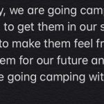
I absolutely loved Katlyn’s approach to Task 7 – Mode-Bending. We were tasked with changing the semiotic mode of the first task, “What’s In Your Bag?”, and delivering it in audio form. Katlyn took a very creative approach to this task by conveying the contents of her bag through song. I admire that Katlyn went outside her comfort zone to complete this task, and I think she did a fantastic job.
Our approaches to this task differed, although we both produced an audio file for this task. I took a narrative approach to this task, and I chose to portray a “day in the life” of a TTOC to demonstrate the importance of various items in my work bag. The audience was like a fly-on-the-wall, listening in on the typical workday of a TTOC. Katlyn, on the other hand, created a song to the tune of Old Town Road to outline the items in her bag. Katlyn included both the lyrics and a music video featuring her Memoji singing along to the song on her webpage. Including the lyrics and a music video as part of her submission enables the audience to consume her work in a variety of ways. My approach to the task, on the other hand, does not allow for this, as I only produced an audio file. I think this speaks to the literacies that Katlyn’s website privileges compared to mine, as she allows her audience to view and enjoy her work in numerous ways.
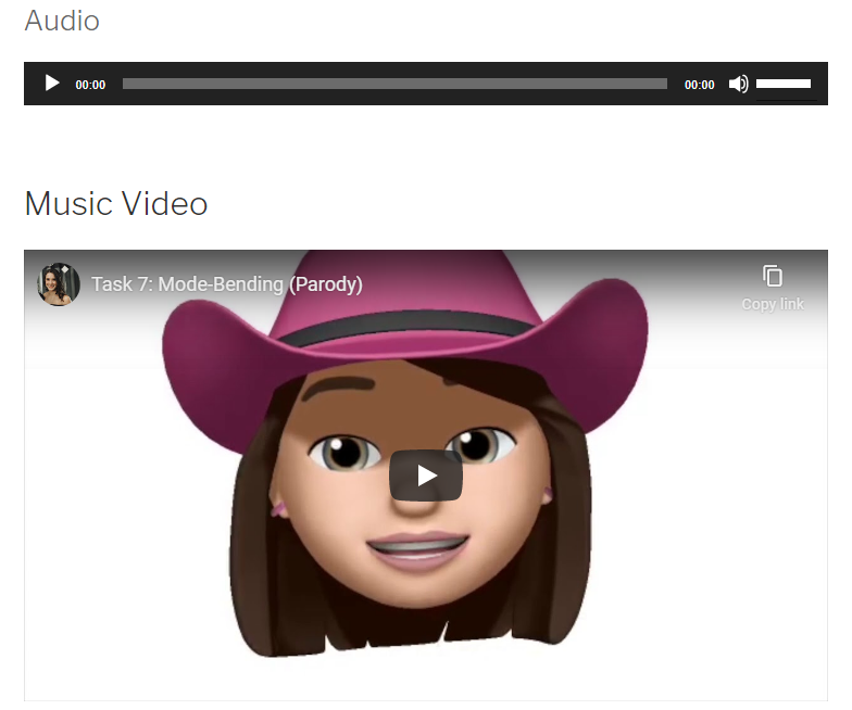
Katlyn’s Audio File and Music Video
Listening to Katlyn’s rendition of this task opened my eyes to the many different ways people thought to “redesign” the purpose of this task. I had not even considered doing a song, but this was a very playful and effective way to redesign the “What’s In Your Bag?” task. When I first read the instructions for the Mode-Bending task, I struggled to think of how I would convey Task 1 in audio form without simply talking about the contents of my bag. How was I supposed to “re-design” a task that seemed so simple and straightforward? I was pleasantly surprised with how my idea turned out, and I was curious to see what my classmates would put together for this task. Katlyn’s approach stood out to me as being especially creative, and she succeeded at truly redesigning the purpose of the original task in a fun way.
Aside from the similarities and differences between our tasks, Katlyn and I also had several differences between our websites. I really appreciate the clean, organized look of Katlyn’s website, and the several menu options at the top of the screen. These menus make it easy to navigate Katlyn’s website, and to find what you are looking for within the site. All of my tasks show up on a “wall” on my homepage, and while I like seeing “previews” of all of my tasks on one page, it makes it less clean and concise compared to Katlyn’s website. I think Katlyn’s website reflects what I would expect to see on most professional websites online, whereas mine definitely has more of a “blog page” type of feel to it. While there are no “wrong” ways to design a website, I think that the differences in our design speak to our personalities and professional identities.
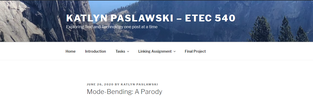
Katlyn’s Clean and Organized Website