 My Yelp search for some good sushi bars in Vancouver has revealed 2 particular restaurants that were rated the highest either in ratings or reviews: Sushi Mart (4.5/5, 129 reviews) and The Eatery (3.5/5, 243 reviews). A quick glance over the restaurants’ websites shows a significant difference in their marketing approaches.
Web design of the Sushi Mart
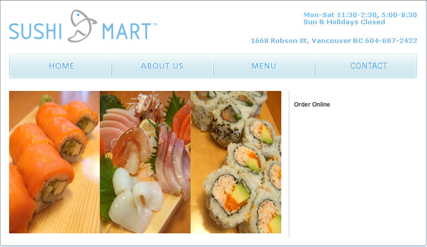
Sushi Mart provides a simple, minimalist homepage that reflects the values of Japanese culture… or maybe it just has a very lousy website design. Anyhow, its strongest point so far is the menu section, which presents clear and mouthwatering photos of each dish. According to Yelp reviews, the food and its quality here are top-notch and are definitely worth coming back for. It’s a successful representation of the restaurant’s mission statement, which states that Sushi Mart is an ocean-friendly place that provides healthy menu, great value and service. Basically it’s a differentiation based on product and service excellence.
Web design of The Eatery
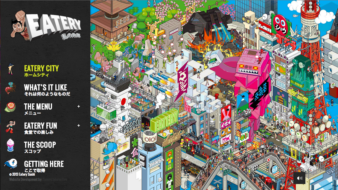
The Eatery has put a significant amount of effort into its website design, which has a slightly geekish but very original feel to it.  The restaurant’s mission statement is:
“We are The Eatery and we don’t just feed the common people, we feed your soul!”
It’s definitely more friendly and has a human touch to it that Sushi Mart lacks. Unfortunately despite the restaurant’s interesting interior design, website design and strong marketing, The Eatery is still behind Sushi Mart in ranking and the reason for that is the average quality of food and poor customer service. The Eatery is located in the Kitsilano neighbourhood that has low number of sushi places, so it’s likely that the restaurant is just taking it easy.
The Eatery is a place that Vancouverites will visit at least once for its unique atmosphere, but it’s still the Sushi Mart that people will keep coming back to, because at the end of the day it all comes down to eating good sushi.
