Mushroom Mapping in Kings Bowl
Previous workers (Catherine Neish, Mike Zanetti) have observed the presence of so-called ‘mushroom’ features at COTM’s Kings Bowl lava field. Also known as pop-ups, one hypothesis, posited by Zanetti, is that the mushrooms are positive topographic anomalies that were created when pyroclasts from the nearby fissure impacted, forming holes in cooled lava through which lava could rise, then cooling into hemispherical, ‘mushroom’-shaped depressions. Here are some pictures by Catherine of the mushrooms in question.
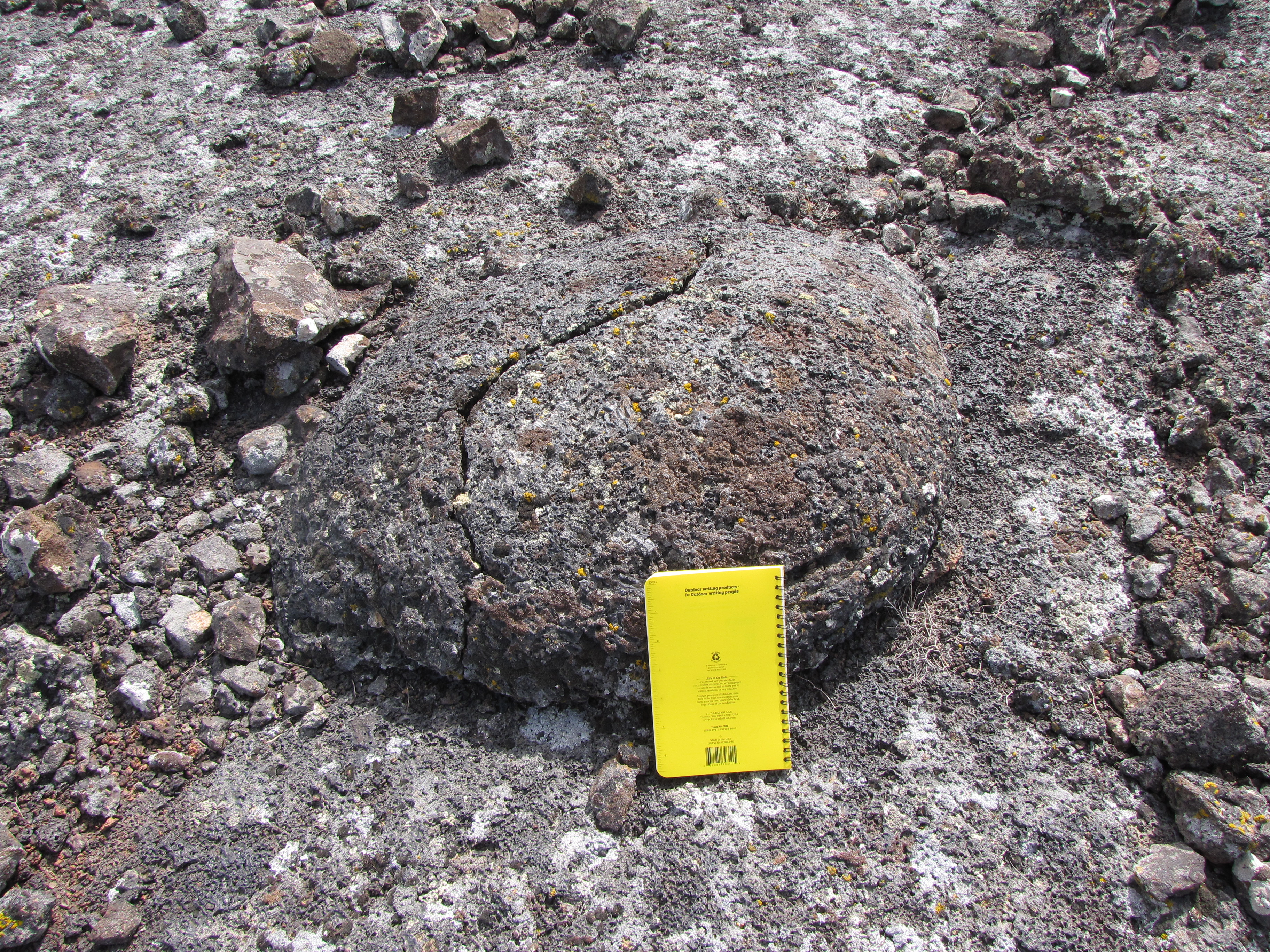
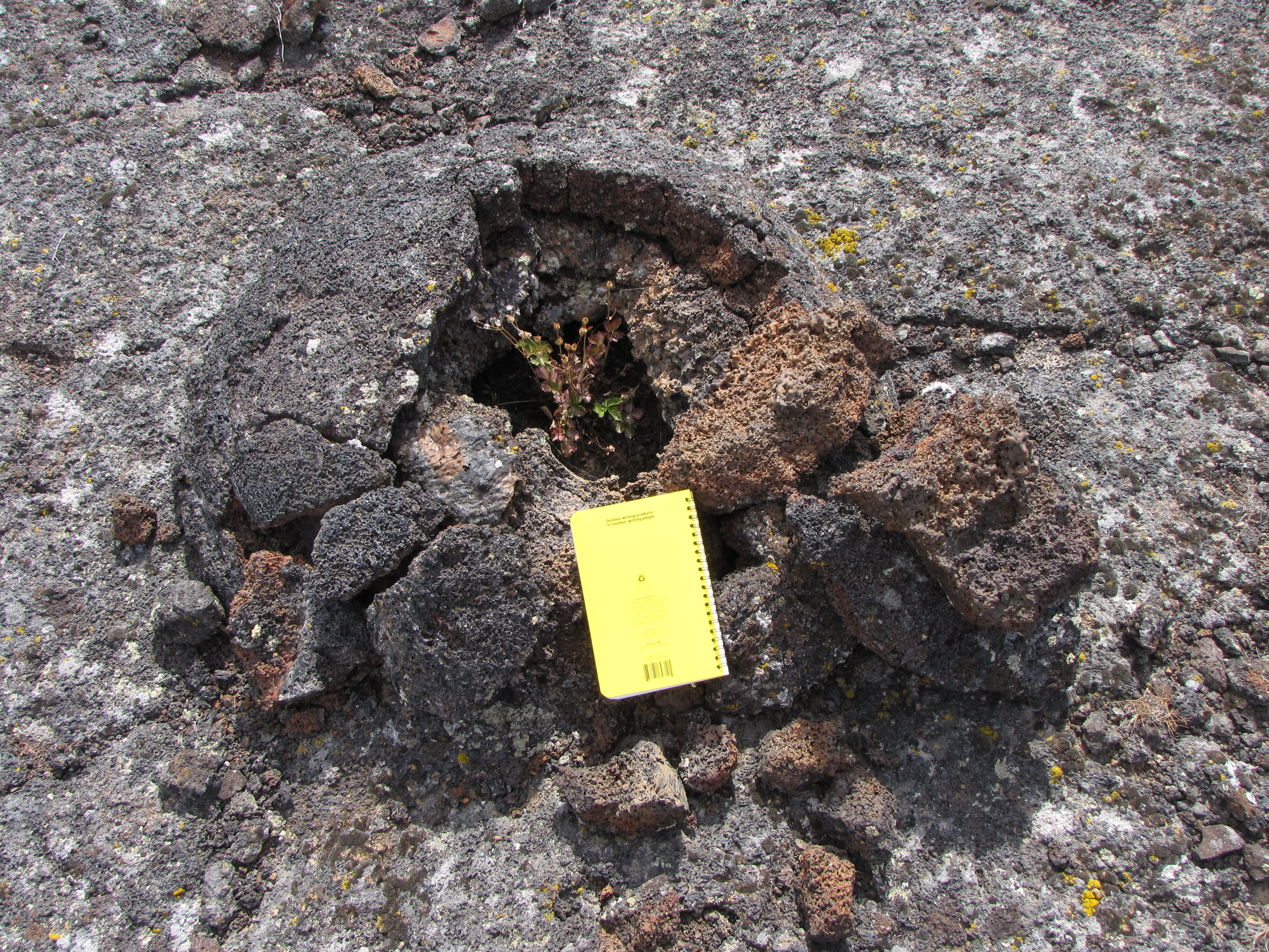
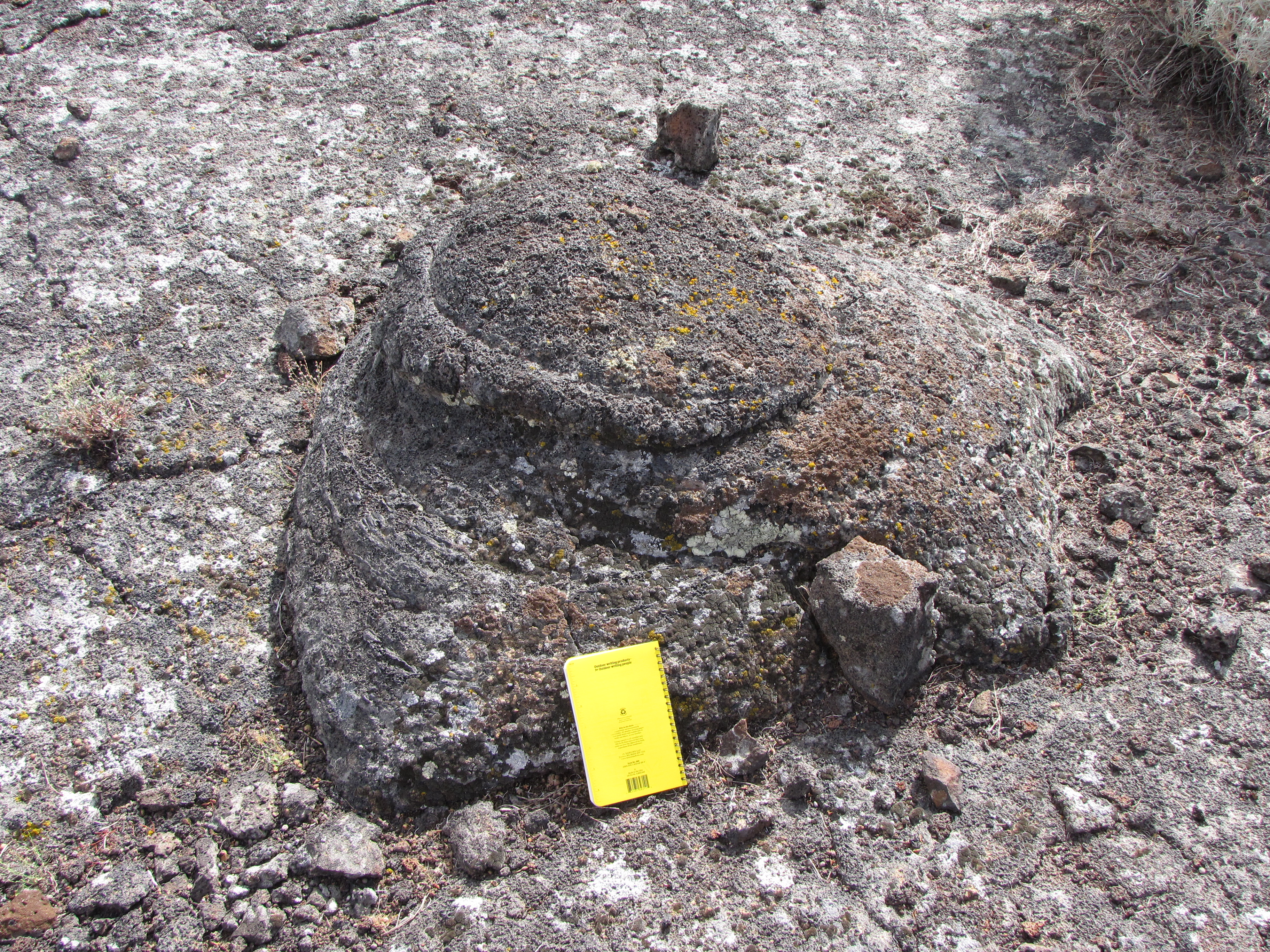
Ostensibly, the mushrooms are heterogeneous, with varying levels of symmetry, aspect ratio (eg. height vs. radius), and the degree to which they have been fractured. I also found it interesting that Greeley et. al. (Chapter 11 (Guide to the Geology of King’s Bowl Lava Field) from “Volcanism of the Eastern Snake River Plain: Idaho” (1977) think that some linear features can also be classified as ‘squeeze-ups’ (their term for mushrooms), as opposed to solely the circular/elliptical features shown above.
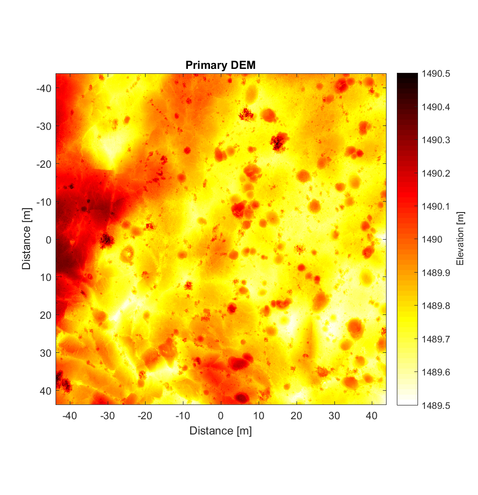
My role in this has been to examine a partial DEM of Kings Bowl in ArcGIS, determined via a high-resolution (2.5cm/pixel) backpack LiDAR system, and find what I believe are mushrooms. There are clearly some somewhat arbitrary factors when it comes to deciding criteria as to what exactly constitutes a mushroom. For instance, is there a minimum/maximum threshold when it comes to the mushroom size (taking for instance the area or radius of the best-fitting circle as a proxy for size). While I had originally envisaged specifying these thresholds before creating shapefiles to map the mushrooms, I found that in general, coherent, contiguous hemispheres resembling those photographed in the field above were typically within the diameter range of 0.75-2m. In the absence of direct visual confirmation, the total number of mushrooms determined from the DEM (927) is necessarily speculative.
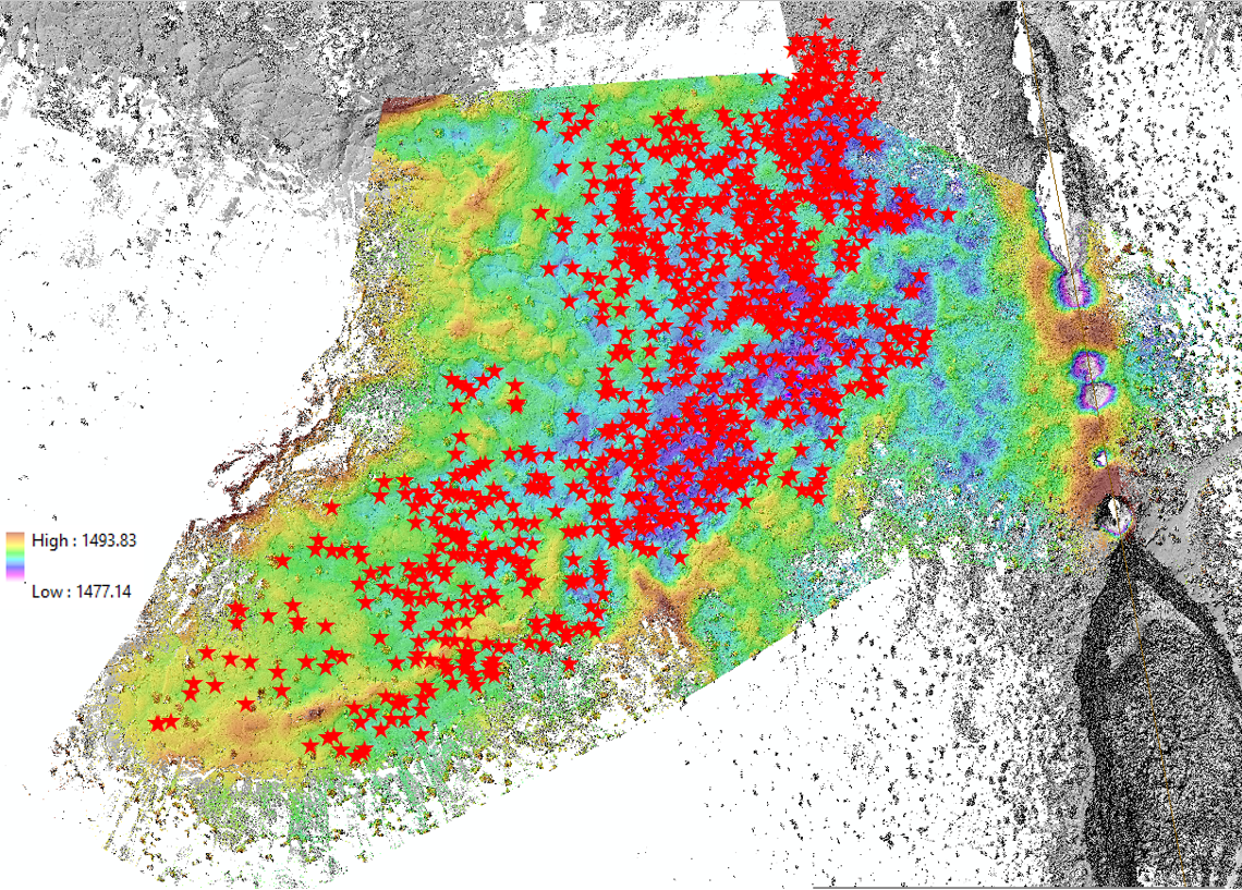
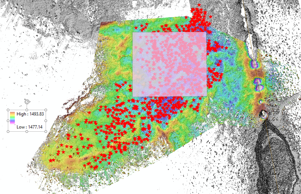
Below is the DEM, in which you can clearly see a linear fissure on the right (which is not the main rift running through COTM), and the stars show the spatial distribution of the mushrooms throughout the area. If this hypothesis were indeed true, we would expect some sort of correlation; perhaps with respect to their spatial density, their proximity (distance) to the fissure that potentially caused them, their shape/area/height, etc.
Another cursory observation would seem to be that the density of mushrooms is higher in the topographic depression (purple/dark blue regions) relative to the higher regions of the DEM.
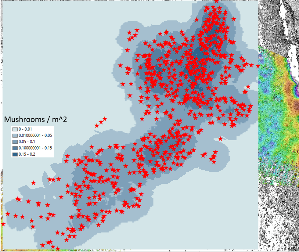
Using ArcGIS’s ‘Point Density’ tool, I converted the shapefile of points (stars) above into a density map. Specifically, the tool calculates the number of points (mushrooms) within a circular neighbourhood centred on each and every pixel, where the neighbourhood (radius of the circle surrounding each pixel) was arbitrarily defined as 10m. The result (below) indicates 2 main mushroom concentrations: to the NE, and near the centre of the map (of which the latter corresponds spatially to the aformentioned topographic depression). It should be noted however that at least qualitatively, this result is to be expected, given that ‘edge effects’ are significant: the circular neighbourhoods of the pixels in the centre of the map will capture more mushrooms than the neighbourhoods of the pixels on the edge of the mushroom cluster.
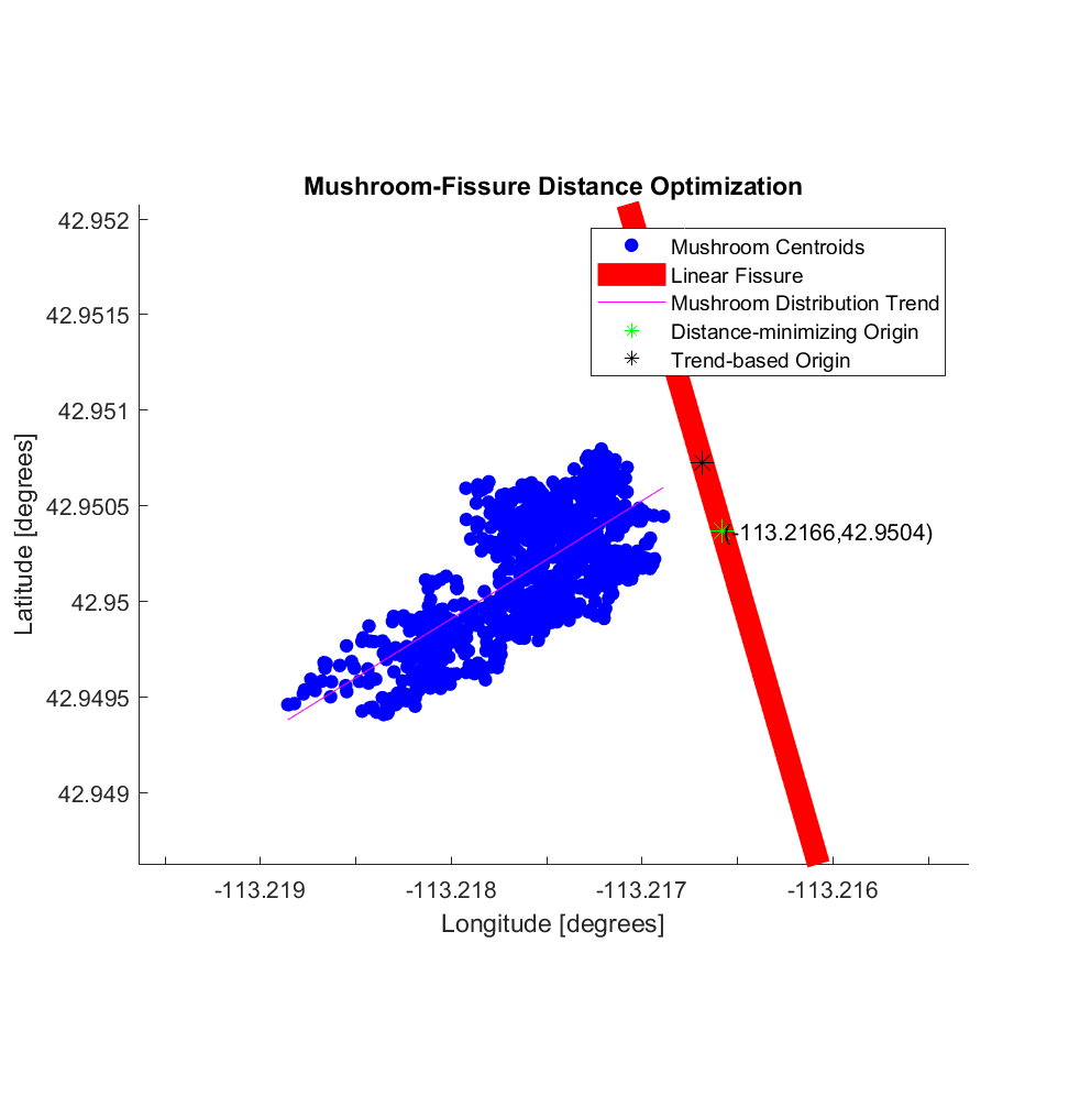
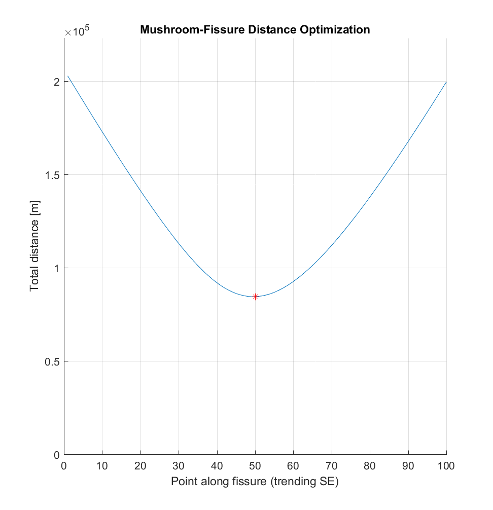
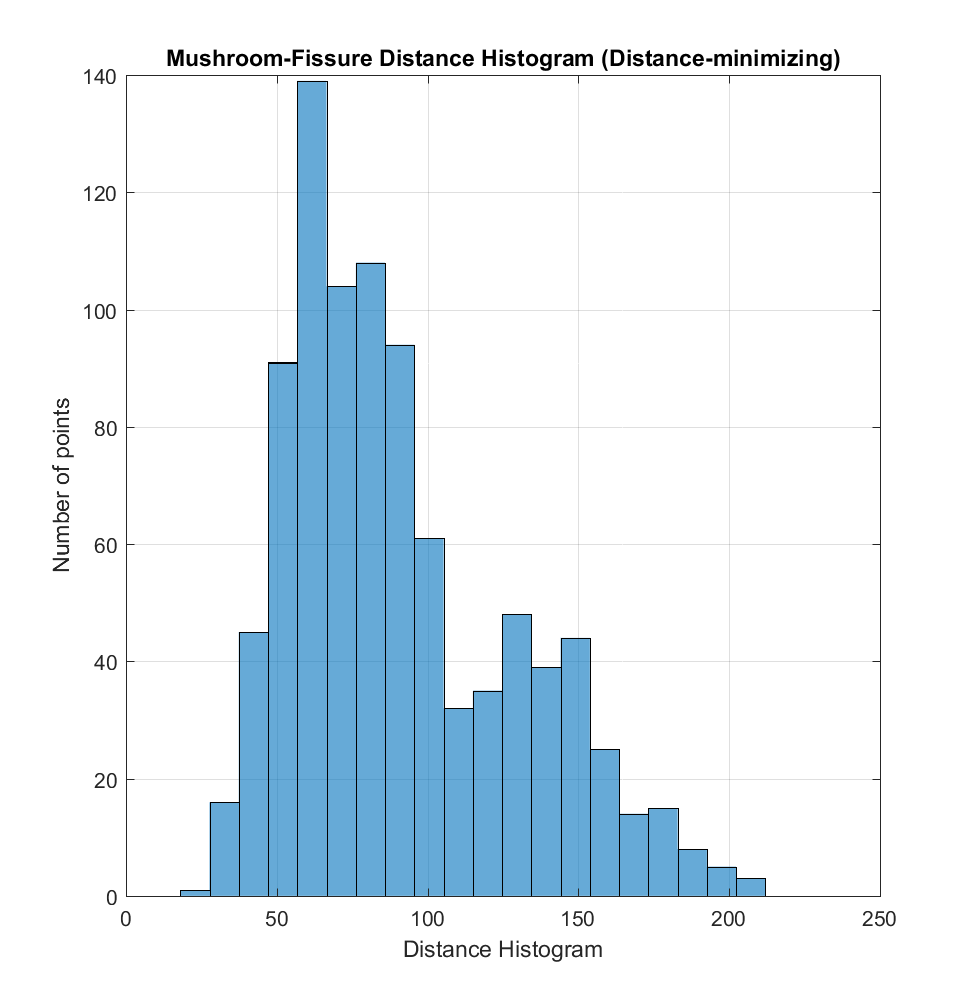
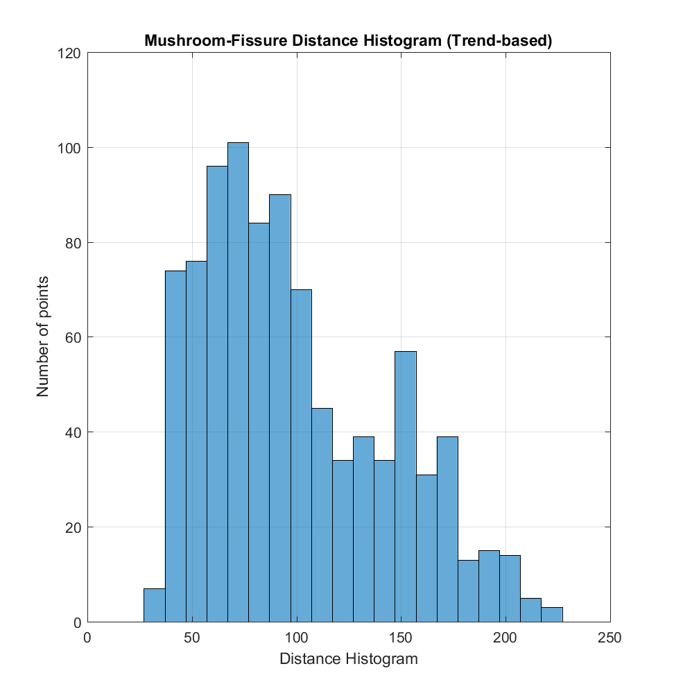
Aside from the density of mushrooms, their spatial relationship (if there is one) with respect to the linear fissure is also of interest. As such, I calculated the coordinates of the mushroom centroids, as well of those of the points constituting the linear fissure. Another somewhat arbitrary choice now arises: if we are to measure the distance between the mushroom centroids and the fissure, which point on the fissure should be employed in the calculation? To use an analogy from electromagnetism and charge distributions, while I can think of ways to calculate/optimize distances from a point-source ‘charge distribution’, I am not so sure about doing so for a line-source.
Nonetheless, assuming a point-source, I chose 2 possibilities:
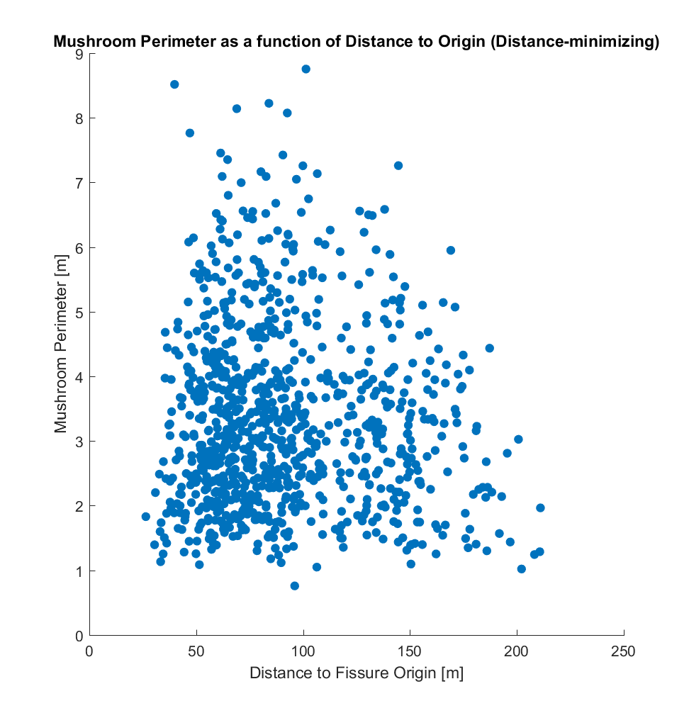
a) Distance-minimizing Origin: Choose a point on the linear fissure, calculate the Haversine (great circle) distance between this point and each mushroom, then total all of these distances. Then perform optimization: repeat this process with a series of different point on the fissure, in order to determine the fissure point which globally minimizes this sum of distances, yielding a ‘distance-minimizing origin’.
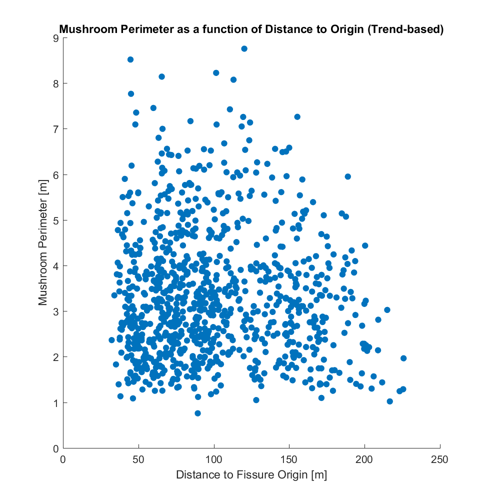
b) Trend-based Origin: Assume the cluster of mushroom centroids is akin to a scatter plot, and determine the least-squares, best-fitting line through it. Then, determine the intersection of this mushroom ‘trend line’ with the line traced by the linear fissure, yielding a ‘trend-based origin’.
This process is visualized in the 2 plots below.
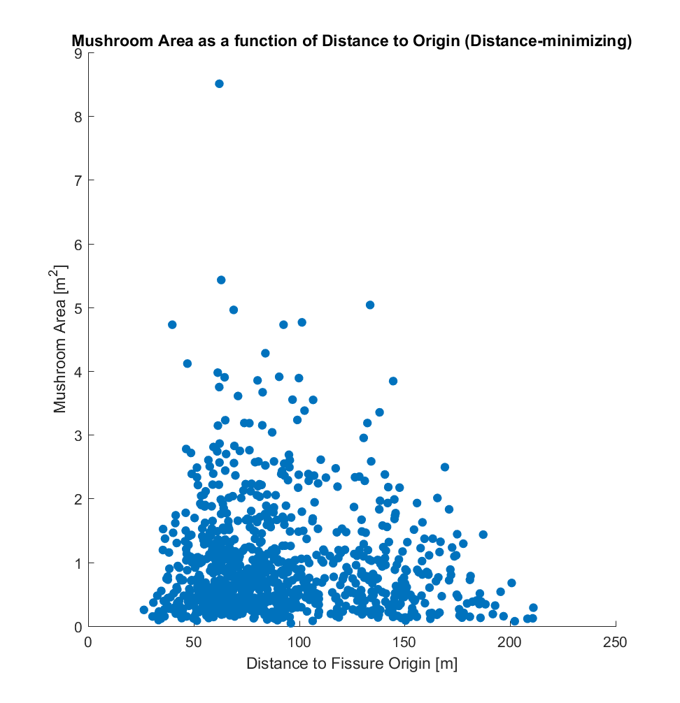
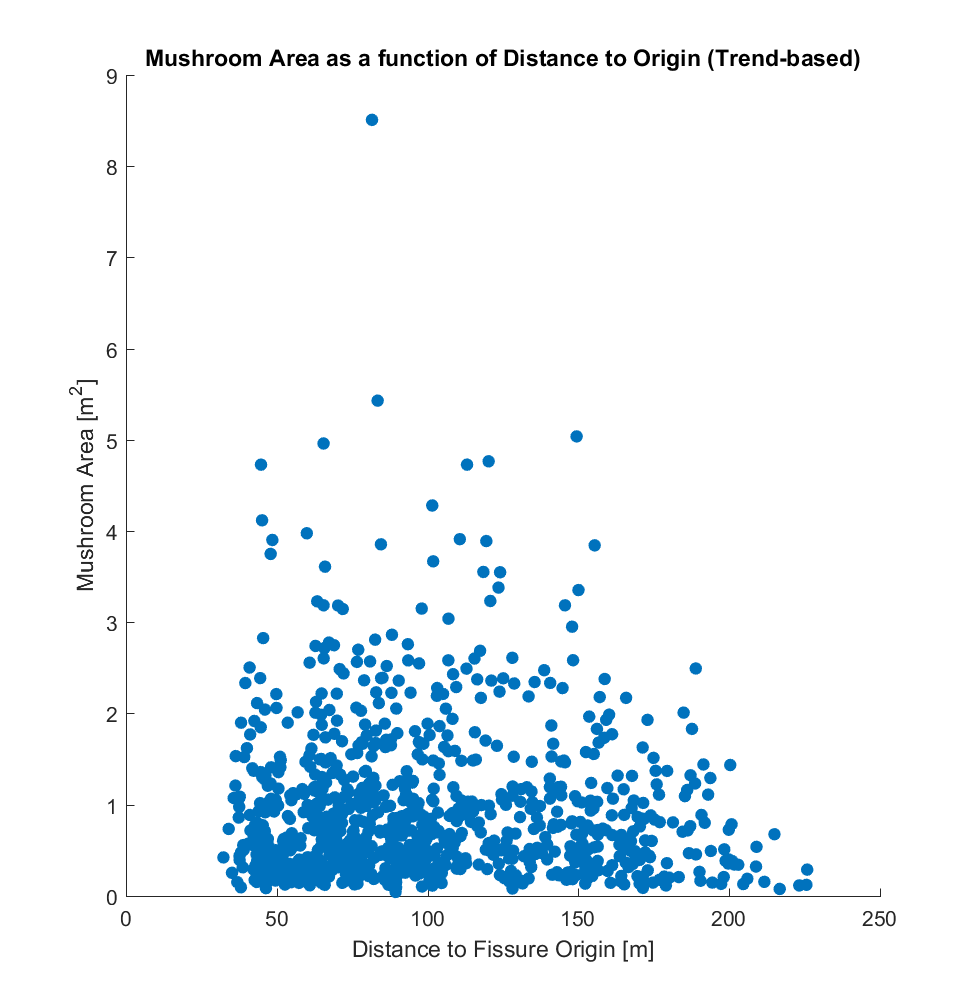
Having outlined how the distances are determined, I then plotted the mushroom centroid – fissure distance against other geometrical parameters (visualized below), for each of the 2 choices of mushroom origin (on the fissure):
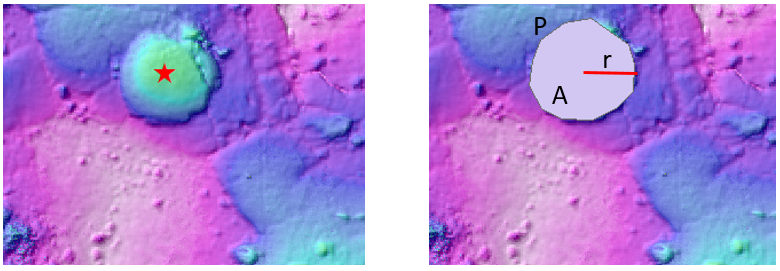
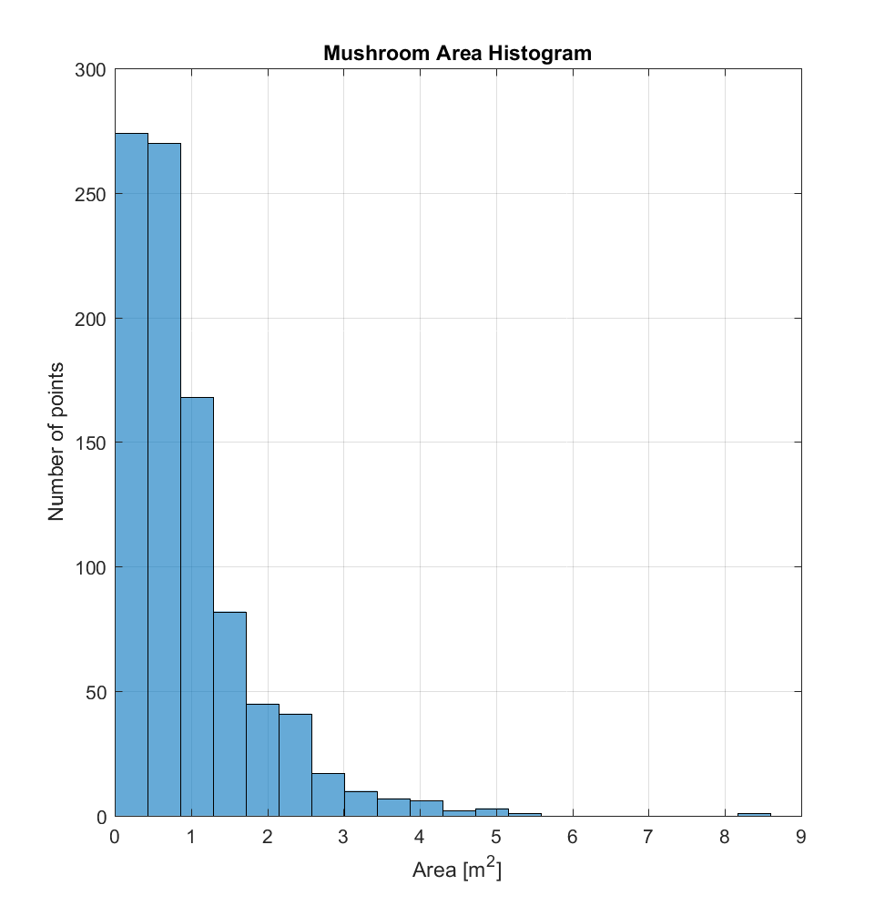
a) Area (A) of the mushroom-approximating polygon.
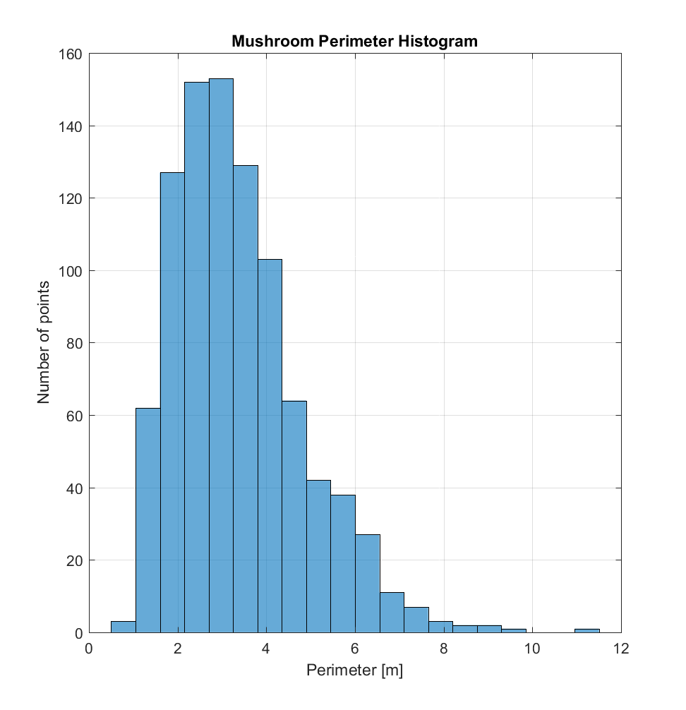
b) Perimeter (P) of the mushroom-approximating polygon.
c) Radius (r), as determined by assuming a circular mushroom (with area A=pi*r^2) such that r = sqrt(A/pi)). (This metric will necessarily increasingly imprecise as a mushroom’s shape deviates from that of a circle.)
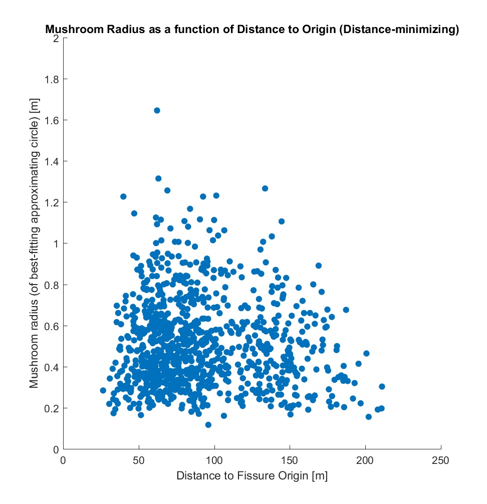
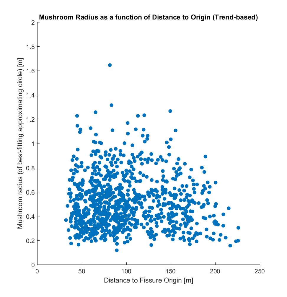
While it is evident that the two origins produce somewhat different correlations when plotted against area, perimeter, and radius, there does not appear to be a correlation between these and distance, for either choice of distance metric. If the method I have used is indeed valid, this result is somewhat surprising to me – a priori, I would have hypothesized that the larger mushrooms (corresponding to larger pyroclasts impacting the lava at those locations), being heavier and larger, would tend to be distributed closer to the fissure, and that conversely smaller mushrooms would tend to be distributed farther away. Perhaps something resembling a power law distribution.l
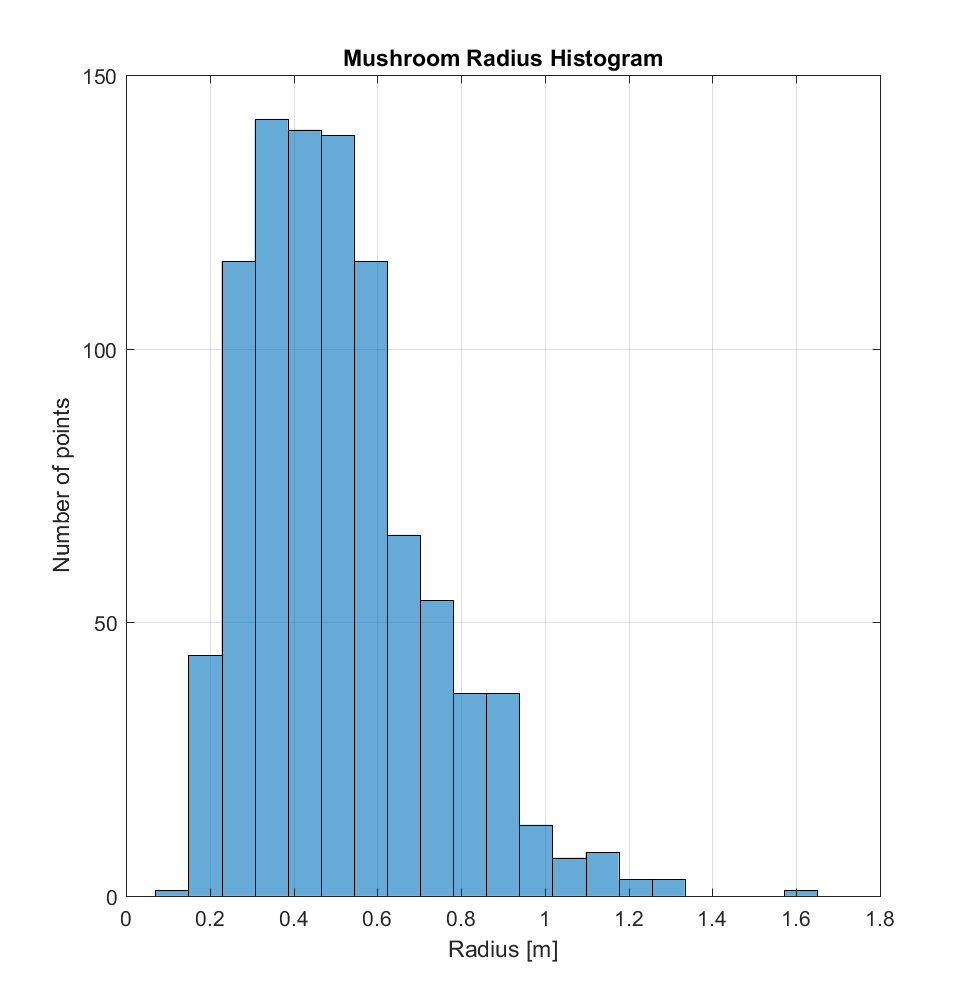
Taking a look at just the mushrooms, I also made some histograms for these quantities. The distance histogram (for either method) appears bimodal, while the area histogram could be a power law. The perimeter and radius histograms seem to cluster around values of 1-6m and 0.2-1.0m, respectively. I think it’s also important to note that there’s probably a bias in my selection away from the smallest mushrooms, seeing as these would be approaching the DEM resolution and therefore likely appear as irregularly shaped, due to discretization error.
I’d appreciate feedback with regards to next steps, and/or if this kind of analysis is in the right direction. Perhaps extracting the heights of each mushroom? A procedure for such could go as follows:
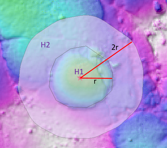
-Determine the maximum height within the mushroom polygon (H1).
-Determine the average ‘background height’ (H2) outside the mushroom, within the annulus defined by (r, 2r).
-Define the mushroom height H = H1 – H2
Similar statistics and plots as those above could then be created for mushroom height.
I also extracted an area of the Kings Bowl DEM and ran the improved, interleaved roughness algorithm on this region (or at least a 3500×3500 pixel block of it), employing as was the case for the the Highway Flow DEM a high-pass 2D Gaussian Filter with a cutoff wavelength of 50m. The results are below, where the local neighbourhoods are 40×40 (ie. 1×1 m). Note that the magnitudes of the heights on the roughness map (ie. Gaussian high-pass filtered DEM) are very small (on the order of 1cm).
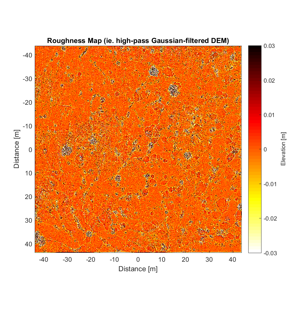
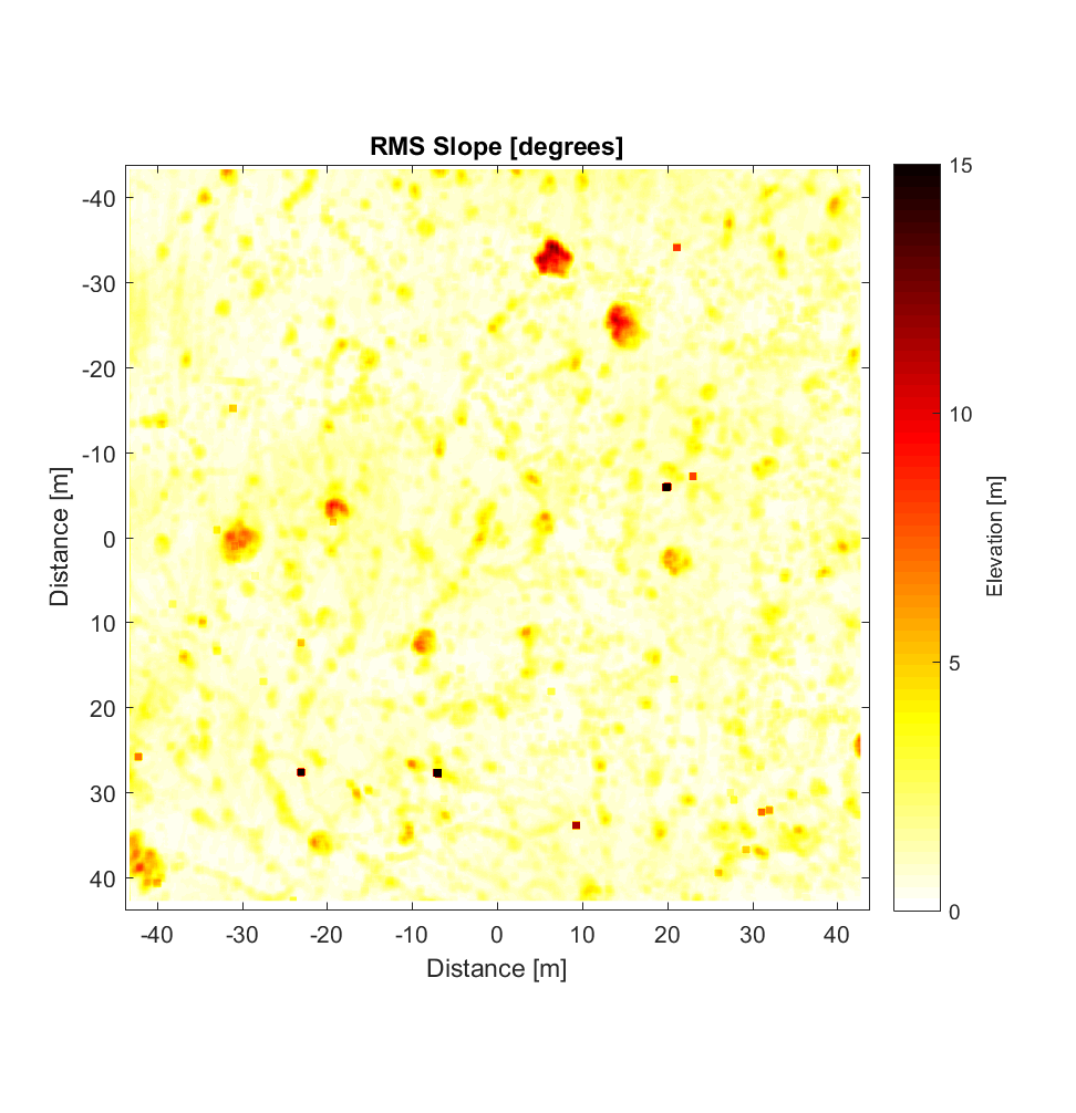
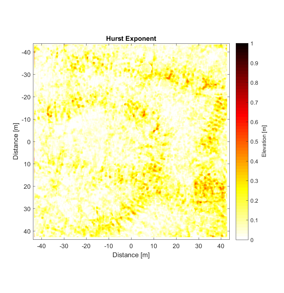
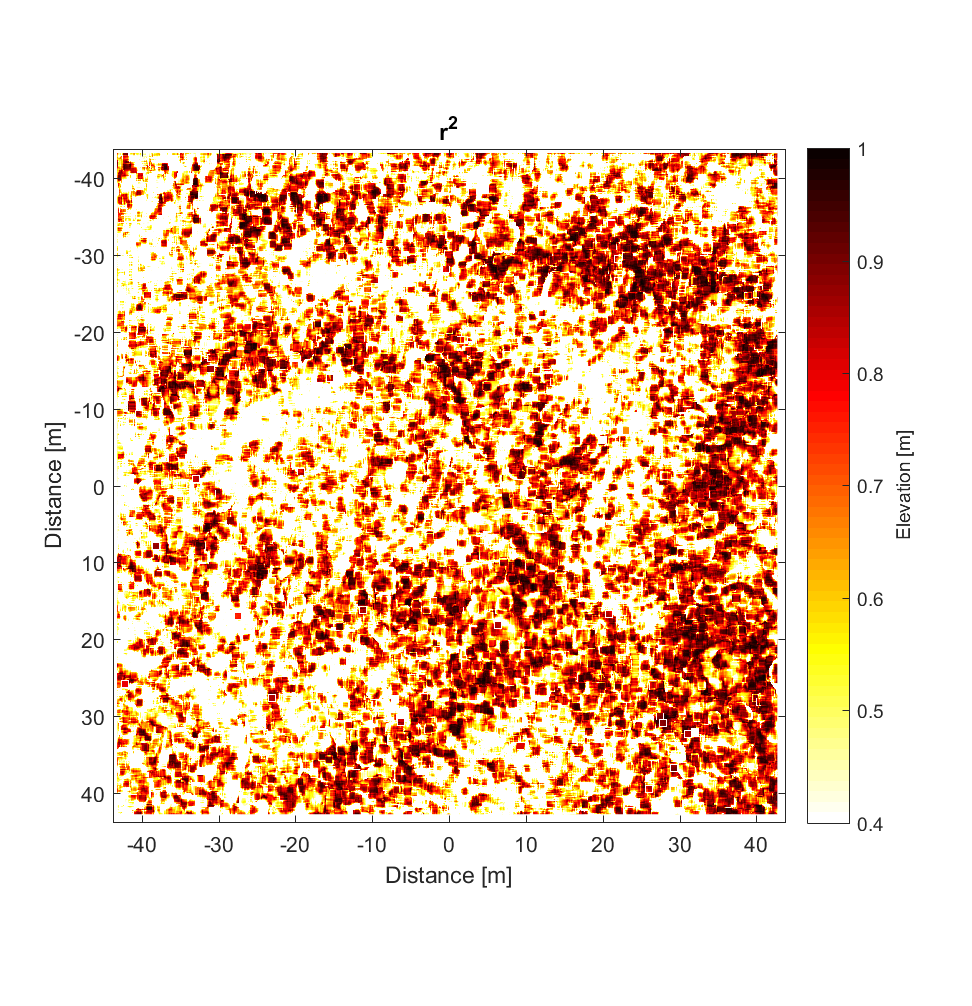
The RMS slope map shows the bushes well (the very ‘speckly’ objects in the roughness map). Given that the original DEM contains many mushrooms, however (see “Primary DEM”), it is somewhat disappointing that these features don’t seem to show upon the RMS Slope map. Meanwhile, the Hurst exponent map is rather enigmatic, showing features not obviously evident in the Primary or high-pass filtered DEM, and with very low values of Hurst exponent (mostly <0.3). The pattern does correspond roughly to that on the r^2 map, such that the few areas with high Hurst exponent are correlated with higher r^2 values.
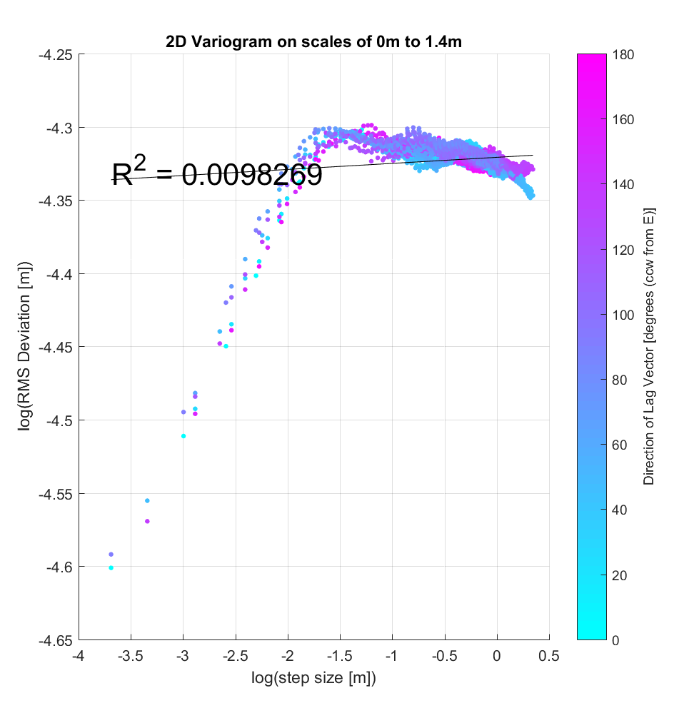
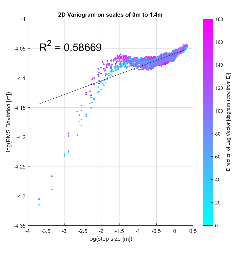
I also applied the algorithm using a very large neighbourhood size of 400×400 (10×10 m), curious to see whether the variogram breakpoint was similar to that for the DEM of Highway Flow (see two variograms below, from 2 different sample locations within the Kings Bowl DEM). To first approximation, this does indeed appear to be the case, there being a noticeable change in slope for step-sizes larger than approximately log(-2 m) = 14cm. After this breakpoint, however, the behaviour is intriguing; whereas at Highway Flow, the slope after the breakpoint was ~0, at Kings Bowl it appears that, depending on the specific location within the DEM, there is a slightly negative or positive slope, implying perhaps that a new geomorphic regime/process is acting at these larger scales.