Social media darling Instagram recently unveiled its online web profiles, presenting yet another user engagement channel that has the opportunity to capture a wider reach beyond mobile audiences.
I thought I had seen it all with Instagram – good practices and interesting campaigns helmed by big brands like BMW, Red Bull, Tiffany’s, Starbucks. But it was through this AdAge article that I was thrust into the greatness that is Sharpie’s Instagram presence.
Dining out in 2012: All you need is good food, good company… and a good angle for this photo I’m about to Instagram?
Documenting your meal for posterity on Instagram before first bite is common practice now, but a handful of years ago? Meticulously rearranging your food for a subpar photo on your phone would have garnered some pointed looks in the restaurant, I’d wager. However, in the advent of smartphone camera technology advancements, snapping pictures on the go have never been snappier. And with the invention of Instagram, the idea of glamourizing blasé still life iPhone photography with vintage filters seemed to connect well with consumers. So well, in fact, that Instagram has comfortably integrated itself into the modern marketer’s repertoire of YouTube-Facebook-Twitter. It’s a formula, tried and true – but it’s running the risk of becoming stale.
Thankfully, New York restaurant Comodo has breathed new life into Instagram. People are taking pictures of their food already – why not use that habit to their advantage? Following this train of thought, the restaurant dreamed up of an “Instagram menu”: customers are encouraged to photograph and review their meals, and in effect, are collectively constructing a new, more visual menu in real time. In terms of the consumer decision-making process, Comodo has ingeniously managed to increase social engagement in a setting that’s traditionally not very engaging. The “evaluation” stage is lengthened and diversified through the ability to consult the Instagram menu. Instead of twiddling their thumbs awaiting the arrival of their meal, customers can browse the menu built by diners before them, possibly gaining ideas of what they’d like to try the next time they’re at Comodo. It’s unique, it’s easy, it’s effective. After all, we have our phones out at the ready anyway. Now get out of my frame, this meal isn’t going to Instagram itself.
Pinterest has piqued everyone’s interest. Not only does the visual platform tickle the fancies of Collectors and Creators on Forrester’s Social Technographics ladder, it’s been a social media dream for online retailers. The numbers don’t lie. According to OttoPilot Media, referrals from Pinterest are 10% more likely to make a purchase, and Pinterest-driven retail traffic boasts an impressive average order value (AOV) of $80 – a whopping $40 ahead of Facebook’s AOV.
Since its founding in 2010, it didn’t take long for brands to flock to the online pinboard site to showcase its wares. It wasn’t until now that Pinterest has taken tangible measures to actively monetize its business. Just this week, Pinterest finally revealed their new business accounts. Apart from allowing businesses to register without the need for a first and last name and a new verification badge akin to that of Twitter’s, business accounts look exactly the same as user accounts.
The good stuff happens behind the scenes. On the back end, the provision of free tools and resources greatly help facilitate and incentivize business-oriented uses of Pinterest. The company introduced a whole slew of materials, such as a Pinterest guide for businesses, marketing guidelines, and even case studies of best practices. On the surface, not much looks different… yet. It’s only a sure sign for bigger things to come.
It is said that 78% of consumers trust peer reviews. It explains why companies pull hairs over their Yelp or Urbanspoon reviews. Online review sites simplify the research stage in the decision-making process for empowered customers. Yet, the foibles of user-generated content – ambiguous credibility, unwarranted negativity – persist to create challenges for the very businesses that rely on it. Rogue reviews running rampant have always been a problem since the inception of these sites. Yelp has come forward with a possible deterrent to regain legitimacy for user reviews. It has implemented a new “consumer alert label” that will appear on the pages of offending businesses caught faking or buying reviews. It’s a logical move for Yelp, but I wonder if this actually makes it easier for business reputations to be damaged. How easy would it be for a nasty competitor to “buy” a review for its rival? The rival’s page would be tarnished with the consumer alert, which is much more alarming, in my opinion, than a couple of negative individual reviews. Yelp has good intentions, but where there’s an ill will, there’s a way.
I am guessing by now that everyone and their mothers have seen Bodyform’s “apology” video to one duped Richard Neill, but it is still worth discussing because it really is a beautiful example of social engagement. It would have been easy to ignore the complaint, or arguably just as easy to respond with a few curt words. But Bodyform went above and beyond with a short video that was basically begging to go viral. A conversation-prompting Facebook question, a personalized reply on Twitter – that’s all standard stuff. But a satirical video from a maxipad company that performs double duty – leveraging conversation while poking fun at the very basis of marketing in the feminine hygiene product industry in which it belongs? That’s new. So it’s no surprise everybody suddenly stopped and paid attention… for once. Who said we consumers are a tough crowd to please?
I’ve laughed at the video with my friends, and it’s already been a hot topic of discussion in two of my other classes. Now that’s what I call conversation.
The music industry has consistently unveiled refreshing and innovative ways of digital marketing. I recall Radiohead’s adoption of the “pay what you want” pricing model for their album, In Rainbows; Arcade Fire’s interactive music video; and more recently, The xx’s audio streaming visualization map. Ellie Goulding is the next big name to harness the power of social media to reach fans.
To promote her new album, Halcyon, the British songstress reached out to listeners through Instagram and Google+. For her first single off the new album, a lyric music video was compiled using Instagram photos submitted by fans. It’s an admirable way to stimulate engagement and personally connect with many fans at once. And I imagine it must feel pretty good to have your photo chosen and immortalized in one of your favourite artist’s music video. Following this, Goulding announced the world’s “first digital album signing”, hosted on a Google+ Hangout – essentially a group video chat – with select fans. These fan-appreciation efforts showcase the powerful match between social media and the power of participation in order to promote to the masses, all the while retaining some degree of a personal touch. Ellie Goulding demonstrates this flawlessly, and has set quite the bar for the rest of the music industry.
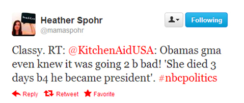
Once something’s on the internet, rest assured that it’s going to be there for keeps. During late night’s presidential debate, one of KitchenAid’s social media managers mistakenly tweeted a distasteful joke about President Obama’s late grandmother. Although the offending tweet was deleted as quickly as it was posted, KitchenAid’s gaffe failed to slip under the radar. Considering that last night’s debate was “the most tweeted-about event in U.S. politics” (with over 10 million tweets dispatched for the 90-minute debate), numerous users had already read it – and shared it.
Unfortunately, this isn’t the first time this type of incident has occurred. Social media damage control has plagued the likes of StubHub, Chrysler, and even the American Red Cross.
The lesson here is a simple one. No matter how social media-savvy your employees are, it’s best to stride on the safe side. Always log out of your personal account. Better yet – don’t mix work with play, especially with social media managers such as HootSuite. These easily avoidable examples of brand-damaging blunders speak for themselves.
Advertisers have long staked their claim on the social media behemoths Facebook, Twitter and YouTube. Tumblr has been on the scene since 2007, but it’s only until now that marketers are meekly exploring the option of advertising on the platform.
One of the earlier promotional uses of Tumblr was for The Hunger Games film earlier this year. A fashion Tumblr site was created to coincide with the movie’s release, called Capitol Couture. The selection of Tumblr as the film’s promotional platform was no mere accident. Firstly, the intended target audience already held a strong fan presence on the microblogging site (this wasn’t just with Hunger Games; Tumblr plays home to virtually every fan community of other movies and TV shows, past and present). Secondly, the inhabitants of the film’s dystopian setting dress in bright futuristic ensembles. Tumblr also happens to host a lively fashion community, so it was a fitting choice to settle down there.
The Tumblr blog doesn’t merely consist of content from the movie studios – for instance, flamboyant images of haute couture designs that happen to echo the costume designs in the film were “reblogged” to diversify content. The Tumblr and Hunger Games was a good match: it was a relevant and intelligent way of getting fans that were already there to interact with the Hunger Games universe in a familiar medium order to build hype.
Tumblr excels at brand advertising. Skepticism taints the modern consumer’s perception of push marketing strategies. We are ever aware that companies are trying to sell us something we might not need or want. And so up comes the resistance. Suddenly we’re no longer paying attention. But we humans are hardwired to be drawn to narratives. Tumblr is all about “visual storytelling”, which is what makes the site so compelling. In this way, brands aren’t necessarily selling anything… anything tangible anyway. It could be a lifestyle, or simply a feeling. There may not be a direct measure of return on investment, but the interactions gained and interest piqued could bring your brand to the forefront – and keep it there.
As sort of a follow-up to my previous post on mobile search, AdWeek reports that 72% of consumers believe it’s important for brands to have mobile-friendly sites in place. A study published by Google adds that 96% of consumers stumble across sites that weren’t fit for mobile use. This is a disturbingly high percentage given the way that mobile search has integrated into our lives.
Mobile sites are not a marketing trend to be followed. Much like how businesses can’t imagine not maintaining a web presence, mobile sites should be regarded the same way. But why invest in developing mobile-optimized sites anyway? Over half of mobile browsers feel that not having the option of a mobile site damages their opinion of the brand. It also impacts their choice to revisit the site or to make a purchase. Since it’s just as easy to find similar information on search engines or review sites, the mobile layout should be clean and simple, yet attractive enough to entice users to come back. Finally, the mobile browser is task-oriented, and as a result the bounce rate is significantly higher if the consumer is dissatisfied with the mobile site experience from the onset. Tasks typically include searching for the basics – a company’s location, operating hours, phone number or contact email.
However, it is important to note the difference between “mobile-friendly” and “mobile-optimized”. The AdWeek article makes use of “mobile-friendly” when the author probably meant to say “mobile-optimized”. Steve Stadwiser does a good job of clarifiying the difference between the two terms; in summary:
- Mobile-friendly: The mobile site is identical to the desktop site, meaning the layout is scaling correctly on mobile devices.
- Mobile-optimized: The URL will redirect to a different, more compact version of your desktop website. They tend to be “optimized for the touch [screen] experience”, having less flashy images and wordy copy, but boasting a more streamlined navigation.
When’s the next showtime for the movie? What’s the closest Indian restaurant nearby? Which movie did I see her in before? And which band was it that sang that song stuck in my head?!
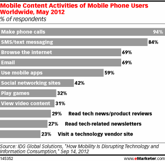
If you’re equipped with a smartphone and a data plan, you are probably well-acquainted with mobile search already. In class, we’ve already discussed extensively about the necessity of webpage and search optimization. But with mobile activity quickly gaining ground, it wouldn’t be such a bad idea to consider the implications of optimization in terms of mobile websites. To put this into numbers, eMarketer reports that 69% of mobile users worldwide browse the internet on their phones. I believe it’s reasonable to infer that, among this segment, a substantial number of people have performed some form of mobile search.
Mashable reminds us not to neglect the mobile version of your website: “In short, mobile should be top of mind, because if people are searching, it’s because there’s an intent to do something.” As time is of the essence, users demand timely information that can facilitate their purchase decisions. Although mobile sites are often highly condensed to optimize loading times and usability, it is important to maintain a consistent brand. That means your mobile site should resemble its desktop sibling site in terms of both design and content.
In a similar vein, search giant Google has taken one step further to make mobile search all the more intuitive. Earlier this summer, the company enhanced its search prowess by introducing a handwriting recognition feature for Androids and iPhones. Google Handwrite allows users to scribble anywhere on their screen on the Google homepage to conduct a search. Although I can’t really see myself making use of this feature on a daily basis, I concede it’s a novel addition to the mobile search realm. With innovations like these, racking your brains will be a thing of the past – after all, “How does that song go again?!” will only be a couple of taps away.