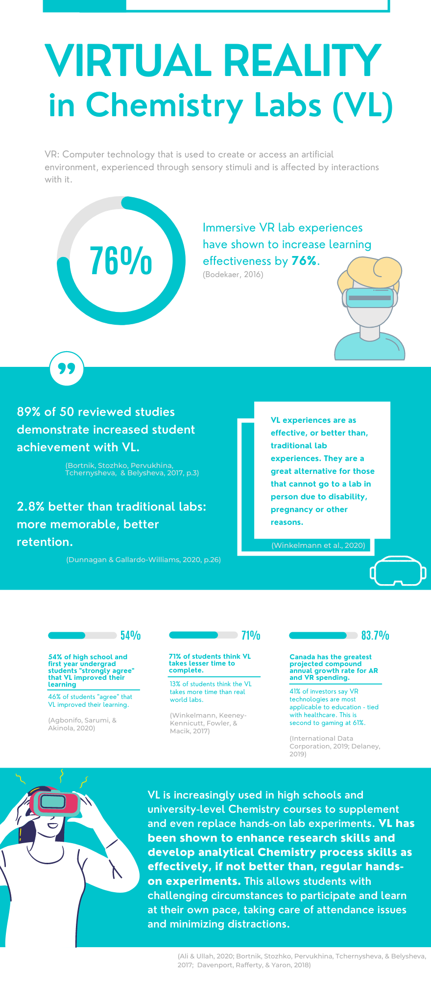
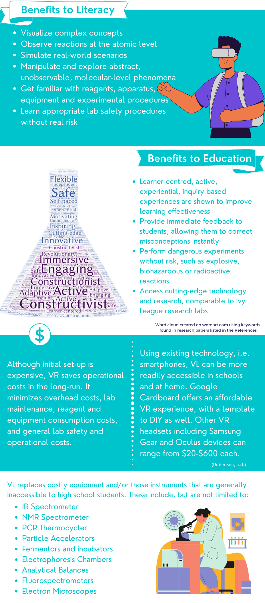
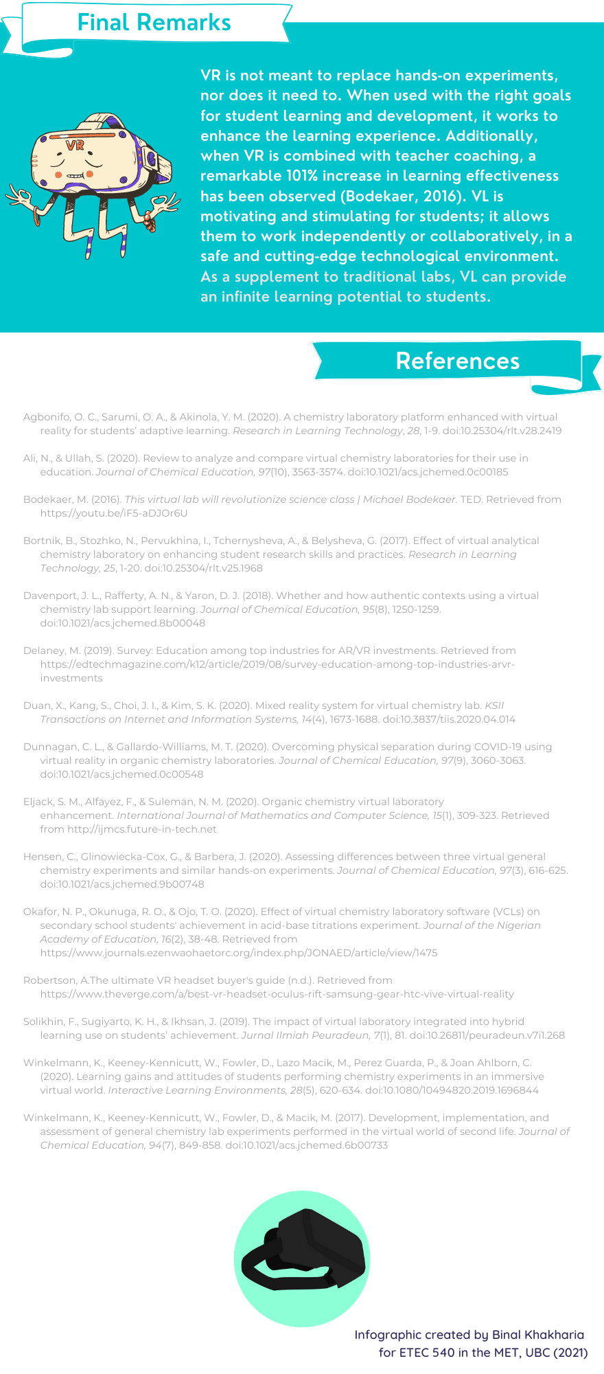
Below are the images of my infographic exploring virtual reality (VR) in Chemistry education aimed mostly at high school and undergraduate Chemistry courses. Please click on the images to enlarge.

By Binal Khakharia for ETEC 540 – MET (UBC, 2021)

Below are the images of my infographic exploring virtual reality (VR) in Chemistry education aimed mostly at high school and undergraduate Chemistry courses. Please click on the images to enlarge.

Adriana’s narratives, both of them, are so exciting to me! Previously for 523 last summer, I explored the AI that is currently being used in education as well as my speculation about the future of education with AI (this one with Greg). Adriana’s narratives seem like a manifestation of this speculation. I envision a learning environment that is enhanced with AI, a tutor/coach that is assisted by AI and their strengths enhanced by it, and same for the students as well. I do not envision a master-servant relationship, but rather a natural evolution of the technologies we use anyway. I represent a snippet of this (rather comically highlighting a potential downfall) in my second narrative for this task. The advantages I see within an AI-enhance learning environment include, but are not limited to personalized feedback and tutoring, flexibility in teaching and learning, convenience, and saving a lot of time. I also see how easy it would be to weave in professional development for teachers and enhanced and effective learning for the students. Adriana’s first narrative (life planner) sees a 13yo girl begin her day with a daily health and affective scans. Her AI is encouraging and informative, helpful and instructive. It provides meaningful interactions and begins the morning routine: the activities broken down into simple tasks. There is flexibility in the order of the day based on needs. The second narrative (curriculum planner) does the same for Lara’s school day and schedules. The two AIs seem to be interacting with each other as seen by the math test anxiety and review session results being communicated across.
The combination of both of Adriana’s narratives is the AI I envision in the assignment above, that requires a smartphone, 5G connectivity and wearables. The health and affective states scanning requires the wearables, and the smartphone and 5G connectivity allow the AI to exist, do the job, and do it fast, for a seamless experience. I wonder where and how Adriana’s AI exist – are they an app, a physical bot, or embedded within a wearable? For this task, we were required to have a good and a failed attempt at AI. To me, both of Adriana’s narratives are good! Maybe she leaves it up to interpretation intentionally. Maybe this dependence on AI is the bad? The alleged “downfall of humanity” as so many fictional narratives suggest? My narrative, on the other hand, pinpoints one big problem that the web is dealing with even today – hacking. A student seems to have hacked my AI and deleted me from the system, blocking me from entering the classroom, and perhaps even existing as far as the system is concerned. If I were to continue with my narrative, it would have led to an administrator (probably Greg) being called to identify the intruder and he’d have to take me to IT to reinstate me into the system. However, if the system can be hacked, its security needs to be updated.
Hacking is not the only problem I envision, however. It does highlight the fact that the AI is data-driven and lacks the qualities that make us human, like empathy. Adriana’s AI do a credible job of sympathizing with Lara and guiding her towards taking care of her physical and mental health. However, they do this based on perceived anxiety and not any other concern or facial recognition even. The other major concerns I have include ethical and economical concerns with AI enhanced lives and classrooms. All this technology, be it 5G internet, smartphones, wearables – all of this speak to those that have the resources to afford it. What about those who cannot? Greg and I circumvent this in our assignment for 523 by saying that of course the school will provide all students with a device and a wearable, but where is the school going to get the resources for this? I am worried that this will enhance the gap between the higher and lower socio-economic statuses.
Ethics is even more of a grey area, and this includes privacy and data protection. For the AI to be that symbiotically integrated into our lives, it needs to collect a lot of personal and private data, store it on a server somewhere and use it to make decisions that will influence and shape our lives. If Lara’s test is postponed to when it is more convenient for her to take it, sure, she will score better in it. However, what life skills did she learn from that? Yes, it will alleviate her anxiety for this one test, but will she be able to reschedule job interviews, deadlines, health scares, pandemics, environmental crises, world wars? With regards to data security and privacy, what happens when the AI is hacked, and sensitive data is accessible to others with malicious intents? There are so many more questions here!
But I digress… I am curious as to whether the two narratives Adriana puts forth are completely separate entities in her mind or if they can be one with separate homes and roles based on location? Adriana does not have any further illumination nor reflection on her post, which increases the suspense and leaves the reader to interpret her narratives as they choose. I wonder how far (near) in the future will such a speculation come to be true… because it is inevitable.

Paring down the Golden Record from 27 to 10 tracks was a difficult task, and the variance in how my colleagues made their choices was very interesting to see. From Peter’s randomized number selection to Anne’s representation of humanity, to Carlo’s choice of variety in form and location, every mind thought differently about what was worth keeping and what was acceptable to lose. However, it was Marwa’s post that blew me away. I do not think any other post or selection criteria was as detailed, thorough or analytical as Marwa’s. The sheer amount of work she put forth in making her choices is a very clear indication of the scope and difficulty of this task. The initial 27 tracks were chosen with great care by some of the most deserving people, and I cannot begin to imagine how difficult it must have been for them to choose only these 27 from an infinite number of choices. To further pare this down to 10, however challenging that was, it was only 27 that we had to choose from.
My selection criteria primarily is based on emotional range and secondarily on gender and cultural representation. The latter was initially more important to me, however, when we had our video chat, Ernesto mentioned how he felt that the piece from Mexico, El Cascabel, while great, was not fully representative of Mexican music and/or culture. Coming from an Indian heritage, and as someone who listens to a lot of Indian music, I had similar feelings about the piece from India. Kesarbai Kerkar was a legendary musician, and ragas as the blocks of Indian classical music, are the basis for most Indian music. However, this piece, in my opinion, does not represent the vast Indian music industry or the music of the people. Thus, this decided it for me – what if other people from the other cultures feel the same way about the pieces from their countries?
When I look at Marwa’s analysis, she reorganized the pieces from the Golden Record on a spreadsheet and created charts based on geography, culture and gender representation. She saw biases in all three, which the cynical (realistic) part of me already knew existed before I even looked at the list or her graphs. Marwa found limitations even in the time period that the songs were clustered in, and finally she highlights the inaccuracies in proper attribution of the pieces. These last two factors were not something I had paid attention to, but seeing her analysis of it did not surprise me. I agree completely with the quote she chose here: “This lack of proper attribution of Non-Western is a frequent occurrence (Diamond,1990)” (as cited in Nelson & Polansky, 1993, p. 361). Regardless, Marwa’s selection criteria relies on inclusivity – she prioritized geographical representation, followed by diversity in genre and form, followed by gender representation. She has detailed her rationale for each piece with what it represents as well as the musical instruments used within it.
When I compared both of our choices, I found that we actually had 5 songs in common with each other!
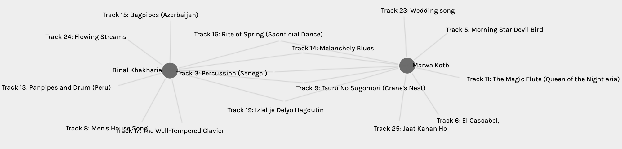
Our selection criteria and analysis, as different as it may look at the surface, actually resulted in a 50% match. As I mention in my network analysis, my highest match was 7 tracks with Chelan, thus, a match of 5 tracks is a pretty good match in my opinion. Also as with the network task, and despite Marwa’s extensive analysis, it is not easy to say why she specifically chose the tracks that she did. Why did she choose Melancholy Blues and El Cascabel specifically to represent North America from all the others? Similarly, why Mozart’s The Magic Flute only and not the others? She chose the Wedding Song from Peru, and I chose the Panpipes and Drum from Peru. Why so? Why did she not choose the Bagpipes from Azerbaijan or the Men’s House Song from New Guinea? I think that despite her analysis and selection criteria, there is still some subjectivity in the final choices. Ultimately, she probably chose the tracks that she liked most from the options she had. So, in some ways, I guess, our selections were done in reverse of each other, which might explain an exact 50% match? Or so I assume, anyway.
Artifact layout:
Marwa’s blogsite has a dark coloured sidebar on the left with a customized site logo and menus, with a white background for the main page. She has her introduction on the homepage. The layout and customized logo both give away her computing background. Her website is very easy to navigate, and everything is easily found. Like mine, her tasks also include a featured image that teases what the content is about. Marwa’s posts are all very thorough and I have learned a lot from them.
Rachel’s sixth task was enjoyable because it portrays one of my favourite movies! I enjoyed how Rachel started with and interpreted the title. I think I may have left it as just the middle envelope emoji, or maybe a man and woman emojis with the envelope in the middle. I prefer her interpretation of the title more, however. Moreover, the way in which she outlines the plot is a very apt description of the main points. I would have added Brinkley though!
Compared to my emoji story, I found Rachel’s to be more eloquent and well-defined. My “story” is more like a summary of all the seasons of the show. I also did not isolate the title from my plot, because my title would have been just the second emoji of my story – the detective. This, of course, would have given away the show and I would not have needed a “story” at all. I wonder how it would have been received though, had I just put that one emoji and nothing else for this task. Rachel highlights how every reader interprets a text “differently based on prior knowledge, current context, and cultural meaning”. If I hadn’t known what movie she was referring to in her story, would I have been able to interpret the laptop, email, love as the title of this movie? Or would it have been interpreted more “literally”?
Rachel ends her reflection with her thoughts on the phrase “a picture is a worth a thousand words”, connecting it to Kress’ comparison of an image and a story. This was also the basis of my thought process of whether “less is more” when it came to writing my emoji story. Is it what is present that counts more or what is left out that gives it more meaning? Originally, I had a lot more emojis in my story but edited them out to get a more streamlined version. Rachel wonders if we should even put images and stories in the same boat, or whether they are completely different entities? To this, I want to reiterate the quote from my post: While words are open to interpretation, depictions provide more context and “constitute their own silent language” (Bolter, 2001, p. 59). Images and words may not be the same, yet they complement each other. They can each, in their own right, provide context (and meaning) for the other.
Artifact layout:
Rachel’s blogsite is bright, well-organized, and has a fun, quirky title. The header has an enticing image of a pier at sunset, and a clear menu. Her site was easy to navigate, as her site was organized very similar to mine. The main difference between our sites was the colour palette: mine is dark themed and hers is light. It was nice to navigate through her tasks and learn more about Rachel.

Task 5 required a different mode of presentation and skills to produce a Twine, a text-based platform. Greg and I both made a game, his was a “choose-your-own-adventure” and mine an escape room. Greg’s exploitation of his son’s obsession with CYOA and Among Us results into a fun, quirky and quick adventure game. Greg’s use of his kids’ drawings gives this game a very personal and charming touch. The game is short and engaging, making it perfect for young kids. Besides the colourful and mostly hand-drawn pictures (with a few well-chosen images), Greg’s Twine is kept simple and easy-to-follow with two links per page at the most. This lets the images shine, and the text is allowed to weave the reader’s imagination. My escape room Twine is similar in the sense that the player can choose their own path. However, this is where the similarities end. For one to get through my game, they must go to every room and collect all clues. The player can repeatedly go back and forth to try to solve the puzzle. If they fail to do so, they can get hints, or even the answer, to push them along. Contrastingly, Greg’s game forces the player to choose one of two options most of the time, rarely leading them back to a previous page. I found two outcomes for Greg’s game as well – perish or set forth to conquer the universe (he said there were 4 – so I’ll have to play more). The former is more easily reached, and seems the only option for the orange character, whereas the purple character gets both options. I also found that although Greg’s storyline does not lead the player to the previous screen, it is easy to click the back/previous button on Twine and choose a different link/outcome. This is also similar to my Twine in that the player can always go back and forth, and I also provide links to do so. However, if I were making a CYOA game like Greg’s, at the death of the character I would not want to provide the player a back button.
I have added my Twine network as the featured image on my post, which shows the various connections and paths between nodes. I am curious about what Greg’s Twine network would look like. I tried to mentally map this out but was soon lost. Greg mentions the ability to link and hypertext as going down a rabbit hole. This also made me wonder if Greg and Owen wrote down their plot or made a network map elsewhere before designing it on Twine. With mine, doing that helped me keep my focus and not lose track of what I needed to do. Regardless, I do not think they got carried away, and the quick game ensure a tight, fun plot for the game. Success!
Artifact layout:
Greg’s blogsite has a dark background, similar to mine, with lighter text. He does not have any pages on the site, and all his tasks have been added to his header menu as separate buttons. This saves one from scrolling through all the posts on the homepage to find the one being sought. The font size is quite small though. Greg uses his mountain bike image as his header, and because I know him, I know this to be reflective of his love for biking!

For this link, I chose to compare Ravneet’s and Erin’s experiences with mine for Task 4. Ravneet and I did the potato printing part of this task, whereas Erin did both, the lino “potato” print and the manual script. Both of their carvings were individual letters as opposed to my full word. This is representative of the first printing presses with their separate letters and symbols that needed to be organized before printing. When I saw the baby potatoes in Ravneet’s post, my first thought was “Why didn’t I think of that?!” It seems so much easier to carve individual letters as separate stamps, and more versatile, too. Erin went with a similar approach with her lino stamps, in that she carved out individual letters, however, she chose to make her first letter uppercase. My entire word is lowercase and cursive; Ravneet’s and Erin’s are obviously not cursive. Ravneet did not reverse her letters on the stamp before carving, and ended up with the mirror image of her word “plain”. Had she had chosen a different word with only those letters that look the same as their mirror image (i and l in her case, and even n to an extent), this problem may not even have been noticed. I like that she went ahead with her stamps anyway, highlighting the challenges the early printer makers must have faced as well. Erin’s post made me think of another unrelated challenge – lack of the material of choice and substitution with another, perhaps better material. As Erin did not have potatoes on hand, she used her art/craft supplies to complete the task. She ended up with a durable (and maybe more expensive) alternative. This made me wonder what other challenges the early makers may have faced, whether they also had reversed letters initially, whether they had to “make do” with alternatives. Again, it makes me think of the missing pieces and what that says about the artifact or the person.
As for the process of printing compared to writing by hand, Ravneet remarks that she finds herself to be more creative and thoughtful with the latter. She mentions that she felt pride in her creation of the potato stamps and wonders if 3D printing them would have given her the same satisfaction. Erin’s reflection on her manual script relays similar sentiments. Erin mentions how she feels her handwritten notes and letters have a more personal connection, but she also emphasizes that they also showcase the thought process and “one’s stream of consciousness” more realistically. Erin’s manuscript and marginalia are representative of this. Personally, this “writing” and marginalia are still a part of my life, even in the digital format. I use a Surface Pro when I teach, and annotate printed notes on OneNote, fill in the gaps, draw models and diagrams, and leave other helpful links and resources for students to explore. I like the connection that Erin makes between marginalia and hypertexts, and think that this demonstrates evolution of “older” techniques with “newer” technology. I think in response to Ravneet, I would say: find something like this that is the best of both worlds.
Artifact layout:
Both Erin and Ravneet have white backgrounds on their blogsites. Ravneet has a mix of posts and pages for her tasks, which are all included as buttons on her header menu. This makes it easy to locate the tasks and navigate through her work. Erin, on the other hand, has a personalized header for her blogsite, which reveals her artistic, creative background. Erin does not have a header menu, but she does have a sidebar menu on the right. She has a photo of herself, adding an even more of a personal touch to her site. The linking assignment can be accessed through a big red-orange (customized) button below the photo, and the tasks are linked, in order, below this. Erin’s artistic background makes her minimalistic site colourful and fun to look at, and the easy to access menus make it fun to navigate.

Ying’s Task 1 was very interesting to me because like her, I also teach Chemistry. I loved her photo with the Christmas Chemistree sweater – I have one, too, of course. She laid out her bag and contents photo on the left with her photo on the right. For my task, I also have my bag and contents on the left and an emoji avatar of me on the right. Funnily enough, I had wondered if I could get my avatar to wear my Chemistree shirt. I relate very much to Ying’s perfectionism and attention to detail. She does come across as someone who is always prepared, as she mentions in her reflection. While the kind of bag we have are similar, and our professions are the same, the contents are different. She has a brown bag, mine is black, both are plain. We both have lip balms and a wallet, but that is where the similarities end.
Throughout this course, I have been thinking of the missing pieces more than the visible ones. In my post I mention that my phone and the Acer Spin and Sylus are missing. Ying’s post emphasized the missing pieces even more. This year, my classes are all online and I teach them remotely because they cannot be placed in one cohort for a safe in-school experience. Thus, my calculator, teacher planner, Sharpies, whiteboard markers and other miscellaneous stationery all live on my desk at school instead of my bag. Mints and sanitary pads can be found in a drawer there as well – since I am not teaching in different classrooms, I do not need to carry them with me constantly. This was striking to me because a year or so ago, my bag would have looked EXACTLY like Ying’s. Ying mentions how it would not be possible to guess her profession, or rather the subject she teaches, by just looking at what is in her bag. The thing is, the calculator, the planner and the stationery actually gives away her profession quite clearly. While it does not say chemistry, it does say teacher. Contrarily, my bag and its contents are more obscure and generic, and do not even say teacher. I also appreciate what Ying says about using Sharpies on lab glassware – I have countless different colours of them, but none in my bag as I have not been in the Chemistry lab at all this year 🙁 .
When I further compare my bag picture to Ying’s, what I see is a more playful, “quirky” (in her words) version in Ying’s depiction. Mine has shades of blues and grey/blacks, and while there are more browns and some black in hers, there is a larger range of colours and playful patterns, too, including the cute keychain on her bag. Her Sharpies are also colourful, while mine would have been blue and black. My Surface Pro stylus is also blue. Ying mentions she hopes that the presence of the kazoo would characterize her as a “quirky” person, and yes, that comes across. Not just because of the kazoo, but through the colours, patters, and her awesome photo of herself on the right.
Finally, through the presence of her iPhone, Ying highlights the modern need “to text” and explains how it can be a creative tool for artistic expression even in the simplest of messages. She mentions the assumption of the owner to be literate because of the text-based nature of the menus and navigation. (While I agree this to be true for someone carrying such a bag wherein this phone will be found, anyone with a smartphone need not necessary be literate. There is a multitude of evidence of babies and toddlers successfully using tablets and smartphones, who, I would argue, are not yet text-literate.) I was intrigued also by Ying’s final comments about media literacy and the implication of digital media literacy in particular. This idea may be more prevalent from the contents of my bag, however, the question still stands – just because one consumes media or uses digital media regularly, are they necessarily “literate”?
Artifact layout:
Ying’s blog site is neat – plain white with mostly black text and a different colour to highlight items and chunk information. Her banner is a dark brownish gray – the same colour as my site background. Her menu only has the 6 Linking Assignment links. While this minimalistic appearance seems to be representative of Ying based on her description, it lacks the quirky side of her personality. It is also less user-friendly when trying to find individual tasks. Her tasks are posts on the home page, and to reach Task 1, the user would need to scroll past all 12 tasks to get to the bottom of the page. This was a little surprising to me given how organized she comes across as, but then again, it makes the menu bar less cluttered. She could have organized all her links on one page and tasks on another though, and have only 2 of these buttons on the menu. Lastly, her light background makes it easy to read during the day, while my dark background makes it easy to read during the night.
1. Meet TempEval: the Climate App of 2040.
Hailed the #1 app by Future City Times Now, TempEval has revolutionized the call for action against climate change. Advocated by the likes of Theta Grunberg, TempEval not only visualizes the changes in the climate, it also calculates, with near-perfect accuracy, significant events in the near future. Unlike other climate apps, Innovative Solutions’ transformative app does not rely solely on historical data to predict future outcomes. Their AI uses special algorithms (currently proprietary and protected) to analyze specific instantaneous data to calculate probabilities of events, including those hitherto unknown to humans. Dr. Oswald, the founder of Innovative Solutions and lead data scientist for TempEval, says that the input includes but is not limited to regional air and water temperatures, CO2 concentration, pH levels, population density, and availability of various resources (medical, financial, food, water, fuel, land etc.). What is most unusual, however, is the use of social media data, including posts, images, videos and hashtags, to enhance the calculations as well as suggestions made by TempEval’s AI. Dr. Oswald is in agreement with the fact that to deduce new solutions to currently unsolvable problems, new ways of thinking and new attitudes are required (Dunne & Raby, 2013). The goal behind TempEval is to propagate positive messages and workable solutions to motivate people to make a difference, rather than only present them with lots of data that may shut them down. See the attached brochure below from Innovative Solutions:

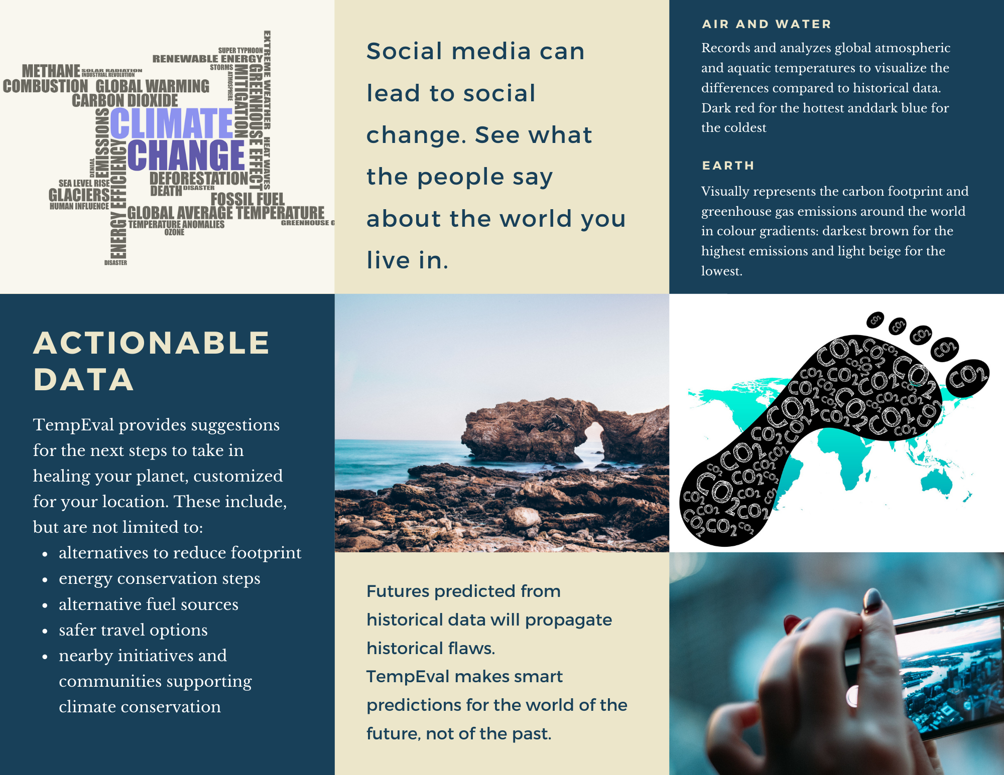
Please click on the images above to enlarge the brochure.
2. Identity Crisis
I hold my phone up to the scanning pad by the main entrance of the school building. It recognizes my phone’s ID and as it connects to the school’s Wi-Fi network, the system logs my time of entry.
I walk up to the third floor, to my classroom, and scan my phone again. Aria regulates the light and temperature to an ambient learning environment. I greet Aria, who informs me of the successful installation of some security updates from the night. Aria and I run through the teaching plan for the day, deciding on a hands-on activity for our afternoon class in favour of a review lesson. As the warning bell rings to signal the start of lessons, Aria turns on the morning music and announcements and opens the classroom doors to welcome students when they scan their devices or chip-enabled ID’s. Aria checks this as the time of entry and attendance record linked to each student’s file and alerts me if a student is absent without a pre-authorized reason.
I greet my students and ask them how they are doing, while Aria reads their faces and analyzes their affective states. Aria leaves a note for me if I need to touch base with any student. As we proceed with the lesson, Aria turns on the screen with instructions and downloads the requisite lesson materials on the students’ devices. When our students are engaged in an individually paced lesson, supplemented by Aria’s suggestions of examples and videos, I decide to step next door to set up the afternoon activity in the lab. I hold my phone up to the chemical storage room door scanner, but when I go to open the door, it remains locked. The scanner does not flash green, instead it buzzes to signal an error/unauthorized entry.
I walk back to my classroom to see if Aria can help scan me in. As I hold my phone up to the scanner, it also buzzes instead of letting me in. Aria informs me that I am not authorized to enter MY classroom.
“Aria, this is my classroom – why won’t you let me in?”
“No, ma’am. This is Ms. K’s classroom, and unauthorized adults are not allowed in the building. How did you get inside?”
“Aria – I am Ms. K! What is wrong with you?”
“Ma’am, Ms.K is in the classroom – how can she also be outside? I do not recognize your device. I have to ask you to leave the building or I will alert Security.”
“Yes, please call Security. Aria, check my device scan log. I just logged out of this classroom and tried to scan into the lab next door.”
“As I mentioned, I do not recognize your device. Ms. K did tap out a few minutes ago, but she returned within the minute and her device is inside at the moment.”
“Aria, do you not recognize my voice? My face?”
“I…”
“Aria?”
“I cannot be sure, ma’am. Some records seem to have been deleted. In fact, I am losing files right now…”
“Stop that!”
“I… am not… in control…”
Reflection
For the first narrative, I was very influenced by the MeTooMentum and their dandelion analogy. I wanted to find something similar for climate change, but have the system also make suggestions that are personalized to the location of the individual using the app. I quickly realized how wide and ambitious that is. TempEval is an introductory attempt to achieve this goal, where it would flag not only temperature changes but also pH and carbon dioxide levels, population density and availability of resources as well. Using social media to gather information about areas that are more aware of the climate crisis can also help as the system can advertise these movements to nearby areas. I can go into a lot more detail about what this ambitious AI can do, but mostly it should help find solutions that seem impossible or unthinkable to us at the moment.
In the second narrative, Aria is the AI (obviously) who is not a slave, but a co-teacher. The master-slave discussion in Sam Greenspan’s Bellwether podcast episode was intriguing to me and I have been wondering about this dichotomy. Why does one have to be the master? Either humans take over or AI does (in fiction). Why can we not work together and complement each other as we should? This working relationship soon turns into a nightmare when Aria is hacked into by a student who deletes my information from the system. While I know this is over simplified for the purpose of this narrative, it is a question I do have about the vulnerabilities of technology. Smart homes and smart classrooms are very convenient and most likely the way of the future, but will we always have to be on our toes to guard against external attack or loss of private information?
References:
D’Efilippo, V., & Kocincova, L. (2019). MeTooMentum. Retrieved from https://designawards.core77.com/speculative-design/83520/MeTooMentum
Dunne, A., & Raby, F. (2013). Speculative Everything: Design, Fiction, and Social Dreaming. Cambridge: The MIT Press.
I have always been very fascinated by AI and the possibilities is presents for humankind, not just in the future but even today. I have done some research on the ways AI can enhance teaching and learning, and also to understand what the future of education might look like (my previous assignments for 523: A1 and A3).
I am not entirely idealistic, however, and have been exploring the ethics and biases within AI, specifically with predictive modelling used in educational and professional settings. Similar to the predictive policing that PJ Vogt addresses in his podcast episodes, predictive modelling uses algorithms that may be inherently biased and ethically questionable. Predictive models that are used to predict student success or make enrolment decisions are not always “fair”. The algorithms that make up these models need lots and lots of data, most likely from the same institution that is developing the model. This historical data, if inherently biased, will result in a model that will propagate the same biases and discriminatory decisions. As Cathy O’Neil mentions in her talk, these machines/ AI are like mirrors – they reflect to us our own inherent biases.
Ekowo and Palmer (2016) found in their research that early alert predictor systems flagged low-income, non-binary, students of colour for poor achievement more frequently than higher income, Caucasian students (p. 14). To these flagged students, the institution’s recommender systems would then suggest courses and majors that may not be as economically beneficial or as challenging as those recommended to their Caucasian counterparts (pp. 14-15). Obviously, like with the policing issues discussed in Vogt’s podcast, these machines will disadvantage those that have historically been disadvantaged to begin with. Ekowo and Palmer suggest how the students that are discriminated against by the algorithm get demoralized, leading to lower self-esteem, disadvantageous choices, and self-fulfilling prophecies of underachievement (p. 15). This 2016 TED Talk by Zeynep Tufekci highlights some more issues with biases in AI and emphasizes the importance of human morals to counter these. (See also: Keep human bias out of AI and Fighting algorithmic bias). Additionally, I believe that it is more important than ever to have transparency in the development of these algorithms. If we are unable to look in the mirror ourselves, maybe someone else can hold it up for us. Instead of then defending or accepting the biases, if we can work together to eliminate or diminish them, we will create a better, fairer world (and there is my idealism).
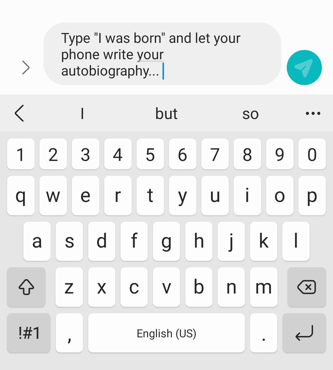
For this task, I was fascinated with the “sentences” my phone’s predictive algorithms came up with, so I did all five. Here is the screenshot of the sentences, and below you can find the videos of me (slowly) generating these.
Not all of these sentences make complete sense, but they are not complete gibberish either. The meaning behind all of these can be easily inferred. I think the reason for this is that when I was given the choice of three predictions, I chose the one I thought would flow well in a coherent sentence. I did not realize I was doing this at first, and I’m not sure when I realized this either. This already reflects my bias before the sentence is even completed – not that I knew what the phone was going to predict next. Regardless, I don’t think all of them are entirely in my “voice”.
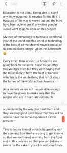
The first one about education is relevant to my job – I teach IB and this year’s grade 11 class have suffered the most, in my opinion, because they are still learning remotely and I have never met most of them in person. Maybe my phone is telling me it won’t be fair to test them? I’m not sure why it’s only the boys who can see if anyone else wants to work on this mysterious project, though.
I found the second sentence about technology the most hilarious. I would say the Marvel movies have awesome technology. It is my dream to visit Wakanda and work with Shuri. I definitely do NOT think that “all of us can be looked up on the livestream” is my idea of good technology! That is a definite NO… is this a warning, phone??? I thought that big smile was super ironic at the end of this sentence.
I am not going to comment on the third one, but I think the fourth sentence is closest to my “voice”, at least for the first half of the sentence. This sentence reminded me of “with great power comes great responsibility”. Cliched, I know. However, I do think that humanity has a long way to go to make the world “fairer”. Eliminating biases from AI might be a good place to start addressing this goal. I agree with both Shannon Vallor and Cathy O’Neil that fiction has got us fearing robots taking over the world, whereas instead we should see how AI can support us to achieve what we cannot otherwise achieve.
The fifth sentence is one I understand the least. Maybe we should worry about cats ruling the world, not AI?
What I reflected most on through this exercise is the fact that a lot of these predictions were able to capture my personal beliefs, feelings, or values to an extent. Were these prompts more politically inclined, or professionally inclined, etc. they may have revealed more about me than I would have chosen. These sentences here are quite harmless, I think, but I wonder whether they could be more “damaging” were they completely automated, without any editing or inference on my part.
—
References:
Ekowo, M., & Palmer, I. (2016). The promise and peril of predictive analytics in higher education New America. Retrieved from: https://explore.openaire.eu/search/publication?articleId=od______2485::e5cde111791c43368359153fc42ebeea
O’Neil, C. (2017). Justice in the age of big data. Retrieved from: https://ideas.ted.com/justice-in-the-age-of-big-data/
Santa Clara University. (2018). Lessons from the AI Mirror Shannon Vallor. Retrieved from: https://youtu.be/40UbpSoYN4k
Talks at Google. (2016). Weapons of math destruction | Cathy O’Neil | Talks at Google. Retrieved from https://youtu.be/TQHs8SA1qpk
Vogt, P. (n.d.-a). The Crime Machine, Part I. In Reply All.
Vogt, P. (n.d.-b). The Crime Machine, Part II. In Reply All.
—
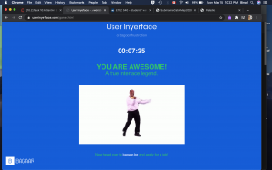
To say that this task was frustrating would be a ginormous understatement. However, this is obviously the objective of User Inyerface. I took me about seven and a half minutes to get through it, but I likely spent 80-90% of that time on the first password task.
I had to keep reminding myself that this is just a game, and tried to focus on the elements that really annoyed me. Reflecting on why these were especially frustrating was insightful to understand how I have been unconsciously conditioned in my use of the webspace (and by extension any software probably). The background colour and font contrast is not the best, but acceptable. (I may be picky, but it also bothered me that it said to “fill in the form as fast and accurate as possible” rather than as accurately.) The big green button with “NO” is placed where perhaps a “GO” button would usually be placed – but this one doesn’t take one anywhere, obviously. To proceed, one has to literally click on the word “HERE”, as the underlined word (suggestive of a hyperlink) or different coloured font are not “functional”. The green and red colours are also used contrastingly to what one is accustomed to. Green usually signifies go or ok, while red is not ok or stop.
Once one proceeds to first password task, the red banner at the top draws their attention. This is usually what one would see to “Accept cookies” and I usually would click on “yes” but no, not on this page. The assistant window on the bottom right, which normally would have an “x” on the top right corner to dismiss it instead has “^” which raises the window even more obnoxiously higher. Why does this bother me? The window is not even blocking my view, and if it was just there, I could ignore it. But when it went up instead of down, I was annoyed. When I found the “send to bottom” button, which would normally be a “send message” button, I had to laugh at how slooooooooooooooowly the window proceeded to disappear. By the way, it returns soon and pops in rather fast. Also, why are the flashing green circles for 1, 2, 3, and 4 also annoying? The timer above this makes me quite anxious. As if this was not enough, a pop up literally appears to remind me of the time ticking. Instead of the close button, there is a full screen button on the top right corner – because, why not? Once we get rid of this, there is the form itself.
The placeholder text in the textboxes does not disappear, the password rules at the bottom of the form are written in green and turn red when they are met, the checkbox reads “I do not accept the terms and conditions”, which scroll really slowly as well before you get the accept button, the obvious button to click says “cancel” rather than “next” or ok. Every single element listed here is counterintuitive and goes against “normal” or “conventional” website design. But how did we decide that normal? How did I learn to navigate these pages in that specific way? Why is this different page not a good different, but frustrating?
After getting past the double negatives (not unsafe password), the second task required uploading an image, but the button says “download”. The silhouette on the left, meanwhile, constantly keeps spinning to signify the image is loading, even after an image has been uploaded. The checklist requires exactly 3 to be checked, but all checkboxes have been checked. Another thing I take for granted. The green button, again, says cancel rather than next. This was still less frustrating than the first task.
Moving on to task 3 to fill in the personal details, the age calculator is actually accurate, and date of birth and age need to match. The months for the birthdate are all shuffled, I thought they were in alphabetical order but they aren’t. And hitting “tab” to go to the next textbox actually moves the cursor to the assistant window on the bottom right even if it has been sent away. Choosing a country with black and white flags was funny at this point. Luckily the Canadian flag is easy to identify. I did not even bother looking for the Tanzanian one ![]() . The assistant window is now blocking the gender selection, which is also not clear. Is it selected when it is blue or white? When it matched the title, it allowed me to proceed.
. The assistant window is now blocking the gender selection, which is also not clear. Is it selected when it is blue or white? When it matched the title, it allowed me to proceed.
Finally, the last task to prove that I am human, as if all the frustration till now was not proof enough, required me to choose images that had light or were light – I cannot remember the exact wording, but it was vague. The checkbox for the image was actually above it and not below – another thing I take for granted, I realized. I could choose anything that had literal light in it – sun, light bulb, etc. or that depicted light things like a feather. Finally, the button on this page was “correct” in that it was blue, clickable and said “validate”. I really think I would have flung my laptop if it had said “Cancel” instead and I’d clicked it.
I found that this exercise made me slow down and think about every keystroke and every click, at least for a few minutes. It helps to be mindful – but in a regular daily fast-paced life, the small things that I (we) take for granted are important time savers. More often than not, I will click blindly on “Accept cookies” and merely scroll through the terms and conditions without reading but accept them anyway, despite being very aware of security and privacy concerns, sharing excessive information, and all the other concerns of using the internet. This “game” brought that to light and made me feel a bit guilty. It also raised lots of questions about acceptable design and conditioning. Since most clever and cunning designs are meant to integrate seamlessly into our psyche, playing with us emotionally and even physiologically, to trick us into buying products, services, or even allegiances, this design stood out. It failed to be subtle and seamless, and in that was its success (Harris, 2017). It helps bring to attention the ways in which we are unconsciously tricked, and maybe that we are happier with it that way? I am very curious to know how very young children would do with this game – would they be more successful and less irritated? If yes, would that be because they are not as afraid or concerned to go around clicking everything until it works, or because they are not as experienced/conditioned and would go slower and follow the rules they see on the page, or because it would be more intuitive to them? I think I want to share this with my students and see what they think of it.
—
References:
Harris, T. (2017). How a handful of tech companies control billions of minds every day. Retrieved from https://www.ted.com/talks/tristan_harris_the_manipulative_tricks_tech_companies_use_to_capture_your_attention?language=en
Tufekci, Z. (2017). We’re building a dystopia just to make people click on ads. Retrieved from https://www.ted.com/talks/zeynep_tufekci_we_re_building_a_dystopia_just_to_make_people_click_on_ads?language=en