Golden Record Curation Analysis
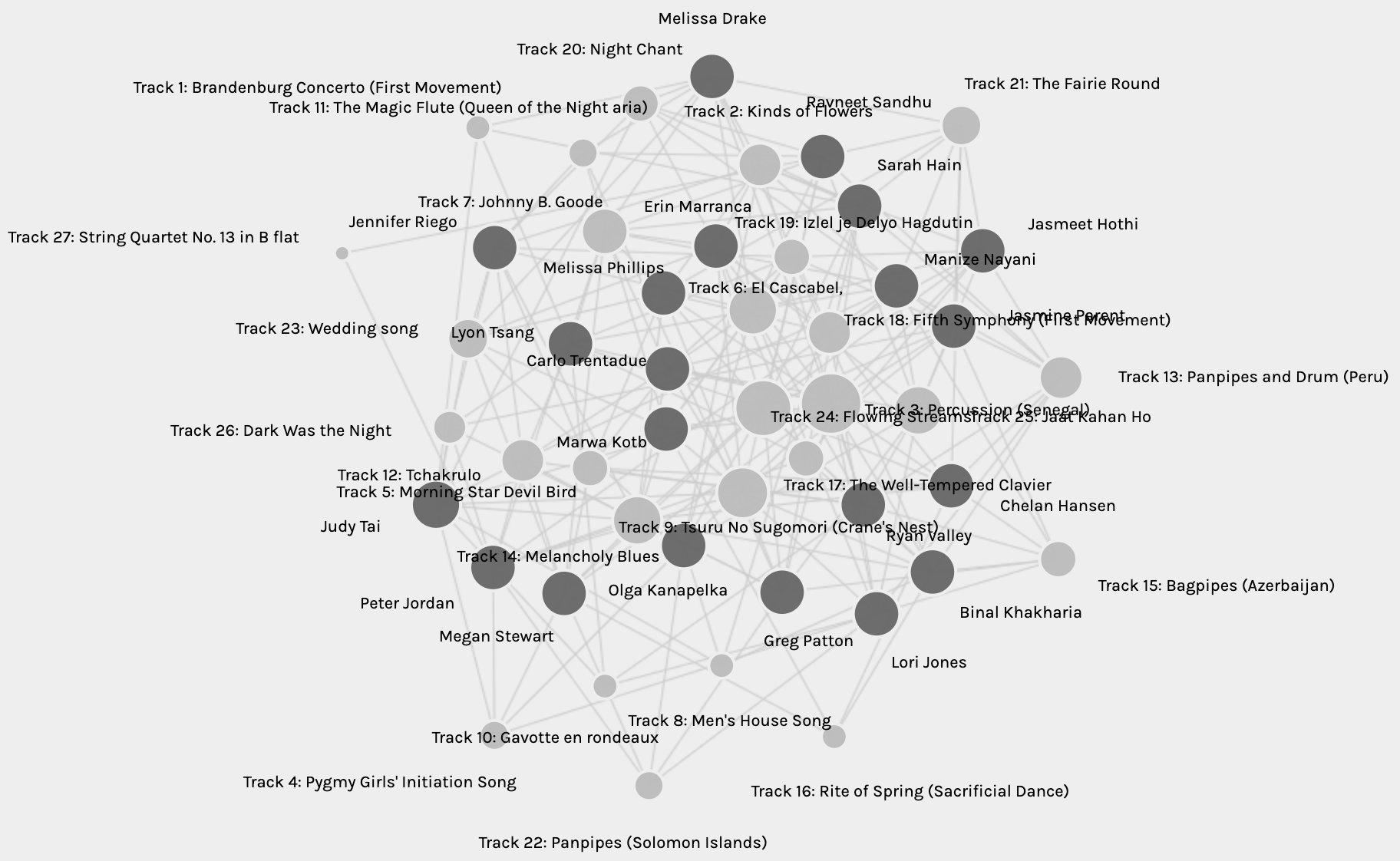
The graph from Palladio represents an undirected multigraph, with edges between the nodes: Sources and Targets. The sources represent the curators, and the targets represent the tracks of the Golden Record. Initially, the network observed is an intertwined jumble of connections as seen in Figure 1 below:
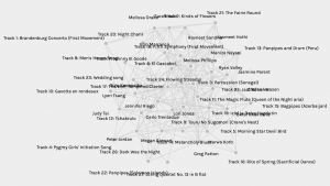
Fig. 1: Network graph of curators and tracks from the Golden Record.
Deciphering this network is not an easy task. The edges overlap and the endpoints are hard to see. I fiddled around with the settings to highlight the source nodes and also “sized” the target nodes. This made it easy to differentiate the source from the target. I then decided to move the source nodes to the outside and leave the targets on the inside. Figure 2 below is a representation of this network, and it is now easier to see the multi-network connection between all the curators. By sizing the target nodes, it is also clearer to see the track chosen the most (Percussion (Senegal)), as well as that chosen the least number of times (String Quartet no.13 in B Flat) (circled in red in Fig.2).
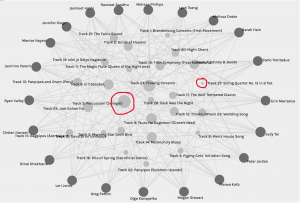
Fig. 2: Network graph with highlighted source nodes and sized target nodes.
While this representation of the graph is more informative than Fig.1, it is still quite well-connected, with many edges between all the nodes making it difficult to isolate each edge. Taking advantage of the “facets” and “modularity class”, it is possible to make the groups smaller for analysis. I looked through the six pre-made groups and found the node labelled with my name in Group 3. Figure 3 below represents the network map for group 3.
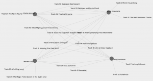
Fig. 3: Network map for Group 3.
In Fig. 3, despite there being many edges crossing over, they are easier to isolate because there are only 4 source nodes. There are also three four-way vertices, meaning all four of us have chosen three tracks in common with each other (Tracks 3, 9, and 14). Additionally, it displays three-way vertices representing tracks chosen by any combination of three of the four curators, as well as two-way nodes representing tracks chosen by any two curators. Three of us have two tracks not in common with any other curator in the group, while one has only one track not shared by the rest. What does this say about us? Presumably, the four of us were grouped together because of the similarities in our choices of tracks. However, the network does not tell us why we chose the tracks we did. Is it likely that all four of us had the same criteria for choosing the tracks? Hardly. If it were true, all our choices may have been the same. All we can infer from the data is that our track choosing criteria had large overlaps, greater than any other grouping determined by the software’s programming. What the programming does not tell us are why the curators have those tracks in common? Why is it that we have a total of nineteen tracks in our map out of the total twenty-seven? Why were the remaining eight tracks not chosen by any of us?
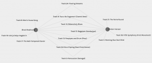
Fig. 4: Graph of my highest matched choices
Figure 4 above represents the node that has the most matches with mine. Chelan and I have seven tracks in common with each other. Conversely, Figure 5 represents my least common matches with Melissa. I went back to read Task 8 by both Chelan and Melissa and was quite surprised. I had not read their reflections and curation criteria up to this point. I found that quite simply, all three of us have placed emotion as the central criterion. Why then do I have seven matches with Chelan but only one with Melissa? I chose to include as wide a range of emotional diversity as I could with the tracks I enjoyed listening to, and found that Chelan’s reasoning was somewhat similar to mine. She also specified drama and intrigue in addition to emotion, and that perhaps explains the three tracks that are different for us. Conversely, Melissa specifies that she wanted to choose only happy, upbeat tracks that did not include any words. In my reflection, I designated the word “happy” to two of my ten choices: Percussion (Senegal) and The Well-Tempered Clavier (Bach). The link that connects my node with Melissa’s is indeed one of these – Persussion (Senegal). This track is also one of the three tracks that is common between all fours of us in Group 3, of which Chelan is also a member. It is interesting to note that neither Melissa nor Chelan chose The Well-Tempered Clavier. Maybe I need to listen to it again to find what it was about it that made me choose it.
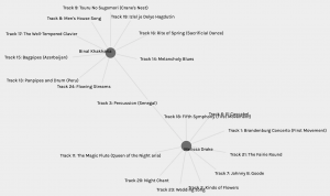
Fig. 5: Graph of my lowest matched choices.
The similarities in our choices may be somewhat explained by our Task 8 reflections, but not entirely and not from the graphs alone. The network graphs from Palladio cannot say why one track feels happy to me but not to Melissa or Chelan, and vice versa. Or maybe, it does feel that way to them but not compelling enough to include in their top ten? Emotions are subjective, but some are universal – the former explains the differences in our choices, while the latter explains the similarities. Maybe?
I created a new graph to see how both Chelan’s and Melissa’s choices interact with mine, see Fig. 6 below. Although I had seen how both their choices link to mine separately, this was an interesting depiction of how Chelan’s relate to Melissa’s. They both have 3 tracks in common, Percussion (Senegal) of course linking all three of us. The other two are tracks 18 and 21, and I probably did not choose them because I already had “happy” tracks and wanted more diversity.
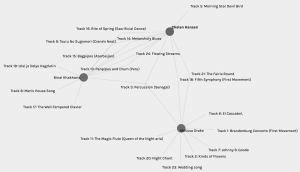
Fig. 6: Interaction with my most and least common choices.
Finally, Figure 7 below depicts my interaction with my second highest common choices – 6. Two curators matched with me here, Jasmine P and Greg P. I like this graph because of how symmetric it is. The three of us have 6 common choices all three ways. All three of us have four tracks in common and share two tracks with one other person. While with Chelan and Melissa, the curation criteria matched in terms of emotion, with Greg and Jasmine this is not quite the case, not overtly at least. Greg chose tracks he felt he could connect with (OK – maybe there is emotion here), but Jasmine chose tracks that represented physical diversity. She wanted to include tracks that were from different parts of the world. Why then, do I have so many tracks in common with both of them? I did want diversity in emotion and maybe I got geographical diversity in that – but why then do Greg and Jasmine have so many tracks in common? Palladio, unfortunately, cannot answer these questions.
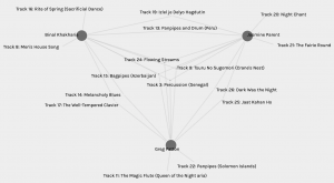
Fig. 7: “Triangle” with my second highest choices.
As for the political implications of such groupings, it is evident to me now that though people’s choices may be similar, their rationale need not be. I have made a few assumptions in my analysis thus far, based on the data I had, and also referred to different reflections to supplement this. When large scale decisions are made from similarity data or such network graphs, it is highly unlikely to take into account multiple reflections to understand people’s choices. I think that with more complex networks, more complex walks in the graphs, it would become exponentially more difficult to isolate and explain each choice, deduce the missing information, and thus, increase the risk for misinterpretation. Whether this is to one’s advantage or disadvantage, or good or bad, would depend on the risks associated with the decision, if it can ever be that discretely bipolar.
—
References:
Systems Innovation. (2015). Graph Theory Overview. Retrieved from: https://youtu.be/82zlRaRUsaY
Systems Innovation. (2015). Network Connections. Retrieved from: https://youtu.be/2iViaEAytxw

Oh wow, I didn’t even notice that not all of the songs were represented there. I was too busy focusing on the data we did have to notice the data that was left out.
Isn’t it interesting? I love playing around with data, and I am always fascinated by the missing pieces. Sometimes what’s missing says more than what is present.