
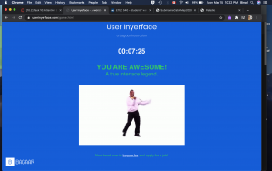
To say that this task was frustrating would be a ginormous understatement. However, this is obviously the objective of User Inyerface. I took me about seven and a half minutes to get through it, but I likely spent 80-90% of that time on the first password task.
I had to keep reminding myself that this is just a game, and tried to focus on the elements that really annoyed me. Reflecting on why these were especially frustrating was insightful to understand how I have been unconsciously conditioned in my use of the webspace (and by extension any software probably). The background colour and font contrast is not the best, but acceptable. (I may be picky, but it also bothered me that it said to “fill in the form as fast and accurate as possible” rather than as accurately.) The big green button with “NO” is placed where perhaps a “GO” button would usually be placed – but this one doesn’t take one anywhere, obviously. To proceed, one has to literally click on the word “HERE”, as the underlined word (suggestive of a hyperlink) or different coloured font are not “functional”. The green and red colours are also used contrastingly to what one is accustomed to. Green usually signifies go or ok, while red is not ok or stop.
Once one proceeds to first password task, the red banner at the top draws their attention. This is usually what one would see to “Accept cookies” and I usually would click on “yes” but no, not on this page. The assistant window on the bottom right, which normally would have an “x” on the top right corner to dismiss it instead has “^” which raises the window even more obnoxiously higher. Why does this bother me? The window is not even blocking my view, and if it was just there, I could ignore it. But when it went up instead of down, I was annoyed. When I found the “send to bottom” button, which would normally be a “send message” button, I had to laugh at how slooooooooooooooowly the window proceeded to disappear. By the way, it returns soon and pops in rather fast. Also, why are the flashing green circles for 1, 2, 3, and 4 also annoying? The timer above this makes me quite anxious. As if this was not enough, a pop up literally appears to remind me of the time ticking. Instead of the close button, there is a full screen button on the top right corner – because, why not? Once we get rid of this, there is the form itself.
The placeholder text in the textboxes does not disappear, the password rules at the bottom of the form are written in green and turn red when they are met, the checkbox reads “I do not accept the terms and conditions”, which scroll really slowly as well before you get the accept button, the obvious button to click says “cancel” rather than “next” or ok. Every single element listed here is counterintuitive and goes against “normal” or “conventional” website design. But how did we decide that normal? How did I learn to navigate these pages in that specific way? Why is this different page not a good different, but frustrating?
After getting past the double negatives (not unsafe password), the second task required uploading an image, but the button says “download”. The silhouette on the left, meanwhile, constantly keeps spinning to signify the image is loading, even after an image has been uploaded. The checklist requires exactly 3 to be checked, but all checkboxes have been checked. Another thing I take for granted. The green button, again, says cancel rather than next. This was still less frustrating than the first task.
Moving on to task 3 to fill in the personal details, the age calculator is actually accurate, and date of birth and age need to match. The months for the birthdate are all shuffled, I thought they were in alphabetical order but they aren’t. And hitting “tab” to go to the next textbox actually moves the cursor to the assistant window on the bottom right even if it has been sent away. Choosing a country with black and white flags was funny at this point. Luckily the Canadian flag is easy to identify. I did not even bother looking for the Tanzanian one ![]() . The assistant window is now blocking the gender selection, which is also not clear. Is it selected when it is blue or white? When it matched the title, it allowed me to proceed.
. The assistant window is now blocking the gender selection, which is also not clear. Is it selected when it is blue or white? When it matched the title, it allowed me to proceed.
Finally, the last task to prove that I am human, as if all the frustration till now was not proof enough, required me to choose images that had light or were light – I cannot remember the exact wording, but it was vague. The checkbox for the image was actually above it and not below – another thing I take for granted, I realized. I could choose anything that had literal light in it – sun, light bulb, etc. or that depicted light things like a feather. Finally, the button on this page was “correct” in that it was blue, clickable and said “validate”. I really think I would have flung my laptop if it had said “Cancel” instead and I’d clicked it.
I found that this exercise made me slow down and think about every keystroke and every click, at least for a few minutes. It helps to be mindful – but in a regular daily fast-paced life, the small things that I (we) take for granted are important time savers. More often than not, I will click blindly on “Accept cookies” and merely scroll through the terms and conditions without reading but accept them anyway, despite being very aware of security and privacy concerns, sharing excessive information, and all the other concerns of using the internet. This “game” brought that to light and made me feel a bit guilty. It also raised lots of questions about acceptable design and conditioning. Since most clever and cunning designs are meant to integrate seamlessly into our psyche, playing with us emotionally and even physiologically, to trick us into buying products, services, or even allegiances, this design stood out. It failed to be subtle and seamless, and in that was its success (Harris, 2017). It helps bring to attention the ways in which we are unconsciously tricked, and maybe that we are happier with it that way? I am very curious to know how very young children would do with this game – would they be more successful and less irritated? If yes, would that be because they are not as afraid or concerned to go around clicking everything until it works, or because they are not as experienced/conditioned and would go slower and follow the rules they see on the page, or because it would be more intuitive to them? I think I want to share this with my students and see what they think of it.
—
References:
Harris, T. (2017). How a handful of tech companies control billions of minds every day. Retrieved from https://www.ted.com/talks/tristan_harris_the_manipulative_tricks_tech_companies_use_to_capture_your_attention?language=en
Tufekci, Z. (2017). We’re building a dystopia just to make people click on ads. Retrieved from https://www.ted.com/talks/zeynep_tufekci_we_re_building_a_dystopia_just_to_make_people_click_on_ads?language=en
Hi Binal, Glad you made it through the frustration. I appreciate your attention to grammatical detail! Adjectives in the place of adverbs bother me also. I think it is interesting to think about how a young child might to at this task but your saying that made me think about my experience last week with my father. He is not very tech savvy and he lives half way around the world. We face time quite often but I wanted to get him onto zoom. It took over an hour to walk him through the process of opening his browser, finding the zoom webspace, downloading the software and installing it. I cannot even imagine how long it would take him to get through the BAGAAR task. It is interesting to me the way that those of us who are accustomed to using tech daily find this task frustrating, because as you say you have to suddenly think about every click and keystroke.
Oh, I totally get what you mean about the “older” generation trying to struggle through this. I think I would be more frustrated than my parents if I were to guide them through this one. I am more interested to find out how very young kids would do with this because they are not as immersed into this kind of tech, yet. Also, they are not as worried or scared of clicking the wrong buttons. And maybe they wouldn’t be frustrated when the buttons aren’t in the “right” places…