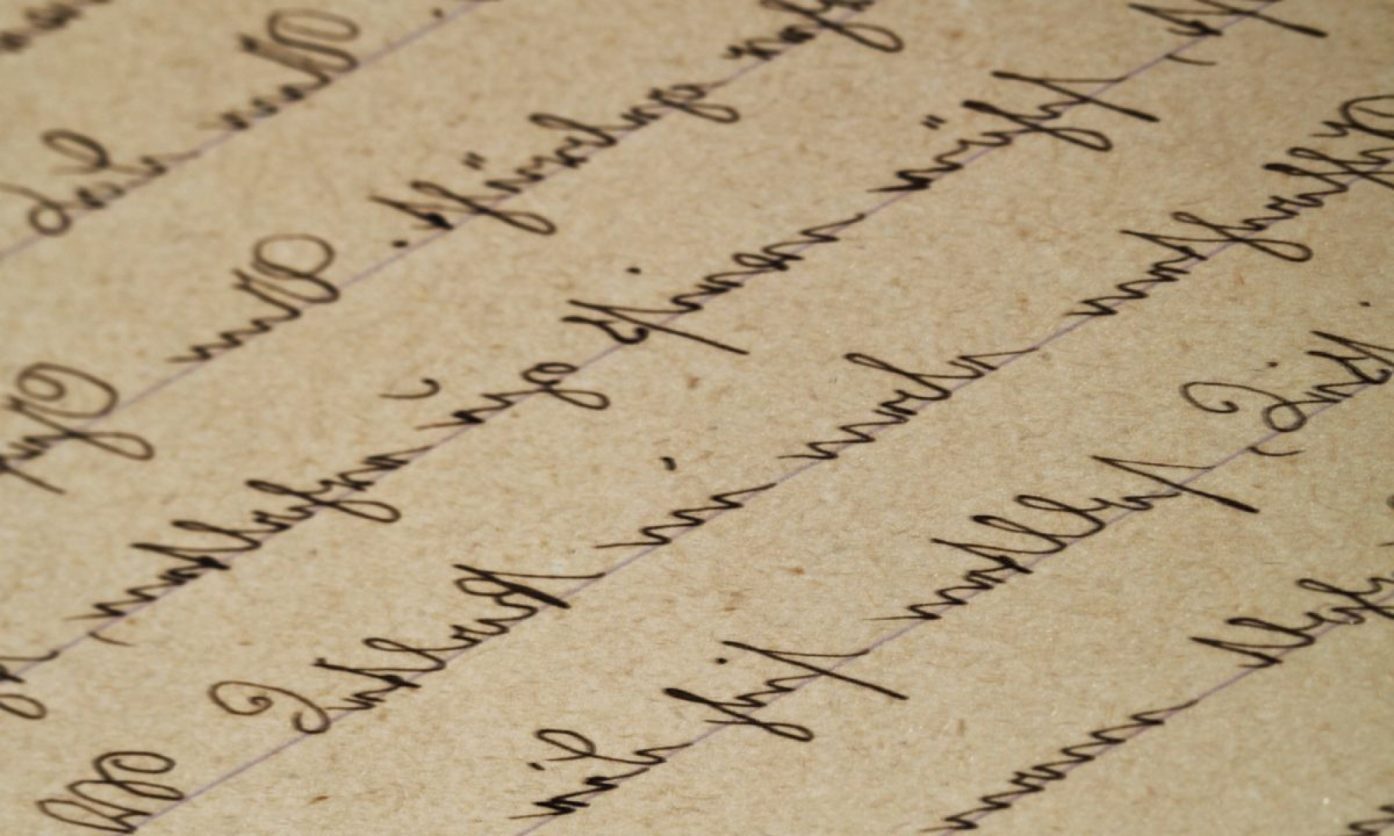
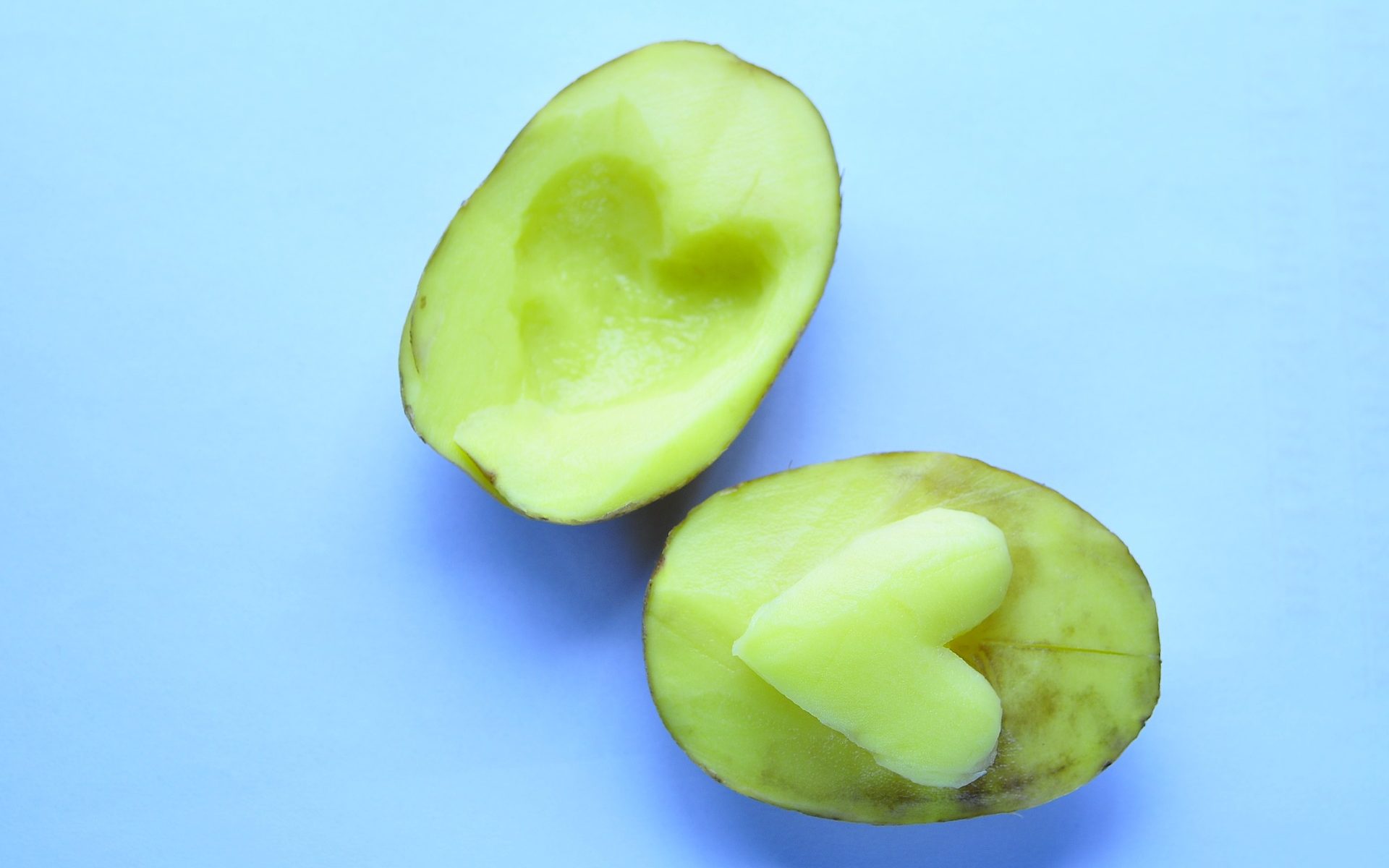
For this link, I chose to compare Ravneet’s and Erin’s experiences with mine for Task 4. Ravneet and I did the potato printing part of this task, whereas Erin did both, the lino “potato” print and the manual script. Both of their carvings were individual letters as opposed to my full word. This is representative of the first printing presses with their separate letters and symbols that needed to be organized before printing. When I saw the baby potatoes in Ravneet’s post, my first thought was “Why didn’t I think of that?!” It seems so much easier to carve individual letters as separate stamps, and more versatile, too. Erin went with a similar approach with her lino stamps, in that she carved out individual letters, however, she chose to make her first letter uppercase. My entire word is lowercase and cursive; Ravneet’s and Erin’s are obviously not cursive. Ravneet did not reverse her letters on the stamp before carving, and ended up with the mirror image of her word “plain”. Had she had chosen a different word with only those letters that look the same as their mirror image (i and l in her case, and even n to an extent), this problem may not even have been noticed. I like that she went ahead with her stamps anyway, highlighting the challenges the early printer makers must have faced as well. Erin’s post made me think of another unrelated challenge – lack of the material of choice and substitution with another, perhaps better material. As Erin did not have potatoes on hand, she used her art/craft supplies to complete the task. She ended up with a durable (and maybe more expensive) alternative. This made me wonder what other challenges the early makers may have faced, whether they also had reversed letters initially, whether they had to “make do” with alternatives. Again, it makes me think of the missing pieces and what that says about the artifact or the person.
As for the process of printing compared to writing by hand, Ravneet remarks that she finds herself to be more creative and thoughtful with the latter. She mentions that she felt pride in her creation of the potato stamps and wonders if 3D printing them would have given her the same satisfaction. Erin’s reflection on her manual script relays similar sentiments. Erin mentions how she feels her handwritten notes and letters have a more personal connection, but she also emphasizes that they also showcase the thought process and “one’s stream of consciousness” more realistically. Erin’s manuscript and marginalia are representative of this. Personally, this “writing” and marginalia are still a part of my life, even in the digital format. I use a Surface Pro when I teach, and annotate printed notes on OneNote, fill in the gaps, draw models and diagrams, and leave other helpful links and resources for students to explore. I like the connection that Erin makes between marginalia and hypertexts, and think that this demonstrates evolution of “older” techniques with “newer” technology. I think in response to Ravneet, I would say: find something like this that is the best of both worlds.
Artifact layout:
Both Erin and Ravneet have white backgrounds on their blogsites. Ravneet has a mix of posts and pages for her tasks, which are all included as buttons on her header menu. This makes it easy to locate the tasks and navigate through her work. Erin, on the other hand, has a personalized header for her blogsite, which reveals her artistic, creative background. Erin does not have a header menu, but she does have a sidebar menu on the right. She has a photo of herself, adding an even more of a personal touch to her site. The linking assignment can be accessed through a big red-orange (customized) button below the photo, and the tasks are linked, in order, below this. Erin’s artistic background makes her minimalistic site colourful and fun to look at, and the easy to access menus make it fun to navigate.