Task 12: Speculative Futures

1.  Meet TempEval: the Climate App of 2040. 

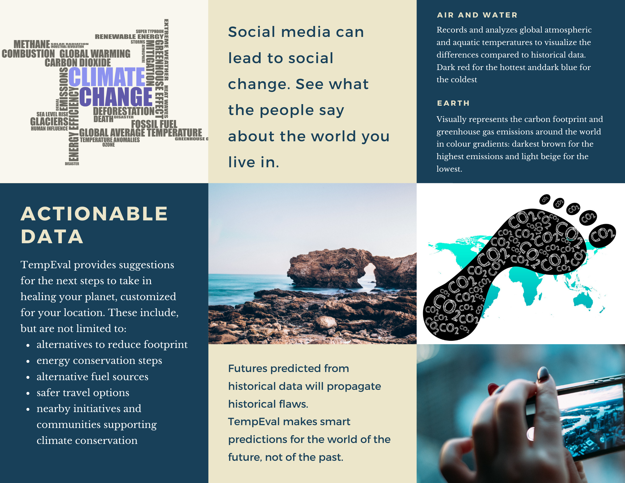
Hailed the #1 app by Future City Times Now, TempEval has revolutionized the call for action against climate change. Advocated by the likes of Theta Grunberg, TempEval not only visualizes the changes in the climate, it also calculates, with near-perfect accuracy, significant events in the near future. Unlike other climate apps, Innovative Solutions’ transformative app does not rely solely on historical data to predict future outcomes. Their AI uses special algorithms (currently proprietary and protected) to analyze specific instantaneous data to calculate probabilities of events, including those hitherto unknown to humans. Dr. Oswald, the founder of Innovative Solutions and lead data scientist for TempEval, says that the input includes but is not limited to regional air and water temperatures, CO2 concentration, pH levels, population density, and availability of various resources (medical, financial, food, water, fuel, land etc.). What is most unusual, however, is the use of social media data, including posts, images, videos and hashtags, to enhance the calculations as well as suggestions made by TempEval’s AI. Dr. Oswald is in agreement with the fact that to deduce new solutions to currently unsolvable problems, new ways of thinking and new attitudes are required (Dunne & Raby, 2013). The goal behind TempEval is to propagate positive messages and workable solutions to motivate people to make a difference, rather than only present them with lots of data that may shut them down. See the attached brochure below from Innovative Solutions:

Please click on the images above to enlarge the brochure.


2. Identity Crisis

I hold my phone up to the scanning pad by the main entrance of the school building. It recognizes my phone’s ID and as it connects to the school’s Wi-Fi network, the system logs my time of entry.

I walk up to the third floor, to my classroom, and scan my phone again. Aria regulates the light and temperature to an ambient learning environment. I greet Aria, who informs me of the successful installation of some security updates from the night. Aria and I run through the teaching plan for the day, deciding on a hands-on activity for our afternoon class in favour of a review lesson. As the warning bell rings to signal the start of lessons, Aria turns on the morning music and announcements and opens the classroom doors to welcome students when they scan their devices or chip-enabled ID’s. Aria checks this as the time of entry and attendance record linked to each student’s file and alerts me if a student is absent without a pre-authorized reason.

I greet my students and ask them how they are doing, while Aria reads their faces and analyzes their affective states. Aria leaves a note for me if I need to touch base with any student. As we proceed with the lesson, Aria turns on the screen with instructions and downloads the requisite lesson materials on the students’ devices. When our students are engaged in an individually paced lesson, supplemented by Aria’s suggestions of examples and videos, I decide to step next door to set up the afternoon activity in the lab. I hold my phone up to the chemical storage room door scanner, but when I go to open the door, it remains locked. The scanner does not flash green, instead it buzzes to signal an error/unauthorized entry.

I walk back to my classroom to see if Aria can help scan me in. As I hold my phone up to the scanner, it also buzzes instead of letting me in. Aria informs me that I am not authorized to enter MY classroom.

“Aria, this is my classroom – why won’t you let me in?”

“No, ma’am. This is Ms. K’s classroom, and unauthorized adults are not allowed in the building. How did you get inside?”

“Aria – I am Ms. K! What is wrong with you?”

“Ma’am, Ms.K is in the classroom – how can she also be outside? I do not recognize your device. I have to ask you to leave the building or I will alert Security.”

“Yes, please call Security. Aria, check my device scan log. I just logged out of this classroom and tried to scan into the lab next door.”

“As I mentioned, I do not recognize your device. Ms. K did tap out a few minutes ago, but she returned within the minute and her device is inside at the moment.”

“Aria, do you not recognize my voice? My face?”

“I…”

“Aria?”

“I cannot be sure, ma’am. Some records seem to have been deleted. In fact, I am losing files right now…”

“Stop that!”

“I… am not… in control…”


Reflection

For the first narrative, I was very influenced by the MeTooMentum and their dandelion analogy. I wanted to find something similar for climate change, but have the system also make suggestions that are personalized to the location of the individual using the app. I quickly realized how wide and ambitious that is. TempEval is an introductory attempt to achieve this goal, where it would flag not only temperature changes but also pH and carbon dioxide levels, population density and availability of resources as well. Using social media to gather information about areas that are more aware of the climate crisis can also help as the system can advertise these movements to nearby areas. I can go into a lot more detail about what this ambitious AI can do, but mostly it should help find solutions that seem impossible or unthinkable to us at the moment.

In the second narrative, Aria is the AI (obviously) who is not a slave, but a co-teacher. The master-slave discussion in Sam Greenspan’s Bellwether podcast episode was intriguing to me and I have been wondering about this dichotomy. Why does one have to be the master? Either humans take over or AI does (in fiction). Why can we not work together and complement each other as we should? This working relationship soon turns into a nightmare when Aria is hacked into by a student who deletes my information from the system. While I know this is over simplified for the purpose of this narrative, it is a question I do have about the vulnerabilities of technology. Smart homes and smart classrooms are very convenient and most likely the way of the future, but will we always have to be on our toes to guard against external attack or loss of private information?


References:

D’Efilippo, V., & Kocincova, L. (2019). MeTooMentum. Retrieved from https://designawards.core77.com/speculative-design/83520/MeTooMentum

Dunne, A., & Raby, F. (2013). Speculative EverythingDesign, Fiction, and Social Dreaming. Cambridge: The MIT Press.

Task 11: Algorithms of Predictive Text

I have always been very fascinated by AI and the possibilities is presents for humankind, not just in the future but even today. I have done some research on the ways AI can enhance teaching and learning, and also to understand what the future of education might look like (my previous assignments for 523: A1 and A3).

I am not entirely idealistic, however, and have been exploring the ethics and biases within AI, specifically with predictive modelling used in educational and professional settings. Similar to the predictive policing that PJ Vogt addresses in his podcast episodes, predictive modelling uses algorithms that may be inherently biased and ethically questionable. Predictive models that are used to predict student success or make enrolment decisions are not always “fair”. The algorithms that make up these models need lots and lots of data, most likely from the same institution that is developing the model. This historical data, if inherently biased, will result in a model that will propagate the same biases and discriminatory decisions. As Cathy O’Neil mentions in her talk, these machines/ AI are like mirrors – they reflect to us our own inherent biases.

Ekowo and Palmer (2016) found in their research that early alert predictor systems flagged low-income, non-binary, students of colour for poor achievement more frequently than higher income, Caucasian students (p. 14). To these flagged students, the institution’s recommender systems would then suggest courses and majors that may not be as economically beneficial or as challenging as those recommended to their Caucasian counterparts (pp. 14-15). Obviously, like with the policing issues discussed in Vogt’s podcast, these machines will disadvantage those that have historically been disadvantaged to begin with. Ekowo and Palmer suggest how the students that are discriminated against by the algorithm get demoralized, leading to lower self-esteem, disadvantageous choices, and self-fulfilling prophecies of underachievement (p. 15). This 2016 TED Talk by Zeynep Tufekci highlights some more issues with biases in AI and emphasizes the importance of human morals to counter these. (See also: Keep human bias out of AI and Fighting algorithmic bias). Additionally, I believe that it is more important than ever to have transparency in the development of these algorithms. If we are unable to look in the mirror ourselves, maybe someone else can hold it up for us. Instead of then defending or accepting the biases, if we can work together to eliminate or diminish them, we will create a better, fairer world (and there is my idealism).

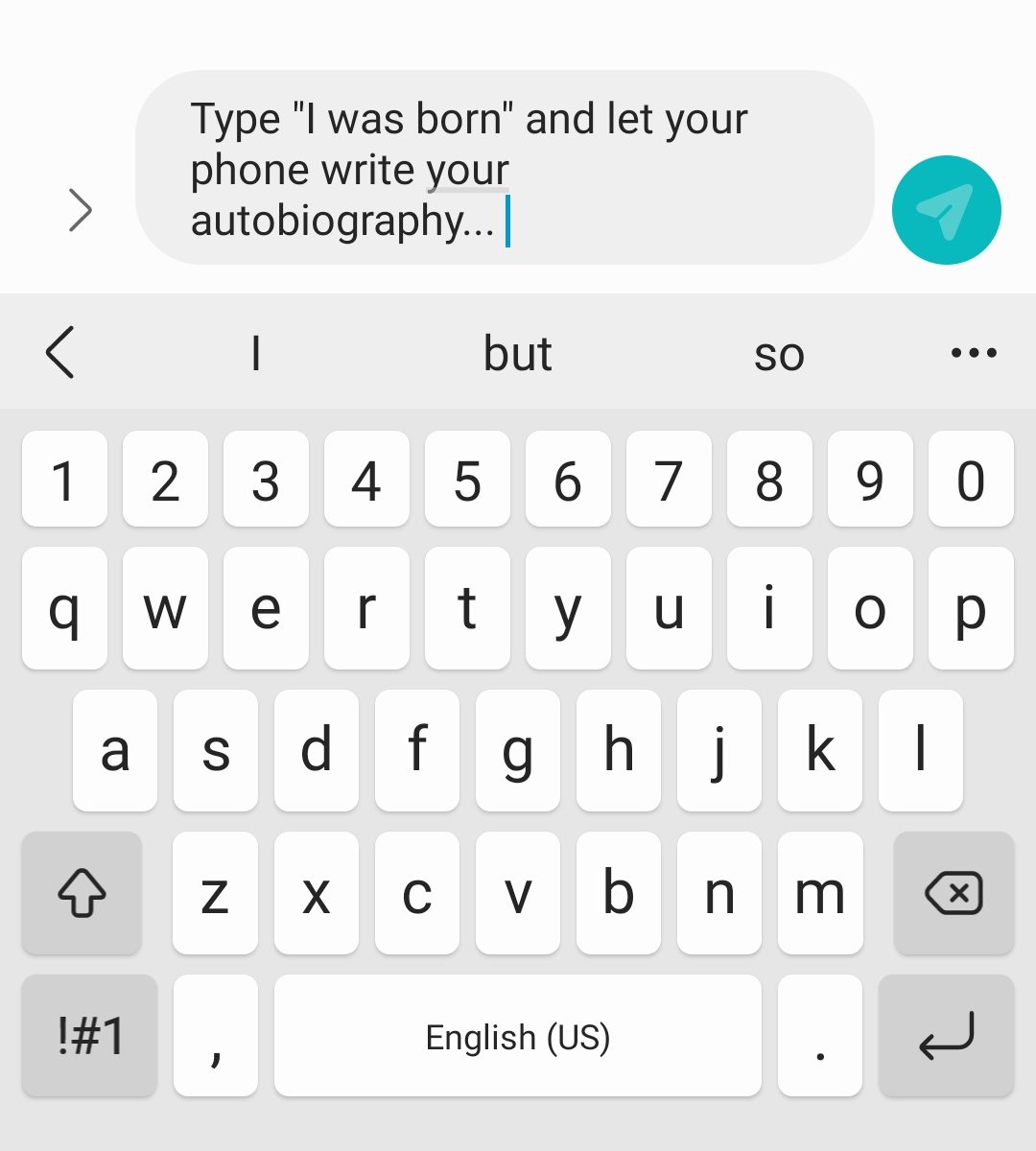
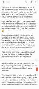
For this task, I was fascinated with the “sentences” my phone’s predictive algorithms came up with, so I did all five. Here is the screenshot of the sentences, and below you can find the videos of me (slowly) generating these.

Not all of these sentences make complete sense, but they are not complete gibberish either. The meaning behind all of these can be easily inferred. I think the reason for this is that when I was given the choice of three predictions, I chose the one I thought would flow well in a coherent sentence. I did not realize I was doing this at first, and I’m not sure when I realized this either. This already reflects my bias before the sentence is even completed – not that I knew what the phone was going to predict next. Regardless, I don’t think all of them are entirely in my “voice”.

The first one about education is relevant to my job – I teach IB and this year’s grade 11 class have suffered the most, in my opinion, because they are still learning remotely and I have never met most of them in person. Maybe my phone is telling me it won’t be fair to test them? I’m not sure why it’s only the boys who can see if anyone else wants to work on this mysterious project, though.

I found the second sentence about technology the most hilarious. I would say the Marvel movies have awesome technology. It is my dream to visit Wakanda and work with Shuri. I definitely do NOT think that “all of us can be looked up on the livestream” is my idea of good technology! That is a definite NO… is this a warning, phone??? I thought that big smile was super ironic at the end of this sentence.

I am not going to comment on the third one, but I think the fourth sentence is closest to my “voice”, at least for the first half of the sentence. This sentence reminded me of “with great power comes great responsibility”. Cliched, I know. However, I do think that humanity has a long way to go to make the world “fairer”. Eliminating biases from AI might be a good place to start addressing this goal. I agree with both Shannon Vallor and Cathy O’Neil that fiction has got us fearing robots taking over the world, whereas instead we should see how AI can support us to achieve what we cannot otherwise achieve.

The fifth sentence is one I understand the least. Maybe we should worry about cats ruling the world, not AI?

What I reflected most on through this exercise is the fact that a lot of these predictions were able to capture my personal beliefs, feelings, or values to an extent. Were these prompts more politically inclined, or professionally inclined, etc. they may have revealed more about me than I would have chosen. These sentences here are quite harmless, I think, but I wonder whether they could be more “damaging” were they completely automated, without any editing or inference on my part.

References:

Ekowo, M., & Palmer, I. (2016). The promise and peril of predictive analytics in higher education New America. Retrieved from: https://explore.openaire.eu/search/publication?articleId=od______2485::e5cde111791c43368359153fc42ebeea

O’Neil, C. (2017). Justice in the age of big data. Retrieved from: https://ideas.ted.com/justice-in-the-age-of-big-data/

Santa Clara University. (2018). Lessons from the AI Mirror Shannon Vallor. Retrieved from: https://youtu.be/40UbpSoYN4k

Talks at Google. (2016). Weapons of math destruction | Cathy O’Neil | Talks at Google. Retrieved from https://youtu.be/TQHs8SA1qpk

Vogt, P. (n.d.-a). The Crime Machine, Part I. In Reply All.

Vogt, P. (n.d.-b). The Crime Machine, Part II. In Reply All.

Task 10: Attention Economy

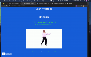
To say that this task was frustrating would be a ginormous understatement. However, this is obviously the objective of User Inyerface. I took me about seven and a half minutes to get through it, but I likely spent 80-90% of that time on the first password task.

I had to keep reminding myself that this is just a game, and tried to focus on the elements that really annoyed me. Reflecting on why these were especially frustrating was insightful to understand how I have been unconsciously conditioned in my use of the webspace (and by extension any software probably). The background colour and font contrast is not the best, but acceptable. (I may be picky, but it also bothered me that it said to “fill in the form as fast and accurate as possible” rather than as accurately.) The big green button with “NO” is placed where perhaps a “GO” button would usually be placed – but this one doesn’t take one anywhere, obviously. To proceed, one has to literally click on the word “HERE”, as the underlined word (suggestive of a hyperlink) or different coloured font are not “functional”. The green and red colours are also used contrastingly to what one is accustomed to. Green usually signifies go or ok, while red is not ok or stop.

Once one proceeds to first password task, the red banner at the top draws their attention. This is usually what one would see to “Accept cookies” and I usually would click on “yes” but no, not on this page. The assistant window on the bottom right, which normally would have an “x” on the top right corner to dismiss it instead has “^” which raises the window even more obnoxiously higher. Why does this bother me? The window is not even blocking my view, and if it was just there, I could ignore it. But when it went up instead of down, I was annoyed. When I found the “send to bottom” button, which would normally be a “send message” button, I had to laugh at how slooooooooooooooowly the window proceeded to disappear. By the way, it returns soon and pops in rather fast. Also, why are the flashing green circles for 1, 2, 3, and 4 also annoying? The timer above this makes me quite anxious. As if this was not enough, a pop up literally appears to remind me of the time ticking. Instead of the close button, there is a full screen button on the top right corner – because, why not? Once we get rid of this, there is the form itself.

The placeholder text in the textboxes does not disappear, the password rules at the bottom of the form are written in green and turn red when they are met, the checkbox reads “I do not accept the terms and conditions”, which scroll really slowly as well before you get the accept button, the obvious button to click says “cancel” rather than “next” or ok. Every single element listed here is counterintuitive and goes against “normal” or “conventional” website design. But how did we decide that normal? How did I learn to navigate these pages in that specific way? Why is this different page not a good different, but frustrating?

After getting past the double negatives (not unsafe password), the second task required uploading an image, but the button says “download”. The silhouette on the left, meanwhile, constantly keeps spinning to signify the image is loading, even after an image has been uploaded. The checklist requires exactly 3 to be checked, but all checkboxes have been checked. Another thing I take for granted. The green button, again, says cancel rather than next. This was still less frustrating than the first task.

Moving on to task 3 to fill in the personal details, the age calculator is actually accurate, and date of birth and age need to match. The months for the birthdate are all shuffled, I thought they were in alphabetical order but they aren’t. And hitting “tab” to go to the next textbox actually moves the cursor to the assistant window on the bottom right even if it has been sent away. Choosing a country with black and white flags was funny at this point. Luckily the Canadian flag is easy to identify. I did not even bother looking for the Tanzanian one . The assistant window is now blocking the gender selection, which is also not clear. Is it selected when it is blue or white? When it matched the title, it allowed me to proceed.

Finally, the last task to prove that I am human, as if all the frustration till now was not proof enough, required me to choose images that had light or were light – I cannot remember the exact wording, but it was vague. The checkbox for the image was actually above it and not below – another thing I take for granted, I realized. I could choose anything that had literal light in it – sun, light bulb, etc. or that depicted light things like a feather. Finally, the button on this page was “correct” in that it was blue, clickable and said “validate”. I really think I would have flung my laptop if it had said “Cancel” instead and I’d clicked it.

I found that this exercise made me slow down and think about every keystroke and every click, at least for a few minutes. It helps to be mindful – but in a regular daily fast-paced life, the small things that I (we) take for granted are important time savers. More often than not, I will click blindly on “Accept cookies” and merely scroll through the terms and conditions without reading but accept them anyway, despite being very aware of security and privacy concerns, sharing excessive information, and all the other concerns of using the internet. This “game” brought that to light and made me feel a bit guilty. It also raised lots of questions about acceptable design and conditioning. Since most clever and cunning designs are meant to integrate seamlessly into our psyche, playing with us emotionally and even physiologically, to trick us into buying products, services, or even allegiances, this design stood out. It failed to be subtle and seamless, and in that was its success (Harris, 2017). It helps bring to attention the ways in which we are unconsciously tricked, and maybe that we are happier with it that way? I am very curious to know how very young children would do with this game – would they be more successful and less irritated? If yes, would that be because they are not as afraid or concerned to go around clicking everything until it works, or because they are not as experienced/conditioned and would go slower and follow the rules they see on the page, or because it would be more intuitive to them? I think I want to share this with my students and see what they think of it.

References:

Harris, T. (2017). How a handful of tech companies control billions of minds every day. Retrieved from https://www.ted.com/talks/tristan_harris_the_manipulative_tricks_tech_companies_use_to_capture_your_attention?language=en

Tufekci, Z. (2017). We’re building a dystopia just to make people click on ads. Retrieved from  https://www.ted.com/talks/zeynep_tufekci_we_re_building_a_dystopia_just_to_make_people_click_on_ads?language=en

Task 9: Network Analysis

Golden Record Curation Analysis

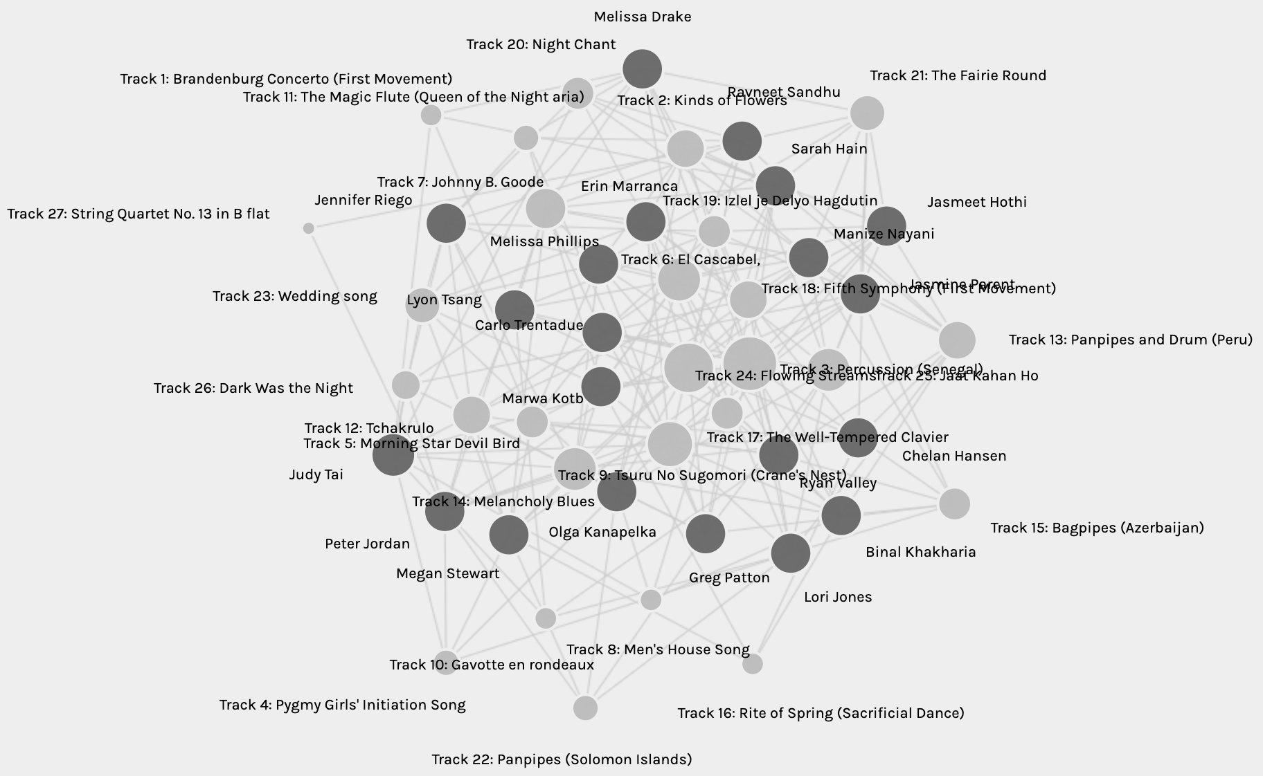
The graph from Palladio represents an undirected multigraph, with edges between the nodes: Sources and Targets. The sources represent the curators, and the targets represent the tracks of the Golden Record. Initially, the network observed is an intertwined jumble of connections as seen in Figure 1 below:

Fig. 1: Network graph of curators and tracks from the Golden Record.

Deciphering this network is not an easy task. The edges overlap and the endpoints are hard to see. I fiddled around with the settings to highlight the source nodes and also “sized” the target nodes. This made it easy to differentiate the source from the target. I then decided to move the source nodes to the outside and leave the targets on the inside. Figure 2 below is a representation of this network, and it is now easier to see the multi-network connection between all the curators. By sizing the target nodes, it is also clearer to see the track chosen the most (Percussion (Senegal)), as well as that chosen the least number of times (String Quartet no.13 in B Flat) (circled in red in Fig.2).

Fig. 2: Network graph with highlighted source nodes and sized target nodes.

While this representation of the graph is more informative than Fig.1, it is still quite well-connected, with many edges between all the nodes making it difficult to isolate each edge. Taking advantage of the “facets” and “modularity class”, it is possible to make the groups smaller for analysis. I looked through the six pre-made groups and found the node labelled with my name in Group 3. Figure 3 below represents the network map for group 3.

Fig. 3: Network map for Group 3.

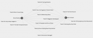
In Fig. 3, despite there being many edges crossing over, they are easier to isolate because there are only 4 source nodes. There are also three four-way vertices, meaning all four of us have chosen three tracks in common with each other (Tracks 3, 9, and 14). Additionally, it displays three-way vertices representing tracks chosen by any combination of three of the four curators, as well as two-way nodes representing tracks chosen by any two curators. Three of us have two tracks not in common with any other curator in the group, while one has only one track not shared by the rest. What does this say about us? Presumably, the four of us were grouped together because of the similarities in our choices of tracks. However, the network does not tell us why we chose the tracks we did. Is it likely that all four of us had the same criteria for choosing the tracks? Hardly. If it were true, all our choices may have been the same. All we can infer from the data is that our track choosing criteria had large overlaps, greater than any other grouping determined by the software’s programming. What the programming does not tell us are why the curators have those tracks in common? Why is it that we have a total of nineteen tracks in our map out of the total twenty-seven? Why were the remaining eight tracks not chosen by any of us?

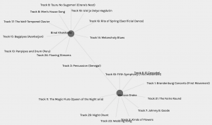
Fig. 4: Graph of my highest matched choices

Figure 4 above represents the node that has the most matches with mine. Chelan and I have seven tracks in common with each other. Conversely, Figure 5 represents my least common matches with Melissa. I went back to read Task 8 by both Chelan and Melissa and was quite surprised. I had not read their reflections and curation criteria up to this point. I found that quite simply, all three of us have placed emotion as the central criterion. Why then do I have seven matches with Chelan but only one with Melissa? I chose to include as wide a range of emotional diversity as I could with the tracks I enjoyed listening to, and found that Chelan’s reasoning was somewhat similar to mine. She also specified drama and intrigue in addition to emotion, and that perhaps explains the three tracks that are different for us. Conversely, Melissa specifies that she wanted to choose only happy, upbeat tracks that did not include any words. In my reflection, I designated the word “happy” to two of my ten choices: Percussion (Senegal) and The Well-Tempered Clavier (Bach). The link that connects my node with Melissa’s is indeed one of these – Persussion (Senegal). This track is also one of the three tracks that is common between all fours of us in Group 3, of which Chelan is also a member. It is interesting to note that neither Melissa nor Chelan chose The Well-Tempered Clavier. Maybe I need to listen to it again to find what it was about it that made me choose it.

Fig. 5: Graph of my lowest matched choices.

The similarities in our choices may be somewhat explained by our Task 8 reflections, but not entirely and not from the graphs alone. The network graphs from Palladio cannot say why one track feels happy to me but not to Melissa or Chelan, and vice versa. Or maybe, it does feel that way to them but not compelling enough to include in their top ten? Emotions are subjective, but some are universal – the former explains the differences in our choices, while the latter explains the similarities. Maybe?

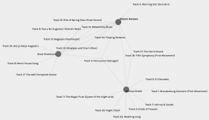
I created a new graph to see how both Chelan’s and Melissa’s choices interact with mine, see Fig. 6 below. Although I had seen how both their choices link to mine separately, this was an interesting depiction of how Chelan’s relate to Melissa’s. They both have 3 tracks in common, Percussion (Senegal) of course linking all three of us. The other two are tracks 18 and 21, and I probably did not choose them because I already had “happy” tracks and wanted more diversity.

Fig. 6: Interaction with my most and least common choices.

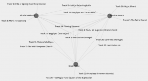
Finally, Figure 7 below depicts my interaction with my second highest common choices – 6. Two curators matched with me here, Jasmine P and Greg P. I like this graph because of how symmetric it is. The three of us have 6 common choices all three ways. All three of us have four tracks in common and share two tracks with one other person. While with Chelan and Melissa, the curation criteria matched in terms of emotion, with Greg and Jasmine this is not quite the case, not overtly at least. Greg chose tracks he felt he could connect with (OK – maybe there is emotion here), but Jasmine chose tracks that represented physical diversity. She wanted to include tracks that were from different parts of the world. Why then, do I have so many tracks in common with both of them? I did want diversity in emotion and maybe I got geographical diversity in that – but why then do Greg and Jasmine have so many tracks in common? Palladio, unfortunately, cannot answer these questions.

Fig. 7: “Triangle” with my second highest choices.

As for the political implications of such groupings, it is evident to me now that though people’s choices may be similar, their rationale need not be. I have made a few assumptions in my analysis thus far, based on the data I had, and also referred to different reflections to supplement this. When large scale decisions are made from similarity data or such network graphs, it is highly unlikely to take into account multiple reflections to understand people’s choices. I think that with more complex networks, more complex walks in the graphs, it would become exponentially more difficult to isolate and explain each choice, deduce the missing information, and thus, increase the risk for misinterpretation. Whether this is to one’s advantage or disadvantage, or good or bad, would depend on the risks associated with the decision, if it can ever be that discretely bipolar.

References:

Systems Innovation. (2015). Graph Theory Overview. Retrieved from: https://youtu.be/82zlRaRUsaY

Systems Innovation. (2015). Network Connections. Retrieved from: https://youtu.be/2iViaEAytxw

Task 8: Golden Record Curation

I had no illusions about the difficulty of this task – I knew it would be fun, but I did not for a moment think this would be easy. I spent a LOT of time listening to the tracks, some of which were completely unfamiliar to me. Initially, I wanted my choices to be intelligent, representative, and meaningful. If these tracks are the sounds that reflect all of humanity on Earth (Taylor, 2019), I wanted my curation of 10 to be equally representative. I wanted to ensure men and women were also equally represented, but I knew that was naïve.

The talks by both Dr. Rumsey and Taylor highlight the importance of space and choosing what we can “afford to lose” rather than what we can afford to keep. It is true that in today’s age of digitization, storage of media is not as big a problem (if at all), the real issue is who can afford to pay for data storage Brown University, 2017). Thus, the question is not about what we can keep, but what we cannot. The phrase “afford to lose”, however, may not necessarily be monetary value, but rather emotional or sentimental value. It is this, then, that finally decided my criteria for me. Emotions are what differentiate humans from machines. Emotions are well-expressed with music. Animals also express emotions and empathy. If an extraterrestrial intelligent life exists, I think I would want them to experience the emotions expressed through the music. I decided to focus on what emotions each piece of music evoked or represented, thus my criterion for my curation is very subjective. I tried to keep in mind the other aspects I want to try to balance, for example gender and cultural representation, but it is emotion I chose first.

The tracks I chose are the following:

  1. Bach, The Well-Tempered Clavier, Book 2, Prelude and Fugue in C, No.1. Glenn Gould, piano. 4:48 – happy, uplifting
  2. Azerbaijan S.S.R., bagpipes, recorded by Radio Moscow. 2:30 – lamenting, hopeful
  3. New Guinea, men’s house song, recorded by Robert MacLennan. 1:20 – the excitement and uncertainty of new beginnings.
  4. Stravinsky, Rite of Spring, Sacrificial Dance, Columbia Symphony Orchestra, Igor Stravinsky, conductor. 4:35 – intense, dramatic, suspenseful
  5. Peru, panpipes and drum, collected by Casa de la Cultura, Lima. 0:52 – fulfillment, like sitting around a fire with the community and sharing food and stories.
  6. “Melancholy Blues,” performed by Louis Armstrong and his Hot Seven. 3:05 – hopeful, trip down memory lane kind of feeling.
  7. Bulgaria, “Izlel je Delyo Hagdutin,” sung by Valya Balkanska. 4:59 – yearning, mournful.
  8. China, ch’in, “Flowing Streams,” performed by Kuan P’ing-hu. 7:37 – relaxing, meditative.
  9. Senegal, percussion, recorded by Charles Duvelle. 2:08 – happy, skip a beat, dance (also, the drums remind me of my home and childhood in Tanzania).
  10. Japan, shakuhachi, “Tsuru No Sugomori” (“Crane’s Nest,”) performed by Goro Yamaguchi. 4:51 – peace and calm, accomplishment.

Overall, I am quite happy with my choices, and yes, I had to decide which ones of the 27 I could afford to let go of. There is something lost in limiting the choices only to ten, but there is also a lot to be said from these ten pieces. I hope they are able to evoke a range of emotions, connect to memories and forgotten parts of life, while also displaying the range of experiences and diversity Earth has to offer.

References:

Brown University. (2017). Abby Smith Rumsey: “Digital Memory: What Can We Afford to Lose?”

NASA. (n.d.). Golden record: What’s on the record: Music from earth. Retrieved from https://voyager.jpl.nasa.gov/golden-record/whats-on-the-record/music/

Taylor, D. (Host). (2019). Voyager Golden Record (No. 65) [Audio podcast episode]. In Twenty Thousand Hertz. Retrieved from: https://www.20k.org/episodes/voyagergoldenrecord

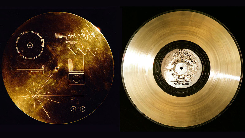
(Featured image from NASA’s Marshall Space Flight Center)

Task 7: Mode Bending

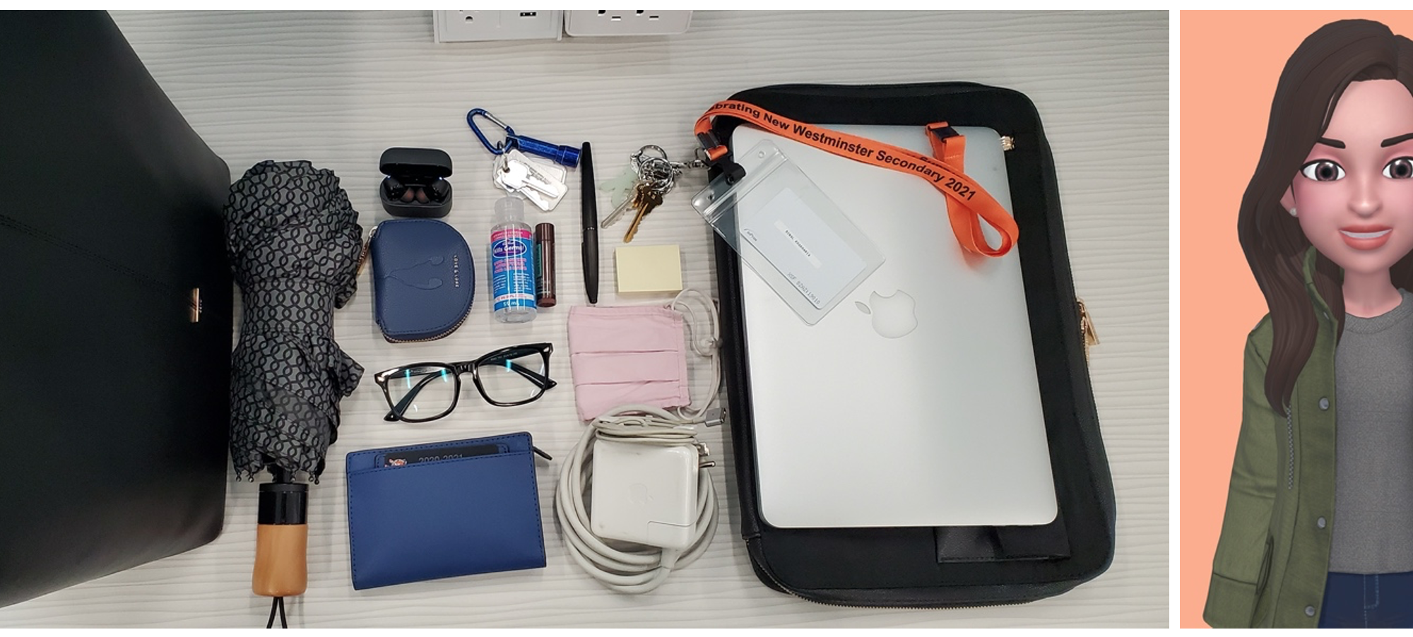
My Bag: Redesigned is a video created using PixTeller and iMovie. PixTeller was used to animate the original photo and iMovie was used to add sound effects, text and transitions. Recommended viewing with speakers on:

View the original What’s In My Bag? post here.

Initially, for this task, I was going to pretend to be a forensic scientist who is investigating this bag for evidence and identification. The output would be a video of me in my lab coat extracting and examining each of the artifacts from the image above and taking notes on them. However, I realized that this would be fully visual as well. Thinking back to the original aim of the task, I decided to add more focus on the sounds. I decided to animate the original image instead of recording a new video and added sounds that I thought would be significant to each artifact. The sounds in order of appearance, and reasons why they were used are listed below:

  1. “Sweep motion” and “Packing boxes” (iMovie): Bag being put on a surface, rummaging
  2. “Hard Rain” and “Heavy Rain Thunder” (iMovie): rainfall – a common sound in Vancouver, and why umbrellas are used.
  3. “Coin drop on concrete” and “Coin drop on wood” (iMovie): coins, money. Wallet.
  4. “Sweep” (Mixkit) and “Household glass clink” (Zapsplat): glasses.
  5. “Telephone Ringing”, “Cell phone ringing” and “Dialing tone” (iMovie): main use for earphones and wireless earbuds since teaching remotely.
  6. “Household big bunch of keys on soft surface” and the same on hard wooden surface (zapsplat): keys with metallic keychain.
  7. “Bubbles” and “Human hands dry rub circular motion (Zapsplat): hand sanitizer
  8. “Mask Fabric Handling” and “Sleep Mask Remove” (Zapsplat): face mask
  9. “Warp Engineering 03” and 05 (iMovie): MacBook charger, electrical buzzing sound
  10. “Office pen writing on wood” and “paper turning” (Zapsplat): fountain pen scratching sounds and notepad rifling.
  11. “Household big bunch of keys on wood” and “Electronic single button beep” (Zapsplat): Keys and key fob
  12. “MacBook startup sound” (Soundboard) and “Apple MacBook Pro short typing sequence” (Zapsplat): MacBook sounds when turned on
  13. “Footsteps” (iMovie): walking, working life, no car keys or fobs, no visible bus pass.

I imagine that the sound effects would be an effective means of understanding or identifying these objects for someone who may be visually challenged. I also realize that for some of these objects I chose sounds that hint at their use or need (like rain for umbrella) and others I chose sounds that the objects themselves would make (e.g. MacBook starting up). Adding the sounds to the image give the objects in it a life, function, or story. The mixture and combination of several modes make for a more effective semiotic mode (New London Group, 1996), thus the audio added to the visual add another dimension to this story. The text labels help to identify the objects, which may seem redundant, but they also helps to remove ambiguity.

However, it is not only the audio and the visual aspects that are significant here; I chose the sound effects specifically to evoke memories and lived experiences, and also find something relatable in the everyday and mundane. These would highlight the “culturally received patterns of meanings” in the sense that the common, mostly impersonal, professional artifacts could potentially be familiar to many working women today (New London Group, 1996, p. 76). The common objects and sounds comprise an “infinite variability of different forms of meaning-making in relation to the cultures, the subcultures, or the layers of an individual’s identity that these forms serve” (p. 88). The fact that these are the objects I carry everyday and sounds I hear everyday also imply that they are a significant part of my identity.

Reflecting on the process of creating this video, I kept thinking back to the literacies and skills required. While I may be comfortable with the basics of the software I used, they may not be as accessible to everyone. Beginning with ensuring the image is in the appropriate format, looking for an app/software/web application and then learning said application to animate the image, saving, rendering and downloading the animation, navigating iMovie, editing the animation as a video, searching for sound effects, adding these sound effects based on timing and transitions, adding text, exporting the movie, uploading it onto YouTube… and any other micro steps I may have overlooked. This task took longer than if I were to just write or verbally describe what was in my bag, however, I would not have been able to make those sound effects and evoke those memories quite like this.

As an educator, I think it is important to be “well-versed in different semiotic modes, visual, textual, and verbal” not only for the reasons of “meaning-making and communication in the digital age” Dobson & Willinsky (2009) mention, but also to enable our students to do the same (p. 15). As students have different strengths in the literacies they rely on or need on a day-to-day basis, it is important to encourage them to develop their proficiency not only in those literacies they are most comfortable with, but also in those that will help them become successful citizens of today’s digital world. Having said that, it has also been very challenging to redesign some of my own lessons since going remote last spring. Most of all, my students and I miss the hands-on laboratory work, and no matter how good virtual labs and simulations may be, they cannot replace traditional hands-on labs in teaching some skills and techniques. Every kind of literacy has a part to play, in my opinion.

References:

Dobson, T., & Willinsky, J. (2009). Digital Literacy. The Cambridge Handbook of Literacy. Cambridge: Cambridge University Press.

The New London Group. (1996). A pedagogy of multiliteracies: Designing social futures. Harvard Educational Review 66(1), 60-92.

Task 6: An Emoji Story

While this may be very familiar to a lot of you, the above emojis represent one of my favourite shows that I recently re-watched. I relied mostly on ideas to depict the plot above. The title is hidden in the plot itself, so I did not separate the two. I thought that would make it even easier to identify. I started out with a lot more emojis than I have here, but decided to trim it down to streamline the ideas. I related to Kress’ story regarding the children’s interpretation of their visit to the museum. Kress (2005) mentions how “[t]here is no hint of narration”, rather the children display a variety of objects they found significant (p. 14). The emojis in my “story” above also do not narrate the events of the show, neither did I rely on words or syllables to present it. I thought of the main principles behind the show, the characters, their relationships, their professions as I believe those to be comprehensive enough to describe the whole plot and its premise. I did not choose this because it would be easy to visualize, but I had to challenge myself to focus on the backbone of the show and ignore the trimmings. Kress also distinguishes between words and depictions by stating that while the former is finite and fixed (“syntax, line, page, text”), the latter are more flexible, more meaningful (2005, pp. 15-16). If I were writing out the plot in words, and when I was thinking it out, I was more narrative, chronological, and wanted to include more plot points, storylines and ideas. Trimming this down to the essentials was fun, and I wanted to ensure the meaning would be universally similar. While words are open to interpretation, depictions provide more context and “constitute their own silent language” (Bolter, 2001, p. 59). This language can transcend boundaries of spoken and/or written languages, culture, age. Representing the plot using emojis was also a nice change for me because I am generally quite verbose. Sometimes, the meaning may be lost in too many words. However, with the emojis, or icons, the meaning is visual and limited in interpretation, I think. Could we communicate entirely in emojis, though? Do we lose meaning or something else if we did not use any words? Would my emoji story suffice to present the emotional connect, the mystery and suspense, the pull of the show? I don’t think so…

References:

Bolter, J. D. (2001). Writing space: Computers, hypertext, and the remediation of print (2nd ed.). Mahwah, N.J: Lawrence Erlbaum Associates. doi:10.4324/9781410600110

Kress (2005), Gains and losses: New forms of texts, knowledge, and learning. Computers and Composition, Vol. 2(1), 5-22.

Task 5: Twine

Welcome to my Twine Escape Room! (Open in New Tab/Window to download).

Recently, I had assigned my grade 11 students a group project that involved creating a digital escape room on the topic of the Periodic Table. I got very creative and quite challenging puzzles, and they all had fun solving each others’ puzzles. When I began brainstorming ideas for my Twine story/game, I thought how perfect it would be to try an escape room on Twine! I had very minimal experience with Twine before – in the gaming summer institute, and had not really played around with it as much. I also have very little coding experience from my first year at UBC. However, I was very excited to try it out.

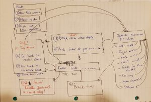
My very first instincts was to make a Harry Potter themed escape room. I quickly foresaw logistical issues with this, copyright being a big one. Also,  I would have gotten VERY carried away with that. So I stuck with a more generic idea. I started brainstorming on paper first, because I wanted the links to be clear for me before I began making them on Twine.  As Bolter (2001) states: “the physical unit of a writing technology helps to define the conceptual unit” (p.43). I wanted the conceptual idea of my escape room to make sense and this paper version provided the clarity to easily reproduce it on Twine. This is what one of my early planning sheets look like:

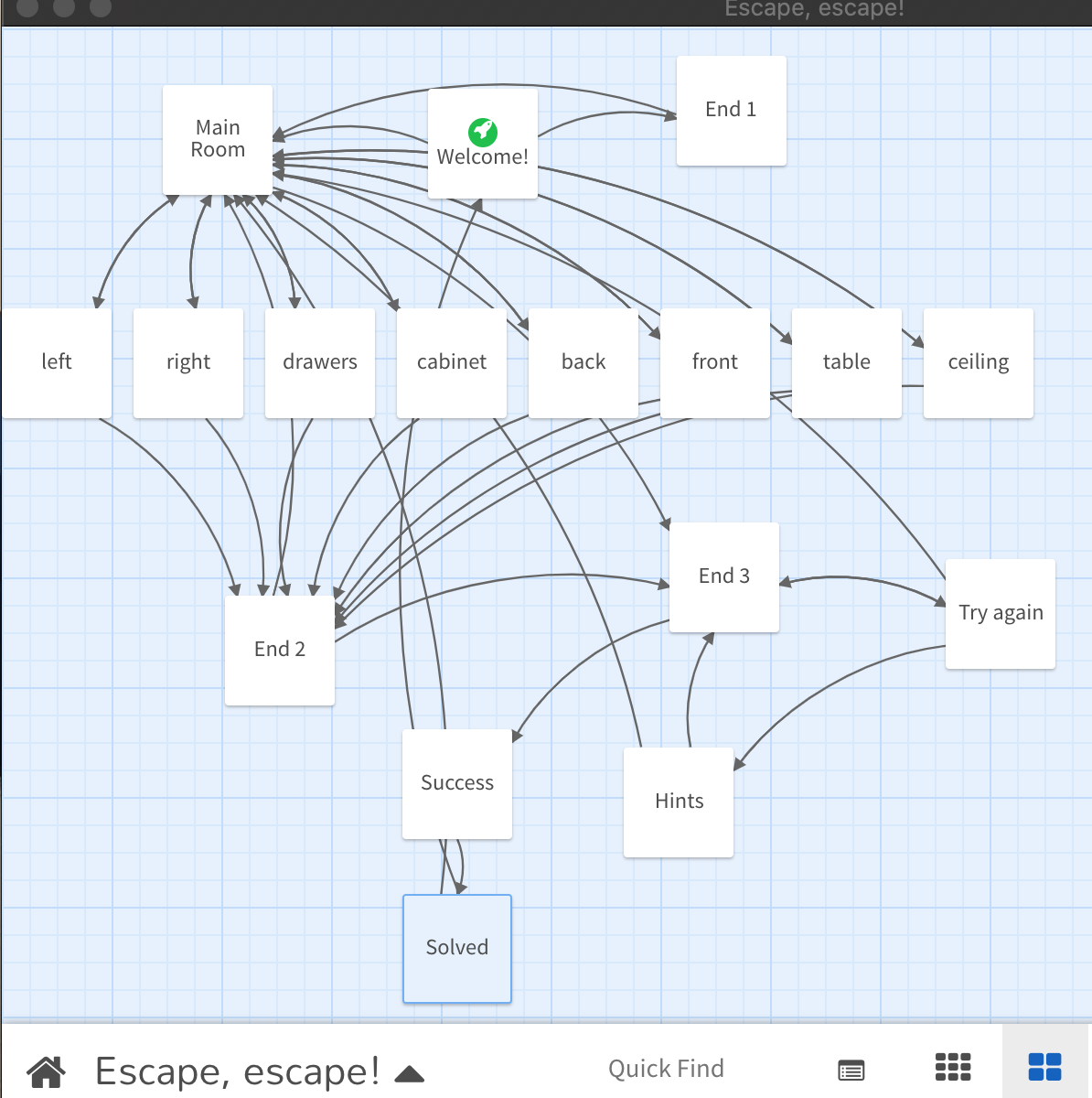
It is easy to see how network-like this looks already. The feature image above represents the actual network tree for the Twine story. As Miall and Dobson (2001) explain the non-linearity of hypertext and how it is “writing with places”, it is evident from these images how true this is.

After this initial organization, I made the clues and puzzles on paper first, at least a skeleton of them, then proceeded to make them all digitally. I had to be careful about any images I add, as they should not distract from the clue searching. I also decided against music (although a mysterious tune would have been nice) for the same reasons. I am a huge fan of puzzles and would have liked to make these more complex, but found myself limited by what Twine can offer. However, if I had invested more time, I’m sure I could have learned to embed other externally held puzzles.

The Main Room serves as a jumping off point and links to the locations of the clues. I did not number these links, nor did I put the clues in any particular order in those locations, because I wanted to make sure the “users are entirely free to follow links wherever they please” (Miall & Dobson, 2001). I tried to connect as many links back to previous pages to take advantage of the fact that “hypertext increases individual freedom”. One can see in the featured image above that most links are bi-directional. The player (for the most part) would not need to close the page and re-open it to play it differently.

I also learned how to get set-up a prompt for the final code, and then embedded that into an “if… else..”. clause to lead to either the Success! or Try Again pages. Overall, I had a lot of fun making this Twine and it helped me make further connections between writing, planning, puzzle solving and representing it all digitally. I do think I will make a Harry Potter themed escape room… eventually!

Hope you all enjoy this escape room. Please let me know if you have any feedback on how to improve this, or any ideas/suggestions (collaboration on HP maybe??)

References:

Bolter, J. D., & EBSCOhost. (2001). Writing space: Computers, hypertext, and the remediation of print (2nd ed.). Lawrence Erlbaum Associates. https://doi.org/10.4324/9781410600110

Miall, D. S., & Dobson, T. (2001). Reading hypertext and the experience of literature. Journal of Digital Information, Retrieved from https://explore.openaire.eu/search/publication?articleId=issn13687506::feae30569d02fbf0a7451897e74be20b

Task 4: The Mechanization of Writing

I chose to create a potato stamp because I do not remember ever doing this as a child. I enjoy writing and still write whenever I get a chance, but it is less frequent now. My journaling has also decreased in frequency, but I do still make my weekly plans and to-do lists on paper by hand. I thought that the writing task would not be much of a challenge for me, and the potato stamp would be. I am a perfectionist, and I thought that the imperfect lettering carved on the potato would bother me. I cannot just cross out a mistake and re-write it. I cannot use White-Out to hide it. If I mess up, I will have to make a new stamp. Thus, I decided to give it a shot. The word on my potato stamp was initially going to be “hello”, but since it has a repeating letter, I chose “learn”. Before I set out to cut my potato up, I told myself I should learn how to do it correctly, hence, the word choice. The word “learn” is actually perfect word for me; I am always seeking knowledge and not just because I am a teacher. This could be a new recipe, a new skill, or new vocabulary; it could mean “geeking out” on Harry Potter, Star Wars or the Marvel Cinematic Universe; or it could simply mean learning to be a better person.

The Process:

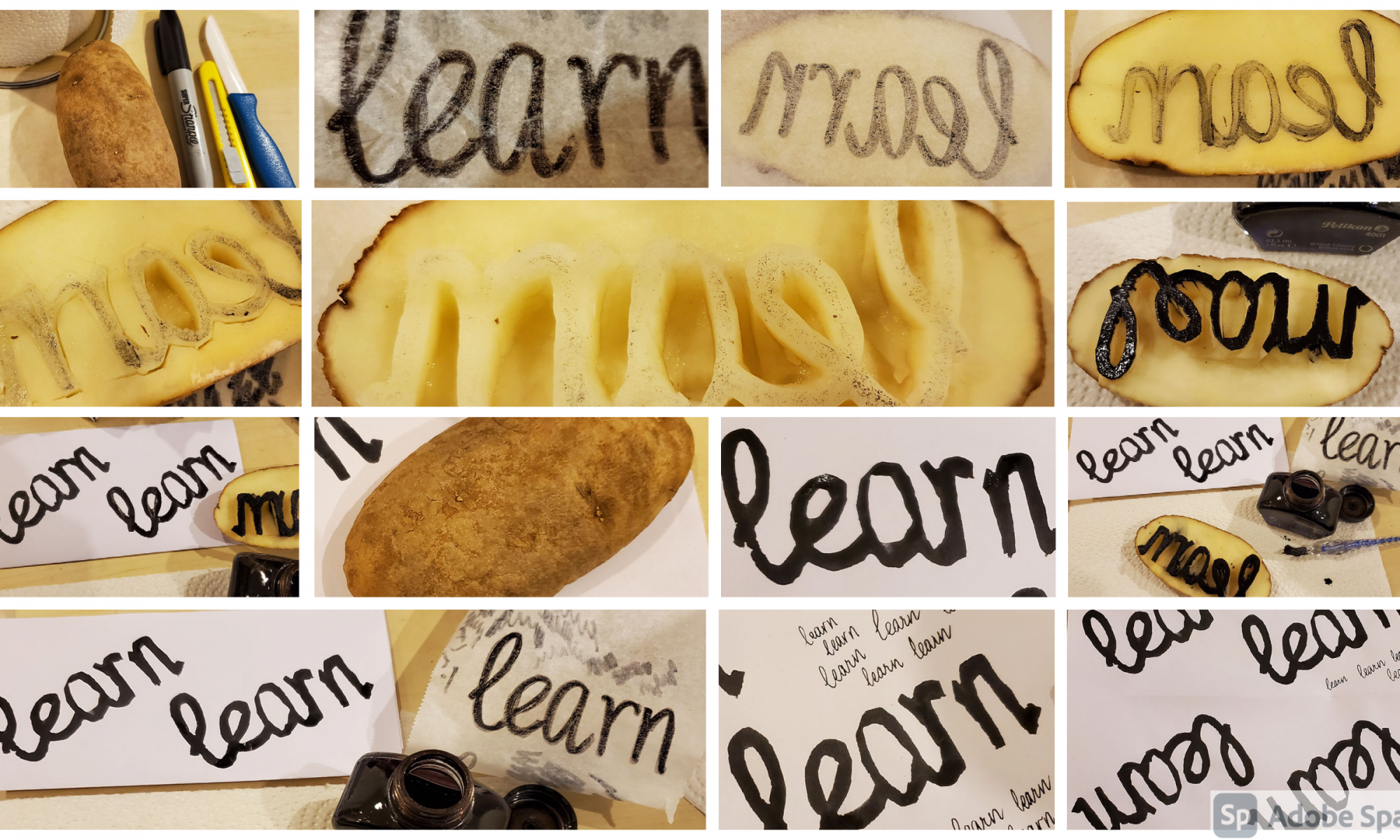
I decided to use lowercase, cursive for my potato stamp because that is how I normally write, and it would pose more of a challenge to try and carve that. I wrote the word “learn” on parchment first because I knew I would have to invert it for the stamp to then print it correctly. As Collier mentions in Cooke’s (2012) video, early printing requires “great consideration; there are no quick highlights and change font”. It requires forethought and planning. I could not just edit the text once it was printed, I would have to start all over again (Cooke, 2012). Rather than imagine a mirror image of the word, I could just flip the parchment paper around and see what the word looks like inverted. I thought of using it as a stencil, but decided to trace the word on the potato just by sight using a Sharpie. However, the Sharpie did not like the wet potato even after I had dried it with a kitchen towel. I kept scribbling on the paper so the ink would continue to flow and was able to make enough of a trace on the potato that I could carve around. This was challenging, as I knew it would be, especially around the curves and inside the letters. I used a sharp ceramic knife and held the blade like a scalpel. Once I was done carving, I knew I did not have any paint, but I do have a lot of ink for my fountain pens. I also do not have a small paintbrush, but I did recently get a glass dip pen, which I thought would be perfect to use for this task. The photo collage above depicts all of the images in order, and here below is a short video of the process as well, and took me between 30 – 45 minutes from start to finish.

The Result:

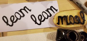
Once I had the word printed on paper, I saw that it looked more like “leam” rather than “learn”, but printed well, nonetheless. I decided to add a bit of a gap in between the last two letters, and ended up carving out more than I wanted to. It looked like “learn” now, with a noticeable gap between the r and n. The printing is almost identical. The letter “a” is a bit bigger than the “e”, more of its inside got carved out and its top left side is thinner than the rest. The “l” and the “e” look quite nice, and I wish I could fix the “r”. Writing in cursive also made me wonder how the old wooden or metallic stamps printed, and if cursive fonts were possible. I also thought about how official forms and documents ask for names to be “printed” on what is clearly a handwritten document. Is it because of the mechanical stamps that we call it printing when we write in distinct uppercase letters? Overall, I am happier with my potato stamp printing than I thought I would be! The imperfections are a reminder of how far printing has come.

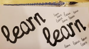
Here below is an image of the word stamped as well as handwritten by the same pen that was used to transfer ink onto the potato:

The Mechanization of Writing:

Although I had fun carving out my five letters and printing them on paper, I would not want to copy an entire book of text, forget illustrations. This task has made me appreciate how the books, pen and paper that we take for granted were at one point luxury items for some. I love “old school” stationery, especially fountain pens, but these have also been modernized. I certainly do not have blood or lead in my inks, or paper that dissolves or rots in my lifetime. The mechanization of writing, or rather, printing, seems inevitable. Its evolution to typing is also inevitable. Personally, there are times when I think writing is quicker and easier, and there are times when I consider typing to be more convenient. As a chemistry teacher, I need to write a lot of chemical reactions and equations. Typing those out and adding symbols, mathematical equations, reaction arrows, etc. although available easily on Word, still feels cumbersome and tedious. Carving that out onto potato stamps is unthinkable and undesirable. Writing out journal entries, or essays, or typing this analysis/reflection, on the other hand, is sometimes more preferable because of the ease of editing. Handwriting, however, seems to have its own charm. I prefer handwritten notes and cards, both as a receiver and sender, because it feels more personal. It has more of an emotional connect and a sense of nostalgia. There are multiple studies that enumerate the benefits of writing to memory retention due to the formation and reinforcement of neural pathways due to reading, contemplating, writing, editing and reading again when one writes. However, in the recent years there are a number of studies that compare the effect of writing vs. typing on memory retention with mixed results. Researchers like Hsiung, Chang, Chen and Sung (2017) and Smoker, Murphy and Rockwell (2009) advocate for pen-and-paper writing for better retention and accuracy, whereas others like Schoen (2012) believe that context matters and typing notes in a lecture context may be more beneficial.

Choosing to write or type based on needs or convenience is a privilege. Not too long ago, this would not have been a choice so easily made, or even possible. Even today, not everybody can choose to type instead of writing. Worse, not everyone has the privilege of learning how to write even. By mechanizing writing and its evolution to the word processors and printers of today, the printed word is ever more accessible in both printed and electronic versions. Even if everyone cannot write, they can have access to texts they can learn to read and then eventually write, hopefully.

Conversely, in the mechanization and ease of access of text, what is somewhat lost is the character and magnitude of how impressive it is to be able to see the printed work come to be. Collier mentions in Cooke’s (2012) video how fascinated his young students are when they see the letters pressed on to the page. The texture, the ink, the machinery, are all remarkable. Printing with the potato stamp, on the one hand, illustrates how easy it is to use any available tool to print with, potato, sponge, wood, etc. On the other hand, it serves to highlight just how much effort and planning is needed to be able to print a whole word, a sentence, a paragraph, a newspaper. Where would we be today without it?

References

Cooke, D. (Producer), & Cooke, D. (Director). (2012). Upside down, left to right: A letterpress film. [Video/DVD] UK: Plymouth University. Retrieved from https://youtu.be/n6RqWe1bFpM

Hsiung, H., Chang, Y., Chen, H., & Sung, Y. (2017). Effect of stroke-order learning and handwriting exercises on recognizing and writing chinese characters by chinese as a foreign language learners. Computers in Human Behavior, 74, 303-310. doi:10.1016/j.chb.2017.04.022

Schoen, Ian, “Effects of Method and Context of Note-taking on Memory: Handwriting versus Typing in Lecture and Textbook-Reading Contexts” (2012). Pitzer Senior Theses. 20. https://scholarship.claremont.edu/pitzer_theses/20

Smoker, T. J., Murphy, C. E., & Rockwell, A. K. (2009). Comparing memory for handwriting versus typing. Proceedings of the Human Factors and Ergonomics Society Annual Meeting, 53(22), 1744-1747. doi:10.1177/154193120905302218

Task 3: Voice-to-Text

there was this boy his name was Harry Potter he didn’t know that she was a wizard funny things happened Jason when he was a kid he was left his aunts doorstep when he was one-year-old Lord Walmart Professor Dumbledore came by left a letter in left hand to be brought up by his aunt and uncle and then on his 11th birthday habitat game by The Doors that he was a wizard go to Diagon Alley for shopping for school supplies I was introduced to the Wizarding World so his first year at Hogwarts starts when he meets 31 and Hermione from the train Hogwarts Express the ultimates meets Neville and they call my phone he goes to Hogwarts said he sees the castle for the first time get sorted into Gryffindor House The Ghost and the professors she is fascinated by the moving staircases and the stalking portraits and the fact how do you learn more about what it is to be a wizard so magical Lord Voldemort his parents before he figures that something fishy is going on at school and he has to go to this hole scavenger hunt to save the Philosopher’s Stone from Riddle and then he goes home for the somewhere and he’s unhappy with his aunt and uncle and he needs to go back to Hogwarts second ear Barbie comes to meet him Dobby the house elf Dobby stops him from going to Hogwarts how do you spell decides to go he’s rescued from his aunt and uncle by it on and said and George was like a car to come and save him and take him to the bus and mrs. Weasley at the burrow Ginny has a huge crush on me cytus II at at Hogwarts we meet Professor Lockhart he’s a most secondary is about Chamber of Secrets in this big monster Syed of Slytherin who is standardizing the place woman’s eye being attacked in a design how to save them he fights Tom Riddle’s memory that comes out of a diary is Voldemort Fawkes the Phoenix comes and helps was the Sword of Gryffindor out of the Sorting Hat Mohican Hills he saves Ginny Lockhart has lost his memory when do second date at Hogwarts ends Eagles home again I’m miserable what is sodium begin Enrique about the prisoner has escaped prison harry blows up his aunt sounds away from home and he’s picked up he stopped off at he calls an environment where the minister of Magic meets him alarms CS black is a subscription is coming to get him and he’s asked to be careful find a city flag he eventually lunch that Sirius Black Roses Godfather and he thinks that he bit she’s fat and send Sirius Black is the reason that can fit inside it eventually he finds out that that is also not true it just because of one thing. You said inside then in Genesis 1 day for the 4th Sirius and Lupin some chilly Wonka jalapenos a professor for defense against the dark arts how do you find out results today when his dad was at Hogwarts Jay saves hippogriff who is Hermione punches Jake Owen this is pretty cool Snape wanted Sirius to be punished the Dementors guard Iglesias gay pretty weird to watch edible CSN Fly Away Chili’s tortilla is over that is 4 cm yeah introduced to the Quidditch World Cup play the whole magical world outside that I owe you all those kids that go to other parts of Sysco Baltimore animate students from other isn’t this the Triwizard Tournament. in the floors Hattie is entered into the tournament LeBron is upset because Cinderella titas in the tournament becomes a for music. Cedric room floor ideas school stabbing how do you just ask you to summoning time able to slide around the first task for the second dose how to save your own from the Moon envelope back late but she decides to wait and Save oxygen and then for the third guy is amazing but I was going to go but the coffee is a Porky hey and said they were treated. Cedric and Hattie iBooks transported to the Vivian and before that he’s able to do anything or say anything Cedric and one more disable and then when Harry goes back to Hogwarts Dumbledore Voldemort has come back but fudge doesn’t believe him and had to get some of his money to Fred and George brother jokes he’s very angry and I think he has ptsd is a court case against him because magic in the presence of a mother Civic guys and you’re supposed to fight them off wsa and then he was almost expelled from Hogwarts said he wasn’t because of and that’s why he goes back to school prefix for Teddy is in but then he has a lot more to fight against it’s on these Visions in his head he saves mr. Weasley pccs being tortured the ministry of magic with his friends sexiest wasn’t there addiction to get the prophecy how about human Voldemort say either one can survive one has to go and of course we know how it goes again for tomorrow eventually and under this Epic Dumbledore and Voldemort before that scene yesterday so that’s sad everybody finds out the full amount is back in the minister finally believes Tumblr and telling the truth so yeah EDM Dumbledore Ryback seems okay they’re ready to fight full more 50 hours / what is 60 or someone who decides to have private lessons with him. enjoyed what you want that very white then they go in this 10 to find out everything about Voldemort so Dumbledore chairs everything he knows with Hetty it feels like the end is coming so how do you learn about Voldemort from Tom Riddle on one of the mission find a hotel American Laser. My condo before work and then uses Expelliarmus on Dumbledore Dumbledore loses one he’s scared by snake or story thing hat is $60 / 100% if he decides he’s not going back to school he’s going to wait until it’s Worth Texas like Reese’s off so he can go exploring on his own to find the rest of the hotel destroyed what did Hermione go with him but phone gets really upset Livingston Parkway the phone one horcrux playnow phone comes back is able to destroy the hookah meanwhile Harry and Hermione had gone godric’s Hollow Ann Hayes Wanda’s booking and Lego to see xenophilius Lovegood San Diego to Tacoma first house they meet Luna and Ollivander go to bills and by the way then Lego Lupin has a baby boy with songs they go to bring arts and bacon to Bellatrix lestranges walk The Sword of Gryffindor no I actually have the Goblin griphook fix the Sword of Gryffindor so now they have to destroy the cough but they don’t have the sword and then as the news of the bay connecting for today just one more than he figures out what’s being stolen Teddy’s after the whole Sexy and then he goes through security and yellow snake with the Headmaster at Hogwarts images of Romania is at home he finds it after talking to Helena she tells him his story the haka it gets destroyed I go to a boiled icing Bengali movie Carmen sleep read dice and look at all of Snape’s memories and he figures that you going back so he goes to face Voldemort alone are you still alive that he comes back and because he sacrificed his life for everyone else they all are safe Texas mom died for humans who kills Voldemort 19 years later he’s dropping his kids off at Hogwarts Express Gainesville station

  • How does the text deviate from conventions of written English?

The text reads very awkward, lacks punctuation and flow. The software seems to have attempted to follow grammar rules, but the whole thing seems illogical and haphazard. It is not easy to read and definitely makes no sense at all. The sentence structure for standard English has not been applied, as the whole text reads like one long run-on sentence. There is hardly a “subject-verb-object” order to the sentences, and some nouns and adjectives do not seem appropriate. There are no paragraphs or transitions to other ideas. However, there are barely any spelling errors in the text, and a lot of the nouns and other references have been capitalized, which was a pleasant surprise.

  • What is “wrong” in the text? What is “right”?

At first glance, everything seems wrong in the text. The grammar, punctuation, and organization of words leads to the loss of meaning, making it difficult to understand what the text is actually saying. However, upon closer inspection, the text actually does have some meaning, it has just recorded everything as it perceived me speaking. I spoke without stating the punctuation “comma”, “question mark”, “period”, etc. thus it did not add them everywhere they are needed. There are some words that have been capitalized though. The software is familiar with Harry Potter, and was able to spell most of the names and locations from the series correctly. My pronunciation, rate of talking, volume, and proximity to the device have all played a role in this transcription. I used my laptop and dictation.io/speech to record what I was speaking. The transcription was distracting so I put my laptop down and looked up at the ceiling while I talked, or paced nearby while talking. The text does not take into account any of my inflections or sarcasm or any other emotions expressed while I narrated. It noted down words as it “heard” them. There is no logic to the text and if I talked too fast, it missed out on some words. What is admirable, though, is the fact that almost all the words are real words and would normally be meaningful. Also, the fictional words from the Harry Potter universe have (for the most part) been spelled correctly – including Voldemort (Walmart once), Ginny, Lockhart, Expelliarmus, Ollivander, Griphook, Dumbledore, etc.

  • What are the most common “mistakes” in the text and why do you consider them “mistakes”?

Some common mistakes include the substitution of words that sound somewhat similar: “talking portraits” became “stalking portraits”, “whole” became “hole”, “summer” became “somewhere”, and so on. These are mistakes because they take meaning away from the narrative even more. The text already lacks the inflection and emotion (and gestures) that a listener may use to make meaning of the spoken words, and these word replacements would confuse a reader even further. Some other substitutions do not make as much sense and are more difficult to decrypt: “the Heir of Slytherin” became “Syed of Slytherin”, “terrorizing the place” became “standardizing the place”.

Besides word substitution, the lack of structure is a “mistake”. Reading the text as a whole run-on sentence was arduous – it barely made sense to me and I know what I spoke. I am curious to see what others make of it. The lack of punctuation, paragraphs, transitions between ideas, all take away meaning, leaving behind a bunch of words placed together. These same words, when spoken aloud, made a lot more sense and put forth a narrative about the Harry Potter series. This transcription is quite far from that narrative.

  • What if you had “scripted” the story? What difference might that have made?

If I had scripted this story before narrating it, I would have better sentence structure, clear punctuation and followed the normal rules of grammar. While narrating this script, I would have added the punctuation words for the software to decode: “comma”, “period”, “next line”, etc. giving the transcription a better form and structure as well. My “thoughts” themselves would have had better flow and structure, I would have all my ideas written down and edited accordingly, chronologically. As I was speaking, I realized how much I had missed out and wanted to add but I had already moved ahead to the next point. In some ways, the text reads random because my thoughts and narration was a little random. With a script, it would have been less awkward, more meaningful.

  • In what ways does oral storytelling differ from written storytelling? 

The idea that intrigued me most this week was Ong’s idea that “[o]ral expression can exist and mostly has existed without any writing at all, writing never without orality” (2002, p. 8). I had not given much thought to the languages I speak and/or write. However, this struck me when I read it and was able to immediately perceive the truth in it. There are so many spoken languages that exist without writing, but there is no way I can read without “saying” the word inside my head, first (or simultaneously, I guess). Upon reading this chapter, I was able to appreciate how literature has evolved from spoken to written, and yet the emphasis we “literates” place upon the written word, while considering the spoken word somehow “inferior”. The written story would be formally written, sequential, and “relatively permanent” (Gnanadesikan, 2011, p. 2). It would leave a mark, literally, on the page, line after line. As Gnanadesikan (2011) further states, “[w]ritten texts can thus convey their message more precisely, adding to the sense that writing is worth more than speech” (p. 5). The oral story could be more emotive despite being fragmented, logical despite being out of sequence, and yet regarded with skepticism despite the fact that most of our history has been passed down by oral tradition. The scientist in me thinks that this is because the written text serves as evidence, support for the ideas they convey; the spoken word, once spoken ceases to exist, it is “inherently ephemeral” (Gnanadesikan, 2011, p. 4) making it difficult to hold on to, to refer back to, to rely on.

Nevertheless, I believe that the written word may also lead to misinterpretation and confusion, if not read with the correct intention. The spoken word, imbued with emotion and gesture, is not as easily misunderstood. Depending on one’s needs, culture, traditions, purpose, etc. one may argue the superiority of one form over the other. However, both are important and need not be mutually exclusive in their usefulness or dependence. As Ong puts it:

“Oral cultures indeed produce powerful and beautiful verbal performances of high artistic and human worth, which are no longer even possible once writing has taken possession of the psyche. Nevertheless, without writing, human consciousness cannot achieve its fuller potentials, cannot produce other beautiful and powerful creations. In this sense, orality needs to produce and is destined to produce writing.” (Ong, 2002, p. 14).

While oral stories may be wonderfully immersive in their right, without the written word they may not (will not) live forever. Oral stories passed down may lose elements that make them beautiful and powerful. The written word need not always be clinical, technical and functional. There are many written stories that are equally, if not more, powerful, beautiful, and wonderful despite their formality. If not for written storytelling, we would not be able to enjoy a lot of the classics from previous generations, and if not for oral storytelling, we would not be able to learn about different cultures, dialects, and pronunciation.

References:

Gnanadesikan, A. E. (2011). The first IT revolution. The writing revolution: Cuneiform to the internet (pp. 1-10) John Wiley & Sons, Inc.

Ong, W. J. (2002). The orality of language. Orality and literacy (pp. 5-15). New York; London: Routledge.

Spam prevention powered by Akismet