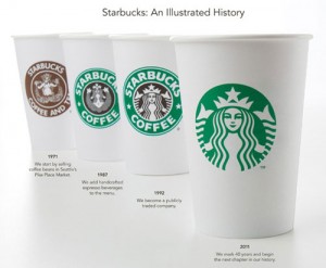
I thought it would be fitting to discuss the logo change of Starbucks as they were my team’s choice of business for our 1st marketing assignment. Being an avid coffee drinker I was quite intrigued when looking at how Starbucks logo/image has changed over the years.
Looking at their present choice of logo, which has no words, I find it more similar to the first logo Starbucks chose. After researching this, it turns out that Howard Schultz, CEO of Starbucks, wanted the company to return more to its roots. This is a strong marketing technique used by Schultz as Starbucks has been having problems due to such large commoditization of their company. They are beginning to be viewed as a “fast food” chain of coffee, when really, their coffee is high quality.
Another reason for their logo change is that Starbucks is not just a coffee company anymore. They serve many different types of drinks, including teas, as well as offering food. Schultz has also stated that they want to be viewed as a more diverse company, and stripping the words off its logo will help do this.
Due to Starbucks having such a strong brand, they are able to have zero words in their logo, yet still have millions of people recognize them. This shows how massive their company is, and how without even including words on their cups, almost everybody can still recognize one. How does Starbucks do this? How is their brand image so strong? To be continued in Part 2…

