
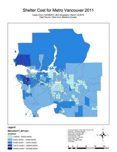
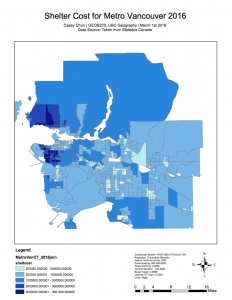
As illustrated below, the maps depict the shelter costs in Metro Vancouver from 2011 to 2016 (as taken from Statistics Canada as a data source). Both maps compare how housing affordability has shifted from 2011 to 2016, with a specific focus on shelter costs.
Shelter costs could be defined as costs that households are paying (monthly) in order to reside/rent/own their dwelling. These costs are showcased throughout these maps in order to indicate the prices induced by households to live in Vancouver. Although this variable is effective in portraying housing affordability throughout Vancouver, there may be issues in areas of economic disparity. For instance in Main Street, the same region has a large transition between cheaper and more expensive housing, thus shelter costs would vary immensely. As shelter costs only look at the price of residing in a dwelling, it does not necessarily represent the price of purchasing private housing, thus may not include critical information.
For more information on the Lab scenario, please see the following link: https://blogs.ubc.ca/caseychun/2018/03/05/quantitative-data-classification-lab-4-housing-affordability/
Maps 1, 2: Shelter Costs in Metro Vancouver from 2011-2016
Full Resolution of the maps can be found below: