Link to Our Website – https://milarad12.wixsite.com/info-419-star-trek
The Objectives of Our InfoVis Design
With our project, we aimed to find and display how diverse the Star Trek franchise is and, moreover, the priority given to certain cast members/characters through screen time, based on the number of lines they speak per episode. The goal was to see how much the franchise emphasizes the minority characters, considering that it is deemed revolutionary for its inclusivity. Characters such as Benjamin Sisko from Star Trek: Deep Space Nine have been said to have contributed to “part of larger more inclusive history in which Africans were the first to go boldly into the unknown,” (Pounds, 2009, p. 228) for instance. In some cases, however, scholars are finding the inclusion of minorities in the franchise to be performative, and so the result is that these groups are being misrepresented. Writing on the “demotion of women,” Tudor and Meehan say that the “Star Trek franchise exemplifies the textual operations of gender in neoliberal, postfeminist media, which frequently make the female roles seem more significant than they are” (2013, p. 130). Scholars have also assessed “how gender and race define certain characters… as the Other,” and therefore how Star Trek “exposes American ideological systems and those concepts that are deemed alien” (Casavant, 2003, pp. 799-800).
Even though a variety of academic research on the representation of minorities throughout the Star Trek franchise exists, much of this research is inaccessible to the general public. These documents also typically include dense academic jargon, making the information even further inaccessible to those with any interest outside the strictly academic. Our aim was to make visuals which would depict the essential information about representation in the franchise clearly and effectively, so as to reduce the barrier of entry to this data.
The Details of the Data Set
The data set we used consisted of six attributes/columns: every line spoken by each character, the character names, and the number of the season and episode each line was spoken in. The title of each episode was also present, although this ended up unused in our final visualizations. The data set included information from every episode of Star Trek: The Next Generation (TNG), Star Trek: Deep Space Nine (DS9), and Star Trek: Voyager (VOY). While there is a limitation present in that this does not represent minority inclusion across the franchise as a whole, which includes twelve television series and many films, books, and other media products, we felt that this would generally represent an effective sample. TNG was a huge success during its original run (Cerone, 1992) and, while they didn’t reach the same heights as TNG, DS9 and VOY were produced and created by many of the same creative forces behind TNG, and enjoyed their own relative success. Reflecting this, these three series are often placed in “top ten best” lists generated by reviewers and fans of the franchise. (Diaz, 2021; Hanson, 2022; Snellgrove, 2022) Due to their popularity, we wanted to find out whether these shows were representative of a large portion of their fanbase. (Gallaher, 2011)
The Tools We Used
In order to clean the data for the purpose of creating information visualizations, we used Excel. In Excel, we manually added two more attributes/columns: one which indicates whether the character/cast member is a racial minority, and another which indicates whether they are a gender minority, by checking every character entry against an associated entry on the Star Trek fan wiki, Memory Alpha (Various Contributors, 2022). We chose not to include sexual orientation in the data, as this information is largely unavailable for most of the cast, and not relevant to the characters they are representing in the show. Using Excel meant this data had to be sorted manually – with tens of thousands of entries, this was a slow process, but due to the nature of the sorting, the only possible way to do so. As a side effect, every entry in the data set was scrutinized, leading to a very low margin of error in terms of data cleanliness. Tableau Prep was used to combine the three data sets, one for each series, into a single unified data set for ease of use.
To create the information visualizations, Tableau was used. Our familiarity with the program allowed us to experiment with a variety of visualization methods, as well as interpret the data through the use of calculated fields. The limitations of Tableau’s suite of visual editing options, however, resulted in some ideas for visualizations being discarded after failed attempts to create these through Tableau. We also included three visualizations made in Infogram which were initially designed in Tableau. The visualizations made in Infogram are simpler, and the way they are embedded match the appearance and animations on the website, which makes them more appealing and approachable.
Analytic Steps
The very first analytic step we had to complete in our design process was to remove characters that, for a variety of reasons, could not have their ethnicity or gender verified. This included uncredited actors, roles that were too small to have any information on the character accessible, and typos or mismatching character names. Additionally, we noticed that some characters were played by the same actor, such as in the case of clones or possession, and so their entries were adjusted so as to only represent the one character. This helped us to prevent unintentionally inflating the data with misleading and redundant entries. Errors, such as null entries or lines with an unknown speaker, were noticed during this process and removed.
Once the information was in Tableau, a few visualizations based on rough ideas were drafted, although some had to be discarded as previously mentioned. From there, we went through a round of analysis on this data – identifying trends, notable data points, data that was well within or wildly outside expected parameters, and other relevant aspects of the data. Using this analysis, our visualizations were revised, and new visualizations were experimented with, so as to best display the relevant and important aspects of this data. With these visualizations complete, we went through a final round of analysis similar to the previous, leading us to our final results.
Design Process
The first step of the design process was rough sketches of potential visualizations – the data set was too large for any even close to accurate drafts to be made by hand, so these were primarily focused on visual design and ensuring the visualizations were utilizing effectiveness through the choice of visual measures. (Fig. 1, Fig. 2) Once the data had been brought into Tableau, accurate visualizations could be drafted, and we could experiment with aspects of expressiveness, (Fig. 3, Fig. 4) making sure that the information contained within the data was clearly and efficiently communicated to the reader through the selected measures, without sacrificing any of our hard won effectiveness (Munzner, 2015, pp. 100-101).
Due to the vast size of our data set, interactions were necessary for any in-depth visualization. This was implemented through the use of Tableau’s filters feature – allowing information to be viewed at a scale of every episode of every season of every series, or on an episode-to-episode basis. In this way, we were able to introduce what we feel is a high degree of expressiveness without the loss of effectiveness that initially resulted from the size of our data creating a cluttered visualization (Munzner, 2015, pp. 111). Overall, the filters allow the user to “limit the number of items in [each] display,” (Heer & Shneiderman, 2012, pp. 4-6) which was crucial in our visualizations, as it would permit both a big picture view as well as nuanced, magnified views that depend on the user’s interests.
In terms of the aesthetics of the website and visualizations, we chose a colour palette based on the LCARS computer operating system from TNG (Koopa, 2017). The hues chosen were distinct and all equally saturated to ensure that the data is viewed as categorical rather than ordered (Munzner, 2015, pp. 223-224)

Fig. 1 – A prototype sketch.

Fig. 2 – A prototype sketch.
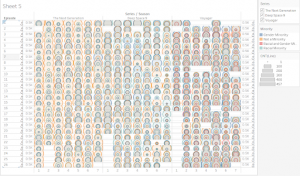
Fig. 3 – A discarded visualization.

Fig. 4 – An early draft of a visualization used in the final results.
The Story
The story that we are telling in our infographic is one that demonstrates the performativity of the effort to include minorities in the casting in prominent roles as the franchise evolved.
The first series, TNG, shows a prominence of white, male cast members. The character with the most lines in this series, and in all of these series overall, is Captain Jean-Luc Picard, who is portrayed by Patrick Stewart, a white male actor. He is followed in line count by Commander William Riker and Lieutenant Commander Data, portrayed by Jonathan Frakes and Brent Spiner, respectively. Both of these actors are also white men. Following these characters are POC male actors Levar Burton and Micheal Dorn, playing Lieutenant Commander Geordi LaForge and Lieutenant Commander Worf. It is with noting that Burton, who has the most lines of the two POC main cast of TNG, has just a little over a third of the amount of lines as Stewart, and almost two thousand fewer lines than Spiner. At the tail end of this are the white, female characters, Dr. Beverly Crusher and Counsellor Deanna Troi, played by Gates McFadden and Marina Sirtis. Each has about 3200 lines across a series with a total of 178 episodes, around a quarter of Stewart’s line allocation. There are no female POC actors in TNG’s main cast. We can see that, initially, TNG was making an effort at diverse representation, but was still heavily prioritizing white, male cast members. The data of representation across the entire cast of the series reflects this as well, although it is worth noting that as the series progressed minority characters were gradually given more lines, and white male characters less, although the hierarchy of minority representation remained consistent throughout the series.
Following TNG was DS9. The main cast of this was notably more diverse. Commander Sisko is the character with the most lines in this series – he is played by Avery Brooks, a POC male. Following him in line count are Kira Nerys, played by white actress Nana Visitor, and Doctor Julian Bashir, played by POC male actor Alexander Siddig. After Bashir are white male actors Colm Meaney, René Auberjonois, and Armin Shimerman, representing Miles O’Brien, Odo, and Quark. Next is Dax, played by multiple actors, both white women, and finally Worf, with Dorn reprising the role. It is notable that most of the main cast of DS9 have a similar amount of lines throughout the series, with only Brooks and Dorn having significant variations, Brooks due to his character’s important role in the show, and Dorn due to Worf joining the main cast partway through the series. This cast is not much more inherently diverse than that of TNG, however the line distribution being much more equitable among minority and non-minority cast members, leading to much more diversity of representation on this series compared to the previous. It is worth noting, however, that this cast also does not include a female poc actor. The overall cast’s line distribution reflects this as well – while representation of white male cast trends upwards, representation of gender and racial minorities are more consistent and consistently higher than that of TNG. Representation of POC women remains low, however.
VOY stars Kate Mulgrew, a female white actor, as Captain Kathryn Janeway. She has the most lines in this series, and the second most lines overall, behind Stewart by less than a thousand lines. Following this are Robert Picardo as EMH, also known as The Doctor, and Commander Chakotay, played by male POC actor Robert Beltran. Next are white male actor Robert Duncan McNeill as Lieutenant Tom Paris, and male POC actors Tim Huss and Garret Wang as Lieutenant Commander Tuvok and Ensign Harry Kim. Following is B’Elanna Torres, played by Roxann Dawson, is notable for being the only female POC cast member of the main cast of any of the series analyzed. Finally are Seven of Nine, played by white female actress Jeri Ryan, and white male actor Ethan Phillips as Neelix. VOY is the most diverse of the three series – its main cast has an equitable distribution of lines, similar to DS9, but is also the most diverse. This is highlighted even further when looking at the representation in the cast as a whole. Minority representation is much more common than in the previous two series, and representation of every minority group trends upwards as the series progresses. It is the only series of the three to break a strict hierarchy of representation – in some seasons, female cast members are given equal screen time as males. Female POC representation is also significantly higher than in the other series, although it still remains low.
We can gather general trends through this data. The franchise, as represented by these three series, begins with line counts dominated by white male actors. As the franchise continues, these characters are given less screen time as a diverse range of main and side characters are introduced, increasing efforts of minority representation, culminating in VOY, which has a remarkably diverse cast represented, in comparison to TNG. A clear hierarchy is still maintained, however, and room for improvement still exists.
Potential Cons of Our Data and Analysis Process
One major con is that our data was not set up to analyze the number of words per line. This means that, while some characters have fewer distinct lines, they may have longer lines and therefore more screen time than other characters who have more but shorter lines. This is also related to the fact that our analysis does not identify the type of dialogue spoken. A character may have thousands of lines which perhaps reinforce negative or inaccurate stereotypes, which does not contribute positively to inclusivity and diversification (Carrington, 2021). A sentiment analysis would need to be conducted, but this type of data analysis is outside of the scope of this project, yet is still very important for a complete understanding of minority representation.
In addition to limiting our scope to just three series in an expansive franchise, our data lacks similar, contemporary data to be compared to. Repeating these analytical steps on shows from the same era and from current times would allow us insight into how the representation in Star Trek fares relative to its contemporaries and to current franchises. Perhaps representation in TNG is lacking, for example, but compared to other shows it is quite progressive? Or vice versa, perhaps VOY was nowhere near as diverse as other shows from the era. These questions cannot be answered without further data analysis.
References
Carrington, R. (2021, February 26). Voyager’s Native American consultant was a fraud. Redshirts Always Die. https://redshirtsalwaysdie.com/2021/02/26/voyagers-native-american-consultant-was-a-fraud/.
Casavant, M. M. (2003). “to boldly go where no other has gone before: The construction of race and gender in star trek”. American Quarterly, 55(4), 799.
Cerone, D. (1992, November 6). ‘Star trek’ –Still on the Beam : Television: One year after creator Gene Roddenberry’s death, the born-again series tops the syndication charts. Los Angeles Times. https://www.latimes.com/archives/la-xpm-1992-11-06-ca-1286-story.html.
Diaz, E. (2021, April 12). Every STAR TREK Series, Ranked from Worst to Best. Nerdist. https://nerdist.com/article/star-trek-series-ranked/.
FoundationINTERVIEWS. (2019, Jan 16). Nichelle Nichols on Martin Luther King, Jr. convincing her not to leave “Star Trek” [Video]. YouTube. https://youtu.be/zrzygziT11I.
Gallaher, V. (2011, March 14). More Female Trekkies Than Male, According To New Survey. MTV. https://www.mtv.com/news/m0qnf3/more-female-trekkies-than-male-according-to-new-survey-demographics-of-star-trek-fans.
Hanson, D. (2022, May 9). Every Star Trek TV Series, Ranked by Popularity. ScreenRant. https://screenrant.com/star-trek-tv-series-tos-tng-ds9-voyager-ratings/.
Heer, J., & Shneiderman, B. (2012). Interactive Dynamics for Visual Analysis. Queue, 10(2), 1–26.
jkingsman. (2021, April 12). Star-Trek-Script-Programmatics. GitHub. https://github.com/jkingsman/Star-Trek-Script-Programmatics.
Koopa, R. (2017, February 17). LCARS-style wallpaper [Image]. Wikipedia. https://commons.wikimedia.org/wiki/File:Lcars_wallpaper.svg#/media/File:Lcars_wallpaper.svg.
Munzner, T. (2015). Visualization Analysis and Design. Boca Raton, FL: CRC Press.
Pounds, M. C. (2009). ‘explorers’ – star trek: Deep space nine. African Identities, 7(2), 209-235.
Snellgrove, C. (2022, September 12). The best ‘Star Trek’ series, ranked. Entertainment Weekly. https://ew.com/tv/best-star-trek-series-ranked/.
Tudor, D. V., & Meehan, E. R. (2013). Demoting women on the screen and in the board room. Cinema Journal, 53(1), 130-136.
Various Contributors. (2022, December 6). Memory Alpha. https://memory-alpha.fandom.com/.
Hi Joseph and Mila,
I really liked your topic! Regardless of the scope of your data (in context of the larger franchise), I think you provided a really interesting and compelling way to tell this data story. I appreciate the consistency of the visuals throughout as well as the extra context provided where it was needed. You’re writing is concise and helps keep the reader engaged throughout! My only feedback would be to perhaps include some examples of significant data points following your interactive visualizations. This could help give users a better idea of what can be found in the data, as it might be daunting to explore since your visualizations are quite complex.
Overall, great job! Even though I’m not the biggest Star Trek fan, you guys told the story clearly and it was really interesting!
Hi Joseph and Mila, very interesting and thought-provoking topic! I really enjoyed reading your design process (especially the prototypes), I think they are very detailed in guiding me through the whole trajectory. The website is aesthetically pleasing, I loved how you choose colors and elements to match the Star Trek theme. The story is very appealing as well, and even though I didn’t watch much Star Trek, the experience of reading its backstory was still engaging. I think one thing to improve would be the interactive viz, adding more explanation to the graphs would make them more comprehensible. Overall, I really enjoyed your project!
The research that was included throughout your writing was reassuring and helped me to understand the matter that was being addressed, I am particularly grateful as I don’t have any prior knowledge on the Star Trek franchise. It’s obvious that a lot of work and care was put into organizing and preparing the data and the results show this. Some other strengths I identified was the intelligent decision to use interactions as an effective countermeasure to the volume of data without losing effectiveness. Furthermore, the website is beautiful and incorporating the interactive elements through Wix was a wonderful experience, it enticed me to further compare and explore different patterns and changes in the data over time.
This was a fantastic project Mila and Joseph, your data told a wonderful story that I did not expect when I first thought Star Trek; this is definitely a cause that is worth investigating with the skills we have developed in class, those of which are clearly present in the Tableau visualizations. It was difficult to think of things to change but if I must scrutinize and nitpick, then I would recommend either removing or brainstorming a different way to present the distinct counts visual aid which appeared in some of the visualizations; I took a while to figure out what the purpose was and given the existing hover function which plainly displays the distinct counts, I don’t think it was a necessary addition that helped me to better understand the data. Also, I wasn’t sure if there was a typo in the design process section or if I am just unaware of colloquial saying but I came across “of every episode of every season of every season”.