By Nyah Gray and Miriam Celebiler
A link to our website can be found here.
Objectives
The English Premier League is the most-watched football league in the world, garnering an international audience of around 1.4 billion people annually. Its players are some of the highest-paid in the world, but there isn’t a standard salary or easily determinable, consistent reason for disparities. Our goal with our visualizations was to analyze players’ salaries in relation to their attributes and markers of success, and try to see if there were any significant correlations. We hoped that these statistics would reveal surprising patterns or even more surprising outliers, possibly providing insights into how Premier League success is measured, and what contributes to a player’s value. The intended audience for our visualizations is Premier League fans, ones who are familiar with the teams by logo and with the players by name, and would be interested in the sport from not only an entertainment perspective, but from a cultural and business-minded perspective as well. The information is still understandable and accessible to a wide audience, however, and could potentially be of even greater interest to a non-Premier League fan who isn’t aware of the economics around the sport.
We aimed at presenting our visualizations on a simple, easy-to-follow website, which guides viewers through our findings and analyses with text and images. Where necessary, certain visualizations are interactive, allowing for the viewer to isolate relevant data points and become engaged with the data.
Data we used
For this project, we created a data set composed of the top 22 players in each of the 2021-2022 English Premier League teams. Each data point consists of the player’s name, their team, their nationality, the total amount of minutes they played during the season, their Instagram followers as of November 2022, and their gross salary for the entire season. We sourced the basic details of each player from the official Premier League Stats Centre website, and we sourced their salaries from Capology.com, a website that covers football finance. To find each player’s Instagram follower count, we had to search them up by name and manually check that they were the correct, verified account before inputting the data.
The Tools
In the data collection step, we used google sheets to compile our data set. Sourcing information from the internet, we manually inputted data into our spread sheet.
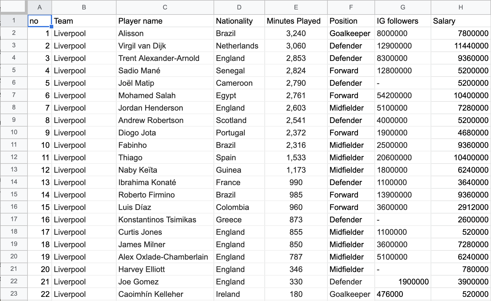
Figure 1: Our dataset on Excel.
Once completed, we brainstormed ideas for how we wanted to represent our data using a pen and paper.
Figure 2: An initial draft of our box plot on pen and a paper bag.
We then ingested the data into Tableau desktop, and used the software to assign the correct attribute type to our attributes, fixing Instagram followers from a sting to a whole decimal and nationality from a string to a geographical region. With our dataset, we created our visualizations in Tableau, using online resources to learn new functions on the software. One of these new functions was figuring out how to use the team logos as marks and another was about changing the coloring of the visualizations. Tableau was the ideal choice for us since it is a strong visualization making software that we already learned how to use. Tableau fit our needs perfectly, though we did have some trouble with publishing to Tableau Public.
After we completed our visualizations in Tableau, we prepared a website on Wix as our final product. The website embeds our Tableau visualizations to maintain interactivity and also allows for text that can guide the viewer through our visual story. We chose Wix because it is easy to use, but some of the negatives that came with using it was that it was hard to work on it collaboratively and it was hard to customize.
Analytic Steps
A lot of our analysis of the data, and therefore the types of visualizations that we would include, had to be done through playing around on Tableau Desktop, and seeing what results we could garner from different iterations of scatterplots and bar graphs. We knew that we wanted to analyze the correlation between salary and total minutes of playing time, as well as between salary and Instagram followers, so we made scatterplots pertaining to those attributes. They somewhat revealed the results that we hypothesized, but not explicitly and didn’t reveal any consistent positive correlations. We included these graphs in our final visualization as they are still interesting and a crucial part of the story we are telling. The analysis of Instagram followers especially was a tricky one, since Cristiano Ronaldo’s extremely high follower count makes him an anomaly that makes the rest of the data appear skewed and minuscule. We thought that this phenomenon was very telling about the “success” disparity between players in the EPL, so we included this as part of our story in the final visualization.
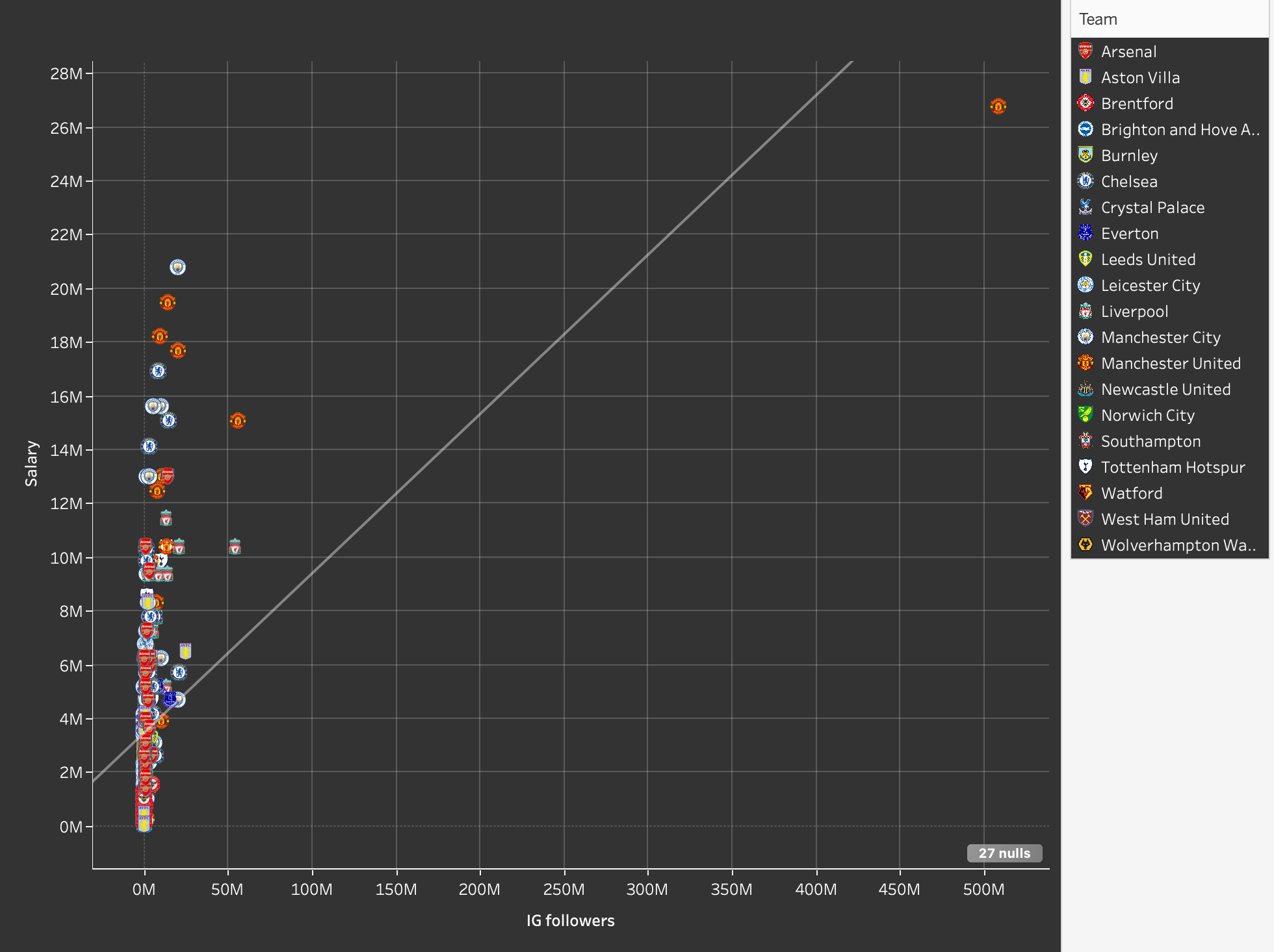
Figure 3: Ronaldo’s Instagram followers as an outlier point.
We found that the inclusion of each player as a separate data point wasn’t as easily readable or informative as we had hoped, so we created a more comprehensive scatterplot which took the average salary of each team. Initially, they were ordered alphabetically, but then we had the idea to add another attribute to compare this data to, which is the final standings of the teams, which we placed them in manually.
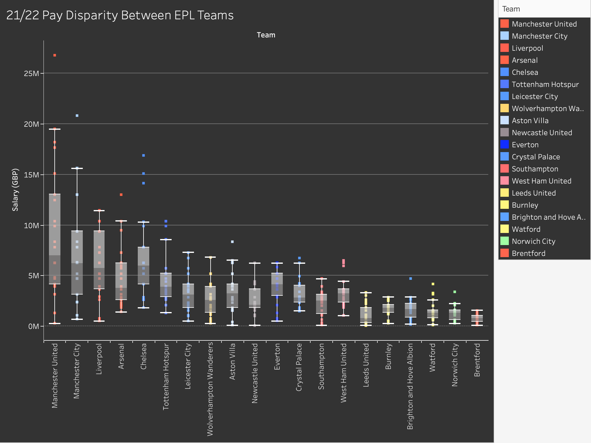
Figure 4: Final box plot showing pay disparity between EPL teams.
We found that the most interesting aspect of our data had to do with salary disparities within teams, or the difference in salary between the highest and lowest players, in other words. To analyze this, we created a box and whisker plot which measured the range of salaries within the teams, and we ordered them from largest disparity to smallest disparity.
Design Process
Once we had all of our data collected, we revisited our proposal and set goals for what we wanted to achieve with our visualizations. Our goals were to see if there were any correlations between player salaries and their time played, as well as how their salaries compared to their Instagram follower count.
As mentioned above, we chose to represent this data using scatterplots. Once we began putting our visualizations for these points together we wanted to be able to visually represent the teams of players to see if that had any impact on the results. At first we used color hue to code circle shaped marks, but since we were working with 20 teams the visualization wasn’t that effective. Instead we chose to use the team logos as the marks, as well as a key for which logo matched which team to the right.
Figure 5: Final scatter plot showing EPL players’ salaries.
We kept the salary on the x-axis to maintain consistency with the visualization that showed salaries compared with Instagram followers. When designing our website we chose a black theme in order to show that our story is not necessarily neutral. It is shocking and dark. With a black website, we wanted to match the color by making our visualizations dark as well. Using the web to figure out how the change the color of the background, different boxes, the text, gridlines, and more, we finally got the visualization’s shading where we wanted it. At that point, some of the logos were not visible against the black background. From our knowledge of opponent process theory as mentioned in Ware (2008), we knew we needed to change the dark blue Tottenham logo to increase visibility. We used the black-white channel by finding a Tottenham logo with a white background to create contrast and fix our problem.
When inputting the data early on in our project, we noticed a huge difference in salaries across teams. We tried a bunch of different ways to visualize the gap. First we made a bar graph, but we ran into the same issue with coloring as we did in our earlier visualizations. We instead opted for a scatterplot, using placement and size to emphasize the differences in average annual player salaries across teams. We chose placement and size because using Muzner (2015)’s explanation of the effectiveness principle, average salaries are quantitative and area and placement are two of the most effective ways to show that.
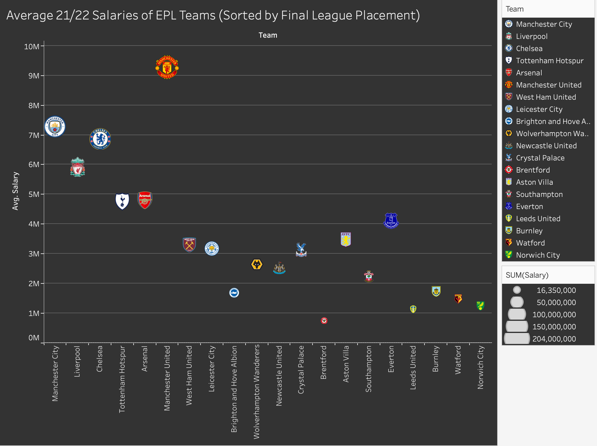
Figure 6: Final team salaries visualization.
Since our visualizations with all the players are very busy, we needed to use interaction to allow viewers to sort the data by team and be see more details on a player using the tooltip. We chose to have players of the same team highlighted on hover because hovering is one of the most intuitive ways to interact with a visualization and we did not want users to skip over the ability to interact. For our visualization of Instagram followers we chose to include one visualization using Ronaldo’s data and one excluding it on the same dashboard. We linked the interaction on the two visualizations so that the hover for teams linked.
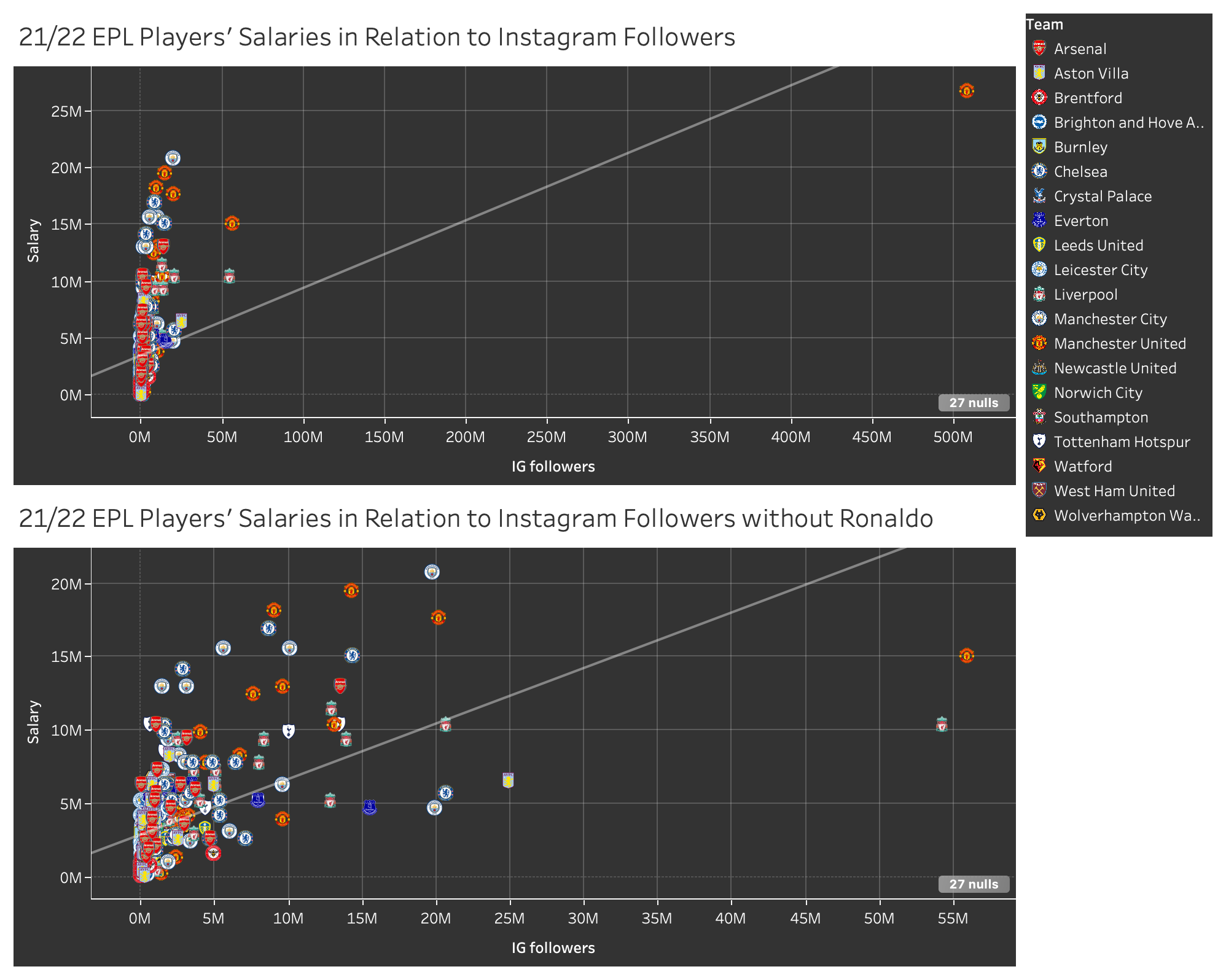
Figure 7: Dashboard of visualizations showing IG followers with and without Ronaldo.
Finally, we made a box and whiskers plot to show income disparity amongst and within teams, we chose a box and whiskers visualization because it was the most effective in showing all of the key differences in salaries by team.
There were also several visualizations we made that we did not end up using in our final story. We tried to make a visualization using some of the other attributes we had in our data set. We first attempted to find a link between position or nationality and salary but we didn’t have enough data to draw conclusions. Then we tried to make a pie chart of the demographic of EPL players. The pie had too many slices to make an effective visualization, so we turned to a chloropleth map instead. The final visualization was not that interesting as most of the players are from the UK. Since the map did not push forward our story either we decided to scrap it.
Figure 8: Scrapped map design.
The Story
Once all of our visualizations had been made, we started thinking about how we wanted to tell our story. A website seemed like the best choice because it allowed us to embed our visualizations and maintain their interactive elements. Our website guides the viewer through four visualizations, prompting thoughts and asking questions throughout the experience.
When we did embed our visualizations onto the website, the color of the logos appeared very overexposed and washed out. We aren’t sure why this happened because the visualizations look the way they do in the screenshots throughout this report when we view them on Tableau.
We started off with a short introduction to get the viewer thinking about our topic. Then, we showed our most complex visualization, showing all the players and how their salary compares to their playing time. From there we guided them to another visualization which shows each player individually, this time comparing salary to popularity. At this point we introduce the idea of stardom and the effect it has on salary. After that, we begin to move away from individuals, showing the difference in average salary between teams. This is where we are starting to move more towards the crux of our project. Our next visualization ties the knot, showing a box and whiskers plot that makes the salary disparity within and amongst teams shocking. We prefaced each visualization with a small description of what is being shown. While each visualization can stand on its own, we wanted the story to flow through words and visuals alike.
We end with a conclusion that summarizes the key takeaways and why this data matters. At the very end of the page, we added a note on where we sourced our data from and how viewers can access our data set. We did this in order to abide by Schwabish and Feng’s “Do No Harm Guide,” and be transparent with our data.
Evaluation of Design
Pros
Our visualizations accomplish what we had aimed for, which is to visualize a dataset in ways that compare attributes pertaining to EPL players that may not have been done before. We made sure to capitalize on effectiveness and expressiveness during our design process and feel that the choice to use the team logos for the individual marks was successful and unique, and makes it easier to digest the data and gain an understanding of it even at first glance. If viewers feel compelled to inspect the data further, they can do so by hovering over the points, and the interactiveness adds an engaging element overall.
Cons
The cons of our visualizations are that some of the data attributes are inherently messy, even if they are technically accurate. For example, the measurement of a player’s minutes on the field may have been impacted by things like injury, and therefore that dataset must be taken with a grain of salt in terms of how accurately it represents a player’s contributions to the team. There is also the con that the logos we’ve used are somewhat complex in their designs, and might confuse viewers at first glance or if seen from afar. In the box and whisker plot, we decided to use hue to encode the teams, and opted for colours that are most associated with the teams, using the eyedropper tool to make them exact. While this is understandable to a well-versed EPL fan, a lot of the colours are quite similar, but we hoped that the inclusion of labels would counteract this con and make it so that each team was still distinguishable.
Also, a con that only occurred once we published our visualizations is that the colours in the logos appear to be quite faded on our website, which they didn’t appear to be during the design process. The screenshots we’ve included in this blog post have the properly saturated colours.
References
Capology. (2022). 2021-2022 Premier League Player Salaries. [Data file]. Retrieved from https://www.capology.com/uk/premier-league/salaries/2021-2022/?fbclid=IwAR0IqWGxxciPJ8DO7_4TwOhV8SumyChvYncsMw-LapSF4IjIJU9vwwkszto
Football TV Audience Figures – Who Is The Premier League’s Most Watched Club? (2022,
October 21). Sporting Index. Retrieved December 6, 2022, from https://www.sportingindex.com/spread-betting-blog/premier-league-viewing-figures#:~:text=More%20than%201.4%20billion%20people,League%20followers%2C%20with%20300%20million.
Munzner, T. (2014). Visualization Analysis and Design (1st ed.). A K Peters/CRC Press. https://doi-org.ezproxy.library.ubc.ca/10.1201/b17511
Premier League. (2022). Premer League Player Stats. [Date file]. Retrieved from https://www.premierleague.com/stats/top/players/mins_played?fbclid=IwAR1cKESBknrnz5eBhF_78n7NC8-m6eacrPk0O_3lEAOfw8StxMhiGIK9lIE
Schwabish, J. & Feng, A. (2021). Do No Harm Guide: Applying Equity Awareness in Data Visualization. Urban Institute.
Ware, C. (2008). Color. Visual Thinking, 65–85. https://doi.org/10.1016/b978-0-12-370896-0.00004-4
Hi you two!
These infovis are so nice — I’m jealous of your interactions! I really love how, kinda like the cereal assignments we had, you highlight the team (league? I don’t know anything about soccer apologies) in both the key and in the infovis itself. Its super helpful. I also found the overall story of your project really interesting, especially the section on instagram followers versus pay and how much more telling it was than the time playing v. pay graph. I also think your choice to omit Christiano Ronaldo in that followers v. pay graph was a smart choice, since he seems to be a bit of a cult figure (even I’ve heard of him!).
There were a few small things I found a bit confusing. I was a bit puzzled, and this might be a me problem, with the choice to have those angle/tilt lines change when you highlighted each player on the IG v. pay graph — shouldn’t a trend line be what the trend is not what it would be if there was only one data point? I may be misreading the graph though! On the range of pay graph (between highest and lowest player) which was SUPER interesting to me and probably my favorite infovis in the project, I found it a bit confusing why the range wasn’t showing between the actual highest player and lowest player. The whiskers seemed to not reach up to the highest players for several teams. I also think those ranges would benefit from having a label display what that range actually is (in numbers!). Those are my only pieces of feedback! Overall, good job! Im also very impressed you were able to gather all this data — that must have been a beast.
Have a happy holidays!
Hi Nyah and Miriam,
This is a fantastic project visually! I am not the target audience for your project as I am not familiar with the English Premier League, but I thought that the questions you asked pertaining to player salaries in relation to the markers of success was a very interesting perspective. I also thought that your website was very visually beautiful. I liked the background that you chose and the sans serif-font. Furthermore, I think you’ve done an excellent job of integrating the interactive aspects of Tableau into your website.
I thought your analysis of instagram followers was particularly creative as a measure of success and popularity. I found it very interesting to see where players fell on the chart. However, I struggled to create meaning from these charts at first, maybe because of the sheer number of players. Are we supposed to see a correlation between more followers equating to more money? I think a little bit more description on the website explaining any possible correlations or lack thereof would be helpful for an unfamiliar audience. If you wanted to, you could even add a still chart of one or two teams to compare their salaries in relation to followers as a case study to see if there’s a measurable connection between the two.
I really liked your visualization of the average salary per team. I thought that you did a good job of explaining its importance and relevance. Additionally, I found your Salary Disparity chart between teams particularly insightful, as it gave me a really clear idea of how player’s salaries ranked against each other within the same team.
I thought it was a great idea to use logos instead of colours for your player salary chart in relation to minutes played. I have a much better understanding of your visualization because of it. I appreciated your explanation about the slight positive correlation between minutes played and salary. If possible, I would consider maybe showing this data as a box and whisker plot in addition to your current visualization as that might make it more clear within teams if there is any correlation.
I think you do a great job of walking the viewer through the story you are trying to tell. For future projects, it may be interesting to explore how player goals or points are related to salaries.
I noticed a small spelling error on your blog post that you may want to change: “Once we had all of our data collected, we revisited our proposal and golf for what we wanted to achieve with our visualizations.”
One more thing I would consider changing is the chat bot on the wix website. It probably popped up as a default setting, but it would be good to disable it.
RIP to this Anthony Elanga player.
A fun football comic that you are probably already aware of, but if you’re not, you might enjoy: http://www.sbnation.com/a/17776-football
Hey y’all!
This was a really sweet project idea and I really enjoyed taking a look through the post. I am a big sports fan but not for football in particular so seeing the numbers you provided relayed in this fashion was quite interesting to read, especially given that I’ve been watching more with the World Cup on (though I know that is separate from the English Premier League.
I thought that the infographics/figures you provided were very impactful and informative. The region map section was extremely well represented as well as your bar graphs that supply good reasoning as to why you decided to express the information like so. I liked the Pay Disparity chart in particular because I felt you communicated the statistics in a way that facilitated understanding from both football fans as well as the average reader who may not know the players or teams but understands what it means to have a pay disparity.
One aspect I would potentially look at editing or improving ahead of Friday’s deadline is potentially clearing up some clarity in the designs. For example, I think that the logos are a bit hard to read and I’m wondering if there is a way to have a more zoomed in view while still representing the entire graph. I think that this could enhance the ability for the average reader to understand, as I mentioned above. Especially on the salary versus minutes played graph. I think this is a super interesting statistic and totally worth representing but it is hard with all the logos stuffed in. However you do explain it well in the sections to follow. I also think you mentioned it that the minutes played are a hard variable to exactly relate to salary because of injuries among other factors. Our project was on team attendance in the NHL and we decided that it wouldn’t be completely fair to display teams with better attendance numbers than others just because their arena has a larger capacity. So we decided to do percent of building full because, for example, one team could have more fans in attendance at let’s say 18,000 but still have 3,000 seats empty while another arena may have only 17,500 fans in average attendance but their arena only holds 17,500 and they sellout every game. So I’m wondering if maybe that graph could display minutes/per game as a stat rather than total minutes to represent injured players and provide a more accurate revealing of the information you wish to communicate.
Awesome job y’all! Happy Holidays 🙂