Short-term Rentals, Long-Term Crises: Investigating Vancouver Airbnb Usage Amidst Housing Insecurity
Objectives
Our project is driven by an interest in how and why it is so challenging for low- and middle-income renters to secure affordable long-term housing in Vancouver. While there are many factors contributing to Vancouver’s housing crisis, one issue we wanted to examine in detail is the impact of short-term rental platforms on the city’s housing supply.
Airbnb, the most successful of these platforms, allows homeowners to rent out their properties to tourists and visitors at a considerably greater profit than can be expected from a long-term rental. Our objective was to examine Airbnb activity in Vancouver in the context of the city’s deeply inequitable housing market, and to encourage readers to explore correlations between these two issues.
We expect that our project will be of interest to Vancouver residents across all income levels and geographic communities. While there have been a number of government investigations and scholarly inquiries into the relationship between Airbnb and housing supply, we have seen little reporting that uses data to tell the story of Airbnb in Vancouver to everyday renters and homeowners. We therefore chose to create a simple editorial webpage that employs a combination of narrative text, static infographics, and interactive visualizations in the service of three goals:
- to provide readers with background knowledge about the state of Vancouver’s long-term rental housing market;
- to inform them of how, where, and how many short-term Airbnb rentals are operating across the city;
- to give them tools to explore relationships between long-term rental cost and availability, and the short-term rental market operating through Airbnb.
Datasets
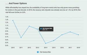
Our visualizations draw from a combination of City of Vancouver reports and open-source data from the website Inside Airbnb. On topics of rental housing insecurity—including issues of affordability and vacancy rates—we derived our data from the “City of Vancouver’s Annual Progress Report and Data Book, 2019”: a 197-page document detailing municipal and census data relevant to housing issues in the city. Relevant tables in this document on subjects like vacancy rates over time, households paying more than 30% of income on housing costs, and median income by neighbourhood required manual entry into Excel in order to be ingested by visualization software.
For map visualizations focussing on Airbnb usage in the city, we sourced open-source data from Inside Airbnb, which compiles and publishes data about Airbnb rental listings for major cities worldwide. We assessed that this data had a high degree of credibility, since it was developed in consultation with data experts, community activists, and investigative journalists, including a local scholar studying Vancouver’s short-term rental market (Cox & Morris, n.d.; Sawatzky, 2016). The Inside Airbnb data is available as monthly sets, so we chose to visualize data in 6-month increments beginning in May 2018: the month after short-term rental regulations were enacted in the city (Housing Vancouver, 2019). To show and group data by neighbourhood boundaries in several of our map visuals, we imported geographical data on “Local area boundary” available through the City of Vancouver’s Open Data Portal (City of Vancouver, 2020).
Tools
Our project has both narrative and exploratory elements: infographics and simple visualizations that give accounts of Vancouver’s long-term rental precarity amid Airbnb’s popularity, and complex interactive maps that invite independent query. This multimodal approach called for a combination of tools: Tableau for map visualizations, Infogram for simple idioms and infographics, and Wix for web hosting and textual narrative. The infographic “Unavailable and Unaffordable: Visualizing the City of Vancouver’s Rental Housing Crisis” was made using Infogram. Infogram’s drag-and-drop design functions were intuitive for customizing designs, and its charts offered responsive, eye-catching interactions by default. This tool excels at facilitating visual, data-driven narratives, but there are many blocked functionalities for free users, which prevented our integrating map idioms, or combining column-line diagrams. For map-based visualizations, we turned to Tableau, which can sustain a high degree of interactivity, several filters and toggles, and the ability to encode attributes along multiple visual channels. Tableau’s mapping functionalities were necessary to visualize the massive, multi-attribute datasets comprising Inside Airbnb’s reports. We found embedding visualizations to be one less-intuitive process in Tableau; it took some trial-and-error to format dashboard sizes and layouts to look seamless in our Wix site.
To knit our disparate visualizations together into a coherent display, we chose Wix for its capacity to embed Infogram and Tableau creations, and for its ease-of-use, since only one team member has experience in web design. Wix was simple to learn and offered all the functionalities we needed to complete the project: text editing for narration, embed widgets for links and iframes, and simple visual elements similar to those offered in Infogram or Canva. While this tool meets our needs for this project, the free site can be a bit slow to load, which could pose accessibility issues for more bandwidth-intensive designs.
Initial Analysis
We were fairly clear on the ideas we wanted to communicate from the initial stages of our project. Our challenge was to make sense of our two primary data sources (the City of Vancouver’s housing reports and Inside Airbnb’s open-source data), which both contain a high volume of information and a broad range of attributes. Our first task was to determine which attributes would be most relevant for us, and where the two datasets intersect.
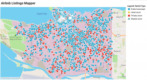
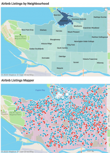
We began by visually exploring a portion of the Inside Airbnb dataset from May 2020. Because one of our goals is to allow readers to see the extent of Airbnb activity across the city, a map idiom was a natural choice. Inside Airbnb provides a GeoJSON file delimiting Vancouver neighbourhoods, which we were able to import into Tableau alongside a dataset containing detailed information on Airbnb listings. Joining these files together allowed us to create a dual-axis map that can display information at the neighbourhood level, but also at the level of individual listings.
Creating this initial view helped us to determine two things. First, we would need to design a handful of interactive filters and parameters to help readers focus on different aspects of the Airbnb data, which can appear overwhelming in an unfiltered view. Second, we would need to provide enough context about the Vancouver rental market to help readers draw connections between long-term housing inequities and Airbnb activity.
One stumbling block we encountered was a dearth of long-term rental housing statistics that align with the neighbourhood boundaries as defined by Inside Airbnb. This made it difficult to represent both sets of information in the same view. We chose to address this by introducing our project with a set of infographics that contextualize Vancouver’s housing crisis. In this section, we compare several attributes: rental costs relative to income, and vacancy rates over time. We also include two additional Tableau-generated maps to help readers see income disparities between renters and home-owners, and between different Vancouver neighbourhoods. Our hope is that this information sets the stage and prepares the reader to meaningfully engage with the Airbnb visualizations that follow.
Design Approach
Our design approach was informed by an analysis of our target reader and their tasks. As Munzner states, before we can begin designing: “we must understand the cognitive tasks and visual queries a graphic is intended to support” (p. 14). We therefore sought to define our objectives according to our imagined reader’s top-, mid- and low-level goals.
At the highest level, our reader’s goal is to analyze data about Vancouver’s housing market in order to make new discoveries or increase their understanding of the topic. By framing our visualizations within an editorial narrative, we supply a hypothesis: that Airbnb exacerbates the existing housing inequalities in Vancouver by competing with the long-term rental market. Our reader’s task is to use our visualizations as a way to verify or disconfirm that hypothesis.
As described above, we decided to introduce readers to our topic with infographics and explanatory text. According to Lankow et. al, readers are drawn to formats that are “efficient, engaging and entertaining” (p. 45). Our infographics therefore feature an attractive header image, clean typography and ample white space in order to generate appeal. Charts are supported by simple descriptions and feature hover interactions with information-on-demand in order to assist readers with comprehension and retention.
Next, we chose to include a series of maps that integrate our quantitative and categorical data with base spatial data. Neighbourhoods within Vancouver are delimited by area marks using given geometry, while non-spatial data is encoded in one of two ways, depending on the level of detail required for analysis. The principles of expressiveness and effectiveness were carefully considered in each case in order to avoid misrepresenting the data and to ensure that readers’ visual queries could be served as rapidly as possible. This required distinguishing between our quantitative and categorical attributes, then choosing the most effective visual channel available for each one. These resulting maps take two forms:
- Several choropleth maps encode quantitative attributes (median income; percent of income spent on housing; number of Airbnb listings) at the neighbourhood level, where the degree of colour saturation shown for each neighbourhood indicates values.
- A dual-axis map encodes individual Airbnb listings as point marks layered on top of the neighbourhood geometry. In addition to showing each listing’s geographic coordinates, these marks encode categorical data about the type of property shown, using hue to distinguish rentals of entire homes from private or shared rooms.
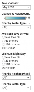
Finally, we sought to support our readers’ search tasks by supplying several means for them to manipulate the visualizations. Our map views include multiple ways to filter out data in order to focus on specific elements or relationships. They also make use of tooltips that appear when the user hovers over a specific neighbourhood or a specific mark. These help to reduce clutter in the view, while providing readers with “information-on-demand.” The two maps showing Airbnb data are coordinated, so that when the user applies a filter or makes a selection, both views are automatically refreshed. This enables multi-dimensional exploration, and helps the reader make visual queries and comparisons across both maps simultaneously.
Storytelling
The website we created does not offer a story with a defined conclusion, but instead, we sought to give an open-ended account of how in recent years, Airbnb operations have flourished in Vancouver, while also posing potential threat to long-term rental affordability and availability. In telling this story, we follow Thudt et al’s (2018) suggestion that both exploration and explanation belong in data-driven stories:
While explanation is a powerful way to provide a narrative for readers and orient them within large and complicated issues and data sets, exploration enables readers to make their own inquiries, personalize their reading experience, and get a feeling for the limits and the shape of the data. Providing exploratory power can also be a way to communicate complexities in the data and mitigate some of the biases inherent in providing a narrative. (p. 61).
The infographic “Unavailable and Unaffordable” is one example of an explanatory approach. In it, we use simple visualizations and narrative to demonstrate how even though rent has largely kept pace with Vancouver’s median income in the past decade, those prices have merely remained too high; over one-third of renters spend an uncomfortable portion of income on housing, and vacancy rate has lowered to exacerbate Vancouver renters’ precarious situation. When renting a suite as an AirBnb for 10 nights brings 30% more income on average compared to long-term leasing, this profitability certainly threatens long-term rental stock.
The rest of our website—and its focus on interactive maps—is more exploratory in nature, with the intent of letting visitors personalize their search, inquiries, and conclusions about Airbnb usage in Vancouver, the effects of regulation, and housing insecurity. We preface each map with brief explanatory text and prompts to motivate interaction. In the last two maps for instance, users can query the efficacy of Vancouver’s short-term rental regulations, observe the prevalence of Airbnb usage in their own neighbourhood, and note the impacts of the COVID-19 pandemic on listings. Since short-term rental regulation and housing precarity remains a developing issue in the city, it seemed most appropriate to conclude inconclusively: to invite further questions into this unsettled debate.
Pros and Cons of our Approach
By applying our knowledge of information visualization design techniques and strategies, we were better able to represent the data in this data-driven narrative. Diagrams in our introductory infographic move in response to the user’s scrolling, and this draws the user’s eye toward their content as a central narrative component. Moreover, the infographic offers a moderate degree of interactivity, since their data points are selectable, and legends can be toggled as filters; these interactive elements encourage visitors to spend additional time with each visual, and to reflect on the written analysis that surrounds it. At the same time, the infographic’s layout and colour scheme is fairly minimal. While different attributes in a line graph are encoded with different hues for contrast, the same blue and green colour scheme operates throughout the infographic to minimize unintentional visual distraction. Ware’s (2008) contention that “a visual object [that] is distinct on one or more of the visual channels . . . can be processed to direct an eye movement” (p. 42) can be read both as a suggestion and a note of caution. Harnessing the viewer’s attention can be a careful balance, so our design choices reflect a desire to aid—rather than impede—the reader’s visual search.
The maps in our site’s latter half were designed for high interactivity, in order to promote self-guided exploration and analytic insight. All make use of various filters to accommodate users’ diverse search habits and queries, and in recognition that—as Heer (2012) explains—“analysts often want to shift their focus among different data subsets” (p. 4). Our map designs also reflect adherence to principles of effectiveness and expressiveness as best was possible; neighbourhoods are spatially segmented to align with city geography, orders of magnitude like listing numbers and income are encoded using hue and saturation, and in the last map, rental types are distinguished using dots with contrasting hues. Lastly, detailed tooltips in Tableau maps enable users to dig further into the detailed attributes corresponding with a mark label. Together, these design decisions assist visitors to intuitively observe patterns like where, for instance, rental affordability is worst in the City. They also empower our audience to personalize their investigations into these connected issues, to consider the impact of short-term rentals in their own neighbourhood, and to draw their own insights.
Some possible weaknesses of our designs reflect data limitations. For example, comprehensive neighbourhood-specific data on rent for Vancouver does not exist in a way that can be mapped without building custom polygons, since the existing data only refers to “rental market zones” that differ from neighbourhood boundaries. As a result, users are sadly not able to determine if rental affordability by neighbourhood corresponds with relative average rent. Similarly, the first set of diagrams in our infographic compare slightly different year spans, and this is due to income data only being available for census years. Another minor limitation of our design might be the clarity of neighbourhood labels on maps. Although we did customize their placement so as not to overlap, we were not able to constrain the width of text labels or reduce their font size any further, so longer text strings like “Kensington-Cedar Cottage” intersect with other boundaries in a way that might cause momentary confusion.
Works Cited
Cox, M. & Morris, J. (n.d.) About Inside Airbnb. Retrieved from: http://insideairbnb.com/about.html
City of Vancouver. (2020). Open Data Portal. Retrieved from: https://opendata.vancouver.ca/pages/home/
Heer, J. Shneiderman, B. (2012). Interactive Dynamics for Visual Analysis: A Taxonomy of Tools that Support the Fluent and Flexible Use of Visualizations. Queue, 10(2), 1-26
Housing Vancouver. (2019). Short-Term Rental Highlight Report. Retrieved from the City of Vancouver website: https://vancouver.ca/files/cov/short-term-rental-highlights-report.pdf
Lankow, J., Ritchie, J., and Crooks, R. (2012). Infographics: the power of visual storytelling. John Wiley & Sons.
Munzner, T. (2015). Visualization analysis and design. Boca Raton: CRC Press, Taylor & Francis Group.
Sawatzky, K. (2016). Short-term Consequences: Investigating the Extent, Nature and Rental Housing Implications of Airbnb Listings in Vancouver (Master’s Thesis, Simon Fraser University, Burnaby, BC). Retrieved from: https://summit.sfu.ca/item/16841
Thudt, A., Walny, J., Gschwandtner, T., Dykes, J., & Stasko, J. (2018). Exploration and explanation in data-driven storytelling. In N. H. Riche, C. Hurter, N. Diakopoulos, S. Carpendale (Eds.), Data-driven storytelling (pp. 59-84). CRC Press.
Ware, Colin. (2008). Visual Thinking for Design. Morgan Kaufman.
Hello Lian and Jessica,
I cannot access your two Tableau interactive maps…
Hi Lydia. I believe you need to be signed into Tableau Online in order to see the embedded maps.
I modified the permissions of each dashboard to give view and explore access to all users (just realized that wasn’t enabled by default). Let me know if you still have issues and thanks for the heads up 🙂
Great website! I love the overall design of the website. It’s very clear and easy to read. The topic you chose is excellent, because it’s a well-known and relavant topic to most people who live in the Lower Mainland.
When I went to view the webpage, the last two infovis (embedded from Tableau) did not work for me. I got a message saying “Resource Not Found.” It also required me to sign in to Tableau Online in order to try and view them. I wonder whether this might be a barrier for most people to view your content since they might not want to go through the time and effort it takes to create an account. However, from the screencaps of the infovis you posted in the blog, I can see that those infovis are important and necessary, so trying to find a different way of re-creating them outside of Tableau would be out of scope for you to do before the deadline. I appreciated that you explained what the different filters meant and prompted some questions for the viewer to think about while exploring the infovis.
For the infovis that you created were all very clean, clear and easy to read. I liked the variety of idioms you chose to express the data. However, I’m uncertain about the trend lines used in the first infovis (Renter household income vs owner household income). The angle of the trend isn’t easy to compare because the angles are so similar. I wonder if a different idiom might show the difference better. I also noticed that the second infovis numbers don’t match up. One is 32%, the other is 52%, so who are the other 16%? Some explanation of this would be very helpful.
Overall, I liked your project! I do recommend strengthening up the introduction and making a more prominent thesis statement (like in the blog post: “Airbnb, the most successful of these platforms, allows homeowners to rent out their properties to tourists and visitors at a considerably greater profit than can be expected from a long-term rental.”) because I spent half of the time wondering how rental rates were influenced by Airbnb. While this is shown, having this information at the beginning will prevent the viewer from being confused. Additonally, even though you mentioned wanting to leave it open-ended, just ending the webpage in that way made it feel really incomplete and that I, as the reader, was left hanging. Maybe you could suggest some further reading, or some questions for the person to take away and think about.
Ah, I forgot to mention that an idea out of scope for this project but might be interesting to explore would be to compart Vancouver to other major cities to see whether this is an overall trend with Airbnb, or whether there’s something specific about Vancouver that makes this problem worse than usual.
Hi Amanda,
Thank you for your super-helpful comments! The angles in that first infovis is very similar but that was intentional; this section explains that–oddly–rents have kept pace with income nearly exactly in terms of % increase. We can definitely think about how to revise this to make the conclusion more apparent. As for the one where it looks like the “numbers don’t match up,” this is because the diagrams are of two separate populations: % of subsidized renters paying over 30% on housing, and % of non-subsidized renters paying over 30% on housing. Again, this flags for me that the design or context has caused confusion, so we can work on emphasizing that these are related but different populations, and these numbers need not equal 100%. Thanks as well for the thoughts on developing some concluding words to end it more meaningfully; makes a lot of sense.
Cheers,
Lian
Hello Lian and Jessica,
Very good job on your Term Project so far! Your blog is very well written and your website is well-crafted.
Highlights of the blog include how well you explain your objectives and the rationale of the design of your website, along with your tools section. (I can now access the map visualizations.)
Highlights of the website are numerous. One is the simple, but effective colour scheme, that, as you wrote in your blog, assists the viewer by “minimiz[ing] unintentional visual distraction”. Along with a good use of hue, you have strong contrasts between the text colours and the background, plus the font type is easy to read. Another highlight is the fact that when you hover over the legend, there is highlighting of a specific section of a chart, creating a popout effect. However, it was not obvious to me that I could do that, I accidentally stumbled across that function. Perhaps you could add some more tips about how to interact with your visualizations?
Another highlight is the choices of chart types in your infographic, along with the aesthetically related choice of the charts looking like meters. However, the placement of the number on top of the pointer could be confusing to some viewers. Perhaps you could put the total percentages in the middle of each section of the meter instead?
One suggestion I have is to add small perpendicular lines to the axes’ lines of the charts to show where the categories lie e.g. for the years in the first set of infographics. Another suggestion I have is to have a vertical line for the y-axes of the same charts since it could be somewhat ambiguous which line the labels apply to e.g. $85K. Also, it may be better to have an x-axis line on the bar chart as well for improved clarity. Additionally, I think it would be beneficial to have the axes of the first three charts to start at zero: it appears that they start at $600, $30K, and 0.4% unless I am reading the graphs incorrectly. I also appreciated the use of alliteration in the name of your infographic.
Good job on the interactive visualizations’ designs. For example, by allowing the option to declutter the map through filtering and combining more than one source of information into your maps. It is also beneficial that you connected your two map views together for easy comparison.
Good choice of using chloropleth maps. I like how you included labels of the names of the different neighbourhoods and I appreciate how you keep your colour scheme throughout your whole website. Another small suggestion I have is to perhaps change the colour of either “Entire home/apt” or “Shared room” because they are quite similar colours. Also, perhaps instead of having a white border around the dot marks you could have a black border around them to make them more distinct?
It is also beneficial that you provided some examples of questions to guide the viewer.
Another suggestion I have is, if possible, to figure out a way to prevent a viewer from zooming out past a certain point in your visualizations (if you cannot figure out how, that is fine). Or perhaps you could disable the zoom function? I sometimes accidentally zoomed out…
Other developments related to this project could be doing this sort of analysis for a different geographical location or looking at data of a different short-term rental platform.
Overall, very good job! 🙂
Regards,
Lydia Huey