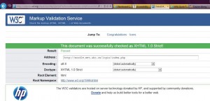
After carefully examining my Moodle LMS site and cross-referencing it with the Quick Tips guide on the Website Accessibility Initiative (WAI), I then checked my LMS site using the Markup Validation Service at: http://validator.w3.org/. I was pleased to see that the following message appeared: “This document was successfully checked as XHTML 1.0 Strict! Result: Passed.” I also noticed that I could put a “valid” icon on my LMS site to show users that I have developed an interoperable Web page. The next step for me now is to add the associated HTML for the “valid” icon on my LMS page. 🙂
Overall, I found this to be a useful exercise and consulting the top 10 list from the W3C site helped provide guidance about the key principles of accessible website design. I’ve included the list below as a reminder:
10 Quick Tips
1. Images & animations: Use the alt attribute to describe the function of each visual.
2. Image maps. Use the client-side map and text for hotspots.
3. Multimedia. Provide captioning and transcripts of audio, and descriptions of video.
4. Hypertext links. Use text that makes sense when read out of context. For example, avoid “click here.”
5. Page organization. Use headings, lists, and consistent structure. Use CSS for layout and style where possible.
6. Graphs & charts. Summarize or use the longdesc attribute.
7. Scripts, applets, & plug-ins. Provide alternative content in case active features are inaccessible or unsupported.
8. Frames. Use the noframes element and meaningful titles.
9. Tables. Make line-by-line reading sensible. Summarize.
10. Check your work.Validate. Use tools, checklist, and guidelines at
http://www.w3.org/TR/WCAG
© W3C (MIT, INRIA, Keio) 2001/01
2 replies on “E-learning toolkit: All about Accessibility”
Well done!
Thanks John! 🙂