Category Archives: Uncategorized

The Final Products

Overall, I am very happy with the final products. I wanted to create renderings that told the story, were fun, and more stylistic than photo realistic. The part that I am most happy about it the pencil sketch textures that I used on the wood pillars. This made them stand out, but not be too overwhelming. Originally, I was also going to show brick in my “Chocolate Lab” rendering, however after putting a brick texture in the image, it took too much attention away form the people and the wood columns. I think that I made the right decision because the materiality and story I was trying to portray came through more successfully by not using too many textures.

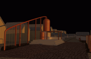
I am also happy with the “Hidden in the Fabric” night scene. However, I did have difficulties with how to collage that surrounding buildings. I did not want to draw people’s eyes to the surrounding buildings but I also had to make them have the same style as the rest of the rending. In the end, I decided to use a light grey texture on the buildings. I think it was the right choice, but if I would do it again I would continue to experiment with how to best represent the surrounding buildings in this render. Overall, my goal was to bring attention to the refuge space and to portray a sense of protection and warmth through using the lighting in this night scene.

Rendering Process: Sketch-Up and Photoshop

So far, the process has been fairly smooth. My experience in Sketch-up has really helped me be able to create the rendering scenes that I want. It is the photoshop part that has definitely been more difficult and time consuming, as this is my first time using photoshop. I have watched a lot of youtube videos to learn how to do photo collages and it has been really helpful. The tools that have been the most helpful for me have been creating clipping masks and using the clone stamp tool. For lighting, I have been using curves and blurs.

For my “Hidden in the Fabric” render it is important that I have the right lighting and am able to create the mood I want for the night scene. For the “Refuge” and “Chocolate Lab” I want more of my time to be spent on showing the materiality of the wood columns, but I also don’t want to take away attention from the programming that takes place in each space. My goal is to create renders that are well crafted, tell the story, and simplistic.

Rendering Dilemma

The biggest question that I’ve had trouble with is, what work flow and programs should I use to create my renderings? I have gone back and forth on this question a lot. On one hand I would like to use Sketch-up because I have a lot of experience with it, and on the other I would like to try Rhino, because after creating the Hulk, I know I could easily model in this program. My second question is, will I photo collage in photoshop or also use keyshot?

In order to help answer my own questions, I have decided to experiment using all of these approaches. I have modelled my building both in Sketch-up and Rhino and I have rendered one using the photo collage technique and the other using Keyshot. After this experimenting, I have decided that I am going to use Sketch-up and then photo collage the image in photoshop. I am much happier with the atmosphere I was able to create in my test images using these techniques, than using rhino and Keyshot. Rhino and Keyshot did a good job, but it was almost too realistic for what I was wanting. By using Sketch-up and photoshop I am confident that I can create the lighting and more fantastical experience that I am going for. I guess we’ll find out!

Choosing the Scene

The first step that I’m taking with our final renders is choosing what story I want to tell. For my final project, I am designing a chocolate shop for women facing adversity to find work and refuge within. This Chocolaterie will provide spaces for reflection, creativity, and the community. I want one of my renders to show the inward looking space of the refuge and the other to show the outward looking cafe and community space. I think these experiences/scenes define my project well and I hope that I can use them to tell the story. The next step is choosing what methods I want to use to make the renders!

Editing and compositing renders in Photoshop


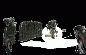
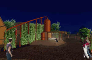
Below, you can see the basic steps that I took to transform the render right out of Rhino into my final product. I added people, plants, texturing on the cabinetry, and some extra lighting (seen as the white blobs that did not transfer well into GIF form).

undoctored-renderrender-photoshopped-stuff


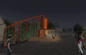
Then I added a sky, and made many adjustment layers, primarily hue and saturation. Above is the render without adjustments, and below you can see much of the hue/sat taken out of parts of the render that I don’t want people to focus on.

Then I did all of the same for render number two, and that’s that!

render--hue-sat

final-render

Texturing Studio Project, Part 2

When I modeled my studio project scene, I wasn’t always thinking about the use of those modeled objects for my final render. I ended up with quite a few objects that needed to be split so that they could be textured properly. The houses and sheds were some of these – these are really just a background in my project, not important to my actual design. Nevertheless, I found I had to split the buildings from their roofs in order to apply any sort of convincing texture to them. Thankfully, this didn’t take long at all, and once I had textured one, I was able to match the texture for the others, since they are all exact duplicates of each other.


modeling for render 01

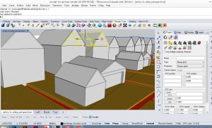
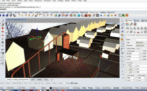
I ended up texturing my entire scene in Rhino, then rendering out for editing in photoshop. Rhino’s version of clownpass, material ID, ended up being invaluable for this step.  Here is what the scene looks like as a screenshot, and then actually rendered:

texturing-for-render

undoctored-render


Texturing studio project part 1

I decided to do my texturing and rendering through Rhino and v-Ray rather than Keyshot, for two reasons. One, I really wanted to learn v-Ray. Two, my computer couldn’t handle my scene in keyshot, so I really had no choice!

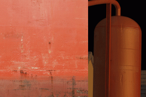
It ended up not feeling that difficult, although I clearly have much to learn. I found texturing with vismats pretty straight forward, as these are already set up to wrap and tile well. The downfall of the vismats is that I found they gave you a pretty generic texture, tiled evenly over the entire object. For the focal part of my project, the Big Red Anaerobic Digester, I wanted a little more detail, so I created my own texture from an image of a weathered steel panel. This detail took a while, but gave the texture more definition. See below for the bitmap that I used for the colour and bumpmap, compared to the final render of my tank.

brad-texturing

Modelling studio project

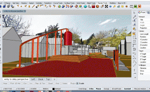
Modelling in Rhino became a big part of my final studio project. I modeled as a design tool – to quickly test out spatial ideas – and produced many virtual iterations of my project. The Rhino model then became the basis of many final drawings, including plans and sections, diagrams, vignettes, and of course my final renders.  Below is a screen shot of my final design, as viewed in Rhino shaded mode.

modeling-for-render

Modelling this scene was quite easy in comparison to modelling my Walter White figurine, although I did struggle quite a bit with figuring out how to model sidewalks, pathways etc. that conformed to the sloping topography. I ended up first making my topography as a solid object, then projecting the lines from my paths and sidewalks down onto it. I then used those lines to split the topography, so that the sidewalks and paved areas were separate objects, but still had the same contours as the ground topography.

Render #2: An Indoor scene at Twilight

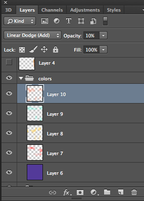
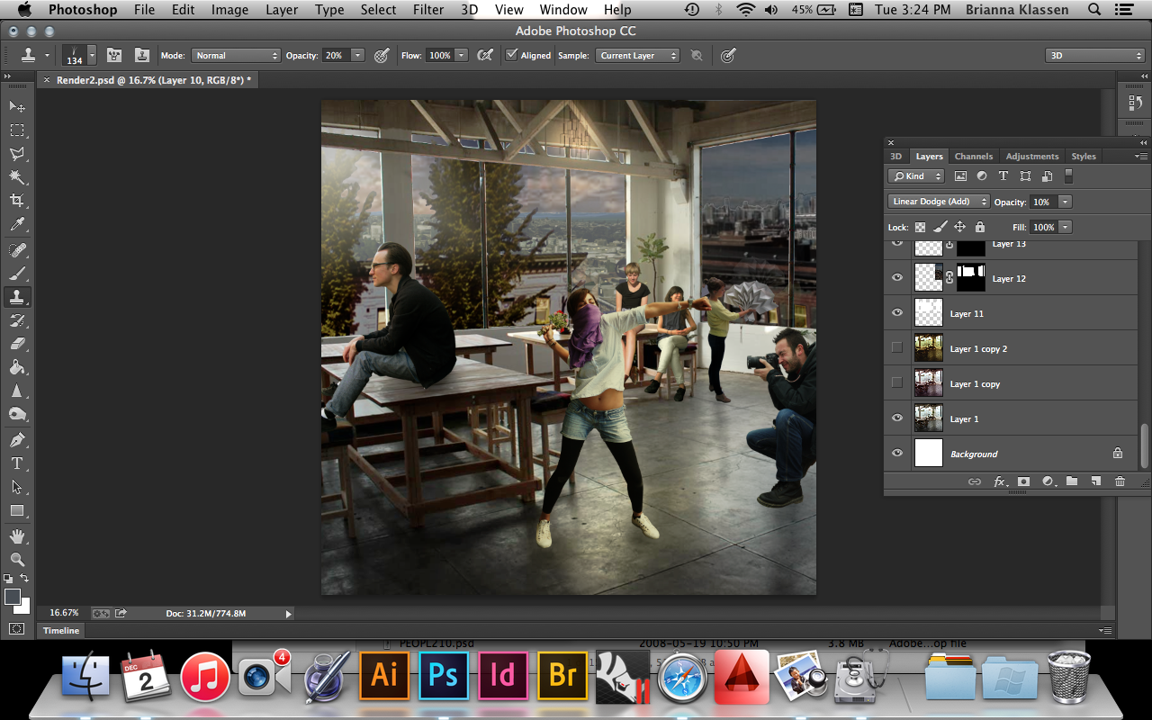
For my second rendered image, I wanted to take two new challenges: First,  creating a scene at twilight, and second, adding an artistic flare to the image. My scene is of the interior of an art studio, so I wanted to illuminate the ‘art’ of the render by putting in some lighting and mood filters. My main strategy was to learn more about layer settings, and experiment with the various lighting and colour effects they can offer a render. Screen Shot 2014-12-02 at 3.18.14 PM

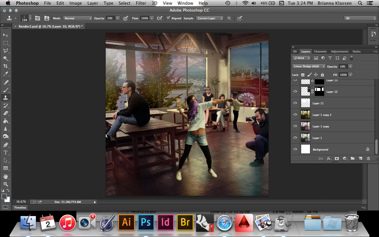
Above: using a soft brush of a light hue of colour, I was able to create lighting effects using the ‘linear dodge’ setting on photoshop, which creates a lighting mood from the painted colour.  I also experimented with the overlay, screen, and soft light layer settings to simulate interior lighting and reflections/refractions. Following are the before and after images showing the differences in the lighting effect:Screen Shot 2014-12-02 at 3.24.24 PM

Above: before colour effects

Below: after colour effects

Screen Shot 2014-12-02 at 3.24.48 PM


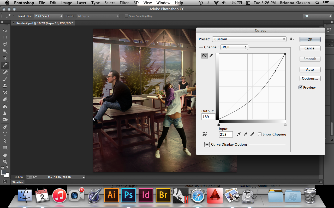
In order to create the illusion of twilight, I used the curves function to distort the amount of black and white input from the light and dark elements of the collage. After applying this to the background buildings, a few additions of orange light to the windows make the city appear to be at dusk as well.


Screen Shot 2014-12-02 at 3.26.45 PM


The Hulk FINAL

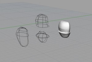
I added more complex geometry to the base surfaces I created the week before by intersecting shapes and adjusting them using control point editing and cage edit. I went back to the curves I used for the other surface and added to them to continue the fluid forms.

I make the legs of the pants one surface and then split the surface of the torso to them edit the surface further and adjust the curve network to create the crotch area of the pants. This way I could have the shape of the legs district from the rest and create the lip of the pants against the torso.

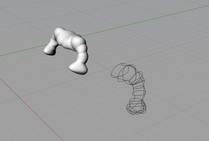
Arms were constructed very quickly using circles that were placed in the middle of each muscle and at the crease where the muscles would meet. This technique extended into the chest so that when the surface was mirrored, there is an indent delineating the pecks.

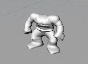
The abs and back muscles along the spine were edited using control point edit and cage edit.

pants
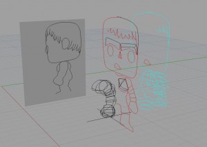
Left to right: Curves from picture frame used to create curve network, pant legs, torso split into two, lip of the pants
torso
Adding to existing curves to create a smooth, continuous surface for the pants to be added to the pant legs.

armsarms final

Circles used to create the prominent muscle structure

BODY

resulting form