In order to move forward with our spatial analysis, we first wanted to assess our data. Thus we compared our data in terms of crops, drought, agricultural plot lands.
Crop Comparison
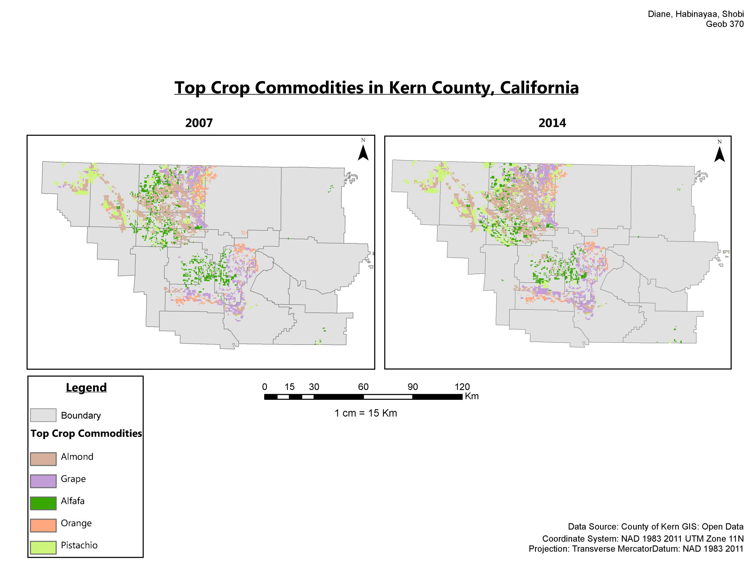
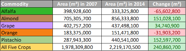
Kern county’s agricultural data for both years encompassed all of its agricultural commodities. We queried the data using SQL to only include the top five crop commodities of the county (alfalfa, almond, grape, orange, and pistachio). From the map that was produced (Map 1) we created a table (Table 1). Alfalfa and orange decreased in area from 2007 to 2014, while almond, grape and pistachio had all increased in area. Although 2014 was a more severe drought year, more land area was being utilized has farmland for the crops.
Drought Comparison
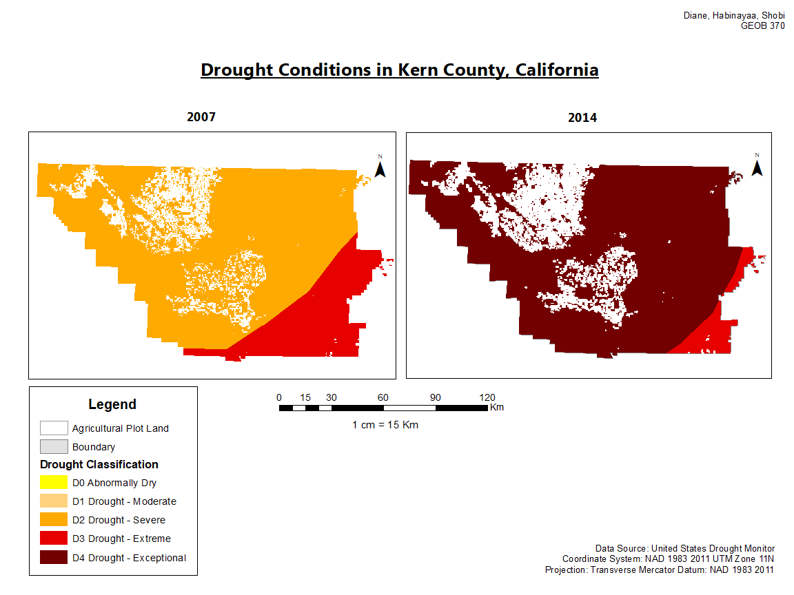
In order to assess the impacts of drought conditions on the top crop commodities planted in 2014, we compared the variation in drought conditions of Kern County in 2007 and 2014 (Map 2). From Map 2, we found the drought conditions in Kern was more severe in 2014 than 2007. Thus we hypothesized the conditions of the crops and the impacts of the industry would be negative. To note, the majority of the agricultural plots reside in one classification of the drought intensity scale. There is little variation of drought conditions within Kern County which may skew the effectiveness of our spatial analysis.
Agricultural Plot Comparison
Through our research of 2007 and 2014 agricultural land use, we found that there were a lot of changes with land use. Annually, there are changes in land use from agricultural to urban use and vise versa. Thus, we prepared Figure 1 to better grasp the changes in agricultural plots for the assessment of our spatial analysis results.
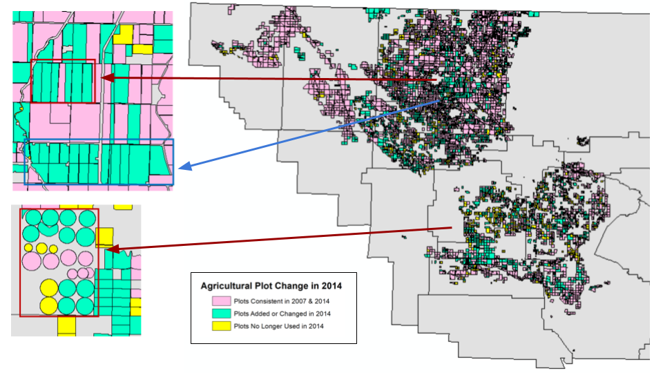
In Figure 1, there are three key land use characteristics we have highlighted. Plots labelled in pink indicate the plots have not changed at all from 2007 to 2014. Plots in green indicate the plots have changed in 2007 and 2014. They have been changed by either separating one large plot into several plots or transforming a plot for agricultural use by 2014. Plots in yellow indicate the plots existed in 2007 but no longer exist by 2014.
Examples of land use changes are included in the insets in the figure above. In the top inset, the red box has outlined areas in green that used to be a larger plot in 2007. The blue box in the same inset has outlined green agricultural plots that did not exist in 20007. In the bottom inset, the red box has outlined green agricultural plots that did not exist in 2007.