
Introduction
In this assignment, I reflect on how the design choices in the game “User Inyerface” influenced my behaviour as a user and heightened my awareness of manipulative design practices in online spaces.
The “Attention Economy”
Digital platforms are constantly competing for our attention. The “attention economy” describes the ongoing, often hidden, competition among technology companies to capture and retain user focus (Harris, 2017). Social media, video games, and mobile apps all vie for this one finite resource from its users – our attention (Harris, 2017).
Dark Patterns
To maximize our engagement and their profits, companies frequently employ manipulative design tactics that encourage users to make unintended decisions or spend more time on their platforms. These tactics, known as “dark patterns,” are intentionally deceptive user interface designs (Brignull, 2010).
Common examples include:
- Hidden costs or fees
- Automatically adding items to a cart without clear consent
- Misdirection through layout or wording that distracts from important information
- Confusing language (e.g., double negatives) to manipulate user choices
- Forced subscriptions or automatic charges after free trials without clear reminders
- Hiding key details in dense text or fine print
- Default opt-ins for data sharing or marketing
- Concealing negative feedback while highlighting positive reviews
- Deceptive wording that appears transparent but masks the true intent
- Selecting design variations (via A/B testing) that increase conversions, even if ethically questionable
The Game: “User Inyerface”
“User Inyerface” is a satirical website designed to expose manipulative interface design patterns that create frustration for users. The designers intentionally built the site to trick users, revealing how deceptive and confusing web design practices, known as “dark patterns” (Brignull, 2010), can shape user behaviour. The game’s design choices mislead, pressure, and confuse users into taking actions they did not intend. Ultimately, “User Inyerface” highlights the importance of ethical user experience design and exposes the subtle techniques used to capture attention, drive engagement, with the goal of exploiting the user to increase company profits.
Description of the experience playing “User Inyerface
Home page
 The interface initially appears inviting, with an eye-catching blue background, a clean logo, and simple design. A large green button in the centre of the page seems like the logical way to enter the website. The button’s colour, reminding me of a traffic light, feels encouraging. It enlarges when I hover over it, further enticing me to click. Although it reads “NO,” the text isn’t enough to dissuade me. However, clicking the button does nothing. The actual instructions are hidden in small, dark text beneath the button, barely noticeable. Normally, hypertext links are underlined, so it seems natural to click on the word “click” since it’s underlined. Meanwhile, “next page” appears in a different colour, also suggesting a hyperlink. The true link, however, is hidden in the word “here.” Success! I’m finally into the website.
Screen 1 of 4 – Email and Password 
The first screen is overwhelming. An immediate case of information overload. As I attempt to read the instructions, a distracting red notification banner appears at the top: “This site uses cookies, is that a problem for you?” The “Yes” button is highlighted to draw attention, but clicking it does nothing. The only way to dismiss the banner is to choose the confusing double negative “no, not really.” Flashing numbered buttons (1, 2, 3, 4) alternate colours, adding to the distraction. I try to complete the form but quickly become frustrated. The tab key doesn’t work, and the placeholder text doesn’t disappear when I click into a field. The password requirements are unnecessarily complex. I even have to look up what a “Cyrillic” character is. The terms and conditions section is another trap: the double negative between “I do not accept the Terms & Conditions” and the warning “Please do NOT forget to accept our terms and conditions” makes it unclear what to click. The “Next” button is a muted grey, while “Cancel” looks like the action button. Accidentally hitting “Reset” forces me to redo the entire form.
Countdown Window
Next, an alarming but useless pop-up box appears with the message “Hurry up, time is ticking!” accompanied by a green “Lock” button that seems like the next step. Clicking it turns the button red with the word “Unlock.” When I try to close the window using the “X” in the corner, it expands to cover the entire screen. Eventually, I realize that the only way to close it is through the faint text at the bottom “©close©” where the copyright symbol makes the link even harder to notice. I finally click it and return to the main screen, but the countdown continues to pop up randomly, adding ongoing distraction, annoyance, and frustration.
The Help Box The help box in the bottom-right corner behaves unpredictably. The button I assume will close it instead expands it to fill the screen. The “Send to bottom” option minimizes it, but very slowly. The “Help” button offers no real help, it only displays the message “485 people in line,” increasing by one every time I click it.
Screen 2 of 4 – Profile Photo and 3 Interests
The “Download image” button appears to be where I should upload my profile photo, but it simply downloads a generic avatar image to my computer, completely irrelevant to the task. The screen also asks me to select three interests, yet every option is checked by default. After some frustration, I find the small “Unselect all” button, which saves me from having to manually deselect each option before choosing three.
Screen 3 of 4 – Personal Details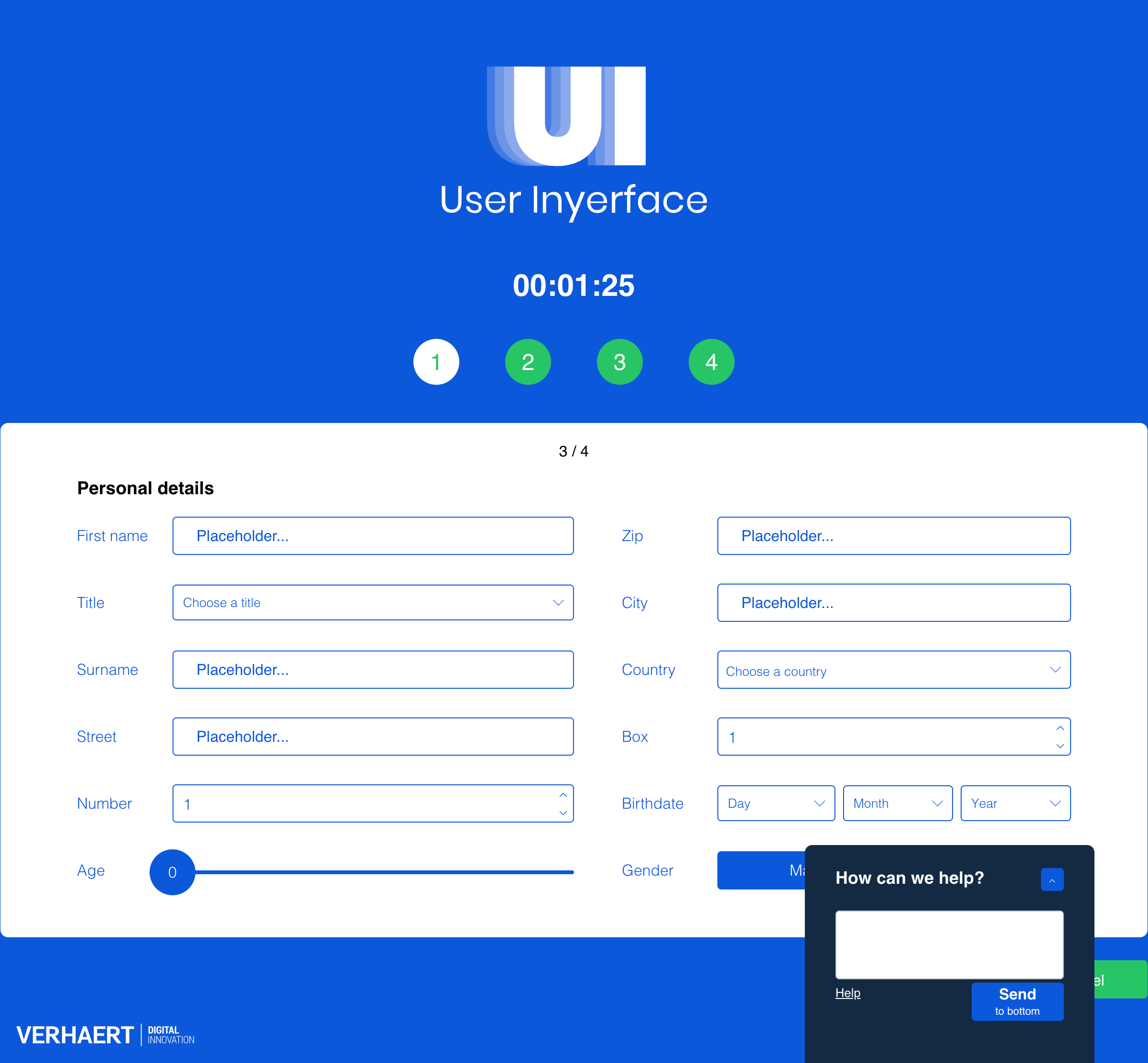
On this screen, usability continues to decline. I can’t tab between text boxes, and there’s no explanation for the numbered field. I must click up on the control box to choose a number instead of simply typing it. The age slider needlessly goes up to 200, and the months in the birthdate dropdown are not in chronological order. Countries are listed only by flag, which is confusing, and the warning message “age and birthday don’t match” highlights redundant data collection. The “Title” and “Gender” fields are also misleading. Although “female” appears highlighted, “male” is actually selected.
Screen 4 of 4 – Proof that you are human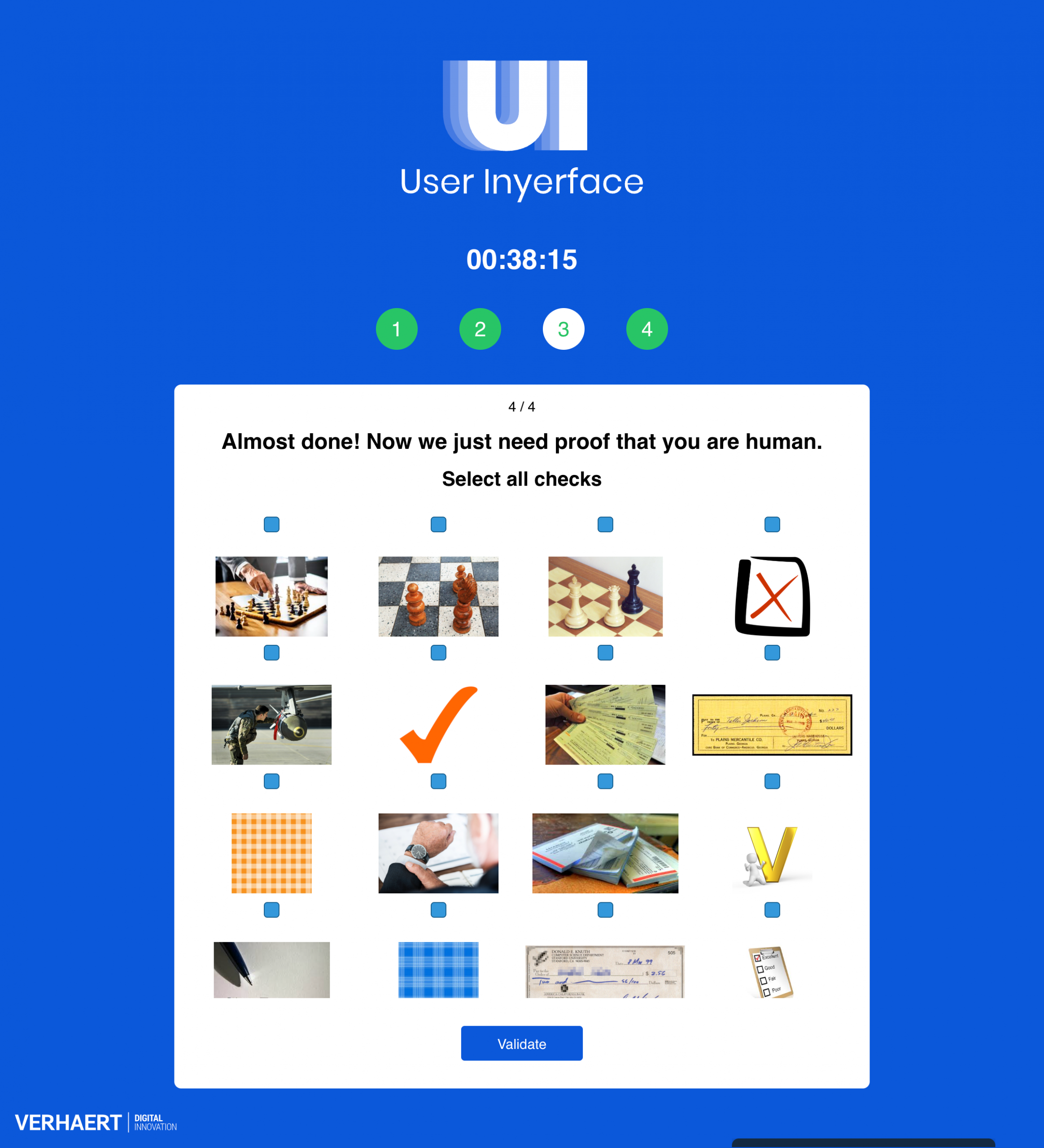
The final screen asks me to prove I’m human. There are 16 images but only 12 visible checkboxes. After several minutes of frustration, I realize I need to scroll up within the window to reveal the remaining boxes. The instructions tell me to select all the “checks,” but the images show various interpretations of the word including checkmarks, checkmates in chess, checkerboards, bank cheques, and people checking an airplate, illustrating how language ambiguity with homonyms adds confusion. Other examples include “glasses” (as eyewear, windows, or drinkware), “circle” (as a shape, the Earth, or a basketball), and “light” (as in brightness, fire, feathers, or weight).
Final Reflection

Playing “User Inyerface” was a frustrating yet eye-opening experience that revealed how easily users can be manipulated by design choices. Every interaction from misleading buttons to confusing language illustrated how interface design can exploit human attention and habits. These “dark patterns” are intentionally crafted to delay progress, capture focus, and push users toward actions that benefit the platform rather than the individual. This mirrors the broader dynamics of the attention economy, where digital products are designed to maximize user engagement and screen time, often at the expense of user’s autonomy and trust. Experiencing this manipulation firsthand deepened my awareness of how ethical design is not only about usability, but also about respecting users’ time, consent, and cognitive load.
As a former web designer, I approached the website with a basic understanding of user interface design principles, yet I found myself repeatedly frustrated when things didn’t work as expected. Misleading layouts, misdirection, intrusive pop-ups, double negatives, deceptive instructions, and other dark patterns all contributed to my irritation.
During my first attempt, it took me 10 minutes and 47 seconds to complete the game. I began the exercise feeling amused, but that quickly shifted to confusion and frustration. Ironically, these emotions kept me on the site longer as I second-guessed my actions and reread the unclear instructions. I played the game a few times afterward, curious to see if any of the instructions or patterns would change. They were the same with the exception of the second last screen with the checkboxes.
The sense of outrage I felt, similar to what Harris (2017) describes, compelled me to share the link with my family to observe their reactions. Soon, we found ourselves exploring the website neal.fun for additional humorous examples of poor user experience design.

Figure: Screenshot image from neal.fun
This experience left me reflecting on a critical question: How can designers promote honest, ethical, and user-centred design instead of manipulative ones? Technology is not neutral and as Harris (2017) argues, it has become a race to reach deeper into the user’s brainstem to capture attention. This process strips users of their agency, subtly manipulating where and how we focus our time.
Similarly, Tufekci’s (2017) concepts of “persuasion architecture” and “surveillance authoritarianism” reveal how those in power use hidden algorithms to monitor and influence our behaviour, exploiting our vulnerabilities through our devices. This kind of manipulation calls for immediate ethical accountability and design reform or a digital renaissance.
AI disclaimer: ChatGPT was used for brainstorming an outline and to edit my writing for grammar and clarity. All ideas and final edits are my own.
References
Bagaar. (2019). User Inyerface [web game]. https://userinyerface.com/
Brignull, H. (2011). Dark patterns: Deception vs. honesty in UI design. A List Apart, 338. https://alistapart.com/article/dark-patterns-deception-vs-honesty-in-ui-design/
Harris, T. (2017). How a handful of tech companies control billions of minds every day [Video]. TED. https://www.ted.com/talks/tristan_harris_the_manipulative_tricks_tech_companies_use_to_capture_your_attention?language=en
Tufekci, Z. (2017). We’re building a dystopia just to make people click on ads. [Video]. TED. https://www.ted.com/talks/zeynep_tufekci_we_re_building_a_dystopia_just_to_make_people_click_on_ads?language=en