BACKGROUND INFO: TERMINOLOGY NETWORK STRUCTURE AND GRAPH THEORY
Vertices, vertex, nodes = an entity and we can ascribe some value to; each person or song in the visualization is a node; they have static properties that can be quantified.
Edges, links, ties, relations = can be defined as a relation of some sort between two or more nodes; represents a shared choice between participants.
Degree of connectivity = degree of a node in a network is a measure of the number of connections it has to other nodes; some songs will have more edges, showing popularity or shared preferences; all participants should have 10 edges.
Weighted graphs = type of graph in which each edge (connection between nodes) has a numerical value, or weight, that represents the strength of the relationship between those nodes; edges could reflect the strength of connection (e.g., number of shared songs).
Communities / clusters = Groups of people connected by similar selections from subnetworks or communities.
Limitations of representation = the network shows connections, not reasons; it captures structure, not motivation or context.
(Source: Systems Innovation, 2015a; 2015b)
INTRODUCTION
The purpose of Task 9 was to explore how networks or graphs can represent patterns of connection between participants based on our song selections from Task 8 and what songs we would choose for the Golden Record.
Each student in our ETEC 540 class submitted their final ten songs they selected for the Golden Record which we then uploaded via a JSON dataset to Palladio.
Palladio is an interactive visualization tool developed at Stanford that helps humanities scholars explore and interpret complex historical data, revealing patterns and relationships through graphical analysis (Stanford University, n.d.).
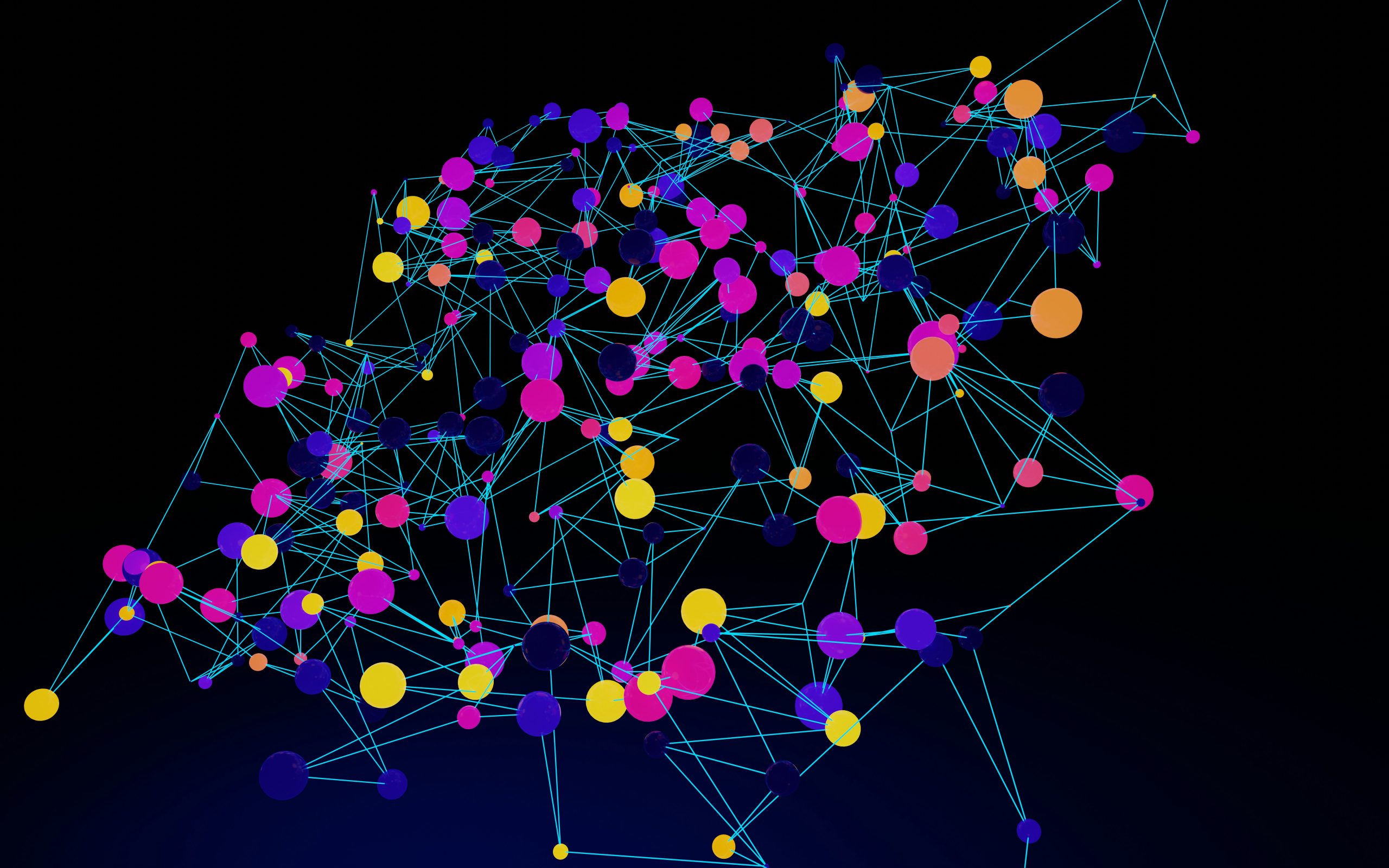
Palladio plotted the JSON dataset containing each student’s ten musical choices from the Golden Record and the resulting network diagram displayed how each participant (vertices or nodes) are connected through their common song selections (edges, links, or relations) (Systems Innovation Network, 2015A).
Palladio created communities and we were able to analyze which people had a higher degree of connectivity based on our song choices. In graph theory terms, this social network is a graph composed of two types of vertices or nodes – people and musical selections – connected by relational edges that reflect shared choices. Through this exercise, abstract mathematical concepts such as nodes, edges, connectivity, and clusters were applied to interpret social data.
The visualization showed several distinct clusters where groups of participants were highly connected through similar selections. For example, Bach’s “The Well Tempered Clavier” was chosen by 14 people so it has many edges radiating outward and a high degree of connectivity, whereas Stravinsky’s “Sacrificial Dance (Rite of Spring)” was only chosen by one person, so there is only one edge and a low degree of connectivity. These nodes function as hubs that link otherwise separate groups of participants, and nodes with many connections are more visible in the network.
QUESTIONS FOR REFLECTION
What patterns or clusters do I notice in the Palladio network?
Figure 1: All data, grouped by person and track
This is the data after I imported the JSON file. The track numbers are highlighted and sized based on the number of connections it has.
Figure 2: Tracks and how many people chose each song
Songs that had a lot of people choose it, have many edges connecting them and larger nodes. Songs that had few people selecting it, have little edges and smaller nodes.
Figure 3: Data grouped based on my community 
This is the data consisting of the people who had the most connections to the songs I selected. I rearranged it to look like Figure 4 below for clarity.
Figure 4: My community showing a high degree of connectivity to my song selection 
There were six other people in my “community” whose song selections closely aligned with mine. The numerous links, or edges, between us indicate a high degree of connectivity based on our similar responses. However, nine tracks were not represented in our group’s data, meaning certain songs were omitted. As a result, Japanese, Georgian, Russia, China, Austria (Mozart), and American pop rock ’n’ roll would not be recognized if aliens were to encounter our version of the Golden Record.
Included Songs:
Track 1: Brandenburg Concerto (First Movement)
Track 2: Kinds of Flowers
Track 3: Percussion (Senegal)
Track 4: Pygmy Girls’ Initiation Song
Track 5: Morning Star Devil Bird
Track 6: El Cascabel
Track 8: Men’s House Song
Track 10: Gavotte en rondeaux
Track 13: Panpipes and Drum (Peru)
Track 15: Bagpipes (Azerbaijan)
Track 17: The Well-Tempered Clavier
Track 18: Fifth Symphony (First Movement)
Track 19: Izlel je Delyo Hagdutin
Track 20: Night Chant
Track 21: The Fairie Round
Track 23: Wedding song
Track 25: Jaat Kahan Ho
Omitted Songs:
Track 7: Johnny B. Goode
Track 9: Tsuru No Sugomori (Crane’s Nest)
Track 11: The Magic Flute (Queen of the Night aria)
Track 12: Tchakrulo
Track 14: Melancholy Blues
Track 16: Rite of Spring (Sacrificial Dance)
Track 22: Panpipes (Solomon Islands)
Track 24: Flowing Streams
Track 26: Dark Was the Night
How do shared selections connect people’s cultural backgrounds, values, or aesthetics?
Any connections would be interpretive rather than definitive. Shared selections cannot fully capture the diverse reasons or contexts that shape each person’s choices.
The visualizations show not only connections between the participants’ music choices but also groups participants based on the strength of these choices, creating communities of individuals with similar responses. But exactly why are these responses similar? Is the visualization able to capture the reasons behind the choices?
The network data cannot display why these responses are similar. The underlying reasons would only be known through direct input from the individuals themselves. While the visualization suggests a networked community of shared preferences, it does not capture the motivations behind those choices. We cannot determine if the similarities arise from cultural background, personal taste, emotional connection, or other influences. It is also possible that these selections were made randomly, with no underlying reasoning; essentially the result of a figurative roll of the dice. The visualization doesn’t show how strongly a participant preferred a song; it could have been their favourite or simply a last-minute inclusion.
Using these visualizations as prompts, reflect on the political implications of such groupings considering what data is missing, assumed, or misinterpreted.
The visualization shows patterns that have meaning that we may never be able to know unless I ask my classmates directly why they chose specific songs. Each choice carries a meaning that cannot be displayed on this graph. There are various reasons why each song was chosen which could include personal taste, culture, emotions, or randomness. If more songs from our Western culture are represented, it can reinforce cultural hierarchies within the dataset. The data visualization hides these reasons and perpetuates bias, marginalizing those left out, even though it appears objective.
Can the reasons for these “null” choices ever be reflected/interpreted in the data?
There are no null choices since all tracks received at least one selection, but some were clearly more popular than others. Had there been any null choices, the visualization would not record their node since Palladio only shows connections, not omissions. We would have to speculate why these songs were omitted without consulting the people who left them out. This shows us the limitations of network data since what is NOT represented can be as politically and culturally significant as what IS.
DATA THEORY AND THE WEB
Relating this back to our course content in ETEC 540, the analysis of these data networks illustrates that graph theory provides the foundation for understanding the structure of the web in relation to search algorithms. The web is parallel to a massive directed graph where web pages are the nodes, and the hyperlinks are the edges connecting them.
When the web was in its earlier stages, it weighted all nodes and links equally when searching with early versions of Google, Yahoo, or other search engines.
Over time, Google’s PageRank began using graph theory principles and weighted each webpage. This transformed the web into a more organized, searchable system, which is shaped by what is digitized and what is omitted.
If importance is based on what is most connected, graph-based algorithms can perpetuate cultural bias which amplifies dominant perspectives while marginalizing others less represented or omitted from the network (Peña, 2025).
CONCLUSION
Graph theory can help us understand data relationships. It shows us how nodes (people and songs) are connected through edges. It visualizes patterns, nodes, and degrees of connectivity that highlight the flow of a data network.
The data shows what is linked, but not WHY. It cannot, however, explain the meanings or motivations behind these connections, or any personal information about the human behind the selection.
Adding human interpretation can add context, cultural, and emotional understanding behind the connections. Like the contents of the Golden Record, this visualization exercise reminds us that it is only a partial glimpse into humanity shaped by what was chosen and what was omitted.
AI usage: ChatGPT was used for idea generation, defining network theory, and refining my writing for grammar and clarity. All ideas and final edits are my own.
References
OpenAI. (2025). ChatGPT [Large language model]. https://chat.openai.com/
Peña, E. (2025). [9.1] What is the web and what is not [Class handout]. WebCampus. https://canvas.ubc.ca/courses/173085/pages/9-dot-1-what-is-the-web-and-what-is-not?module_item_id=8312738
Stanford. (n.d.) Palladio. Visualize complex historical data with ease. Retrieved November 1, 2025, from https://hdlab.stanford.edu/palladio/about/
Systems Innovation. (2015a, April 18). Graph theory overview [Video]. YouTube. https://www.youtube.com/watch?v=82zlRaRUsaY
Systems Innovation. (2015b, April 19). Network connections [Video]. YouTube. https://www.youtube.com/watch?v=2iViaEAytxw