In this lab, I learned about how to classify quantitative data and the ethical implications behind it. I looked at several different 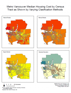 classifications for data related to housing, and created a series of maps comparing them. I also wrote the following response to a question asking about which classification systems would be better in which situations, and ethical issues relating to classification and data source.
Were I a journalist, a narrative I might want to tell is how problematically high Vancouver housing costs are. If I wanted to demonstrate this, I would use Manual Breaks as it seems like the largest number of census tracts in that one are red and dark orange. It makes Vancouver seem very problematically and news-worthily expensive.

If I were a real estate agent, I would likely want to make Vancouver, or the specific area of Vancouver look less expensive. As such, I would likely choose Equal Interval method as there is less red/expensive seeming housing on that map. The area near UBC is also shown as mid-range in the colors and therefore seems mid-range in price. Another option would be using the Standard Deviation map which also shows UBC area housing as not insanely expensive. The other two maps both show UBC as belonging to the most expensive classes.

There are certainly ethical implications of classification method choice. As explained above, varying classification method can make the map as a whole, or areas of the map seem more or less expensive (for example). Ultimately, the map maker must choose a classification system and can use this to show what they want to show, but this bias would be difficult or impossible to eliminate.

While the housing costs and incomes from 2011 are probably very different than the 2017 incomes and housing costs, and for that reason it is problematic to use that data, there is no more recent complete data out because the 2016 census has not yet been released. As such, there is not much else that can be done besides using the 2011 data so even though it is old and would be giving problematically out of date information, it is the only option and so must be used.
The choice of classification system in this case makes a huge difference in how housing costs are perceived and as such is an ethical issue.
Another outcome of this lab was a map comparing housing affordability in Metro Vancouver and London, Ontario.
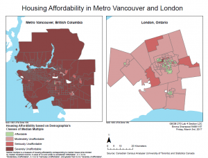 Housing affordability is a measure of housing cost compared to income. In this case, I used Median Multiple which is a measure of housing affordability corresponding to median house price divided by median household income. This is a better indication of how affordable houses are than simply the cost of housing because if someone has a higher income, the same housing is less comparatively expensive or a lesser proportion of income. The relative cost of housing actually shows a persons ability to buy a house, whereas the cost alone does not.
The housing affordability rating categories used when making this map were from the Demographia International Housing Affordability Survey. They are four categories, ranging from Affordable to Severely Unaffordable based on the mean multiple, which is median house price divided by median household income. The category names are attached to mean multiples of 3.0 & Under, 3.1-4.0, 4.1-5.0 and 5.1 & Over. This means that for any map, there could be any number of data points in that category. The two middle categories are equal, but since the data points could hypothetically range from just above zero to infinity, the range of the first and last categories are not equal to the other two. Nonetheless, for creating a standardized set of categories, they did a decently credible job. Since they couldn’t use classification by natural breaks, quantiles or standard deviation, because there is no one set of data it will be used on, the only other option is equal interval or manual breaks. Manual breaks would be more arbitrary than choosing a precise interval. Inherently, at least the top class cannot be capped. Based on the maps of Metro Vancouver and London, they chose to have classes that made sense for displaying what might be regular values while still showing enough detail in the differences. I believe they are trustworthy because they chose the best possible classification method for the categories they had to make.
Although housing affordability provides some interesting information about what it’s like to live in a certain area, it is not a good measure of overall livability, or how suitable an area is to live in. There are a lot of other things to look at such as education, accessibility, or life expectancy; affordability only shows a little information about economic factors.
Accomplishment statement
Demonstrated the effects of various classification systems on map interpretation and created a map comparing housing affordability between two cities using an appropriate classification system.