Task 12: Speculative Futures asked us to design two speculative narratives about the direction of technology, text, and education over the next 30 years. I was excited about this task solely because of the narrative component of this assignment. Since the beginning of this course, I have really enjoyed my rekindling with creative writing and the creative process. So often in post-secondary education, we can be overwhelmingly tasked with research papers, research assignments, and you guess it, more and more research. Don’t get me wrong, I do enjoy research-based assignments as well, but this course has provided a new perspective on how I perceive post-secondary education. There are many times in this course, especially with our “Tasks”, that we were asked to build a foundation of knowledge through research-based articles, videos, and podcasts, and take that new, academic knowledge into a creative space. This new process in this academic space has opened my mind to a different way of thinking and perceiving the knowledge and information that has been provided.
While I was browsing through the amazing narratives that were creative by my colleagues in this course, I was stopped in my tracks by Brian’s speculation of health tracking. Brain takes a unique view of the possible future of health tracking, something that is already a prevalent part of many of our lives. He takes technology focused health tracking to the extreme with two different narratives, one focusing on a character named Jane, and one focused on a character named Julie. At first, when I read “2030 – Jane”, I was immediately drawn to the extreme nature of the technology, and the interaction of the technology with the character. The story comes across as a somewhat “perfect” world with a somewhat “perfect” interaction with the health tracking technology, intertwined with brief moments of imperfections that I didn’t know were so important the first time I read through the story.
In Brian’s second speculative narrative “2030 – Julie”, the story takes a different perspective, one from the not-so-perfect side of the health tracking technology. Jane and Julie are actually sisters, one that seems to live in a life of wrongly perceived perfection with her health tracking technology, and one that lives in a life of stark reality of using such an invasive health tracking technology. Having two very different perspectives of the speculative health tracking technology that Brian conceived provided a more complete view of the reality of this technology. This made me reflect on the perspectives on different technologies that already exist. So often we can be consumed with our own experiences, especially with technology. If we use something, like technology, and it works for us, it is easy to automatically assume that others are having the same experience that we are having. And if they are not having the same experience that we are having, we sometimes can find ourselves thinking that there is something wrong with that. Given the diversity of technology, we have to assume that there is going to be a diversity of usage, and we have to be open to these diversities because technology is a shoe that won’t find the perfect fit with everyone.
Brian’s webspace was developed in WordPress, and provided a simple yet straightforward approach to navigation. Brian’s webspace included menus at the top and recent posts in the sidebar. The simplicity of Brian’s webspace really puts the focus on his posts and projects, limiting the distractions that may be caused by the clutter of images, videos, and vibrant colours.
September started off like any other September; school, school, and more school. I have never loved the harsh transition of returning to school in September, but this year I was excited. My family and I moved to a new town in Silicon Valley, which meant that we were the new family in town and I was the new kid at school. We apparently moved because my dad had a new job opportunity, but I know that my parents made this decision to set me up with the best education and experiences to prepare me for my “future.” This town is known for its highly rated schools and high exposure to technology-related experiences for youth. You know, as they say, technology is the future, so my parents wanted to set me up for success.
My first day at my new school was unlike any other first day I had ever had. Driving up to the school was like driving up to a technologically advanced space station. The exterior of the school was constructed out of reflective metal panels, and the doors automatically opened when we walked up to them. Before even entering the school, I could tell it wasn’t just the aesthetic that was different about this school. The population of students was very diverse. They were all walking around chatting with each other, but the variety of languages that I heard was immense. Two students walking together were each speaking and responding to each other in different languages without skipping a beat. It looked like an average conversation with people who shared the same language, but the languages they spoke were different. I did not know how this was possible, but the only plausible explanation I could come up with was that this school must have a very diverse language learning program.
When I finally entered the school with my parents, we were immediately directed to the school office where we met with the principal. There, I was provided with a school backpack filled with the required materials and technologies that I would need to participate in the classes that I was signed up for. My parents and I went back outside and I bid them farewell. Although they were hesitant to leave me, I was confident that I was going to be just fine.
Outside, I sat on the steps of the school, waiting for my first class to start. While I was waiting, I figured I better go through my school assigned bag to see what was inside.
Everything looked fairly normal: The latest generation Macbook Pro, charging cables, an iPad, and one earbud with the symbol UL on it. I was surprised to only see one wireless earbud in the bag, and I figured that this was a mistake. I put the earbud into my ear, held my finger on the power button to pair to my phone, and was met by this message:
At first, I did not believe what the message said. How can one earbud handle the job of directly translating any language in real time to my own, home language? But then it struck me. Early that morning, seeing those two people walking together, talking to each other in different languages…this must be the explanation. So, I decided to try it out. With the earbud comfortably placed in my ear, I walked over to a group of students hanging around outside, and just listened to their conversation. Very clearly, in English, I heard them talking about their summer vacations, where they travelled to, and which classes they were taking in the first term. Then, I decided to take the earbud out. Nothing! I could not understand one word that was coming out of their mouths. It was like flicking a switch, and each of them was using a different language now. So, I placed the earbud back into my ear and again, perfect English translation. My mind was blown.
As I entered the school, still trying to process this advanced piece of translation technology in my ear, I completely forgot that my first course of the morning was Physics 10. Physics was a subject that was not offered at my old school, and I was very nervous about being behind from the start. When I entered the classroom, my translating earpiece was working overtime, processing the countless languages booming around the classroom as we all waited for the teacher to come. When the teacher entered and asked us all to sit down, I could tell that she was speaking a different language because her mouth was creating shapes that did not match the words I was hearing in my earpiece. She immediately started writing things down on the interactive whiteboard, jumping right into heavy physics language and terminology. I was completely lost, until I remembered something from the UL’s introduction message. I double clicked the button on the UL earpiece and immediately, the translation that I was hearing from the teacher was simplified into more accessible physics concepts. I continued to double click the button until I could finally understand what the teacher was talking about. Again, I was amazed by the technology in UL’s earpiece. I was able to take any auditory language and simplify it until I could understand it. The possibilities for this feature were endless. I started thinking about Stephen Hawking’s lectures and how anyone, no matter what age, could find common ground for understanding his brilliant concepts around black holes and relativity. Mind blown times two.
I went home that day, feeling overwhelmed with ideas and possibilities. UL’s earpiece really made my first day at school accessible and exciting. I understood everything in my classes and I understood everyone around the school. What could go wrong? But this also got me thinking about the bad, the dark, and the gloomy. With technology like this, what is next? Will people stop learning different languages? Is bilingualism dead? What will happen if we rely on this technology but it fails somehow? If the earpiece is always listening, is UL’s company collecting logs of verbal interactions? If so, what will they do with those logs? In the wise words of Spiderman, “With great power comes great responsibility.” I decided to be responsible by taking the earpiece out when I got home. I know that I will have to navigate this technology carefully, just like any other technology.
Imagine
I want you to imagine a time.
Imagine a time of technology.
Imagine a time where technology thinks for humans.
Imagine a time where technology takes over our increasingly boring and repetitive daily tasks.
Imagine a time where technology embraces the job of responding to human connections.
Imagine a time where technology generates human responses to human interactions.
Imagine a time where technology becomes our human voice in email, text messages, and other technology focused communication styles.
Imagine a time where humans gain convenience through the use of predictive text technology in everyday lives.
Imagine a time where predictive text technology gives confidence to diffident writers.
Imagine a time where humans gain more time through using predictive text technologies to respond to banal messages.
Imagine a time where technology writes for writers.
Imagine a time where technology thinks for thinkers.
Imagine a time where predictive text technology replaces writing lessons in school.
Imagine a time where technology divides humans through assistive communication and predictive text.
Imagine a time where technological advances in predictive text connect humans to technology but disconnect humans from humans.
I want you to imagine a time.
Reflection
I really wanted to focus on the idea of predictive text technology and it’s future in the world. With each new predictive text technology feature that is tested and released by major technology corporations, I have started to wonder to which point predictive text technology will be developed. In the ever evolving space of innovation and metadata, I have a hard time believing that the progress in this technology space will be halted anytime soon. The idea of automatically generated email and text responses is becoming a reality, specifically with Google’s advances in testing out Smart Reply and Smart Compose in Gmail. With auto-generated responses in email and other communication forms, we are starting to eliminate the “human” in communication. Imagining a world where humans are taken out of the concept of communication is daunting and dreary. But, on the flip-side, predictive text technologies provide accessibility for those who need the technology as a support in their daily lives. So, this leads me to question “Where does predictive text technology responsibly fit within our human world?”
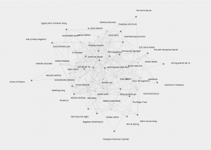
Task 9: Network Assignment asked us to take the Golden Record Curation data that was added into Palladio, and reflect on the data generation based on the confines of the Palladio platform. This assignment was overwhelming for many reasons, but mostly because of the way that Palladio presents the data with overlapping lines, words, and an endless number of interlinking webs. Let’s just say that I am a list and bar graph kind of person. In this overwhelming web of interconnected data, what stood out to me the most was how “popular” some songs were and how “unpopular” others were. This is what I based my interpretation of the data on.
When scanning through other colleagues’ interpretations of the Golden Record curation data, I was very interested in Sasha’s unique take on this assignment. But, before we get into that, I was happy to hear that I was not the only one initially overwhelmed by the Palladio platform. Sasha’s opening line “Holy interconnected web of confusion, Batman!” immediately hooked me into the post and drew me into reading further.
Sasha creatively looked at the data from a gender lens, which they attribute to their participation in the 565S Summer Institute. I also attended this institute, so I was curious to examine the data from that lens as well. Sasha provides an interesting look at gender’s presence in the Golden Record Curation Assignment, taking the data out of Palladio (which does not include a gender filter), and developing new parameters to interpret the findings. This idea of gender in the data connects to the idea of the individual nature of music, and how each curated list of the Golden Record is so specific and individual to the listener. Because of the unbalanced gendered numbers in Sasha’s section of the course, it was not possible to find any concrete conclusions, but Sasha used her creativity to take the immense amount of data from the Golden Record Curation Assignment out of Palladio and rethink it in their own way.
In my own post for this assignment, I spoke of the importance of “why” and how this is missing from the Palladio data. Sasha also connects to this idea in their post, eloquently talking about the need for qualitative data to supplement and empower the quantitative data that Palladio displays. Sasha states that “Visualization is important, as we can construct meaning from it, however, we need more if what we are looking at doesn’t make sense to us or for the answers we are looking for.” Especially from the lens of the social sciences, we find ourselves always looking for more; more reason, and more answers to the WHY. If we had more in the case of this assignment, it might have been possible to further investigate the data from the gender lens to find correlations and connections.
Sasha’s webspace consists of a simple WordPress design that is supplemented by purposeful and intentional visuals that connect to their thoughts and ideas in the posts. I appreciate the personal nature of the webspace through the inclusion of an “About” page with a supplemental photo. Sasha has chosen to organize her posts in a menu at the top of the webspace chronologically with the most recent posts appearing at the top of the menu. The webspace is filled with different sized and different coloured fonts that highlight and bold ideas that are relevant and important to point out. Overall, I felt there were a lot of personal touches on Sasha’s webspace that made it easy and enjoyable to navigate.
Upon first entering Shaun’s webspace, I was immediately drawn to the simplicity that I have come to greatly enjoy in the WordPress universe. But simplicity begins and ends with Shaun’s webspace, and once you click on the task links, a whole lot of thoughtful complexity and creativity is experienced.
For Task 8: Golden Record Curation Assignment, our class was asked to curate a 27 track “Golden Record” that is filled with a representation of the world’s music down to 10 tracks based on our own individual parameters. Shaun used Adobe Captivate to creatively display their 10 track curation. In Adobe Captivate, Shaun was able to use words, images, and provide an audio experience to give their curation life beyond just a list. Shaun provided a description and reason for each track selection and then allowed the user to listen to the tracks within the presentation to provide an immersive experience.
When I first started to go through Shaun’s Adobe Captivate experience, I immediately felt a connection to their reasoning for their track selections. Shaun’s track selections for their curated list consisted of tracks that represented each continental region of the world, tracks that represented a variety of instruments, and tracks that Shaun had a personal connection to. For my own curated list, I solely focused on the instrumental songs and chose the 10 songs on my curated list based on cultural and instrumental representation. We had similarities in our song choices, especially when it came to picking songs that focused on the specific instruments.
Shaun ends the Adobe Captivate experience by sharing a few songs on their list that they added because of a personal connection to the songs. I felt that this part of Shaun’s list was really important to the whole experience. Shaun states that “I chose constructs (parameters) that are important to me.” Music is a subjective experience for each user, and at the end of the day, each curated list that we create is going to be individualized to the listener and curator. I felt that through listening to each of Shaun’s tracks on their curated list provided me with an experience of getting to know just a little bit about Shaun. This is the magic of music.
Task 7: Mode-Bending asked us to take our picture from Task 1: What’s in Your Bag, and transform or “mode-bend” that picture from a semiotic mode to a different mode of our choice. Completing this task put me outside of my own comfort zone because I usually find comfort in semiotic representations of my thinking. For Task 7, I decided to verbally tell a story about the items in my bag and record this story, with sound effects, in an audio-book style. This definitely pushed my creativity to figure out how to take a picture, or a semiotic mode, and transform it into an auditory experience.
When I was exploring other colleague’s posts from Task 7, I was stopped in my tracks, initially by Sarah’s web space design, but also by Sarah’s mode-bending experience for her bag. Sarah’s webspace is visually grabbing with the organized side bars and visual components for the posts (pictures, gifs, diagrams, etc.). When you click on each post, there are different colours that tell you that you are on a different page from the one previous. These simple additions to Sarah’s webspace make the webspace very pleasing to navigate and explore.
This trend of multi-modal representations on Sarah’s webspace also translates into their posts. Sarah’s post for Task 7 is first presented with a reflection and a description of the creation process using both words and pictures to represent their ideas. This originally drew me into Sarah’s post, but the actual experience of her mode-bending representation, a combination of their “What’s in Your Bag” picture and sound effects that are related to each object, really blew my mind creatively. Sarah used itch.io to create her mode-bending representation, and I was taken on a creative journey through visuals and audio that seemed very intentional and purposeful to the task.
After experiencing Sarah’s webspace and Task 7 representation, I felt as though I had explored the webspace of someone who finds comfort in creativity. This creative comfort is clearly embedded throughout all of Sarah’s webspace and posts. Creativity is not something that I have always felt comfortable with, especially in my adult life, but Sarah’s overall experience that she provided in her Task 7 representation really inspired me to try and find comfort in creativity and to try and explore this creativity with confidence more often.
Task 3: Voice to Text was an interesting experience that I have not had a lot of practice with. I found some of the capabilities of Google Doc’s voice-to-text software to be amazing (word accuracy, spelling, etc.), but I was also disappointed with the lack of some features in the software, mainly the lack of automatic punctuation. I figured in this amazing era of innovation and ideas that somewhere along the line, the technology powerhouse called Google would have come up with some sort of algorithm to predict punctuation and automatically add it into their voice-to-text experience on Google Docs. So, in my search for whether other software has the capabilities of predictive punctuation, I came across Jeevan’s voice-to-text story on their UBC WordPress Blog.
In Jeevan’s Task 3 post, the punctuation in their voice-to-text story jumped out at me and I was immediately curious. In my own voice-to-text story, the major issue that I ran into was the lack of punctuation and how this lack of punctuation made my story difficult to read and comprehend. In Jeevan’s story, the punctuation is not perfect, but it does exist. This got me excited and wondering whether it was added in after the fact or if it was part of the software. After some discussion with Jeevan in the comment section of their post, I discovered that it was software based. The punctuation placed itself into Jeevan’s story whenever they stopped to take a breath or a break to gather their thoughts. I really was amazed by this technology, and amazed that it existed outside of a huge mega company like Google. Even though the punctuation in Jeevan’s text is limited, it still exists and does add some clarity to their writing which was definitely missing in my own story.
Jeevan’s webspace is organized in a simple manner, with chronological links to their posts on the sidebar of the webspace. It is also nice to see the most current comments on Jeevan’s webspace listed on the sidebar as well. I did not have to look explicitly for this post because it was still available in the sidebar on the webspace under the “Recent Posts” menu, but I imagine that with more posts, it may be helpful to have a menu on the top of the webspace to direct users to the content that they desire.
Task 4: Manual Scripts and Potato Printing was a challenging task no matter what direction we each decided to go. The challenging aspect of creating manual text through script or potato printing was what linked my own experience to Tamara Vaughan’s experience. Tamara explored potato printing, which proved to be fun but time consuming, and a process of trial and error. The potato printing path was different from the path that I decided to take, but our experiences were very similar.
Tamara provided a finished product image on their webspace which looks refined and precise. When I first saw this image, I did not think that I would immediately have any connection to their experience with this task. But, as I continued to read through Tamara’s post, I realized that in order to get that finished product, Tamara made mistakes, persevered, and took their time (2 hours) to come up with their refined looking final product.
My own experience with this task, though different in product (I chose manual script over potato printing), was very similar to Tamara’s. When I first read the task description, I saw potato printing and immediately saw frustration, so I decided that the manual script task would be the “easier” path to take. What I have learned after going through the experience of this task and reading Tamara’s post is that both experiences were meant to be time consuming and make us reflect on the creation of manual text in a world and time when we might not get this experience as often as we used to. By the end of both of our assignments, we shared a similar appreciation for the manual creation of words and texts.
Tamara’s webspace was very easy to navigate and was familiar because of their choice of using WordPress in UBC Blogs. Tamara’s posts are organized into menus along the top of their webspace and also along the sidebar by the most recently posted. By having their posts located in two different areas, it made their content very easy to navigate and experience. I really enjoy Tamara’s simplicity in her webspace design which draws the user’s attention and focus to her words and pictures.
Network Assignment Using Golden Record Curation Quiz Data
Palladio provides an interesting look at visualizing data. The ability to customize the visualization also provides more insight and variety into the data set. Even with these customizable features, interpreting a set of data that is not grounded in any intention “lacks” an abundance of information.
In the original assignment, Assignment #8, we were asked to curate the “Golden Record”, a record of 27 songs that represent the world of music, down to 10 songs based on our own criteria. This assignment intrigued me from the start because I knew that my own interpretation of the assignment and the music was going to be a lot different from everyone else’s interpretation. For instance, I decided to focus only on the instrumental selections provided in the Golden Record, and then pare that list down even further by selecting songs that represent the variety of the world’s instruments. Instead of focusing on instrumentals, another colleague may have selected songs that were only vocal, or maybe someone decided on their final curated list by selecting songs that they just liked. There was a wide range of interpretation left based on the description of the assignment and this led to a wide variety of data.
When I was reflecting on the Palladio data and Assignment #8, I immediately started thinking about Top 40 music. Top 40 music was something that I was exposed to in my household growing up, and I imagine it was commonplace in a lot of other households as well. By selecting some of the options in Palladio, it is possible to see which songs were the “most popular” amongst the participants, and which songs were the “least popular” amongst the participants. What defines “popular” here is part of the issue interpreting this data. This really got me thinking about music, as a cultural and artistic expression, and how one song can be grouped higher than another song, or how one song can make the Top 40, when another song does not. What made one song in our Palladio data more “popular” than another song? This is one question that I feel is not able to be answered based on the data set that was generated for this assignment. In the selection of the songs, we were not required to enter a “reason” for our selection into the Palladio data set. So even though some songs may have more “hits” in Palladio than another song, it is completely unknown why each participant chose this song over another song.
The “missing data” that leaves the viewer room for interpretation brings about political implications with this data set. Someone viewing this data may be automatically drawn to which songs were “popular”, which songs were misses, and all of the inbetween. But, here we are missing the knowledge of “why.” Through this knowledge of “why”, we might learn about the values and biases that went into the song selections, which would make for a more authentic interpretation of the data. The “why” is what I craved, no matter what selections I made in Palladio to change the visualization of the data.
When I first read the description of this task, I was quite excited about the opportunity to explore the Golden Record from the Voyager spacecrafts. The Golden Record was something that I had read about previously, but I had never had the opportunity to sit down and actually listen to each song. Originally when I read about the Golden Record, my interest was piqued with this idea of a selection music that represents humanity and the world. The original curation of this record would have been a seemingly impossible task, and I found it overwhelming trying to curate this record further into a smaller playlist.
The original parameters that I used for my curation process was to first identify each song as either instrumental (highlighted below in yellow) or vocal (highlighted below in green). This is something that I do with my own music library because personally, I find myself either in the mood for music with vocals or music that is just instrumental. This split the Golden Record into eleven vocal songs and sixteen instrumental songs. Instruments, in their vast shapes, sizes, and sounds, provide language and storytelling in their own way. Since instruments provide a universal language for this world, I decided to choose the sixteen instrumental songs as the new list to be further curated.
The next step, paring these sixteen instrumental songs down to ten, was by far the hardest and most difficult part of this task. I wanted there to be cultural representation in my final list, so I decided to further categorize the instrumental songs by instrument type and style. Some of these songs were really easy to add into my final list, but eventually I was left with seven songs and only one spot left (these seven songs are highlighted below in red). These seven songs were all fairly similar in relation to the rest of the list. All of them included orchestral instruments which created some similar sounds between each of the songs. In the end, the final spot on my list was filled by Stravinsky’s “Rite of Spring.” Stravinsky does a great job isolating the unique sounds of each part of the orchestra which made Rite of Spring a great representative for the other songs.
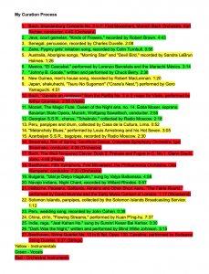
My 10 Song Golden Record
Senegal, percussion, recorded by Charles Duvelle. 2:08
This song uses a combination of drums and other percussion instruments. In the background, some type of flute is used to complement the percussion. The percussion used in this song along with the beat of the music made it a very unique contribution to the instrumental portion of the Golden Record.
Australia, Aborigine songs, “Morning Star” and “Devil Bird,” recorded by Sandra LeBrun Holmes. 1:26
The beginning of this song relies heavily on the didgeridoo, but is eventually complemented by a chant in the background. Even though this song is not truly “instrumental”, I thought that it was an important addition to my curation because of the cultural significance that it brings to the list. I also feel that the chanting in this song is more of an “instrumental” addition versus a “vocal” addition in the traditional sense.
New Guinea, men’s house song, recorded by Robert MacLennan. 1:20
In terms of this list, this instrumental song from New Guinea really jumped out at me. I found the sound of the instrument that is used in this song to be very unique. The beat and the melody of this song is also very interesting and stands along on this list.
Japan, shakuhachi, “Tsuru No Sugomori” (“Crane’s Nest,”) performed by Goro Yamaguchi. 4:51
Another flute or woodwind based song, this song tells a very beautiful instrumental story that was important to be included on this list. The translation “Crane’s Nest” is definitely appropriate for this song, and I could almost visualize myself in a crane’s nest. This song is truly a remarkable piece of instrumental storytelling.
Peru, panpipes and drum, collected by Casa de la Cultura, Lima. 0:52
This song uses a combination of percussion and panpipes and does so in a very unique way. By this point in the list, I was very surprised by the individual differences that exist amongst all of these instrumental pieces from across the world. All of these songs have their own culture and style embedded in the sounds created by the instruments.
“Melancholy Blues,” performed by Louis Armstrong and his Hot Seven. 3:05
This song was also a sure-to-make-my-list song. The dominance of Louis Armstrong and his trumpet in this song is a stand-out on the Golden Record. The brass instruments used in this song create a sound that is not replicated anywhere else on the Golden Record.
Azerbaijan S.S.R., bagpipes, recorded by Radio Moscow. 2:30
This song is another powerful storyteller. The sound of the bagpipes create an eerie but pleasant sound. From start to finish, this song takes the listener on a journey.
Stravinsky, Rite of Spring, Sacrificial Dance, Columbia Symphony Orchestra, Igor Stravinsky, conductor. 4:35
This song was the most difficult song to add to this list because it lives with other orchestral songs on this record.. Being limited to only 10 songs on this curation eventually forced me to choose one song to represent the orchestral group. Choosing this one song far from a complete representation of the other songs, but I feel like Stravinsky did such a wonderful job putting the orchestra on display in this song.
Solomon Islands, panpipes, collected by the Solomon Islands Broadcasting Service. 1:12
Even though this is another panpipe song, I feel that this song deserved a spot on this curation of the Golden Record. This song represents the variety that a panpipe can bring to a song. It is also on this curation because of the stark difference between this panpipe song and the other panpipe song from Peru which displays the cultural impact on instruments and music.
China, ch’in, “Flowing Streams,” performed by Kuan P’ing-hu. 7:37
This song is a strong representative for the string group of instruments. The abundance of sounds that are created on the stringed instrument in this song beguiling.