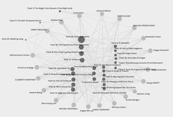
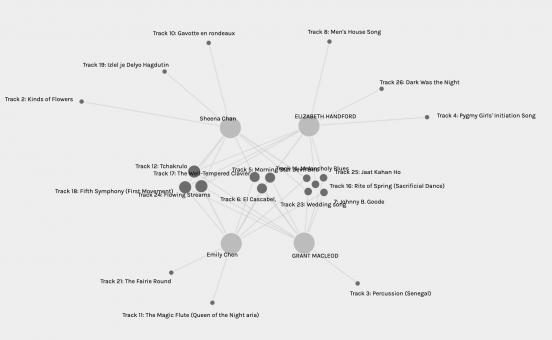
The Graph feature in Palladio is a tool for analyzing relationships between people. The system creates a visualization network based on the datasets that you input. When I entered the page that contained our class data on the song choices from the Golden Record, I could see data from the whole class, the dots are the nodes that represented either the curators or the song tracks that were selected, and the lines represented the edges that showed which curators selected the song.
The Whole Class
After highlighting the tracks, it became apparent that collectively as a class, all 27 pieces from the Golden Record were selected by at least one person. Of that list, two songs were selected by over 50% of our class. They are track 24 Flower Streams and track 18 Fifth Symphony. These two songs can be identified by looking at the size of the node, which is larger because they are connected the most (Systems Innovation, 2015).

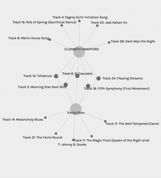
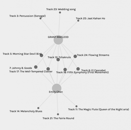
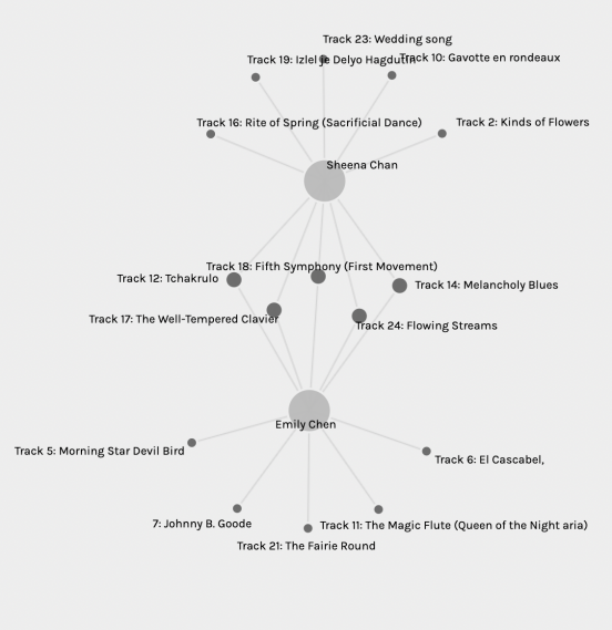
My Community
There are four people in the community that I was a part of. Between all of us, we picked all 27 pieces from the Golden Record, but 9 out of those 27 pieces were only selected by one of us. I rearranged the nodes to place the songs that were only selected once on the outside and grouped the other tracks in the center based on their degree of connection. There were 5 songs that we shared a second-degree connection, three songs where we shared a third-degree connection, and three songs where we shared a fourth-degree connection. When I made my selections, I tried to select a variety of different instruments. Did the others try to do so as well?
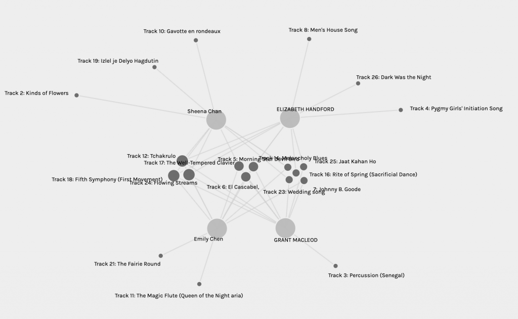
I shared a 50% similarity in song selections with Sheena and Elizabeth and a 70% similarity with Grant. I was surprised to see such a high level of similar selections and wondered what was their reasons for selection. Using these visualizations, it’s hard to determine the reasons behind our choices. Maybe if there are more tags associated with each track, we could see a pattern. For example, is the song instrumental? Representative of indigenous culture? Iconic in its era? Giving tags to the tracks would help to see more patterns of why we might choose similar songs, but it would also mean that there’s more room for misinterpretation and bias. There were songs that matched my criteria of trying to include different kinds of instruments, but when it came down to eliminating songs, I eliminated the ones that I didn’t think sounded good, which was a very subjective decision. Even though from the visualization graphs, we can see how each of us is connected to our community based on our song selection, it is difficult to explain why we selected the songs.


References:
Systems Innovation. (2015, April 19). Network Connections. Retrieved from https://youtu.be/2iViaEAytxw