Linking Assignment

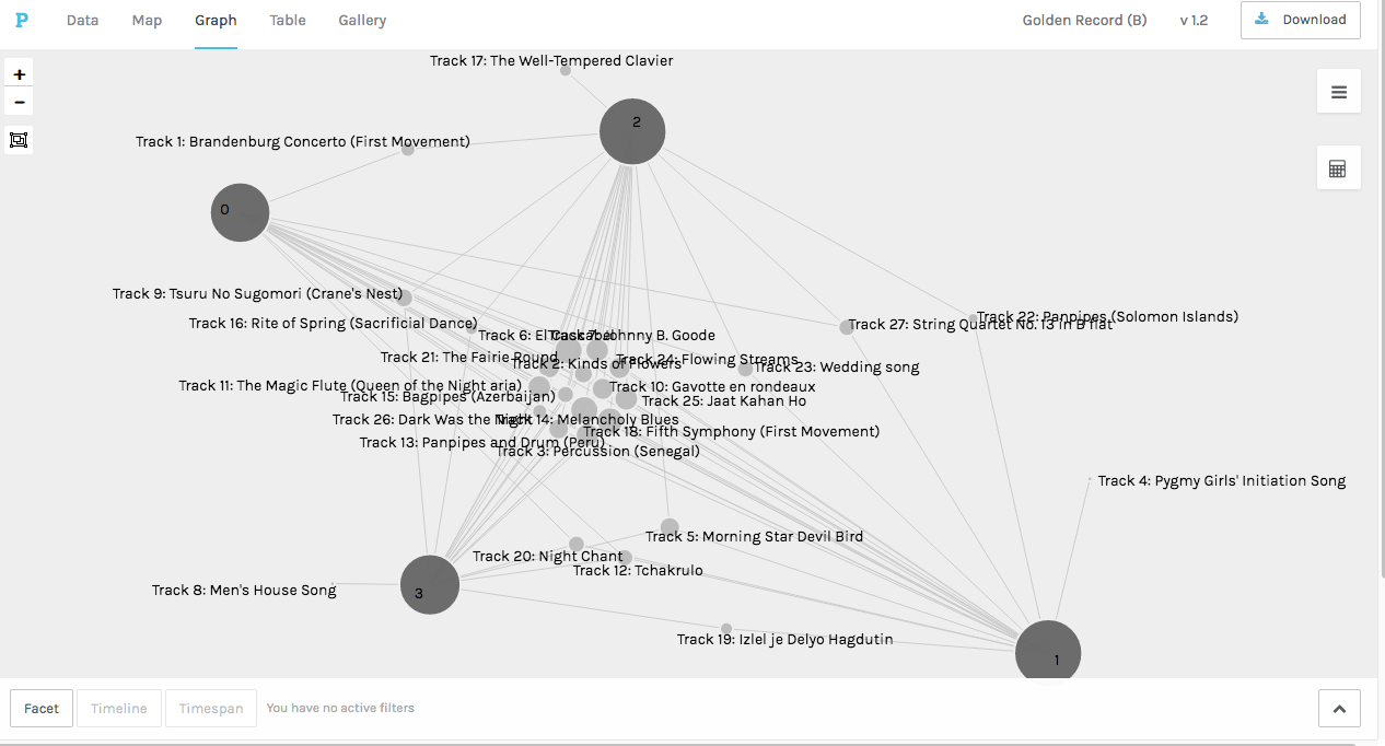
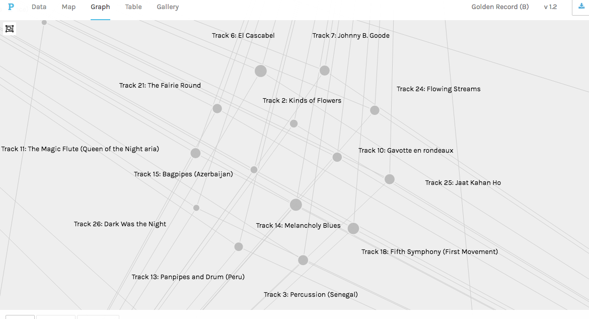
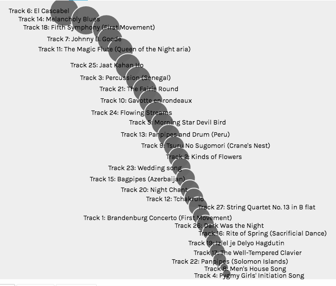
Eduardo Rebagliati: Golden Record Curation
https://blogs.ubc.ca/eduardo540/2021/10/27/task-8-golden-record-curation-assignment/

Knowing that Eduardo is also a musician, I was very curious to see how his selections (and the reasonings behind them) compared with mine for this particular task. His preamble articulates very well many of the same thoughts that I had about the impossibly subjective nature of trying to select the “best” songs to represent humanity, and he also makes an excellent connection to how the Voyager record will privilege the information encoded upon it as the only “legitimate” knowledge that intelligent alien life would know about humanity should the probe ever be discovered by extraterrestrials.

One reoccurring difference between Eduardo’s selection criteria and my own is his inclusion of emotional content/impact as a factor for consideration. While he does acknowledge that alien life having “the capacity to experience emotions” is an assumption that he consciously made, I had subconsciously worked on the assumption that alien life would be too biologically and culturally different from us to interpret human music in an emotionally compatible way, even if the did have emotional states that resembled our own. I believe I was working on the assumption that emotional response to music is culturally based.

For his presentation of the tracks, I appreciate how he gave each one an individual write-up with his reasons for including it, a link to the audio for easy reference, and a title image to give each choice additional “weight”. This design choice makes it very easy to navigate and explore the music itself along with his thoughts on each piece. I noticed that we had several overlaps in our reasons for including or considering tracks. For example, I felt very strongly about including the track Johnny B. Goode on the basis of it being the only representation of an electric guitar, something that Eduardo also mentions as an important factor. Some of his reasons were ones that I did not think of myself, but I absolutely agree with upon reading, such as the social nature of humans and human music-making demonstrated by the Tchakrulo Choir.

Angela Becket: Voice to Text
https://blogs.ubc.ca/etec540abeckett/2021/09/22/task-3-voice-to-text/

Angela did a fantastic job of making direct connections between our assigned readings and the task, something that I did not articulate in my own version of this task. The result of her undertaking of this task differed from mine on a technical level because her device was capable of interpreting where periods should be placed at the end of sentences (whereas my device attempted to punctuation whatsoever). This got me thinking about the technical side of how AI can best attempt to interpret what is NOT said (the spaces in between words), and whether or not there exist any best practices or guidelines specifically regarding the accurate interpretation and transcription of punctuation. This curiosity sparked a search that led me to this resource: http://support.onespace.com/training-resources/transcription-style-guide

As an additional comment on the differences of presentation, I appreciate that she supplemented her story with photographs.


Ping Cao: Voice to Text
https://blogs.ubc.ca/pingcao/2021/09/24/task-3/

Ping’s work on this task really impressed me because she decided to break down and analyze the different types of errors that her transcription software had made (Punctuation, Grammar and Spelling Mistakes) along with examples for the latter category. Correcting and re-formatting the same story for text presentation was another excellent decision that emphasizes the core ideas behind the assignment. She mentions how, as a second language English speaker, her accent and pronunciation can sometimes get in the way when telling a story in English, and I can imagine that voice-to-text transcription AI may not be able to do as good a job as a human at adjusting its “listening” to take this into account, highlighting how technologies like this can harbour discriminatory bias.
One thing I wondered about is whether Ping’s device/software was able to transcribe her story all at once. When attempting to do mine, I had to keep pausing and doing it in pieces, or else my phone would occasionally just stop transcribing after a while and I would have to repeatedly go back and pick up again from wherever the text left off.


Pamela MacGregor: Emoji Story
https://blogs.ubc.ca/pjmacgregor/2021/10/15/task-6-emoji-story/

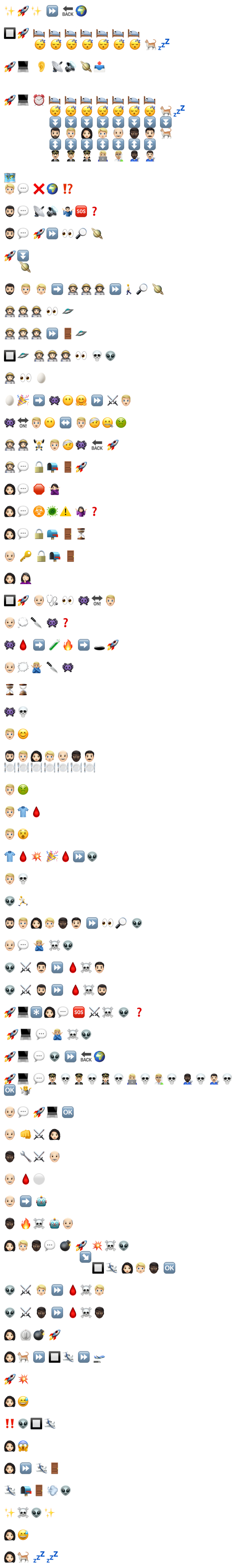
Pamela’s emoji story really jumped out at me for two reasons. Firstly, it wasn’t another Squid Game (although it was really fun to compare the variations on that theme!), and secondly (and more honestly) because it was so short. Or perhaps “short” isn’t the right word. “Concise”, perhaps. Using only 23 emoji symbols (plus another 4 for the title), Pamela captures a very complete-looking story, with a clear beginning, middle and end. I was able to correctly infer much about the show she was describing, including getting the title almost exactly right despite it requiring 4 symbols to depict 1 word. I think the success of Pamela’s emoji story is due to its focus on the most important elements.

I took a very different approach with my emoji story, going into great detail to capture all the major plot points throughout the story. Although the increased detail of my approach might help convey more information, it also creates more opportunities for misinterpretation. Pamela’s version has made me reconsider what a “condensed” version of my story’s plot might look like, and whether that might be more effective for this medium.

Amy Trainor: Twine
https://blogs.ubc.ca/attexttech540/2021/10/10/twine-task/

As someone who has had the opportunity to work extensively with Twine already in the MET program and has come to love it, it was a real joy to read through Amy’s experience of exploring the tool for the first time. What really caught my attention, however, was the particular way in which she used it to develop branching narratives. When I think of text-based and choose-your-own-adventure stories/games, I now realize that I immediately assume a genre convention in which the reader/player’s choices give them power over how the protagonist navigates the world. In Amy’s Twine story, however, some of the choices presented are choices that change the world around the protagonist, such as whether there is a broken kite or a baby owl to find, or whether or not there a gust of wind or a little girl appears. This freer narrative approach feels more akin to the open and exploratory nature of games of imagination that I played as a child, and I hadn’t realized that I had been letting assumptions about genre conventions prevent me from imagining that same type anything-goes approach being undertaken in a perfectly suitable medium like Twine.


Stephanie Carr Twine
https://blogs.ubc.ca/etec540scarr/2021/10/09/task-5-twine/

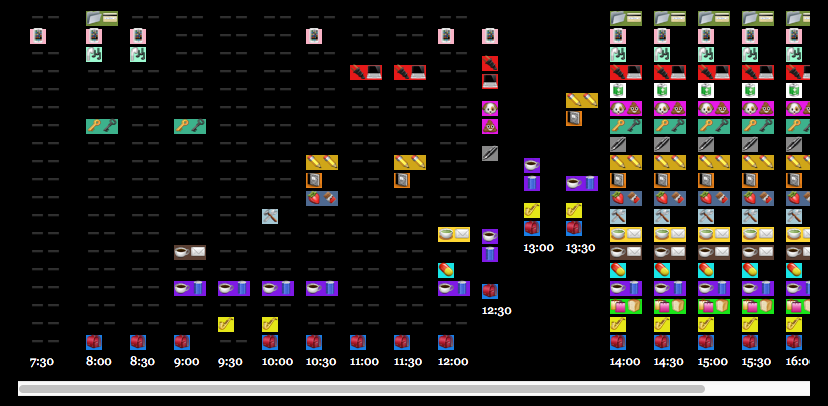
Stephanie wrote an excellent account of her process of building her Twine game and things should would have liked to have also included if she had had more time, such as sounds effects and background noise. I also appreciate how she shared some behind-the-scenes images of the story statistics and passage layouts, and made insightful connections to both the course readings and popular media. It was great to see that she had taken a chance on including variables to build more of a complex game than just a simple branching narrative, blurring the line between the two. The combination of fun challenge and dark humour made it a genuinely enjoyable experience to play through. In contrast, I feel that my Twine is probably not a viscerally enjoyable. I took time to code in some clever elements that are revealed in the details of the time-travel aspect of the game if it is played through in different orders, and because of subject matter of this course I made the cheeky decision to force the player to hand-copy and then manually type in complex codes that could have very easily been included as simple hyperlinks… so I feel like I really made my Twine more for myself than with an audience in mind.

Task 12: Speculative Futures

Hyper-Glasses

I don’t know how I could live without my Hyper-Glasses.

The built-in Heads-Up Display augments my vision with so much useful information all throughout the day.

As I prepare to eat my breakfast on my day off from my main job, the Hyper-Glasses scan the label on my For-U™ cereal box and assure me with a translucent pop-up note in front of the package that the tailored blend of ingredients and added vitamins is optimally balanced for both my taste preferences and my health.

The augmented-reality overlay even shows me how full of cereal my bowl should be as I pour, based on my predicted activity level for the day ahead of me. It looks like less than what I used to fill up on every morning, but I guess that’s part of how my Hyper-Glasses are helping to keep me healthy!

As I put the box down again, my Hyper-Glasses alert me that I am running low on my personalized blend of For-U™ cereal and prompts me to order a new box for delivery. I take a second look at the cereal box and give it a shake. Wow, the Hyper-Glasses are right! I wink at the notification, and see a notice for the order confirmation email scroll across the top of my vision. How convenient! I was going to do some grocery shopping tonight, but I may as well get this item dealt with while it’s so convenient.

Another prompt in the corner of my eye: I noticed that you like For-U™ cereal, – I suppose I do, since I keep buying it! – and I think you would also like For-U™ snack bars. Care to try? Special offer: half price and free shipping on your first order!
Well, my Hyper-Glasses always seem to know what I like before I try it, so it’s easy to trust this recommendation. Let’s get some of those as well! Another confirmation e-mail scrolls by.

As I eat, my Hyper-Glasses ask if I would like to browse my social and news feeds, along with some thumbnail previews including… ok, wait- WHAT is that cat doing? It’s only 12 seconds long, I have to check this out.

The cat video was pretty funny, and the videos that came after were just as captivating (even the new ads were mildly entertaining). There was one about easy apartment-cleaning tricks, one about simple-but-delicious recipes, one about some silly new fad where people try to hold as much ice cream in their mouth as they can for as long as possible, one about playing tricks on a dog, one about-

Another alert from my Hyper-glasses: You are behind schedule for your calendar meeting with Steve at Central Park. Would you like me to order you an Auto-Cab™?

I originally just planning to walk, since it’s not really too far to the park (and because we’re trying to keep this hang inexpensive)… but I don’t want to be late! I wink at the notification to call a car, and wink again to confirm the economy option. So helpful!

Heading out the door, an alert pops up in the corner of my vision:

Did you forget you wallet?

How did it know? I mean, I wasn’t planning to bring it with me for just walking around the park, but sure, I guess it can’t hurt to have it with me.

I grab the wallet off the shelf by the front door, and the alert icon shifts into a green check-mark and then fades away. Locking my apartment door, my Hyper-Glasses tell me that I should take the stairs in order to make up for the walk I’m about the skip, but also that I will be charged a fee if my ride has to wait any more than 2 minutes for me. It’s twelve floors down to street level, so I take the elevator while thinking about how nice it is that my glasses are promoting healthy options.

As I exit my building, my Hyper-Glasses alert me to the current UV level and suggests a shop nearby where I can purchase some sunscreen. Shoot, I don’t want to get burned while outside! But I don’t have time for that right now. A yellow ring on my HUD highlights my ride as it waits next to the sidewalk. The door opens automatically as I approach. Another suggestion from my glasses: for a nominal fee, I can have the sunscreen delivered to me at the park. I wink at the alert to accept the offer. This is becoming an expensive trip to the park, but I guess I can pick up a couple extra hours doing later doing similar shopping delivery jobs in order to make up the difference.

As soon as my seat belt clicks into place, the self-driving car begins moving. The windows are playing translucent ads for all the same things that I always see ads for. Glad for my Hyper-Glasses again, I turn them to TV mode and cue up the greatest invention in the history of entertainment: SmartFlix™. A whole platform of entirely AI-produced TV content that is customized for each viewer. I have never seen anything better than this. Every show on here is my new favourite show. There’s the gritty hard sci-fi show with the clever plot twists and the kind of humour that gets me, the historical political drama with the awe-inspiring speeches, the adult-humour cartoon with the perfect amount of irreverence. I never would have thought that computer-generated shows could be good, but how could any show made by people ever get so close to exactly what I want to watch? Totally worth the monthly subscription, and it somehow keeps getting even better all the time ever since I connected it to my Hyper-Glasses account for increased personalization. It’s so good that I’m actually a bit annoyed when I’m jolted back into reality as my glasses exit TV Mode in response to my car arriving at its destination. Stepping out onto the sidewalk, an e-mail detailing the charge to my Auto-Cab™ account scrolls across the top of my vision.

I see Steve sitting on a bench in the middle of the park and make my way over to greet him. We haven’t seen each other since he moved away for work, and now that he’s in town again to visit family it will be nice to catch up. How has it been three years already? It seems like not so much time has passed, as if nothing new has really happened in the time since I last saw him.

He asks me what I think of the current political situation, but I don’t know what he’s talking about… he’s making it sound like a big deal, but I’m sure something would have come up on my feed if it was really that important. Besides, maybe it was just one of those deepfake videos he saw, it might not even be real. He changes the subject to other news I haven’t heard about either, something to do with a court case involving the parent company of HyperGlass™ and Supershopper™ and Auto-Cab™ and SmartFlix™…

SmartFlix™! Now there’s something interesting! I start telling him about the awesome new show that I just started watching on SmartFlix™… but of course, his shows are completely different and he won’t normally see the same things that are personally crafted for my tastes. Maybe sometime we can do a SmartFlix Together™ later when we’re both at home again and see what shows are generated when both our algorithms are combined? Just as the conversation stalls, my HUD highlights a figure riding a bicycle towards us on the path. They extend a hand to hold out a plastic shopping bag towards me, and I snag it as they ride by. My sunscreen has arrived. I offer some to Steve, but his Hyper-Glasses recommend another brand better suited for his skin, and so he orders that instead.

After a while more of trying to land on a solid thread of conversation (and receiving Steve’s sunscreen delivery as well), I find myself feeling hungry and thinking back to the small bowl of cereal I had for breakfast. Somehow, my Hyper-Glasses recommend with uncanny timing that there is a food truck that is parked nearby: For-U Smoothies – it’s even healthy! Good thing I brought my wallet… I’ll just have to squeeze in a couple more deliveries tonight. I suggest we grab a snack and Steve agrees. We each get a cup of algorithmically-optimized goop that takes into account our demographics, lifestyles, and preferences to create the perfect drink for each of us. We each ask how the other’s drink is, both knowing in advance that of course it tastes good and also that there is no point or benefit in sampling the others’ – that’s guaranteed to be a worse experience. So we enjoy our separate drinks and try to explain the different shows that we watch and the different meals that we’ve prepared from our personalized meal-delivery kits.

We start talking about how crazy it was back in the day when the same movie had to try to appeal to everybody, and the same restaurant had to have enough variety to appeal to everybody… so much of always needing to compromise and rarely being able to get exactly what you wanted, because it often didn’t even exist! And yet, there seemed to be a lot more fond memories from those times than recently…

My glasses show me an alert: I need to leave now if I want to be ready to pick up some delivery orders during the afternoon rush. In fact, I should have left a half-hour ago, but now I can still make it if I grab another Auto-Cab™. I saw farewell to Steve and suggest that we should hang out again later.

I run deliveries until pretty late into the evening. It’s a bad night for tips, but eventually I make enough to offset the unexpected costs from this day. I get home, drop my own packages on the kitchen table, and slump down into my couch to get comfortable before calling Steve to see if he’s still down to hang. As I open up my Hyper-Glasses’ social feed to send him a message, a thumbnail image on the timeline catches my eye. It looks like an outrageous remix of that cat video I loved from earlier today. Nineteen seconds long. I quickly wink it open to sate my curiosity before calling Steve.

An e-mail confirming my monthly gym subscription renewal snaps me back to reality. It’s now 1:30 in the morning. I have watched a lot of cat videos. I did not call Steve, and it is definitely too late now. To be fair, he didn’t call me either. I also didn’t go to the gym today, nor did I do my grocery shopping. I wink open my SuperShopper™ app, and in my weary state I start to nod off and accidentally toggle off the personalization options with my half-closed eyes. Hundreds of thousands of potential purchases stream in front of my eyes, with endless variations of portion sizes and ingredient mixes for any given one. Way too overwhelming to pick between. I quickly re-activate the personalization settings, and after a moment of staring at a familiar selection of items I like I just tell the auto-shopper to figure out what to order for me. I’m always happy with what it picks (and it’s a much easier way to make healthier choices for me since I missed my walk and my gym visit today) and if it’s a bit more expensive than I expect I can always just pick up some extra delivery shifts again. But right now it’s time to sleep so I can get up for work tomorrow morning.

I don’t know how I could live without my Hyper-Glasses.

===============================================

In a Better Future

In a better future…

People will be acutely aware of the powers of algorithms, artificial intelligence, and machine learning, and the consequences that these things can have on our lives if the way in which we design and use these tools is not carefully considered and scrutinized. People will be critical of what they see and read, and measures will be put in place to make the use of these influential technologies more transparent.

Schoolchildren will grow up learning about what AI can do, what it cannot do, how it can reflect and amplify injustices and systemic issues in our society, and how we must take those experiences as opportunities to make our society better when these kinds of problems are revealed to us.

The powers of algorithms, artificial intelligence, and machine learning will be harnessed to enrich the human experience and quality of life, not to manipulate our attentions and opinions in order to maximize profits.

New machine-augmented ways of harnessing and using massive datasets will create a new information age which presents new and novel approaches to remedying some of humanity’s most complex problems such as global food waste, wealth inequality, and climate change.

Social media will be more social and less media. AI will suggest mutually convenient times for friends and family to connect over a phone call or in-person for for a coffee, when they might otherwise be simultaneously passing their time idly alone. Alternatively, it will suggest other creative and personally fulfilling activities to engage with instead of consuming content. When it does suggest online content to consume, it will celebrate and support the sharing of content that not only fits with what a user might already enjoy, but also challenges them to discover things that are different, uncomfortable, and thought-provoking rather than appeasing. It will celebrate amateurism in the media arts, instead of building a machine which promotes commodification as the epitome of successful artistic endeavour.

News feeds, social networks, advertisers, and other content generators & aggregators will have to be transparent to their users about what content is and is not being included and for what reasons, as well as providing easy means to freely adjust how content is sourced and selected for their presentation.

We will not be tools aiding in the profit-driven data collection of technology corporations, but instead technological devices and services will exist as tools to better our human experience. Health, happiness, and informed awareness will be at the core of a better future with technology.

Task 10: Attention Economy

At every turn, the GUI of this game is designed to subvert the user’s expectations and in turn demand additional attention and focus from the user in order to navigate its counterintuitive elements. Buttons to proceed are de-emphasized, placed in unintuitive locations, and do not cause the cursor to transform into a “click-finger” icon that suggests interactivity. Meanwhile, decoy buttons that are large, colourful, and prominently located attract the clicks of the inattentive user. Repeated pop-up windows (featuring more frustrating decoy buttons) interrupt the user’s focus and force the user to give up their attention in order to return to the task that had been interrupted. The appearance of red texts demand the user’s attention with notifications that resemble the design of warnings that would normally prevent the user from proceeding.

From the opening screen of the game, a big circle resembling a button and using the green color often associated with “go” masquerades as a start button. The button grows in size when rolled over with the mouse, and changes the cursor to a pointed finger suggesting a clickable link. All of the design cues suggest a clickable start button, in contrast to the “NO” text and lack of functionality.

In the fine print below, underlined text and text in a different colour each take on characteristics associated with links, again falsely. The word “HERE”, the actual link, is especially deceptive because it did not turn my cursor into a finger-click symbol when moused-over.

On the next page, the user’s attention to the tasks being demanded is constantly distracted by design choices that run contrary to the unconscious expectations of functionality features that are normally common practice on forms such as the one this game resembles.

  • asking for password before email address
  • Grey text labeling form fields needs to be manually deleted
  • Email field broken up into separate fields for address name, domain name, and a cumbersom drop-down menu of top-level domain options (plus .jpg) in no apparent order
  • an “I do not accept the terms and conditions” box is pre-checked. If one accidentally clicks on any part of the text, the user must scroll to the bottom of an extensive terms & conditions document in a (with an artificially slow scroll speed imposed) before being able to accept and close the pop-up and continue filling out the form.
  • A prominent, blue button for “cancel”, which then presents the user with a pop-up containing a “Yes” option coded red and an unclear “Cancel” option coded green in response to the prompt “are you sure you want to cancel?”. This cancel pop-up also features a vaguely x-shaped icon in the upper-right corner that sets the pop-up to full screen instead of closing it.
  • A “reset” button sits in the bottom-right corner of the form, the next location one would normally assume to find the “next” button.
  • Once the user has filled out the form, it will most likely not proceed to the next page. Hidden below the form in an area that needs to be scrolled down to to be able to see is a list of password requirements, including some unusual ones such as needing to contain one letter of the user’s email and one Cyrillic character. The requirements are all coded green, whether or not the conditions have been met. Meeting the conditions draws the user’s attention to a potential “problem” with red text stating that their password is “not unsafe”.

While trying to complete this form, a pop-up window repeatedly appears reminding the user to hurry. The constant reminders to be fast can cause the user to rush and rely on their assumptions about how the form should operate, inviting more potential to make “mistakes”. This window is also challenging to navigate based on assumptions, as it features the same deceptive full-screen-x button in the upper-right corner as the “cancel” pop-up, plus a big green button that can trick the user into “locking” the window and being unable to close it without pressing the button again to unlock it. The actual close button is hidden in the bottom-left corner disguised as a copyright notice.

On the next page, the image upload requirement again de-emphasizes the necessary upload button and instead points the user’s attention to an unnecessary download button.

When prompted to choose 3 interests from a list of what appears to be 21 annoyingly pre-selected options, the useful “unselect all” button blends in with the identical interest buttons, positioned at the very end of the list so that it is unlikely to be noticed until the user has already unselected every other undesirable option. Also hidden near the end of the list is a counterproductive “select all” button, again designed to blend in with the list of interests but this time as a sort of trap for the inattentive user to fall into and undo their progress.

The third page, again, features many counter-intuitive and frustrating methods for entering information, creating ample opportunities for the user to make a mistake that will then demand their attention in order to be corrected. Because of this page’s wider layout, now the “how can we help?” chat box, which had previously been very ignorable, commands the user’s attention as it blocks part of the form that the user is required to fill out. A button in the top-right corner of the chat box where the user would expect to find an “X” button instead only makes the box grow taller, and the only way to make it move out of the way is to realize that the “SEND” button of the chat box actually says “SEND to bottom” (and of course, this only works for a short while before it pops up and gets in the way again!).

The final page, asking the user to prove they are human by selecting certain images, again invites frustration and demands intense focus of attention in trying to decipher the intended aim of the task when presented with pictures that use wordplay to make the instructions deliberately unclear. Again, both the chat pop-up window and the “hurry up!” window continue to get in the way and require the user’s attention before progress can be resumed. Struggling with this page, I decided to actually try typing into the chat window, which created the opportunity for my typing to be hijacked by a ridiculous auto-correct substitution that again demanded my attention in order to re-correct.

I love this game for how much it made me hate it.

Task 9: Network Assignment

When presented with the organization of curators into groups based on similarity of track choices, it is easy to at first come to quick assumptions about both how the members within each community must share similar criteria for evaluating their track selection choices, and how each community must have broadly identifiable differences between them in terms of which tracks were chosen.

A closer look at the data shows that, broadly speaking, the four groups created by organizing the curators in section B did not vary from each other as much as one might assume in terms of overall track selection. To put it another way, all four groups had much more in common than what was different between them. Of the 27 tracks available to choose from, the 14 most commonly-selected tracks overall were common to all 4 groups. Every curator had at least 3 (more often 5-7) of the overall “top-10” tracks on their list. Interestingly, no one person’s list matched the overall “most popular” list, with the closest match being 8 of the 10.

Tracks common to all four communities clustered in the middle.

Close-up of the 14 tracks that are represented in all 4 communities, with the larger circles representing the top-10 most commonly-chosen tracks overall.

Comparative visualization of the “popularity” of all tracks, in descending order. The large circle for El Cascabel represents its “popularity” by being included on 14 curators’ lists. The least-selected tracks (Men’s House Song & Pygmy Girls’ Initiation Song) were selected by just 2 curators each.

With the the most popularly chosen tracks being commonly included in the selections of multiple curators in each community, the most obvious distinctions that can be identified in distinguishing one community from another rests with the differences between the least “popular” tracks that were selected by curators. Examining the least commonly-selected tracks reveals clear organizational trends, where the grouping-together of curators who chose these tracks are highly consistent, with few to no outliers belonging to other groups. The fact that the identity of each community seems to be determined primarily by which of the uniquely unpopular or “fringe” choices are held by its members is particularly interesting to ponder, especially if one re-imagines these patterns being reflected through a political lens (with policies taking the place of song tracks). The communities seem to be organized according to what makes them different from members of the other groups rather than what the members within a community have in common with each other.

Exploring the patterns of the least-selected tracks. All curators who included Track 4 are in Group 1. All curators who included track 22 are in group 2, except for one outlier in group 1. All curators who chose track 19 are in group 3. (not shown: all curators who chose track 17 are in group 2)

This organization is of course blind to the reasons why certain tracks were included or excluded by curators. Looking at community 0, which I am a part of, it is tempting to read into some the different choices made by my group members and to assume that their inclusion of tracks that I was also very tempted to select is due to shared or similar criteria of evaluation. However, some of their other choices suggest an approach to track selection that was done based on a different weighing of criteria than what I used. One of my major foci was maximizing diversity of musical traditions/origins from a geographical&cultural perspective, and so I felt it was important to only include one example of what I consider to be “Western European Art Music” in my selection (proportionally over-represented in the original 27-track list) in order to maintain space for greater cultural diversity. In addition to Beethoven’s 5th Symphony, which all of us had in common, every other member of my community also elected to include at least one additional piece of what I would consider to be “Western European Art Music”. In this sense, I was an outlier in my own group in terms of either how I was choosing to organize and compare the qualities of different tracks (I was, after all, lumping together a number of pieces that are very distinct in terms of style, instrumentation, time period, and location into a single simplistic category) or how I was choosing to weigh the importance of (broadly-defined) cultural/geographical origin against other valid criteria such as diversity of musical elements, diversity of instrumentation, and overall global popularity/recognizability.

In this data, the “obvious” choices and the “hard” choices become nearly impossible to infer for any one curator’s track selection, and the possible reasons behind their choices become further obscured when the grouping of communities suggests more commonality within the groups (and differences between the groups) than may actually exist. It is very possible that my reasons for making the choices I did might be better reflected by a different community whose members’ choices only differed slightly from my own in terms of which of the “least popular” tracks they elected to include.

Task 8: Golden Record Curation

In choosing which 10 music excerpts to include, I wanted to base my choices on what I felt represented the widest variety of examples of what human music is and can be to an audience who may be entirely unfamiliar with the concept of music. To me, this meant trying to select tracks that not only maintained diversity of geographic and cultural origins and musical traditions, but also tracks that featured the widest possible combinations of diverse musical elements. Some of the musical features I prioritized for inclusion are unaccompanied vocal music, instrumental-only music, mixed instrumental and vocal music, vocal harmony, self-accompanied singing and playing, solo music, ensemble music, primarily rhythm/percussion-based music, music without a steady beat, music with pitch-bending & ornamentation, and a wide diversity of types of instruments and arrangement styles. I found this task to be very challenging, and I feel like I will not be satisfied with my selection without the addition of another 4 or 5 tracks.

Java, court gamelan, “Kinds of Flowers,” recorded by Robert Brown. 4:43

Senegal, percussion, recorded by Charles Duvelle. 2:08

Mexico, “El Cascabel,” performed by Lorenzo Barcelata and the Mariachi México. 3:14

Japan, shakuhachi, “Tsuru No Sugomori” (“Crane’s Nest,”) performed by Goro Yamaguchi. 4:51

Georgian S.S.R., chorus, “Tchakrulo,” collected by Radio Moscow. 2:18

Peru, panpipes and drum, collected by Casa de la Cultura, Lima. 0:52

Beethoven, Fifth Symphony, First Movement, the Philharmonia Orchestra, Otto Klemperer, conductor. 7:20

Peru, wedding song, recorded by John Cohen. 0:38

India, raga, “Jaat Kahan Ho,” sung by Surshri Kesar Bai Kerkar. 3:30

“Dark Was the Night,” written and performed by Blind Willie Johnson. 3:15


My spreadsheet of considerations.

Task 7: Mode-Bending

Play on itch.io (may take some time to load; may not work properly for all browsers and devices): https://etec565sdruids.itch.io/mode-bending-whats-in-my-bag

OR

Download to run on your computer: click here to download


(please note that you will likely need to scroll left-right and up-down on your device to access all parts of this multimodal work)


To begin this project, I started by thinking about the original purpose of the “What’s In My Bag” task: presenting the private contents of my bag in order to “implicitly prompt the viewer to begin to construct a narrative about” me. The original task was entirely visual, with the contents of the photograph taking on the roles of texts to be interpreted by the viewer.

In shifting modes, I wanted to see if I could re-imagine the ideas behind the intent of the original project without relying on the core visual element (and without re-introducing written language text… trying to convey meaning without any written language was a fun challenge from the previous task that I wanted to explore again here). I decided that I would represent the original images through emoji. To lend further context to each object/representation, and to redesign the original “glimpse of my private life” aspect, I created audio clips meant to represent a combination of audio “snapshots” of my day and internal monologues made audible. To tie these audio clips to the emoji that represented the objects in my bag, I created an interface using Twine that the user can freely interact with to freely explore each object/sound combination in any order.

To organize these connections between digital pictographic symbols and audio clips, I introduced another Available Design that also allowed me to lend additional weight to the “glimpse of my private life” aspect of the design: the literacy or “grammar” of a cartesian plane-style timeline (New London Group, 1996). With the x-axis labelled by time (using emoji that call upon the additional literacy of reading the face of an analogue clock), I was able to represent and chart each item’s use or uses to specific times in the day. In cases where an item is used more than once, this created opportunities for me to connect multiple audio clips for the different instances of each item’s use, creating additional context for the user as they use the representation of these items construct their understanding of who I am.

The presentation of this timeline of emoji in a html file produced in twine invites the user to click on linked elements in the hypertext interface to interact with the “text” in an order of their own choosing. In this way, the use of Twine and html helps to “create patterns of meaning that are more or less predictable in their contexts” (p.22), as the medium inherently suggests the active interactivity of the user that is required to “read” the text, rather than a more passive form of consumption.

The biggest challenge I encountered when working on this task was ensuring that the organization of emoji stayed spatially organized relative to each other so as to not disrupt the precision necessary for the grid-coordinates system, which is important for that element to maintain its meaning. Originally I used pairs of emojis (and colour coding) to construct concepts such as “wallet” (credit card + folder) that do not have an obvious representation in the emoji character set, but I soon found that the thin columns that the grid is made from would often force the second character  “wrap” down to the next line of text, displacing every other symbol in the column below.

A screenshot of an early version of this task while it was in progress. In the 12:30 column, the laptop+charger character pair, dog+poop character pair, and coffee+barrel(mug) character pair are experiencing text wrapping that I did not desire. The black-line emoji seemed to address this issue, but it persisted after later design changes. The black line emoji were retained as they helped to reinforce the grid-like nature that was desired for the visual presentation.

References

The New London Group. (1996). A pedagogy of multiliteracies: Designing social futures. (Links to an external site.) Harvard Educational Review 66(1), 60-92.


Task 6.4: Emoji Story

Note: the title for this story is at the very end of this post.

My emoji story, rendered as an image reflecting how it looked on my phone:

The same story, rendered using emoji characters:

Emoji story  (for some reason emoji are being converted to question marks when I post to this blog, so I have attached a text file)

For rendering my chosen plot, I chose to focus on using the emoji to represent ideas, and occasionally specific words. I sometimes used the arrangement of emoji pictographically to depict a scene, and in other cases I used them in a symbolic manner. In some cases I appropriated certain emoji to represent concepts that are more abstract and difficult to render through images, but I tried to limit this approach to only a few symbols and to be consistent in how I used them.

I chose this particular story because it was the piece of media that I had most recently engaged with when I began this project. The title of this work is very easy to accurately depict using emoji, so I have chosen to save the title for the end of this post. Some parts of the story I felt were very easy to convey (although the decipherings by my classmates might prove otherwise!), while other parts were very challenging to render in a way that I felt could be understood. Additionally, some details in certain emoji are difficult to visually distinguish on my phone, such as the difference between the closed padlock and an open padlock pictures.

While I was working, I also tried to keep in mind how emoji are rendered differently on different technology platforms, and so I tried not to rely on the specific details of how any particular emoji was rendered, rather than the idea behind it. To assist with this, I often had my phone “read” different emoji out loud so I could learn what they were called in order to avoid misinterpreting the idea of what an emoji is meant to show and to try to anticipate whether a different rendering on another platform might change the image too much from what I intended to show.

While I was working on this project, I also happened to start listening to the Lingthusiasm podcast (co-hosted by Gretchen McCulloch who was featured in the listening resources in Module 5.2] and she and co-host Lauren Gawne devote a significant portion of the first episode discussing why emoji lack the linguistic features required (assuming no future development of a workable grammar) to function as a language on their own.


The title of the story: THIS EMOJI (for some reason emoji are being converted to question marks when I post to this blog, so I have instead used a link to a page for the single emoji that represents this title)

Task 5.4: Twine Game

Task 5.4 The Time Traveller’s Personal Shopper

Play on itch.io: https://etec565sdruids.itch.io/the-time-travellers-personal-shopper

OR download the html file


My original concept for this game was a time-travelling adventure in which the player would have to interact with various forms of language technologies (spoken word, clay markers, scrolls, codices, radio, television, e-mail, etc.). As the project evolved, I steered away from a full implementation of this idea as I realized that the time-travel element itself (and the juxtaposition of making the player memorize or write down abstract code from a hand-written note in order to operate an advanced machine in the game) could be an interesting aspect to explore using Twine.

Instead, I decided to focus on using the affordances of variables in Twine to responsively change the content of certain scenes based on the player’s past actions, rather than manually creating numerous branching unique variations of passages to try to replicate the same effect. This allows for players to navigate parts of the game more freely, rather than being contained to interacting with passages only in predetermined orders along set paths that I created. This is best demonstrated in the 3 pickup times/locations. Not only can the player choose to visit these in any order, but the description of each scene responsively includes comparisons to times/locations that have already been visited, without referencing any that have not yet been visited.

Given that writing and programming for the players who do everything “correctly” is rather straightforward, my strategy for implementing the mechanics of this game was to first focus on what happens when a player tries to do things like going back to previously visited scenes or entering space-time coordinates other than the ones that lead to scenes I have written.

Task 4.4 – Manual Script

“Sunny’s Adventure” is a spontaneously-composed fictional story about what my dog might do if she had the chance to go for a walk around the neighbourhood by herself.

Do you normally write by hand or type?

I do both, depending on the purpose of my writing. For notes to myself, such as to-do lists, brainstorming ideas, or taking notes during a phone/Zoom call, I usually prefer using pen and paper. However, I will often make due with touch-screen typing on my phone if I do not have paper and pens handy. For longer compositions (especially anything that I am writing for somebody other than myself to read), I prefer to type on my laptop keyboard, but again I will make due with my phone’s touchscreen if it is all I have available at the moment.


Did you find this task difficult or easy? Explain.

I found this task difficult due to the physical discomfort that came from writing much more than I typically do in one sitting. I remember frequently writing pages like this by hand in-class during my intermediate and high school years, but it has been a very long time since I have hand-written something this long and I clearly no longer have the stamina in the required muscles that I once did. Given that this was only about 500 words of sloppy writing, I can definitely appreciate how books were once rare and expensive items, as mentioned by Lamb and McCormick (2020) in Invention of the book: Part 1.

Another difficulty came from trying to keep my writing slightly more legible for others than it typically is. As something I usually only do for myself, I realize that my manual writing is probably difficult to decipher in many places. I tried not to get too hung up on this, but I realize that hand-writing with an audience other than myself in mind would mean significantly slowing my writing speed in order to ensure legibility.


What did you do when you made a mistake or wanted to change your writing?

Some mistakes I tried to correct by re-writing the letters in thicker lines that obscured whatever I was trying to cover up. In other places, I simply scribbled over mistakes and carried on.


How did you edit your work? Did your choice of media play a part in how you edited your work?

I wrote this work as a freeform story that I invented as I wrote it down, but during that process I did find myself occasionally pausing to consider where I wanted the story to go next, knowing that I would not be able to go back and re-arrange paragraphs or re-write sentences later. If I were writing something more “serious”/meaningful by hand, I would certainly start with a rough draft to make my edits on before coping out a final version.


What do you feel is the most significant difference between writing by hand and using mechanized forms of writing? Which do you prefer and why?

In my mind, hand-writing lends itself to a more direct transcription of ephemeral words (spoken or thought) to physical text, and is especially ideal for shorter passages and anything that isn’t intended to be copied and things that do not need to be perfectly edited. Mechanized printing, such as the printing press, introduces the need for more complex equipment and initial set-up time in order to produce physical text, but provides exponential savings in time and effort for texts that are intended to be replicated multiple times. My preference would depend on the purpose I intend to fulfil with my writing, and which method would best suit that purpose.


References

Lamb, R. and McCormick, J. (2020). Invention of the bok: Part 1. In Stuff to blow your mind. iHeart. https://www.iheart.com/podcast/stuff-to-blow-your-mind-21123915/episode/from-the-vault-invention-of-the-82316952