Choice and the Ethical Implications of Quantitative Data Classification
The following four maps all display the same data; they show the spatial variation of housing prices in Vancouver. But they use different classification methods, producing very different views of Vancouver.
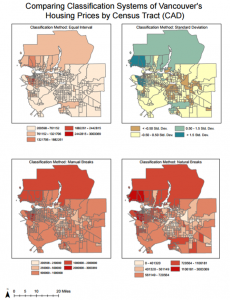
These maps show the impact of classification schemes on how we understand Vancouver’s situation, highlighting the ethical implications of classification and map making. By choosing the classification system, different features are highlighted and trends are distorted, meaning that different interpretations are made and different messages are conveyed.
Take, for example, a comparison between the equal interval and standard deviation classification methods shown above. Using the equal interval method, a rather homogenous picture of Vancouver is created with just a few spots of very high housing prices that would not be accessible to lower income earners. In contrast, the opposing colors of the Standard Deviation classification system underscore the disparity within Vancouver, emphasizing the gap between high and low home values from West to East. By working from an average with a diverging color scheme as the standard deviation approach does, the gap is intensified to highlight polarization and suggest increasing inequality.
This example highlights the social and political implications that are associated with classification systems, sparking ethical debates about the accurate portrayal of Vancouver’s housing markets. The portrayal leads to calls for different (in)action in response, giving the map maker a lot of power of the portrayal of Vancouver. By extension, the map maker has an ethical responsibility to produce a map that is not only accurate but also sensitive to its interpretations, but the reader must know the purpose for which the map was produced as this often sways the classification system used and the data’s representation.
For example, the reader of a newspaper must be aware of the journalist’s desire to produce a visually appealing and dramatic map to encourage people to read the associated article. As a result, a journalist is likely to choose to use the natural breaks method for classifying data on Vancouver’s housing prices for three key reasons. First, natural breaks method is an approach most would understand, as most similar values are grouped together by color. Secondly, without too much of a background in maps, the natural breaks method is intuitive to understand (i.e. the darker colors represent higher costs). This contrasts to the methods of standard deviations where a more mathematical and statistical background are needed to understand the process of classification and the divergent color scheme. Thirdly, the map draws attention to the uneven clustering of wealth in Vancouver, good for a making a provocative point about inequality and disparity in Vancouver.
In contrast, the equal breaks map, and to a lesser extent the manually classified view, might be used by a real estate agent preparing a presentation for prospective home buyers near UBC and has an invested interest in making Vancouver seem both affordable and a good investment. Therefore, a real estate agent may use equal interval classification because it makes UBC itself look affordable and gives the impression that Vancouver as a whole is quite affordable, with just a few areas of high house prices. These areas of high prices highlight, not far from UBC, the potential for a growth in housing prices in Vancouver, deeming Vancouver to be a good city for real estate investment.
As a consequence, map classification systems are vital to understand for the production of maps, but also for their readers who may be swayed by their purposeful representation of the data.
Housing Affordability in Vancouver and Ottawa
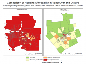
The above map compares housing affordability between Vancouver and Ottawa, underscoring the dramatic difference in affordability between the two cities. But what does “affordability” really measure? Why do we use this indicator instead of raw housing prices?
Affordability is calculated by dividing average housing prices by income for a given location. This ratio results in a value indicating not only the price of housing but how much of an individual’s income is likely to have to be spent on their housing. For many cities, when families and individuals have to spend more than 30% of their income on housing, it is deemed unaffordable. The “Demographia International Housing Affordability Survey: 2016” defines unaffordability as a ratio of housing price to income greater than 3. This is a more useful measurement than merely assessing housing prices because both housing prices and the incomes people receive to pay for their housing vary spatially. For example, house prices in city X may be high but so too may incomes in city X, meaning that the housing prices for people in this city do not pose a challenge or degrade disposable income. In contrast, when income is low but housing costs are high, people may be forced to spend huge percentages of their income on housing, leaving little for necessary goods (e.g. food, clothes), vital services (e.g. health care), or consumer spending that stimulates a local economy. Therefore, we often use affordability as a measure as opposed to raw values as it accounts for the changes in multiple variable across space, enabling a more accurate understanding of the likelihood of families and individuals facing challenges.
As mentioned above, an affordability value of 3 is often used as a cut off for affordability, but unaffordability is further broken down into degrees of unaffordability. See the table below for the classification break down of the affordability index.
| Descriptive Rating | Affordability Index Median Multiple |
| Affordable | <3.0 |
| Moderately Unaffordable | 3.1-4.0 |
| Seriously Unaffordable | 4.1-5.0 |
| Severely Unaffordable | >5.1 |
The cut off for housing affordability comes from a history of the median multiple being generally between 2.0 and 3.0 for major cities in Australia, Canada, Ireland, New Zealand, the UK and the US until the late 1980s, according to Demographia. The value of 3.0 was also used by Arthur C. Grimes, a former chief economist of the reserve bank of New Zealand.
This seemingly fluid and approximate basis for the use of the 3.0 cut off does not breed confidence in this cut of being a particularly meaningful cut off for today, especially as the new norm for large metropolises is to be well above this 3.0 level. In fact, by Demographia’s own publication, the most affordable major market, the United States, still has a median multiple of 3.7, placing it firmly within the “moderately unaffordable” bracket. In contrast, Hong Kong’s rating is 19.0 more than triple the score for “severely unaffordable.” The wide diversity within this top bracket of “severely unaffordable,” ranging from Australia at 6.4 to Hong Kong at 19.0, suggests that the need for another bracket that does homogenize these markets and miss their dramatic differences.
This argument for another class, and the possible amalgamation of lower classes that are no longer as meaningful divisions with the growth in affordability disparity, highlights that the current classes are outdated. This outdating arises as the data breaks are subjective and arbitrary, reliant on historical trends rather than on individual’s needs (e.g. with a ratio of greater than X it becomes impossible for people to purchase high quality food, with a ratio of Y purchasing even basic sustenance is a challenge etc.).
As a result, this classification scheme is not useful for comparing the affordability of large, globalized markets which all fall with the top bracket, nor is the classification very trust worthy as it is not related to a specific value or cost, or to the distribution of affordability values globally, failing to take into consideration the full range of the data.
But, is affordability a good indicator for “liveability?”
It must be remembered that livability is a very broad term, encompassing variables such as sustainability, walkability, safety and diversity. It also considered food affordability, clothing, water supply and other basic needs beyond housing. These variables are not all accounted for in narrower discussions of housing affordability.
However, bearing in mind the narrow dimensions of affordability and the issues associated with trusting the affordability indicator as a classification system, I still argue that it is a useful indicator for assessing a city’s livability. The indicator provides a basis and framework for assessing people’s access the basic necessity of housing, as well as to vital goods and services beyond housing with their remaining income. The indicator is able to incorporate two variables to contextualize housing prices in place and link them to individuals’ needs through underscoring the median percentage of a population’s income spent of housing. In general, it is apparent that affordable places are likely to be more livable and places with greater unaffordability will be less livable.