MODEL 1: ALL VARIABLES
Diagnostics produced by ArcGIS
Diagnostics from the Geoprocessing Messages and the related charts help to interpret the model’s fit and also give you the ability to tweak the model if needed (I did not).
From the diagnostics tables produced by the MaxEnt model, it first shows The Count of Presence and Background Points table.
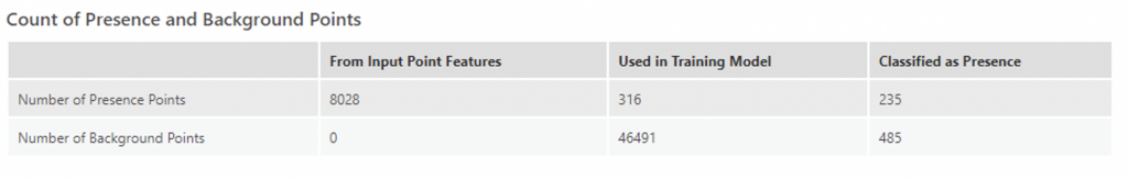
This table contains the count from the Input Point features that were used in training and classified as presence points by the model. This table gives a brief overview of the accuracy of the model – the more that are classified as presence points, the better the model performed. In the case of this first model, 235/316 or 74.4% of the points were correctly classified as presence points, which would signify a decent model, though not great as 80% accuracy or above is desirable for habitat suitability predictions (or any prediction really).
The Model Summary table contains the Omission Rate under the given Presence Probability Cutoff (0.5 by default which was used in this model) and the AUC of the model.
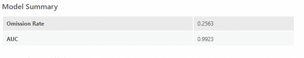
Omission rate indicates the percentage of test localities that falls into pixels not predicted as suitable for the species (Redon & Luque, 2010). In other words, the omission rate tells us the portion of known presence points that were misclassified as non-presence by the model (ESRI). An omission rate closer to 0 indicates a better model fit. In the case of Model 1, the omission rate was 0.26, which is not bad.
As mentioned before, MaxEnt calculates the AUC for each run (Redon & Luque, 2010). It is an evaluation diagnostic for how capable the model is at estimating known presence locations as presence and known background locations as background (ESRI). In Maxent, absence data are replaced by random points. AUC tests if a prediction is better than random for any possible presence threshold. It varies between 0.5 when the result is not better than a random selection and 1 when the result is significantly better than random (Redon & Luque, 2010). Overall, AUC represents the degree or measure of separability. It tells how much the model is capable of distinguishing between classes. The higher the AUC, the better the model is at predicting 0 classes as 0 and 1 classes as 1. AUC closer to 0.5 means the model has little prediction power. AUC closer to 1 means a better model. In this case, the model is closer to 1 and is much better than a random selection.
To obtain a smaller omission rate, or an increase in the percentage of presence points that are correctly classified, you can change the cutoff value by looking at the Omission rates and ROC tables (I did not change it).
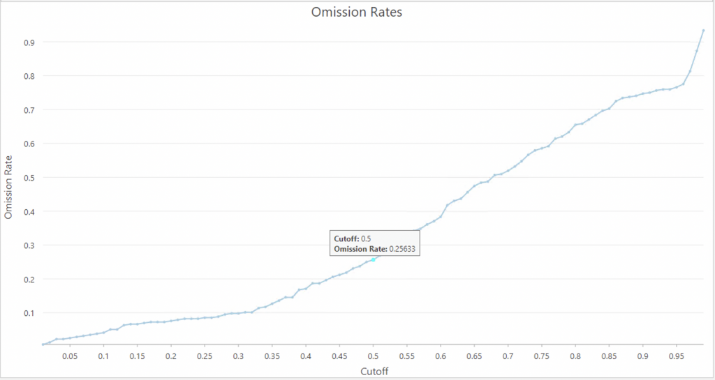
The Omission Rates chart visualizes how several Presence Probability Cutoff parameter values result in different rates of incorrectly classified presence points, otherwise known as the omission rate. While having an omission rate close to 0 is desired, it is also important not to lower the cutoff value simply for the sake of minimizing the omission rate, as this will also minimize how many background points are classified as potential presence (a useful result, in many scenarios) (ESRI). In this case, the Omission rate was 25% (25% of background points are picked up as potential presence locations) at a cutoff of 0.5, which was pretty good rate thus it has been left as it is .
To evaluate how different cutoff values impact the rate of background points being classified as presence, the ROC Plot chart can be used. It includes a comparison between correctly classified presence points and background classified as potential presence across differentpresence probability cutoff values (ESRI).
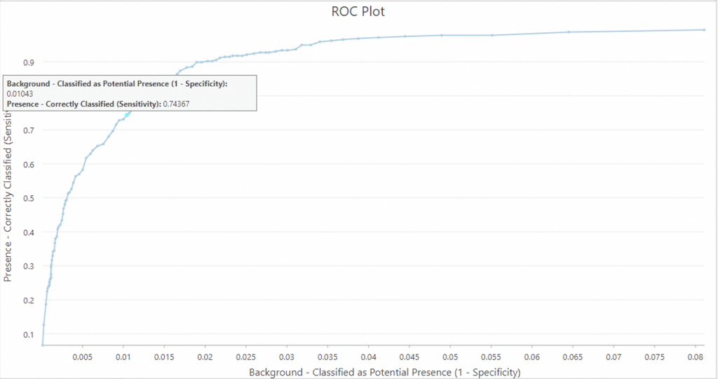
When background points represent unknown but possible occurrences, the ROC plot demonstrates how different cutoff rates impact how many potential background locations have been estimated to be presence (ESRI).
The Area Under the Curve (AUC) in the ROC plot is an evaluation diagnostic for how capable the model is at estimating known presence locations as presence and known background locations as background. The higher the area under the curve, the more appropriate the model for the presence prediction task. While the area under the curve is a helpful generalevaluation diagnostic, it is important to decide whether the objective of the model is to reduce false positives (in other words, ensure that predicted presence is very likely to indeed be presence) or to reduce false negatives (in other words, ensure that predicted non-presence is very likely to indeed be absence). A balance of the two objectives is the ROC plot value closest to the upper left of the chart (ESRI). In this case, at a cutoff of 0.5, the omission rate is 0.25633 and correspondingly on the ROC plot 1-Specificity is 0.01043 and the sensitivity is 0.74367, and is a value quite close to the upper left of the chart, thus I have left it as it is.
As part of the same layer output as the trained features, The Classification Result Percentages chart displays a comparison of the observed and predicted classifications with a user-defined cutoff (default is 0.5 and this is what was used) (Liu, 2022).
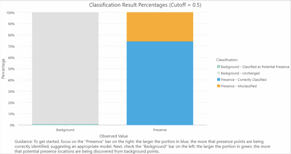
The chart can be used to assess the model’s ability to predict performance on known presence points (ESRI). As can be seen in the image, correctly classified values (blue, true positives) were 74.37% and misclassified points (orange, false positives) were 25.63% Only 1.04% of points were classified as potential presence (light green).
The Cross-Validation Summary table contains the size of training and validation groups in each run, the percentage of presence that was correctly classified and background points in the validation group that were classified as potential presence locations. The diagnostics from each group help indicate how the model will perform when estimating presence in unknown locations.
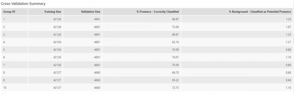
Here, the highest percent of correctly classified points was at 3 groups (Group ID 3) with and training size of 4216 and a validation size of 4681, 86% of the points were correctly classified and 1.25 were classified as potential presence.
To represent how the training model did, an output trained features layer was created. The Output Trained Features show four classification results: big blue dots represent the presence points that were correctly classified as presence, the big orange dots represent presence points that have been misclassified and the small light green dots are background points that have a low chance of presence (Liu, 2022). The rest are unchanged background points. As seen in the map, the training model was able to identify a suitable habitat for ticks around the Toronto and Montreal urban areas but missed the presence points for further areas outside of urban cores of Ontario and Quebec. In the case of Nova Scotia, most points were concentrated around the centre (Halifax) but missed presence points on the northern and southern tips of Nova Scotia.
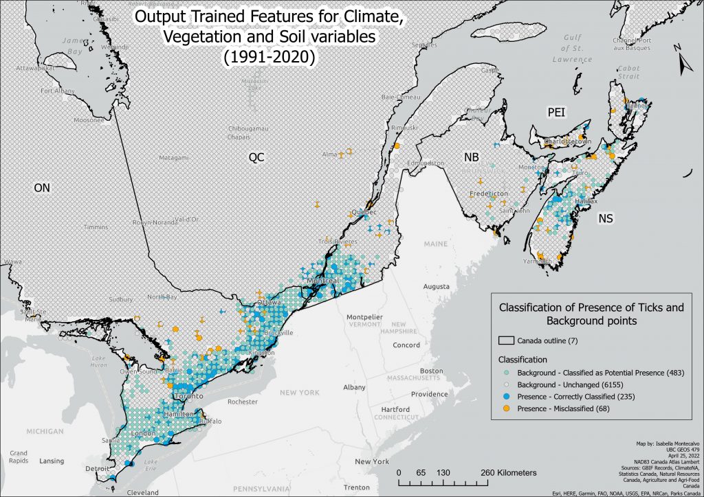
A higher resolution PDF version of this map can be found here: Trained Features All Variables.
The Model also outputted a trained raster, which is symbolized with the four program-defined intervals of the probability of the presence of ticks. Darker purple indicates a more suitable habitat for ticks.
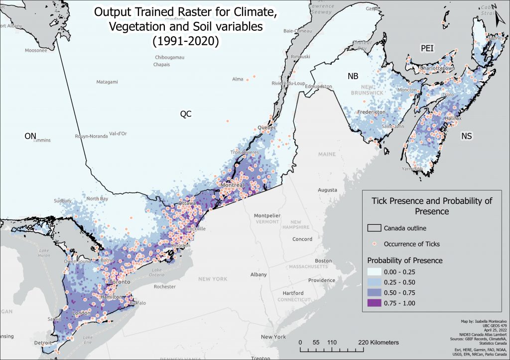
A higher resolution PDF version of this map can be found here: Output Trained Raster All Variables.
As can be seen in the trained raster, there is a high probability of ticks around areas that have known occurrences of ticks. From those regions of high probability, the surrounding areas are also predicted to have 25-50% probability of presence.
The Regression Coefficients table includes each explanatory variable used in the training of the model, including their corresponding basis expansions, and the resulting coefficient. The names of the explanatory variables indicate the nature of the basis expansion eg. product(BFFP) is a product expansion (ESRI). In terms of hinge, the number of knots parameter controls how many explanatory variable transformations are produced. The value controls how many thresholds are created, which are used to create multiple explanatory variable expansions using each threshold (ESRI). The default is 10, which was used in this case. Hinge was used to study the impact of variation of temperatures. The hinge basis function would allow the variable to keep the variation above the knot while reducing noise from all data below the knot.
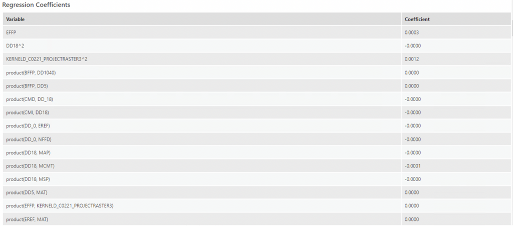
The most notable variables from this regression coefficient table are:
- CMD (Hargreaves climatic moisture deficit): Here, evapotranspirative demand relative to precipitation is expressed in mm, where higher CMD values indicate a larger moisture deficit (Hynes & Hamann, 2020). At a hinge knot order of 3, CMD has a coefficient of -5.0077, which means it explains around -5.0077 of the probability of the presence of ticks. With a one-unit increase in CMD, this would decrease the probability of there being ticks by -5.0. This makes sense, as ticks require moist, humid environments thus a deficit would preclude their presence.
- DD1040 (degree-days above 10°C and below 40°C): with a hinge knot order of 13 it explains 2.6175 of the probability of the presence of ticks. Thus, a one-unit increase in DD1040 would increase the probability of the presence of ticks by around 2.6. Again, this correlates with previous research as the optimal temperature for ticks is around 25 degrees C (Eisen et al., 2016).
- FFP (frost-free period): at a hinge knot order of 13 explains 1.067 of the probability of the presence of ticks. As mentioned, ticks die in low or subzero temperatures, thus they would favour more frost-free days.
- MAP (mean annual precipitation) at a hinge knot order of 9 explains 1.772 of the probability of tick presence (correlates with humidity needed for ticks)
- Urban landcover (17) explains 1.0484 of the probability of the presence of ticks. This is an unusual finding, but would probably be attributed to sampling bias as most tick cases are reported where there are inhabitants (urban areas).
The diagnostics also produce an Explanatory Variable Range Diagnostics table that includes each provided explanatory variable (whether in the form of a field, a distance feature, or a raster), its minimum and maximum values found in the training data, and, if input prediction features are used, the minimum and maximum values found in the prediction data (ESRI) (not included here).
To examine the magnitude and direction of the impact of each explanatory variable, we cannot only look at the estimates of coefficients from the Regression Coefficients Table, though these variables should be considered as important. Instead, we can use Partial Response Plots from the Output Response Curve Table (both for continuous and categorical variables) that summarize and visualize the impact of each bioclimate variable on the probability of the presence of ticks (Liu, 2022). The Partial Response of Continuous Variables chart is composed of multiple charts; each chart visualizes the effect of changing values in each explanatory variable on presence probability, while keeping all other factors the same (ESRI). The charts also use real values instead of standardized values which makes it much easier to interpret. Importantly, the charts cannot tell us the predictive power of the variables but will be helpful in identifying the suitable and unsuitable situations based on each variable (Liu, 2022).
Only the variables with the highest coefficients have been identified here.
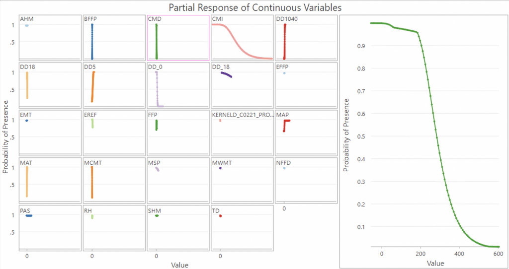
As can be seen from the CMD graph, it is a negative relationship, where low values of CMD indicate probability of presence and higher values decrease the probability of presence of ticks to zero.
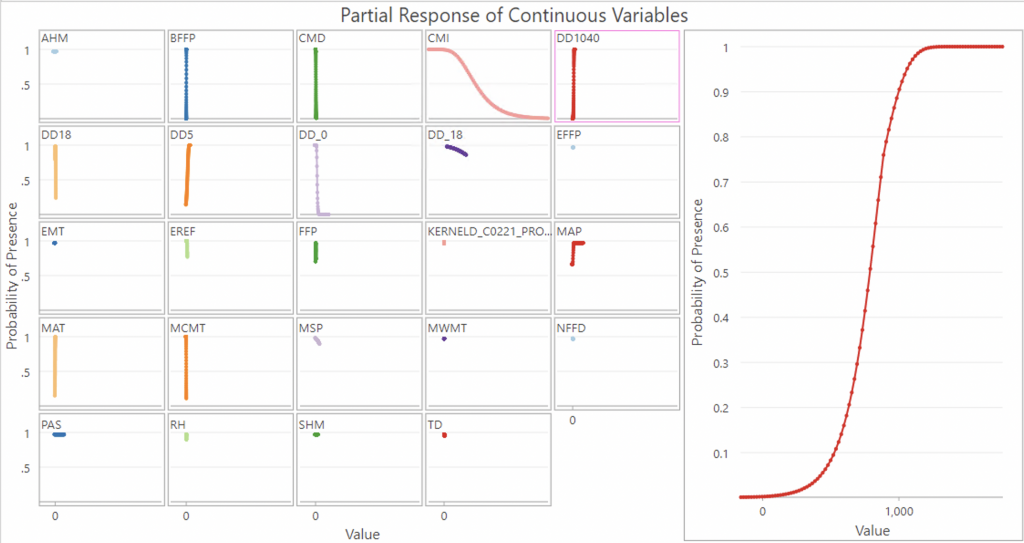
In the DD1040 graph, it is a more of a direct positive relationship (exponential potentially), where a value of 500-100 degree days above 10°C and below 40°C are optimal for tick presence.
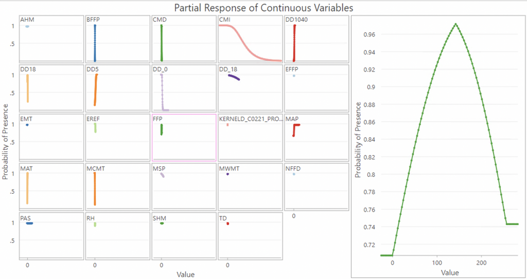
The frost free period graph is interesting, as more of a bell curve graph and would suggest only certain amounts of frost free periods are optimal. Probability of tick presence increases steadily but after it goes beyond a period of 150 the probability of tick presence actually drops.
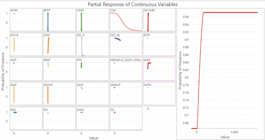
MAP (mean annual precipitation) graph is more of an exponential graph that plateaus at around 1000mm, which again, would make sense in terms of the humidity required for ticks.
While not a notable coefficient, I did want to include the graph for the kernel density of deer:
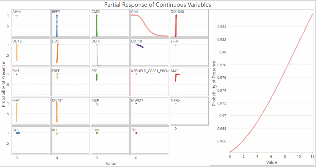
It is shown to be a strongly positive linear correlation from this graph, with high probability of presence throughout the deer density range.
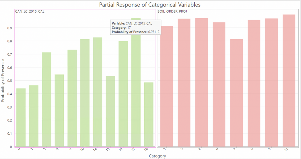
The Partial response of categorical variables shows that Landcover types 17 (Urban), 14 (Wetland) and 10 (Temperate or sub-polar grassland) are the 3 categories that have the highest influence on probability of tick presence, which makes sense given that ticks are most reported in urban areas, they like moist environments and long grasses to live in. Land cover 16 Barren lands 8 Temperate or sub-polar shrubland and 5 Temperate or sub-polar broadleaf deciduous forest are also notable.
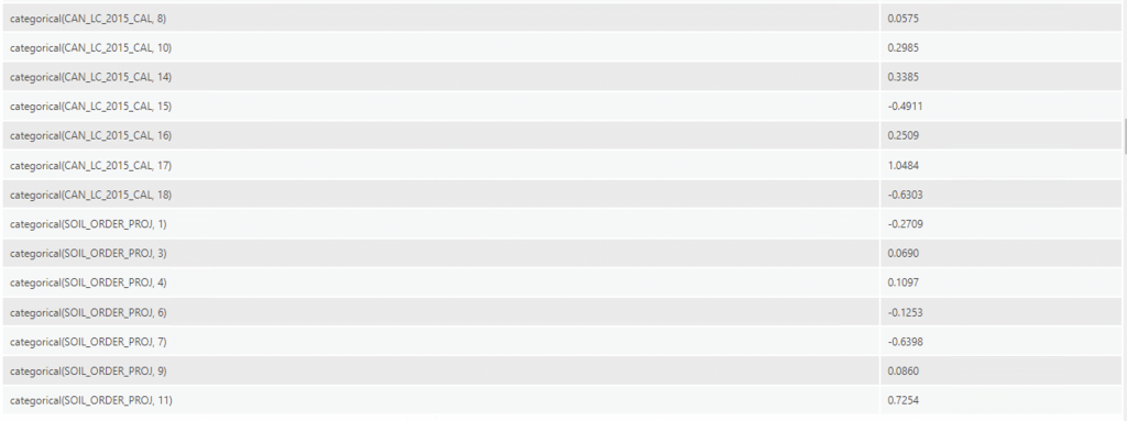
Of the soil orders, 11 (Vertisolic) is the most influential, followed closely by 4 (Podzolic) and 3 (Brunisolic) and 9 (Chernozemic). Vertisols are characterized by a clay-size-particle content of 30 percent or more by mass in all horizons (layers) of the upper half-metre of the soil profile (Canadian Society of Soil Science, 2020), Podzolic soils are forested soils found primarily on sandy parent materials in areas underlain by igneous rocks, most prominently on the Canadian Shield, but are also found in other regions on sandy glacio-fluvial deposits (Canadian Society of Soil Science, 2020). Brunisolic soils are also found developed in sandy parent materials in regions underlain by base-rich sedimentary rocks (Canadian Society of Soil Science, 2020). These soils will often have a slightly acidic or basic pH and may have a Mixedwood (deciduous and coniferous) tree cover. The Podzolic soils and Brunisolic soils are expected influencing factors as previous research has indicated that ticks favour sandy soil habitats (Canadian Society of Soil Science, 2020).
Finally, an output prediction raster has been created to show where tick presence is probable based on training data, the current climate, soil, deer and land cover data.

A higher resolution PDF version of this map can be found here:Output Predicted Raster All Variables.