03/29/13

Re: RIM’s Re-positioning of Blackberry

I used to be one of the most loyal and dedicated Blackberry users that you could possibly know and so when I came across May’s blog on the newest line of Blackberry devices, I had to share my own thoughts!

May did a great job in analyzing the positioning of the old and new devices, especially when it came to the keyboard. When I originally got my Blackberry, it was  the must have phone of my graduating high school class. It was amazing how their devices had catapulted into such success in such a short time and you can largely contribute that to BBM and the physical keyboard. I personally could never see myself using a touch phone once I had become a full “crackberry” addict so it was shocking when RIM (now officially Blackberry) launched it’s first series of touch screens with the Torch because for me, Blackberries were synonymous with QWERTY keyboards.

Z10 and iPhone 5. They almost look exactly alike…

As the company went downhill, I found myself with fewer friends who still had their Blackberry and I grasped on to hope that it would regain the glory days it had once had. I was sadly mistaken. It was clear from the unveiling of the new operating system and physical devices – such as the Z10 – that RIM had become like their competitors. As this article puts it, “[they] are just cloning what everyone else is doing” and thus positioning themselves out of an opportunity to capitalize on the large group of consumers who still use the keyboard because “no one owns that space.”

As a wise and disappointed consumer, I realized that getting a touch screen phone was now inevitable and the alternative touch screen phones were much better than the new Blackberry product line so I am now a proud owner of the Samsung Galaxy s3 (LOVE IT) and I’m sure many others abandoned ship as well.

03/18/13

The Attack on Plastic

Imagine heading to work in downtown Vancouver and seeing this bird sculpture being strangled by a gigantic plastic six-pack ring. I’m sure it would stop any one in their tracks for at least a few seconds to consider why it was there in the first place, which is exactly what the Plastic Pollution Coalition (PPC) was aiming to do.

Over the last few years, the dangers of plastic in landfills and in the environment have become more prominent and this publicity stunt’s main purpose was to protest “against the mass consumption of single-use plastic.” I personally found this approach very unique because usually most companies that are trying to educate consumers on switching from using typical plastic bags advertise at the point of purchase where you can find company branded alternatives to plastic bags. Instead, the PPC has took it upon themselves to do a public demonstration to raise awareness about this critical issue.
It is hard to gauge how effective it actually was but if we consider the AIDA model, you can see how this form of promotion could lead to the end goal of reducing single-use plastic items. The first step is to raise awareness and with the gigantic plastic six-pack rings on display in downtown Vancouver, this is definitely something that would catch people’s attention. The next step is to get people interested and that is closely tied with awareness because, for example, when I saw the image, I was curious to know what the message behind it was and learning more about the facts of plastic. The third step is desire – convincing the consumer they want a product or service – and that is linked closely with action which entails leading consumers toward taking action. While it is difficult to say if the PPC was successful in the last two steps, it is surely possible if it builds on its awareness and interest.

Everything aside, I love the idea and uniqueness of this idea and I feel the message was definitely delivered!

03/7/13

United Airlines Flying into the Ground

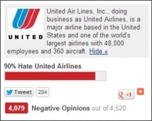
RELAX! United Airlines isn’t literally crashing into the ground, but it might as well be considering the awful job they are doing in satisfying their customers. The dissatisfaction is strongly focused with their website which has been labelled one of the worst in the travel industry. This blog, written by Rohit Bhargava, comments on the many different problems that users can find when trying to use the United Airlines website, but what stuck out to me the most was this picture:

Maybe they are waiting for 100%?
Source: http://www.rohitbhargava.com/2013/03/14-lessons-from-the-best-and-worst-websites-in-the-travel-industry.html

So how can they possible fix this problem?

One idea that instantly came to my mind was the diffusion of innovation. While this theory has more to do with new products, I feel like it is something that United Airlines never thought of when they launched their website because it clearly hasn’t been able to diffuse properly due a number of reasons. The major problem is, in my opinion, the complexity and compatibility of the service. Customers want something quick and easy so that they can quickly accomplish what they set out to do, but instead it is more of a “scavenger hunt” (quoted from blog). Furthermore, most travelers like to browse and see the possibilities of where they can travel; yet, United Airlines discourages browsing by trying to force customers into picking vacation packages and other trips early on in the selection process. On top of this, United Airlines has competitors who have much better online experiences and more importantly they forgot the key to success: listen to the customers and use a more valued-based marketing approach when creating the website.

It’s hard to believe that a company could go a whole year without realizing the negative feedback it was getting; however, if you go on their website today, it is exactly the same and I think it’s only a matter of time before they go into a full nose dive should they not address the matter.