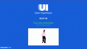
This was an extremely frustrating game. As someone who takes the time to fill out forms carefully, I found it difficult to identify the required information for whatever reason. However, I soon realized that it didn’t really matter what I included. My final password for the first section was “IDontCare#1993”—after about 15 attempts.
First, the one-minute timer was enough to make me want to pull my hair out. Does anyone actually finish this in time?! I saw that Evan completed it in just over four minutes, but I have no idea how that was even possible.
Actually, I later figured it out! There’s an interesting spot to click Close at the bottom of the pop-up window…
It’s fascinating how everything you instinctively want to click on—the large, brightly coloured buttons—is exactly what you shouldn’t click. Even the directions are deliberately misleading. For example, it took me several tries to realize that the Terms and Conditions instruction actually says, “I do not.” Additionally, the Unselect All option is tucked away in one corner, while Select All is in a completely different part of the Topic Enjoyment Checklist.
From a usability standpoint, certain design choices are incredibly frustrating. You wouldn’t adjust a house number by clicking an arrow—you would type it in. Similarly, having age selection on a sliding scale is irritating, especially when it allows the number to exceed 200, which is obviously impossible for a human being.
That said, I did manage to finish the game… though I wanted to punch a wall several times. It was just so annoying—every time I thought I had figured it out, it would throw something new at me. And if I wasn’t paying attention, I would click one of the things I was supposed to avoid—because it looked like the right choice. It really made me think about how often I blindly click on things without realizing it. I sign up for so many free trials without ever really reading the terms—I just click the buttons. It’s a scary world we live in.
Let’s say, I am dragged into a “dark pattern” most days.
In terms of language, this reminds me of when I was teaching my Hospitality class about recipes. Clarity is crucial—you need to be precise about what you want the reader to do. Confusing instructions or even a small typo—like 1 tbsp instead of 1 tsp—can completely ruin a recipe. It would be interesting for my students to try this activity to understand the importance of usability. This could also connect to their assignments, such as creating infographics, posters, or webpages. It would help them think critically about how people see and interpret information, as well as the role language plays in that process.
Wow, thank you for sharing such an honest and relatable reaction. I felt so seen reading your post! I also found the game super frustrating, especially that timer and the endless clicking traps.
Your reflection on the recipe metaphor really resonated with me. I teach Grade 5/6 students, many of whom are English language learners, and we often talk about how important clear, accessible instructions are—whether it’s for a science experiment, a group project, or a simple worksheet. Just like your recipe example, a small miscommunication can throw off the entire task. I could totally see myself adapting this game for a mini-lesson on digital design and how language, layout, and usability influence comprehension. It would be a powerful way to help students think critically about the platforms they use every day.