Filmmakers can use colour to trigger a subconscious emotional reaction from the audience based on the connotations that we attached to certain colours. If done right, this can have a huge symbolic impact in the film. Tough luck for anyone who’s colour blind, right? We’ve already talked in seminar about the colours tied to the characters in Vertigo, and there’s also many YouTube videos that discuss this at length, so I’ll just recap: Madeline/Judy is green, John (Scotty) is red, and Midge is yellow.
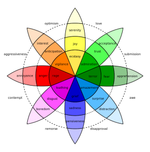
I was curious about whether the choice of these colours meant anything, or if any colour could have represented the characters. I found there is actually a colour coded “wheel of emotions” designed by Robert Plutchik, (Ph.D in medicine, university professor, and psychologist) who has published research just on the theory of emotion.
Plutchik’s Wheel
 From this, we can pair Scotty with emotions like anger and annoyance, maybe because he can’t be with Madeline. Notice how the colour green can be fear and also admiration – the two themes around Madeline/Judy as Scotty falls in love with her, but there is an air of the paranormal surrounding her when we think she might be possessed by Carlotta’s ghost. Then later he falls in love with Judy, but there is a ghostly, eerie hue to her in her uncanny resemblance to Madeline (before he finds out they are the same person). The scene when Judy emerges from the bathroom, transformed for the second time into Madeline, she is surrounded by green light. That leaves Midge, who begins the film in yellow, which represent joy and serenity. I’m not sure how much that fits with her character. But interestingly, the emotion of love fits in between the colours yellow and green, similar to how Midge loves Scotty but he’s just out of her grasp, as he loves Madeline.
The nightmare scene that Scotty has is also full of colour. The screen switches back and forth from flashing many different colours until it is only flashing red.
I can’t say how much Hitchcock intended the colour in the film to have underlying meanings, or if they line up with any points I’ve made here, but there are probably some (if not all) scenes where colour is purposeful.
Plutchik wheel picture: public domain, https://commons.wikimedia.org/w/index.php?curid=13285286
Huh, I didn’t know about Plutchik’s research on colours and emotions. One thing I’m wondering about–I would guess that such links between colours and emotions might be different according to different times/places. Did Plutchik talk about this? I just did a quick scan of wikipedia on him and it seems maybe he didn’t. I seem to recall seeing some research recently on cultural differences in associations with colours, but I can’t find it at the moment.
This is just a question the post brought up for me. If we are roughly in the same place/time as Hitchcock, then maybe we would share his colour associations even if there are time and culture differences!