Jump TO LINK:
-
1) Voice to Text: Punctuation

Summary: I noticed that my colleagues took a different approach (and likely a different experience) from me with voice-to-text technology.Reflection: When I dictated my story to my phone using Google Keyboard’s Voice-to-Text, my attention was focused on how I told my story. Occasionally, my monologue was rudely interrupted by the transcription lagging or stopping altogether, but overall I was able to live in the memory I was drawing up. When I started to read my collegues’ stories, however, I noticed a stark difference from mine: they had punctuation! At first I thought perhaps this was a feature of Speechnotes but a little experimentation proved otherwise. Sasha, Jamie, and Robin all “wrote” their stories with periods. Additionally, Sasha and Robin both used commas, and Jamie used question marks. Robin even has her story broken up into multiple paragraphs! In order for these symbols to appear in their stories, they would all have had to verbally command the algorithm to add them.
I find this method fascinating and foreign. When we write and type, punctuation flows out from our fingers because we have been taught to include it. The only time I give punctuation a second thought is when I brave unfamiliar territory, such as some of the remixing of quotes that I did in my Twine Task. I have never had a similar learning experience with orature. It reminds me of a paper that found that students performed poorly on computer-based tests if they had been learned using pen-and-paper (Russell & Haney, 1997) in that it can be difficult to transfer skills between modes. It seems alien to me to obstruct your flow of speech in order to add the markers which symbolize the tone and pacing of speech. I am not sure I could have focused on trying to tell a good story if I needed to remember to say my punctuation out loud as well.
2) Mechanical Transcription: Freedom to Write
Summary: Linda and Andrew both explored writing with pen and paper in their Manual Scripts task, and discussed the benefits of handwriting with pen compared to computers. Both agree that it is more freeing, though Linda states that this is because it is less permanent, while Andrew proposes that it is because word-processors inherently force you to think linearly (whereas handwriting can be dynamic).
Reflection: Comparing Linda’s, Andrew’s, and my own perspective feels a bit like looking at a three-sided coin. I agree with both that a pen is a tool that offers affordances which computers are (yet) ill-equipt to handle. Namely the breaking away from linearity.
To me, nothing characterizes dynamic writing as well as a mind-map. I became an avid mind-mapper near the end of my biology undergrad; I was taking a course on Animal Physiology, which was heavy on all sorts of biochemical processes, and it was the semester I was committed to bringing up my grades. I remember preparing for the midterm, carefully rewriting out my notes linearly, like this:
I. There was a Big Idea
A. And it had its own Ideas
1. Which usually contained Details
i. and maybe those details had Specifics
My notes were BEAUTIFUL. They were neat, and structured, and highlighted with specific colours.
But then I wrote my midterm, and I barely passed…
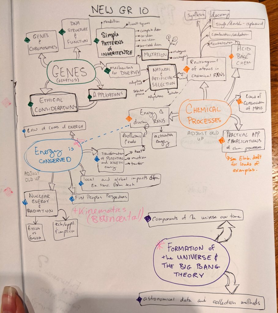
That’s when I decided that I had to do something drastically different. How I was studying wasn’t syncing with how my brain processed ideas. That’s when I threw my fate in with mind-mapping, and have never gone back since. My maps the embodiement of organized-chaos. Rather than pages of lines of text barely spanning the width of the paper, my webs of ideas were as compact as possible. During my undergrad, I kept my notes confined to one page (barely), often using the opposite to hold post-it notes with additional information. This way I could review an entire lecture at a glance, and let my eyes wander its paths as I digested it. Below is a more recent example, from when I was preparing to teach Science 10. Creating mind maps on paper gives the writer freedom to bounce around and interconnect their ideas.
I often made a quick sketch of my main ideas before committing them to my notebook. Even though I used Yen-Store stationary rather than my own handbound journals, the act of writing in something bound felt sacred and ever-lasting. Any mistakes would be there to stay, so it was best to iron out my maps’ biggest wrinkles before committing them to paper. It has taken me years of practice to treat my journals as a place to experiment and play, rather than as a repository of perfect specimens.
In my comment to Andrew, I mentioned my desire to create a digital mind-mapping tool that blends the dynamic freedom of paper with the freedom-to-edit on a computer. In his reply, he said
“I don’t necessarily think that the perfection inherent in digital expression is better for creativity!”
I am curious about this standpoint, as it is so polar to my own. Digital expression is inherently perfect? Isn’t the digital space the perfect place to experiment? To make mistakes? To explore the unknown and if you don’t like it demolish it with the press of a button? The freedom to play and risk losing nothing but my time was one of the main reasons I was attracted to digital art. I could use a slider to experiment with hues before committing to a palette. I could experiment with a whole painting, and go back to what I had in a moment if I wished… If only I had the freedom to tinker so with real paint!
Back to the digital mind-map idea. I have experimented with many different programs, both on PC and Android. XMind is my current go-to, mainly because it is not cloud- or subscription-based. The beauty of digital is that I can easily rearrange my ideas, grouping similar concepts that otherwise may have been written on opposite sides of the web. What it lacks (presently) however, is the ability to switch from verbal to visual. Sure, you could copy-paste a picture into it… but that is not the same feeling as creating your own Sketchnotes to explore your ideas!
View this post on InstagramAs a parting thought, perhaps what Andrew was trying to say was that digital expression is prone to be edited into perfection. Whereas with pen and paper, there comes a point where you have to accept that what is down is down, and its okay to live with something as it is. If I had my Blue Sky digital mind-mapping program, how much time would I spend tinkering rather than just getting my ideas down where I could see them?
- Back to Top
-
3) Textual Architecture: Navigation
Summary: I was overwhelmed by trying to navigate Shaun’s site, which delayed my exploration of his work.
Reflection: I regret that I felt befuddled when I visited Shaun’s site. There seems to be an overabundance of clicking to get where I want to go. I also cannot seem to find his Task 1, as he put it on an external Moodle, and I keep getting the message “You can not enroll yourself in this course” whenever I attempt to view his weekly tasks there; I could have sworn that I found it earlier and that he had some sort of slideshow, but I did not stick around long enough then to comprehend what I was seeing. I am curious about Shaun’s reasoning behind how he has structured his site’s architecture. Did he create it from his own perspective? And/or did he design it with his viewers in mind?
My main goal with my own site is to make it as pleasing to navigate as possible. My Tasks and Assignments are easily spotted on the left. The theme I chose (flounder) just so happens to colour-code posts depending on their category, which distinguishes them from one another and adds a spot of fun. One thing I do not like about my theme is how some posts list the date and category on the top, and others on the side, as I would prefer consistency across the whole site. Within my posts, I try to bold key phrases to help my viewers skim if they so choose. I also include pictures and animations to make it more engaging.
Ironically, this assignment may not be as well organized as the rest of my site, since I chose to have all of my links on one page. I did try to help the viewer navigate by adding anchor links to the top, creating custom graphics so the reader can orient themselves, as each of the anchors move the screen to below the corresponding heading.
-
4) Multi-Modal = Multi-Literate
Summary: My colleagues took many different approaches when returning to the In My Bag task. Some switched to a purely audio form, some produced a video, and at least one other person made an interactive piece.
Reflection: I was very curious to see how my colleagues would take on the Mode-Bending task, and was not surprised to see that many had remade their bag in a strictly audio format. HOW they did this though, was wonderful. Daniella created a podcast-like conversation with her son (age 3?). Not only did this frame her possessions in someone else’s perspective, but it also gave a snapshot of her relationship with one of the most important parts of her life. Šárka created a beautiful soundscape of her favourite place, accompanied by her soothing musings. Katlyn, meanwhile, created a music video of a parody-song describing her bag. She animated a memoji to sing along with the lyrics; I will need to keep this tool in mind, as it could be helpful for students, such as those who are afraid to present in front of the class. And then there was Tanya’s multi-modal masterpiece. Like me, she used code to stitch together visuals, audio, and interactivity. We used different programs to do this and had different results, but they had similar effects. I tinkered with and explored her piece, just as I had observed others do so with mine.
Interactive text is enriching. It is engaging both to consume and to make. It takes planning and problem-solving, and develops multiple literacies all at once. However, it also takes a substantial amount of time to produce. Being multi-literate does not mean it has to be demonstrated all at once. It was encouraging to see such wonderful, and informative works such as those made by Daniella, Šárka, and Katlyn. The act of mode-bending, or of returning to and reshaping previous tasks in new ways, is a way to develop multiple literacies without having learners slog through a colossal, multi-faceted project. I do not know what September will bring. I do not know if I will be teaching digital design skills in the class, or if I will accommodate the vast majority of my students who lack a computer at home. Whatever the case, I know that I need to be flexible enough to assess my student’s learning journeys, and not just if they get from A to B. I am seriously considering gradeless teaching this year. Learners are extremely diverse, and it is more rewarding for them to have the freedom to choose their own path. I will need to be cautious that I do not repeat the mistake of last year (a game-inspired, experience-point-based skill tree system, that led to my students watching my inevitable descent into madness as I gave points for every task they did). Perhaps, if I pair a competency-tracker with regular formative-feedback and student interviews (which may be in person, on the phone, or through Teams one-on-one chat, depending on the situation), my students and I will have a much clearer view of their unique skillsets overall, without the number crunching. Thankfully, I still have a few weeks to mull this over.
- Back to Top
-
5) Twine: Engaging Constraints
Summary: Twine is an excellent workspace for digital text creation, but it can also be used for more engaging text consumption.
Reflection: My experiences with Twine have all been from a makers perspective. It has always been extremely engaging for me, from considering the interconnections of the narratives I want to tell to coding the visual and audio components of its presentation. I see the potential for my digital art class to create interactive webcomics, for English students to remix classic works, for young Scientists to present their understanding of the world around them.
It seems silly in retrospect, but it never even dawned on me that it could be used to teach until I saw Tanya’s Twine. Her Twine, which uses beautiful colour-themed cards created by one of her students, will be used to introduce her future classes to the importance of colour. Instead of being the project, it is a stepping-stone to engage students on their way to developing their skillsets elsewhere. This gives students more time to focus on graphic design, rather than learning how to use a new tool to present it. That said, the experience of using Twine to learn about colour may inspire some of Tanya’s students to experiment with it outside of class, and they may use that skill for a future task. It’s important that we are mindful of the tools we ask our students to use. As I mused on in my Multi-Modal Link, giving students a variety of tools to choose from helps put the power of that decision into the hands of students. If time is learning, and we only have so much time in our life, is it not the responsibility of Educators to facilitate students in choosing how they best want to learn?
-
6) Speculating on the Tools we Choose
Created By Becris From the Noun Project
Summary: For this last task, my colleagues pulled out all the stops. Many mixed media to best present their musings on text and technology in 2050.
Reflection: The final assignment really put me into my students’ shoes. Given a full workshop, and not just a toolbox, I felt spoiled for choice. That in turn put me in a state of choice-paralysis, which gobbled up my time. This experience made me realize that I may have been putting my own students in a similar situation; in my digital art class last spring, I kept students together for about a month before setting them loose on their own inquiries. While many were able to go ahead and choose their own projects, I had some students who day-after-day accomplished very little. Then COVID happened and these same students were reluctant to reengage (some never did).
Learners need to enter the workshop. Sometimes we pick up the same tools, sometimes we vary. A tool may be entirely new to one learner, while another may choose it because they want to improve their skill with it, and a third may decide it is the best way to achieve the product they want to create. The last task for this course was an excellent time for us to go big. It let me try my hand at podcasting for the first time, and to learn new methods of using Twine. For one of her narratives, Janice also returned to Twine. Jamie created a pair of diary entries, one audio-based and the other appearing as writing on yellowed paper (which she created in Photoshop). Norah intermixed graphic design, short audio clips, and links to further reading to demonstrate that her sci-fi prediction may not be that far-fetched at all. We all accomplished the task of speculating on the future, but we chose the production-skillsets we wanted to use. Giving learners full access to the workshop provides an opportunity for them to demonstrate their diverse perspectives. In my own classroom, perhaps I have been rushing my students to this goal. I am still trying to find that balance, between a cohesive learning community and independent-inquiry.
- Back to Top
-
Citations:
Russell, M., & Haney, W. (1997). Testing Writing on Computers: An Experiment Comparing Student Performance on Tests Conducted via Computer and via Paper-and-Pencil. Education Policy Analysis Archives, 5(3).
