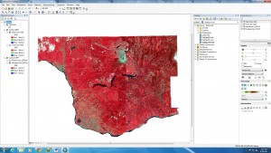
Final Project

Brief Summary:

The final project for this course involved downloading and managing data from various sources having to do with the Agricultural Land Reserve (ALR) in the North Okanagan and analyzing the data (slope analysis, roads, rivers etc) with tools in GIS to figure out what total proportion of land in the ALR is actually used for agriculture.

Team Organization:

Our team split up the maps by interest and voluntary basis.  Once we got the data for our individual maps we grouped together to come up with a consistent colour scheme and layout for our maps.  Together we wrote on the report and discussed if there were any gaps in our data analysis and interpretations.  The flowchart was also a team effort as we had to put together an organized layout of processes that was involved in producing our final shapefile.  Since we had flexible timetables to work on the project, we were able to work on the project together during scheduled lab times and most afternoons.

Team Contributions:

The most valuable contribution that I believe I gave the group was dedication, time and effort into figuring out what kind of commands and processes needed to be done for the analysis of our data and helping my team mates figure out how and what data needed to be extracted from our raw data.  For much of the three weeks, I was in the computer lab trying to figure out ways to make the data presentable and discussing with Jose how to extract and filter out the necessary data.

Both Arron and Eric were great team mates and we worked really well to put the maps and report together.  However, I did feel that Arron did put a lot of effort into figuring out what exactly needed to be filtered out the data and discussed in detail with Jose what the question was asking and how to do the more tedious tasks in ArcGIS such as closing individual polygons to create lakes and rivers etc.

Learning Outcomes:

Some interesting things I learned in the process of doing this project was that the hardest part of making a geodatabase is getting the data and organizing it in a way that is easy for you to work with in your table to contents and is also easy for someone else to understand when you send shapefiles to a team member.  With all the commands and processes that go into making a final shapefile, it gets increasingly hard to be organized and keeping in mind how a third party can follow your workflow.

Some facts about the ALR include that the people who do live in the ALR region in the North Okanagan are not accounted for as the population within this district is suppressed in the census.  There are not enough people living in the area (less than 2000) to be accounted for in the district, but that does not mean that they don’t count either.

Through this project I learned how to take DEM data and mosaic them into a new raster and calculate the slope from that.

In terms of teamwork, sometimes it may be difficult to be on the same page when some team members are not available to work on the project together.  However, communication is key when managing a project and setting deadlines is very important.

Some issues with data management mostly had to do with organization in the geodatabases of individuals.  Sometimes it isn’t clear which shapefiles are which when each individual has a different system of working with data which can make sharing sometimes difficult.  It is all about being consistent and clear about the processes that you use when working with ArcGIS.  Some issues also arose through the publicly available data as sometimes the resolution wasn’t always the best and we had to go through the tedious task of completing and closing individual polygons which were necessary for our analysis.

Below is the complete report of the ALR analysis of the North Okanagan Regional District complete with maps for your reference.
North Okanagan

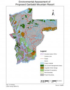
Lab 5: Environmental Assessment of the proposed Garibaldi Mountain Resort

lab5 Map

The proposed project is to evaluate the criticism and recommendations on how to proceed with the project proposal as a natural resource planner.  The controversy surrounding the proposed ski resort states that, “climatological considerations rule out reliable skiing on the lower 555m of vertical.”

There were many necessary steps required in order to analyze the data pertaining to the project area which included:

  • taking into account the project boundary itself and clipping the vector and raster data relevant to the project area.
  • The old growth forest, ungulate winter habitat and endangered plant species polygons were selected by the attributes such as the habitat proximity to the Garibaldi park area, specific endangered plants in a particular biogeoclimatic units etc.
  • Buffers for fish habitat were imposed along streams that would run through the project area. All streams below 555m would be given a buffer of 100m and streams above 555m would be given a buffer of 50m as these streams would be less likely to be fish bearing.
  • Reclassify the DEM layer to create a new polygon to represent the portion of the project area that would fall below the 555m vertical.
  • A union of the old growth forest, fish habitat (river buffers), ungulate winter ranges and redlisted plant species were joined to obtain the total protected area that would appear in the project boundary area.

The general results were that the area occupied by fish habitat, ungulate winter ranges and redlisted plant species would be 55.54% of the proposed project area.  The area below 555m of elevation is 29.92%.  This area however, overlaps some of the areas containing the ungulate, redlisted species and old growth forests as well.

The two greatest environmental concerns to project development would be the redlisted ecosystems and the fish habitat buffer zones as they cover much of the project area and thus, effecting the areas in which can accommodate a ski resort.  Some ways to mitigate the problems is to avoid the protected areas mentioned above and possibly focus project development along the southwest portion of the project area where there aren’t many redlisted plant species and contain streams which have a lesser likelihood of being inhabited by fish.

In terms of the direction of where the project should go, there is not much area available to work with taking into account the sensitive habitats surrounding Garibaldi provincial park.  With only a fraction (about 45%) of the total area (about 54 square kilometers) available to work with, it would be too complicated to build of a series of 124 ski trails, 23 lifts and resort accommodation without effecting the protected areas in some way.

Personally, I don’t think the project should be allowed to go through as there is so much area on the mountain already occupied by ecosystems that would be sensitive to the development of an extensive ski resort.  My personal opinion does not conflict with what was mentioned in the memo above

Accomplishment Statement: Gained practical skills in ArcGIS and data analysis by creating a new database from a government database and using practical commands (or data mining) in ArcGIS to identify areas of interest (ie ungulate winter range zones, fish habitat areas, redlisted species etc.)  and their effects on project development in the Garibaldi mountain resort project area.

Lab 4

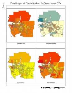
Lab4 dataclass Q7

Quantitative Data Classification: Different classifications of data can be used to represent data on a map, in this case being the affordability of housing in both Vancouver and Montreal.  Using different types of classifications (Natural breaks, manual breaks, equal interval and standard deviation) can influence how the data is display and how the audience interprets the data in concordance with a colour scheme.

In the eyes of a journalist, I would most likely use the manual breaks classification as I would want to communicate the high cost of living for young people who are looking to move to Vancouver. On the other hand, if I were a real estate agent instead, I would most likely use the equal interval classification as it represents areas around UBC to look more affordable than they actually are.  There are ethical implications for the choice of classification as it can make your audience believe that housing is more affordable than in reality.

Housing Affordability:

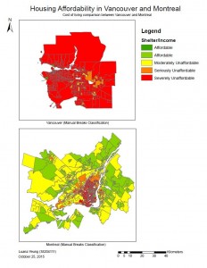
Lab4 Housing affodability Q11

The map above contrasts the housing affordability for the cities of Vancouver and Montreal.  By looking at the maps, you can clearly see that the housing affordability market for Vancouver is in the seriously to severely unaffordable range.

Affordability measures the cost of shelter over income.  This is a better way to compare housing affordability than housing cost alone as the amount of income is a normalizing factor.  By doing this, we can take into consideration the fraction of income that individuals in a household need to spend on housing to live.  In this case, even though those who live in larger cities may earn a higher income, this does not mean that the same individuals can afford to live with their current wages based on the standard of living.

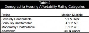
housing affordability rating categories

Above are the housing affordability rating categories.  The Demographia International Housing Affordability Survey uses the “Median Multiple” (median house price/gross annual median household income) to asses affordability.  In my opinion, I think it can be trusted as this method is the standard used worldwide for evaluating urban markets and has been recommended by the World Bank and the UN.

Though affordability might be an attractive quality when looking for a place to live, it may not be the most livable.  In a city such as Vancouver, it is a more desirable place to live due to the fact that the weather is much more mild all year round and has all the amenities that are attractive to a wide variety of people (ie. outdoor activities, green space, young and vibrant culture).  Since Vancouver has such a wide variety of things to offer people from all backgrounds, it attracts more people to the city which results in higher cost of living due to the lack of housing supply to the high demand.  In many ways, perhaps the more livable areas have the least affordability due to the fact that everyone wants to live in a particular area.

Accomplishment Statement: In this lab I have learned practical skills in Arc such as joining tables of data into shapefile data and using data classifications to manipulate datasets to interpret and represent the data in a way that is engaging for a particular audience.


Lab 3

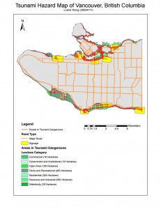
Hazard map

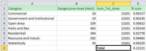
5. 12% of Vancouver’s total area is in danger.  I totaled up the categorical areas in the “Vancouver_landuse” layer to find the sum of the total area and used the values from the “Dangerzone” area to find the totals of each category of landuse that would be affected.  I found  the percentage of affected area for each category and for the total area.

Q5table

6. 2 separate layers were created by using the intersect tool.  The danger layer was intersected with the “Vancouver_health” and the “Vancouver_education” layers separately.  The facilities that are affected.

Category Name
Health Facility False Creek Residence
Health Facility Broadway Pentecostal Lodge
Health Facility Yaletown House Society
Health Facility Villa Cathay Care Home
Education Facility St. Anthony of Padua
Education Facility Ecole Rose des Vents
Education Facility False Creek Elementary
Education Facility Ely Carr Institute of Are & Design
Education Facility Henry Hudson Elementary

Accomplishment Statement: The intersect tool was used in this lab to highlight specific data that is relevant to the mapping area.  In this exercise, the intersect tool was used extensively to highlight the types of roads, schools and health facilities that will be affected in the tsunami zone in Vancouver.

Lab 1

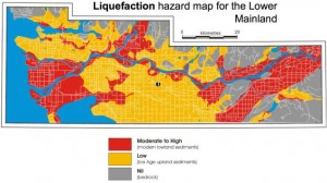
Question 1 liquefaction hazard map of vancouver

This image above illustrates the level of risk associated with liquefaction or the potential for water saturated soil competency to diminish significantly in the event of an earthquake in the lower mainland. The message is clear as it does use a colour scheme that is easily associated with levels of intensity; red associating high risk and danger, yellow meaning a lower risk and grey meaning little or no effect in response to an earthquake. This map is clear and free of clutter which allows for the audience to clearly distinguish which areas of Vancouver will be most affected.

The geospatial data used may be information about the soil types such as quaternary glacial sediments, bedrock and modern, incompetent sediments (ie gravel, landfill, peat, etc) susceptible to shaking induced by earthquakes. Other information for this map may include major roads in the lower mainland that may be affected.

Accomplishment Statement: In addition to the examples that illustrate how GIS is important to our everyday lives, I have also completed the introductory course that teaches students how to use ArcMap and ArcCatalog.  From this I learned basic and practical skills that are essential for interpreting map data for a specific purpose.


Lab 2

Lab 2: Understanding Geographic Data

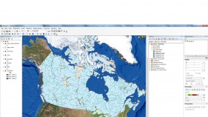
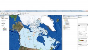
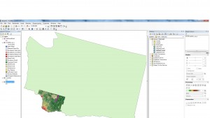
In this exercise we explored spatial map data of Canada and Washington State in the U.S. while learning about coordinate systems, datums, projections, and spatial data models (raster and vector data). We also used raster landsat data to review the before and after of Mt. St. Helen’s volcanic eruption in 1980.

Lab2part2 Lab2part1 Lab2part3 Lab2part4

Above: Images of maps created in Lab 2

In the last part of the lab we focused on Landsat Data to understand how remote sensing works.  An example where Landsat Data would be useful for something like Landslides (ie the Hope landslide or the Mount Polley tailings dam breach). The kinds of questions that might be relevant would be how much volume of material has been displaced before and after the landslide and the time interval needed for landsat data would probably be on a yearly timescale. It would be best to gather landsat data for this situation in the spring or summer months where the landmass is not covered in snow and the details of the damage done by the landslide is most distinct. The geographical location of both of these areas are based in the Cariboo and Thompson region of British Columbia where the quality of Landsat images may be dependent on the season.

Accomplishment Statement: After this lab, I learned that the data used in making a map needs to be referenced properly and need to have consistent coordinate systems and projections.  In addition, I determined the difference between raster and vector data and which situations where one may be better than the other.  Raster data may be used for continuous data and vector data for more discreet data sets.


Spam prevention powered by Akismet