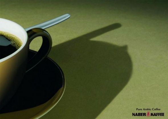
Do you believe that silent language could be more effective in delivering message than verbal language? I do! Look at the ads below:
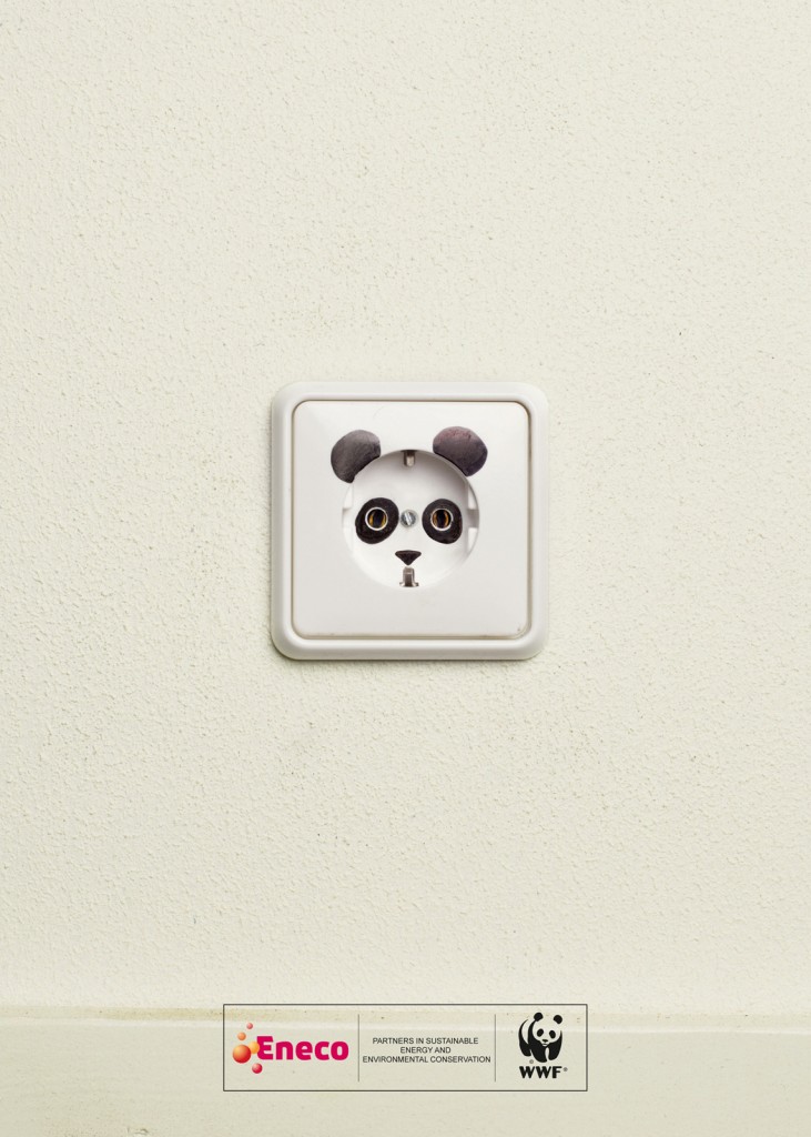
First look at the socket. It is tacitly understood that the ads is talking about energy (or may be electricity). You may not have idea what it is to do with panda. A decoration? And when you read further down, there’s a WWF label with its recognizable icon – the panda. So audience will immediately read what the ads says: Please help save species through power-saving! So save more power guys if you love panda =) (of course, for other animals’s sake as well)
The advertisement is so easy and simple that it doesn’t include headlines and body text to convey its messages. It attracts audience’s attention with only one simple colour on the background that helps focusing our attention on the image. The branding is linked so well with the image that people can quickly catch up and interpret what’s on the advertisement.
Must we have lots of graphics, colours, motions and texts to create compelling message? Definitely not! Creativity could be as simple and powerful as this.
Creativity not = complexity
I’ve later found some nice print ads with similar themes that I wanna share with you guys:
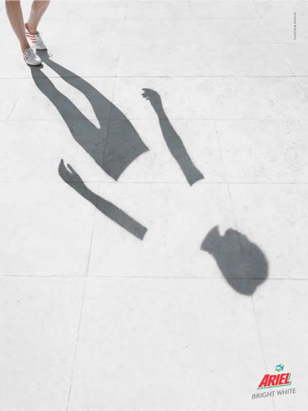
The washing power is so powerful that even the shadow of the clothes turns white! Although it is obvious that the image has been edited in photoshop, people can instantly know the function of the product: White, White, and White! No other message blends into the ads, so the message can be understood rather quickly.
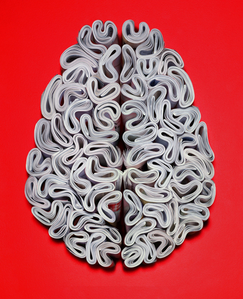
This is the print ads from The Economists, the magazine that talks mainly about world news, politics, economics and business. Your first glance might not realize that the brain is made up of a number of magazine. Look nearer!! The subtle meaning may take time to comprehend. But I love the “smart” feeling that it gives.
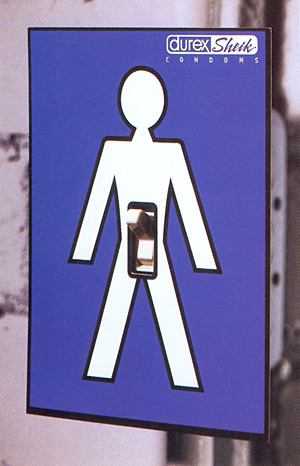
No comment. =) Just brilliant.
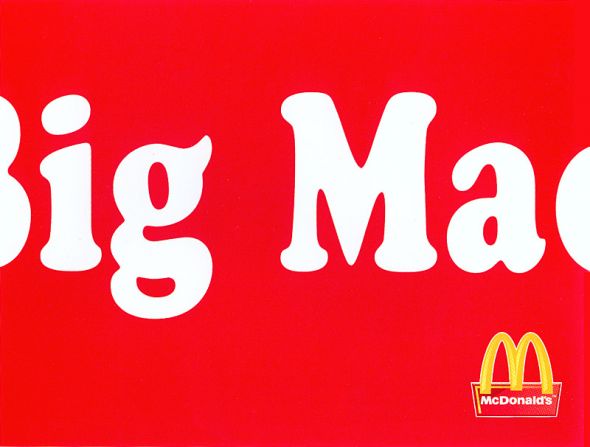
Again, this is another ads with subtle details. Don’t get it? Think why McDonalds makes the font so BIG that it cannot be fit into the space!!!!!
For this one, you’ll need a bit of knowledge about cultural buildings. If you realize the reflection is actually a mosque – the Arabic/Islamic central building for worship. It simply means Naber Kaffee is soooooo Arabic!
*Do you observe that the ads above have no single words describing the products, just a big picture with little variation in colours? Those are often my favourites!*
However, there are also some that I think the messages encoded are… not so nice may be?
The slogan is “always keep the content in its original bottle.” The product advertised is Anne Cream, cream hair remover. Got a hint? I actually looked through the and ads slogan a few times, and meditated for a while, then I got the message that perhaps the guy keeps the hair remover cream in other face moisturizing bottle, that he uses it without noticing that. The ads is way too subtle that it makes the message hard to interpret (may be I’m slow). Also, I don’t quite see how it advertises the greatness of the product.
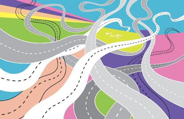
This is “Road” from Nike. Nice colour blended together. But is this an… ads? It may be a picture. I may mistook it as print ads.
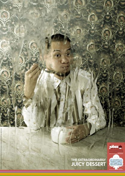
My first impression was: What IS THIS! It looks… unappealing to me. I totally didn’t get why there are so many horrible faces on the ads. After I read through the comments posted by others, only I noticed that those are juices spilled out from the desserts. Perhaps the juices should look more like juices??
