Category Archives: Tasks

Task 12: Speculative Futures

app interface

Worker one reads as a white man who has been funneled into a professional healthcare setting

app interface

Worker two reads as a woman of colour who has been funneled into hospitality (service) work despite being a computer programmer

This speculative future is an app-based survey that would be completed by workers whose jobs have been lost to automation. The program is run by AI and the interface has lost all aesthetic qualities. Workers apply to receive educational training in order to work in a new industry. Worker retraining is currently a popular political solution for job loss due to industry/economic change. The questions are analyzed by an algorithm which predicts likelihood of success based on current workers within the database. Based on current algorithmic bias I speculate that such a system would perpetuate racist and sexist discrimination in assessing candidates for service roles vs. professional roles. I based my speculation regarding automation proof jobs based on a podcast I listened to recently with author Kevin Roose discussing his book, Futureproof: 9 Rules for Humans in the Age of Automation. Roose theorizes that “surprising” jobs that involve making decisions based on changing and surprising variables and “social” jobs that involve service or care are likely not going to be automated. In my speculative example we see the results for two individuals coming from different industries completing the questionnaire and being routed into mandatory education and work. The questionnaire is short and becomes highly personal and seemingly arbitrary. It also requires the worker to disclose their social media username, face ID and fingerprints implying that the algorithm will track and collect their media data in addition to demographic, crime and health data. The results imply that individuals who fought hard against systemic barriers to work in technology industries are set back again due to automation. 

Davis, D. (2021, March 16). The Age Of Automation Is Now: Here’s How To ‘Futureproof’ Yourself. NPR. https://www.npr.org/2021/03/16/977769873/the-age-of-automation-is-now-heres-how-to-futureproof-yourself

Task 10: Attention Economy

screen shot of completed Bragaar exercise

Thank you Alfonso!

This task certainly was a “frustration” as Bagaar intends! Like most people, I find bad UI pretty taxing under normal circumstances. What I found interesting was some of the intentionally frustrating or confusing design elements are common in many form/survey fields I come across. For example confusing password requirements, selecting and deselecting boxes from exhaustive lists, formatting errors, and lacking an auto-advance to the next field or tab function capability are common in messy UI. There were definitely spots where I really struggled to figure out how to move forward, the whole game took about 12 minutes to complete which seems like an excessive amount of time. Beyond simply messy/bad design I noticed that the GUI was also designed to divert my attention to “bad” elements that were confusing or misleading. The flashing numbers and countdown pop-ups added a sense of urgency and panic, these types of techniques are typically used to trick users into clicking malicious elements. When considering the changing spaces of text technology, understanding and navigating digital graphic interfaces is a new literacy that leaves certain populations more vulnerable to manipulation or fraud. When I then consider the learnings from Tufecki and Harris, GUI is used to capture attention and data that can then be sold to not only affect our consumer spending but also our political leanings and voting behaviour. This exercise demonstrated really clearly how easily companies can  exert emotional control and manipulate online behaviour through interface design and human psychology. 


Harris, T. (2017). How a handful of tech companies control billions of minds every day.

https://www.ted.com/talks/tristan_harris_the_manipulative_tricks_tech_companies_use_to_capture_your_attention?language=en

Tufekci, Z. (2017). We’re building a dystopia just to make people click on ads.

https://www.ted.com/talks/zeynep_tufekci_we_re_building_a_dystopia_just_to_make_people_click_on_ads?language=en

Task 9: Network Analysis

Based on these visualizations I don’t think that the reasoning behind individual contributor choices is readily apparent. The information I am able to parse is centered around the strength of connections, but not the meaning behind them. I think any meaning I could try to derive based solely on this visualization would have a lot of bias and assumptions. In the code.org video from this week regarding search engines, companies such as google use demographic and location algorithms to return what is assumed to be the most relevant results. The political implications of how that algorithmic code fosters a feedback loop where users are only seeing results in line with their pre-existing ideas and bias has been widely felt. Unlike the initial dream of the web to use hyperlinks and scan multiple connected sources of data to further human knowledge, search result algorithms may inhibit people from developing new ideas or collaborating across political and cultural domains. Similarly, the strength of the connections here doesn’t provide me with deep and nuanced information and tilts my community towards others that make the same choices even though I don’t know their intention or meaning.  It would be interesting if the quiz included secondary questions around decision making. For example, did you choose this song a) personal preference b) for diversity representation c) other. It would offer insight into the political relevance of nodes within the network based on  intentionality not just popularity. 

The most relevant nodes concentrate towards the center of the visualization. These nodes have the most in common with other nodes within the network because they have the highest number of links. We can visually see a high density of crossing edges in the center clusters of nodes. I did think it was interesting that the links in this network visualization don’t explicitly indicate directionality. Knowing the source data, I can assume that nodes that appear as contributor names are directional to songs and not vice versa. It is interesting to chart a walk between contributor nodes through song nodes, particularly outside of contributor communities (Systems Innovation, 2015). Whereas in my contributor community there is only one node of separation between members, within the larger class visualization I have multiple nodes of separation and innumerable potential walks within the network. I did try turning off links and switching on node size- honestly I found it a bit depressing. Rather than seeing the information as highly networked it quickly became obvious that many songs (and people) are irrelevant to the network (myself included) based on network theory.    

Code.org. (2017, June 13). The Internet: How Search Works (video file). Retrieved from https://youtu.be/LVV_93mBfSU

Systems Innovation. (2015, April 18). Graph Theory Overview (video file). Retrieved from https://youtu.be/82zlRaRUsaY

Systems Innovation. (2015, April 19). Network Connections (video file). Retrieved from https://youtu.be/2iViaEAytxw


Task 8: Golden Record Curation

I approached this task by listening to the golden record songs individually. I printed out the list of songs and listened to each, then jotted beside the song “YES”, “NO”, “YES/MAYBE”, and “NO/MAYBE”. The initial list broke down as follows:

Yes 6
Yes/Maybe 7
No 13
No/Maybe 1
      1. From the 7 yes/maybe songs I tried to again select my favorites, although I did find that I was leaning towards choosing songs that were different in style from what I have already selected.   I wanted to approach the task through my own taste/preference, as an experiment to see how westernized my ear is. I think the “through thread” in what I chose is songs that include choral and percussive elements,

    with a slight over-representation of American music. 

  1. Senegal, percussion, recorded by Charles Duvelle. 2:08
  2. Zaire, Pygmy girls’ initiation song, recorded by Colin Turnbull. 0:56
  3. Australia, Aborigine songs, “Morning Star” and “Devil Bird,” recorded by Sandra LeBrun Holmes. 1:26
  4. “Johnny B. Goode,” written and performed by Chuck Berry. 2:38
  5. Georgian S.S.R., chorus, “Tchakrulo,” collected by Radio Moscow. 2:18
  6. “Melancholy Blues,” performed by Louis Armstrong and his Hot Seven. 3:05
  7. Stravinsky, Rite of Spring, Sacrificial Dance, Columbia Symphony Orchestra, Igor Stravinsky, conductor. 4:35
  8. Solomon Islands, panpipes, collected by the Solomon Islands Broadcasting Service. 1:12
  9. Peru, wedding song, recorded by John Cohen. 0:38
  10. China, ch’in, “Flowing Streams,” performed by Kuan P’ing-hu. 7:37


Task 7: Mode Bending

Please click the audio recording for Task 7 mode bending:

The New London Group.  (1996). A pedagogy of multiliteracies: Designing social futures. Harvard Educational Review 66(1), 60-92

Pena, E. (2021) The Educated Imagination in the Information Age: Redefining our Understandings of Literacy. Module 7.4 paragraph referencing Northrop Frye, (1963) The Educated Imagination.

Task 6: An emoji story

series of emoji that depict the plot of a film

Emoji story based on film

For this emoji story I relied mostly on ideas and words to lay out the plot synopsis of the film I chose. I found that it was easy to represent plot action and basic emotions but was quite difficult to represent relationships between characters. This film does not have a large cast (2 main characters and 3 supporting). Even with the small number of characters it was challenging to represent interactions. A complex plot, or a dialogue driven film would be incredibly difficult. Part of why I chose this story is because it is fairly basic in terms of the romantic story arc and has a distinct feature (vampires) to help the reader decode the reference material. I recently attended a virtual baby-shower and deciphering emoji versions of popular kids books was one of the games. It was pretty fun! My pals and I are all immigrants to the US and each of us is from a different home country (Brazil, Canada, Portugal and Finland). It was interesting to see the slight variations in how we interpret emojis based on our first language. 

screen capture of text messages using emoji to represent popular children's stories

A new virtual baby shower game is to decipher children’s stories represented by emoji.

My process of “translating” a story to emoji (and I would argue this would have been true of a book or film/show) is akin to what Bolter (Chapter, 4) describes as reverse ekphrasis. The emoji (image) has the task of explaining the text of the source material. I organized the plot into scenes (chapters) and beats (pages). I thought of the story in terms of how it would be represented in a book rather than pulling direct imagery from the film itself. There is so much visual content in a film or show that it would be pages and pages of emojis to directly translate. In essence, I translated a synopsis (a rudimentary ekphrasis itself) rather than each visual cut of the film. In fact I found myself referring occasionally to an IMDB synopsis to ensure I had captured the significant plot points accurately. 

Bolter describes new media picture writing as combining both pre-literate (telling a story through time using images) and post-literate (using images as natural signifiers for objects or instructions across language divides). I think this describes the emoji story really well, it was a bizarre experience to simultaneously represent a story arc through time/space and to symbolize objects/ instructions. I think that Bolter slightly missed the mark on how ASCII emoticons would evolve into emoji and how they are used in online writing. He argues that new media writers are moving away from authoritative prose and want to give their work the immediacy of a singular persona. I had to chuckle at the idea that people would abandon writing in favour of sending asynchronous video messages. Even leaving a voicemail message is considered bad taste these days. The reality is that in text based new media forms the writing has more in common with oral rhetoric and conversation than written prose. The emoji functions as a way to return oral modes of emphasis using non-verbal cues such as pacing, expression, breath, and gesture.  

Bolter, J. D. (2001). Writing space: Computers, hypertext, and the remediation of print (2nd ed.). Mahwah, N.J: Lawrence Erlbaum Associates

Task 5: Twine Task

I found this task really fun and interesting to complete. My biggest challenge was during the editing process. Twine offers a great platform to play with a new form, but as a novice it was really challenging to edit through my work. For instance, I learned late in the game that there was no spell check. Something to be said about how modern writers are dependent on word processing to generate content (Bolter). The ability to easily outline, move and edit text was a bit lost in Twine for me. I also realized after I was finished that the navigational device I chose (colour coding) might not be accessible for all readers. My story is written in the first person from the perspective of my dog. I stole this idea from the novel Fifteen Dogs by Andre Alexis and the ancient internet joke about a dog’s diary compared to a cat’s diary. My dog is quite clever, but also obsessed with eating crayons so she falls somewhere on the spectrum of these two inspirations. 

I initially started to make a “choose your adventure” style story, then decided to start over in a different direction. I was thinking about how hypertexts should ideally remediate printed books (Bolter). I wanted to pull from the class theme for this week that the medium of the text shapes the content and writing style. To be honest I find “choose your own adventure” stories a bit clunky and underwhelming, particularly when the author forces you back to the original story arc. I wanted to try to remediate a traditional printed literary device instead. Depending on the genre authors can employ flashbacks, monologues, footnotes, etc. to add richness and information to printed text. I thought it would be interesting to have a core story arc which can be read at face level, with hypertext to add depth through what I called “tangents”. The reader can choose to go on tangents or can choose just to follow the main story path. I think it would be really interesting to expand on this form to have Xanadu style links between story elements. I imagine one could create an entire web of stories in this form where characters and backstories link in a bidirectional manner rather than in a serial manner as we experience with printed books (Nelson). Popular stories like Game of Thrones or true crime serials seem particularly suited to a hypertext medium. 

Dog and the Crayons.html

Task 4: Potato Printing

I chose to complete the potato printing activity for this task. The first challenge I encountered was applying marker to the flesh of the potato. There was some kind of reaction between the ink and the starch which caused the marker to stop working. I used a new sharpie and I still couldn’t get more than one line of ink. I used a yam rather than a potato (what I had on hand) and I wonder if the starch/sugar composition of the tuber was the issue.  I decided to freestyle my letters and quickly became thankful that I only had two letters with significant curvature, I also chose to use uppercase letters which have more straight lines. I was grateful that I watched the video about manual printing and remembered to make my letters backwards. For my uppercase letters that only mattered for letters with curvatures “S” and “J”. The rest of my letters are symmetrical along at least one axis (“A” “E” and “M”). In all it took about thirty minutes to complete the stamps and make two prints of my daughter’s name.

I enjoyed doing the activity since I have a bit of a soft spot for stamps. It reminded me of creating my wedding invitations which I drew by hand and had laser cut onto rubber stamps. I then manually stamped each invitation. At the time it did not occur to me that there was a parallel between my process and early “printing” of diagrams and images in books (How it Began). I agree with Brad Harris that hand illuminated codexis, mechanical book printing, stamping and other forms of “making” generate objects that hold value above and beyond the textual content. In terms of output and dissemination of ideas each evolution of writing/printing has increased both the speed and spread of ideas, certainly people being able to self publish through laser/ink jet printing has resulted in a wider spread of ideas just as the printing press opened up discourse to a wider range of social strata. With digital publishing and social media even more people are able to engage in discourse. My feeling is that with each iteration, “Text” both becomes more democratic and loses layers of authority. Coming from a Disability justice background, I value digital mediums that foster greater access and voice for folks who do not read and write through conventional means. I did have pause while completing this task that both potato printing and manual writing are not readily accessible to all students. “Cripping” this task could generate another perspective on who has access to print discourse and the disruptive presence of disabled bodies. It reminded me of my former instructor and disability artist Eliza Chandler’s practice https://www.ryerson.ca/disability-studies/people/faculty/eliza-chandler/

Task 3: Voice to Text Task

“Okay I think you can start once upon a time there was a narwhal who is friends with a unicorn he do narwhal and then one day sound of evil fish robot the evil face robot had a laser that could make people become its servant so is that the the Narwhals friend and made him his servant the Narwhal was very sad he wanted his friend back so she went end call. Narwhals and then the Narwhals destroyed the robot in destroy the laser in the Narwhal had his friend back it’s a bit”

For this task I asked my daughter to dictate a story on my behalf. She is the age where she has a great capacity for oral storytelling but does not yet have the technical skills to write her stories down. I thought her developmental moment would add an interesting layer to the task. The fact that my scholarly reflections are so tied up in my parenting experiences (she also was central to my “bag” assignment) speaks to the experience of mothers sheltering at home. Her orality is not a primary orality as Ong describes, as she is able to read and prior to reading she was well versed in the concept of written books and western literary story structures. From an education technology lens, it was interesting to ask her about what was “wrong” with the text. It gave me pause to think about how this tool might help early writers to gain a better understanding of how to break their oral ideas into written sentences. I read the story back to her because she found it difficult to follow without proper punctuation. The lack of punctuation is the greatest “wrong” with the text. I noticed that even at moments where she took a long pause the software did not necessarily add a period. This indicates a difference in oral storytelling as compared to written storytelling. An orator can pause and the listener understands this to be the completion of the thought, even if it is not a grammatically complete sentence. Oral stories contain both run-on and incomplete sentences without the listener perceiving a catastrophic “mistake” in the form. In written English punctuation offers essential information that directly impacts how the reader deciphers meaning. One needs only to look at online arguments regarding the oxford comma to realize the perceived value of punctuation. In the above passage the “mistakes” that were most difficult for an early reader to overcome were lack of punctuation, repeated words, and misquoted words. I was impressed by how well the software translated her words into text and that this was possible in real time. My background is in Disability services. For years the assistive devices that could convert speech to text were expensive and often wildly inaccurate. It would be an interesting experiment to record a text-to-speech screen reader and play it back into speech-to-text software. Gnanadesikan writes about the degradation of meaning/content in oral passing of information from one individual to another. Writing was the first technology to be able to capture language out of the temporal and into a spatial medium. I wonder what would happen if the human element of computer writing technology is removed. How many iterations of text-to-speech speech-to-text would render the original content meaningless?

Task One: What’s in your Bag?

My name is Megan. This is my bag.
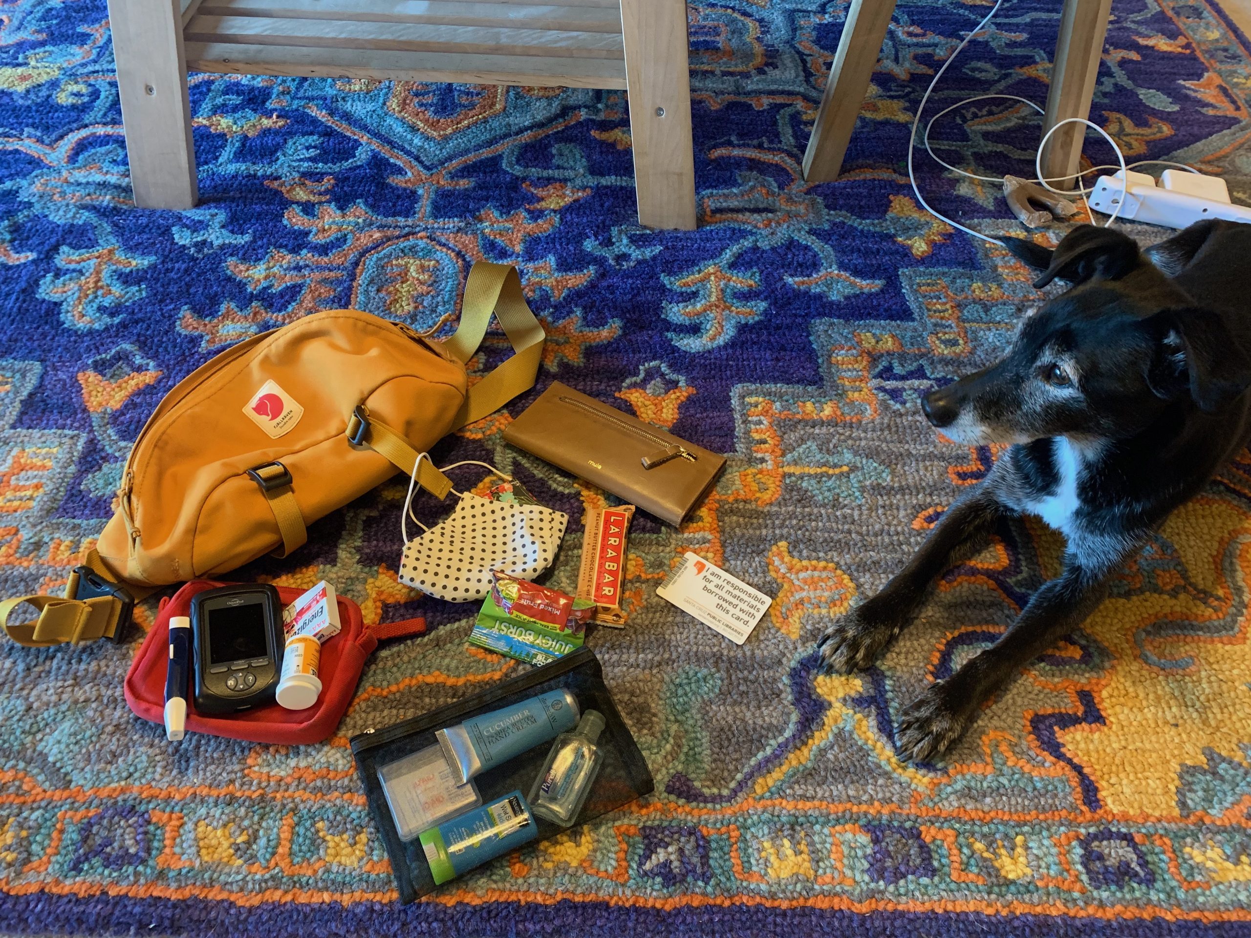
Photo of a bag with contents emptied out onto the floor. A dog is lying next to the bag.

My bag… and dog.

Here is a list of what is inside:

Pictured:

  • insulin pump kit including blood glucose test strips, lancing device and backup batteries
  • fruit snacks
  • energy bar
  • wallet
  • public library card (loose)
  • homemade fabric mask
  • toiletries bag with hand cream, sanitizer, mini-first aid kit, sunblock
  • My dog, who upon seeing me pick up my bag would not let me out of his sight. Time for a walk? Car ride? 

Not pictured:

  • iphone

For this exercise I have chosen to focus on two items from my bag. My library card and my insulin pump kit. Both offer a conduit for reflection on text, technology and privilege. 

The library card is the most direct connection to what I think of as text. Going to the library to access texts has fundamentally changed during the pandemic. My daughter chooses what books to check out through an online portal. She is in kindergarten and the pandemic has made me more conscious of the tactile and visual experience of selecting books for children her age. With the advent of tablets and digital books there was widespread fear that printed books would cease to exist. Her forced ejection from spaces filled with printed texts (school and the library) has distilled how inadequate digital texts are at engaging early readers. She tends to have fewer opportunities to stumble upon new stories, authors or ideas. I am an intermediary between her and the texts she hopes to explore. I often find myself translating six year old ideas into Boolean search terms. 

The library card represents my own level of education, privilege and luxury of time. It speaks to the public institutions that children occupy, and how they are (or are not) valued.  I started going to the public library on a regular basis fairly recently, after moving to California and caring for my daughter full time. I hadn’t fully realized how much this space is occupied by women and children. The vibrancy of a neighbourhood public library is so closely tied to both the municipal property tax base and the values of the community. Where I live, libraries are a manifestation of liberal leaning tech wealth. The community is hyper focused on childhood achievement and the public library is a source of both printed texts and digital literacy. “Coding for Kids” programs are common. This is an example of text as a source of authority and power. Beyond simply being able to navigate the changing space of reading and writing on the internet, children in Silicon Valley are folded into a dynasty that controls and writes the infrastructure of digital spaces we all occupy. 

The insulin pump “PDM” (personal diabetes manager) is a complicated text technology. This device controls the tubeless insulin pump “pod” which is attached to my body at all times. It enables me to communicate wirelessly with the pod, sending commands and programming complex basal/bolus calculations. It also maintains a record which can be uploaded and shared with my medical team through a cloud based interface. I think a lot about digital literacy and how that relates to patient care and chronic disease management. Before I started using an insulin pump I had to manually test my blood sugar, calculate my insulin dose, draw and inject insulin, and write a paper record of what I did. It was very difficult to distill information or patterns from a paper record. My ability to manage my disease is objectively better now than it was 20 years ago when I was diagnosed. I am conscious of the multiple levels of privilege required to access and engage in this level of data management and medical technology. 

I just started using an insulin pump 3 years ago. Prior to that the whole process of dosing insulin was on public display. Most of the time my pod is covered by clothing and I “pass” as non-disabled. The ritual of testing and dosing insulin before a meal has been supplanted. Now I pull out what looks like a bizarre cellphone and press some buttons. My bag reveals the truth of my lived experience. I think an archeologist would understand my body and my relationship to the PDM as a text technology in much the same way we understand the starvation diets used to treat people with diabetes 100 years ago. The technology (treatment) is a rudimentary stop gap to prolong life. The insulin pump company I use plans to release a “hybrid closed loop” artificial pancreas within the next year. An artificial pancreas would not be possible without sophisticated dosing algorithms which exceed what the human brain is capable of fine tuning in real time. One can only imagine what medical technologies and the literacies required to navigate such interfaces will be like in the future.