Author Archives: mliew

USDA Crop Report – Sep 2013

Hi Folks,

The reaction of Corn, Wheat, and Soybeans prices (Nearby +1 contracts) to the USDA crop report released today, on the 12th September 2013.

Some things to note:

  • Notice that the volume of contracts traded today was significantly higher than usual as we had discussed in class
  • Notice that all 3 commodities plunged in early trading, but by the end of the trading session, Corn ended lower, Wheat slightly higher, and Soybeans significantly higher.  Note that here we are talking about nearby prices (2nd nearby contract, to be exact).
  • In addition, the effect of the news on the futures curves (i.e. contracts further out in time) has been quite different for the 3 commodities – I’ll let you guys investigate

These would be great topics to blog about in your upcoming blogpost and I look forward to reading some great stories

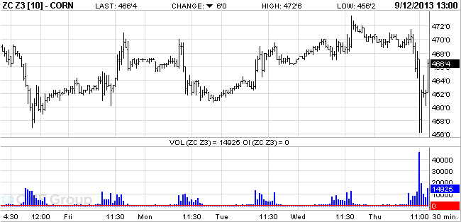
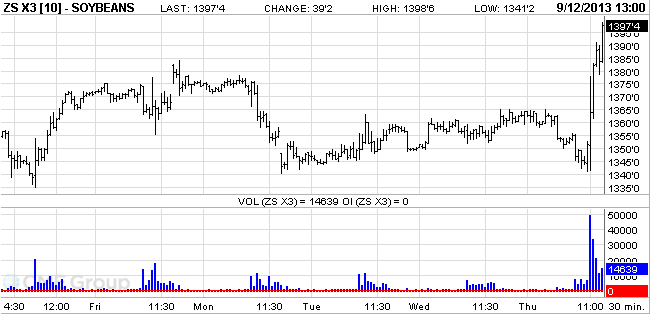
Charts from CMEGroup (note that the time displayed is central time)
Note that Z3 refers to Dec 13 contract, while X3 refers to Nov 13 contract

Excel & Access for Economic Analysis

This is a list of excel and access resources for my students

Recommended Add-ins / Upgrades for Excel:

Excel / Access Links / Resources:

Understanding when to use Excel (spreadsheets) vs. Access (relational database):

  • Microsoft Office Help explanation of the difference
  • A better explanation from FMS Inc here

Excel Files – Practice and VBA simulations:

Curve Flattener Spread Trade

I’ve been asked a few times what my spread trade is and why I did it, so here’s a more detailed write-up:   what I did was to short the wheat pre-harvest premium in 2014.  (premium meaning May 14 was at premium to Jul 14)
And my position is just a bet that this premium would be lower by year end, or end of class.  So I’m short the May-14 contract and long the Jul-14 contract.

2 pictures here are more interesting:

1) Wheat Futures curve.gif
This shows you the wheat futures curve at 3 points in time:
a) In blue is the curve 4 months ago (before news of US drought)
b) In green is the curve at start of class in september (when drought fears were pretty high)
c) In orange is where we are now (where the drought is yesterday’s news)

You can see the curve was in contango (normal carry market) all the way back in June, and the stock out fears from the drought news drove up not just 2012 spot wheat, but also 2013 and 2014….  and i basically felt in Sep that the 2014 market prices were too pessimistic …(who knows anyway what the weather will be next week let alone 2013 or 2014)

2) Wheat May 13 vs Jul 13 (2010-2012)
This chart is interesting because it shows you the entire trading history of these two contracts (May 13 and Jul 13) going back to 2010.  You can see that in early 2011,  bad weather and stock out fears also drove 2013 pre-harvest (may-13) prices to large premium over harvest time prices (jul-13), almost 80 cents per bushel.  But this premium just slowly disappeared over the rest of 2011 as the weather behaved, and people forgot….  sounds familiar?   I see some strong parallels to what is going on right now, with the 2014 contracts…