Ecommerce and Content Creation

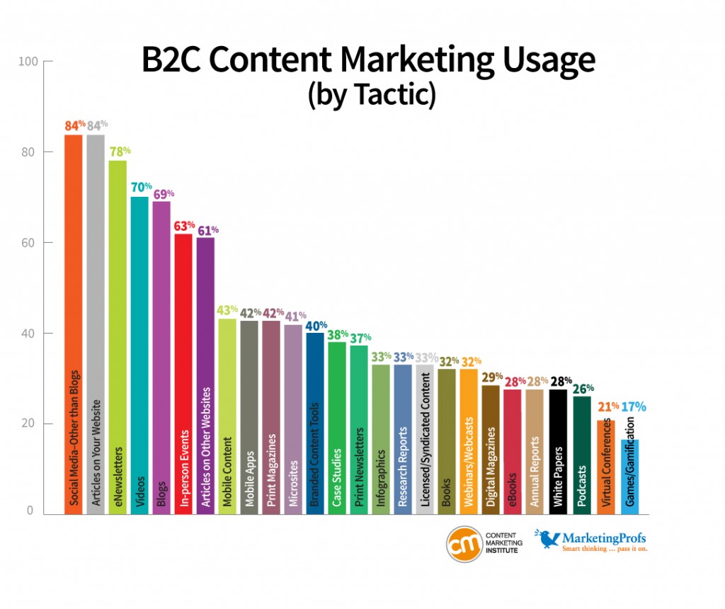
In the beginning of the semester, we discussed in class how you can either be a content creator or a curator. I wanted to combine this concept with ecommerce and how you can use content to build your brand and credibility with this Shopify article by Braveen Kumar. He writes that you don’t necessarily be a content creator in order to benefit from content, and how it is essential to building a powerful lifestyle brand around an ecommerce business. According to the Content Marketing Institute, 70% of consumers say content marketing makes them feel closer to a brand. The most popular content marketing tactics include social media (84%), articles on a company’s website (84%), and eNewsletters (78%).

B2C_Chart3_UsageTactic1

Online businesses may not have physical touchpoints but the online platform provides ample opportunity to understand and connect with your audience. Content marketing allows you to deliver value to your potential and current by teaching or entertaining, and telling your brand story without overtly selling product.

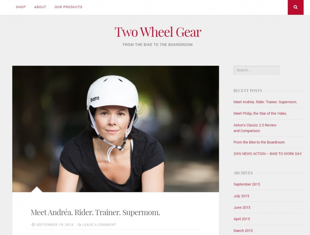
Our client, Two Wheel Gear, is a small startup that manufactures bike bags for professional commuters. We are currently working with them to establish it as a lifestyle brand and create messages that resonate with its consumers. Since Vancouver has a large cycling community, there is a great opportunity to get in touch with influencers on Twitter, Instagram, and Facebook, and also share relevant and local information. Two Wheel Gear has also started up a blog in an effort to provide more valuable content for its consumers. Since content with images and visual elements get 94% more views than text-heavy content, Two Wheel Gear has been using a highly visual approach when creating posts. With tips, cyclist profiles, and articles, they hope to get people interested in bike commuting and their products.

Blog

Sources:

https://www.shopify.ca/blog/69079045-how-to-grow-your-ecommerce-business-with-content-curation

http://contentmarketinginstitute.com/2012/11/2013-b2c-consumer-content-marketing/
Twitch: The Streaming Platform That Could

twitch1

The popularity of video games has been on the rise with the popularity of esports. Games like League of Legends, Defense of the Ancients (DotA), and Counter Strike: Global Offensive rake in hundreds of thousands of viewers for their large scale events, and has opened up a brand new video platform: streaming.

Originally started as Justin.tv in 2007, Twitch has become the largest and most popular streaming platform on the internet. With top streamers reaching upwards of 20,000 concurrent viewers at the same time, it’s no surprise that advertisers have started to notice the potential of the streaming platform. A streamer can choose how often to play ads and for how long, often depending on when a game has low amounts of action, causing a variable amount of money to be generated with these ads. While it makes sense that a streamer can play ads frequently to make more money, they must strike a fine balance to make sure they do not annoy their fanbase.

While the amount of money a streamer can make off of ads and how much it costs to have Twitch display your ad is not public information, popular streamers such as Michael “Imaqtpie” Santana can make $8,000 a month off of partnerships, advertisements, subscriptions, and donations. This speaks to the amount of volume and views an ad can receive within a short amount of time. Similar to how a Youtube endorsement can work, viewers are often more willing to buy a product that has been used and promoted by their favourite streamers, since they tend to trust them more.

Although an unlikely competitor in the entertainment industry, Twitch has shown that it can attract tens of thousands of viewers at any given time of day, causing the reach for advertisements to be massive. Backed by endorsements from popular streamers, it’s hard to ignore Twitch’s power for advertising.

2795345-twitch

Sources:

http://www.ongamers.com/articles/scarra-will-probably-earn-200k-this-year-michael-odee-o-dell-discusses-esport-earnings/1100-908/

Youtube’s Paid Sponsorships

Since first starting in 2005, Youtube has evolved from a platform for sharing your home videos to one of the most visited websites in the entire world. Currently holding 3rd place in the Alexa ranks, the Google-owned company has created thousands of jobs for brand new content creators. Ranging from how-to videos, to make up, to gaming, Youtube content creators have been able to make a living simply off of people subscribing and watching their videos.

The most well-known beauty Youtuber, Michelle Phan.

The most well-known beauty Youtuber, Michelle Phan.

Half of this is possible because of ads. Before every video, users are presented with an ad varying from 15 seconds up to more than a minute, with the longer ones being skippable. These ads provide a source of income for both Youtube and the video creator, generating approximately $5 per 1000 views for a full ad, or 80¢ per 1000 views for a banner ad. It is not uncommon for these content creators to have hundreds of thousands of views per video, with multiple videos created per week.

The second half of most content creator’s income comes in the form of paid sponsorships. A famous gaming personality will be paid privately by a large company to play a game and show off some of its new features, or a makeup artist can do a paid review of a new product from a major designer. This presents a more subtle way of advertisement, as viewers are sometimes not even aware that the content creator has been paid to show off their product.

The existence of Youtube has created a new driving force in the entertainment industry, and has opened a brand new door for marketers and businesses to promote their products. With its easy accessibility and growing popularity, Youtube has proven that it is more than a viable platform for content creators and businesses alike.

Sources:

http://www.mensaxis.com/how-much-money-does-a-youtuber-make/


Snapchat: From Teenage Selfies to Commercial Success

snapchat-ads

Originally created with the intent of allowing people to freely express themselves socially without having to worry about the repercussions of a traceable history, Snapchat has evolved from a personal application used to send food pictures and selfies to a fully fledged business.

Users are able to share pictures for a duration of 1-10 seconds, after which the images are unable to be viewed anymore. In the future, Snapchat also introduced the feature known as “stories”, which allows an image to be viewed by everyone on one’s contact list for a full 24 hours. This gave users the chance to show off what they were doing that day to a wider range of people for a longer period of time, all while still being “temporary”.

The story is what sparked the business. This led to businesses such as CNN and MTV to create channels, broadcasting stories to people subscribing to them. These stories were used to present a more “candid” look at the business, and quickly became an advertising platform. Live events also took part in this, showing snippets from live concerts and award shows that were shown to all users. Due to its large reach and easy consumption, this option became widely popular and became one of Snapchat’s main form of income. With each view costing approximately 2 cents, Snapchat’s reach caused these ad spots to reach into the tens and hundreds of thousands.

Snapchat is an example of a small idea with simple execution opening a brand new door for advertisement in a way that nobody ever imagined. Despite its high costs, users opting in to viewing multiple ads from a company sounds almost too good to be true for some businesses.

snapchat-iphone

Sources:

http://recode.net/2015/06/17/snapchats-making-some-pretty-serious-money-from-live-stories/

Web Design Around the World

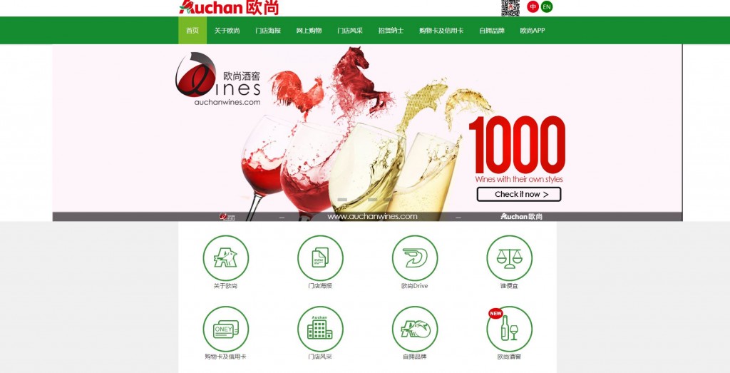
One of the topics I found really interesting that we talked about in class was web design around the world. I’m fortunate to have a group full of students from international backgrounds, ranging from Italy, Russia, China, and Canada. In class, we compared the website for Auchan, a global grocery chain.

We found that in China, there was a use of red and animal imagery. The design was also surprisingly clean in comparison to the other countries. Since Christmas is not a big holiday in China, the site design didn’t feature it.

Auchan-China

The Russian site was more marketed towards families, featuring products of children’s toys in the sliders. The main slider has an image of Santa to celebrate Christmas.

Auchan-Russia


I recently came across this article, “Why Japanese Web Design is so Different,” and immediately thought about the discussion we had in class. In the past, I’ve browsed Japanese sites and noticed that the design was always very crowded and text-based. This baffled me because Japan is a country that is so advanced in its technology, yet so outdated in its websites.

Rakuten, a popular Japanese ecommerce site.

Rakuten, a popular Japanese ecommerce site.

The author breaks down Japanese web design to several factors:

1) Linguistic Differences

  • Unlike English, few characters contain a whole lot of meaning
  • They can’t use emphasis with italics or capital letters

2) Cultural Differences

  • Consumer behaviour – Japanese culture is quite risk-adverse and people prefer a lot of technical information about products versus big pretty images
  • Website design reflects the urban landscape of how cities such as Tokyo are packed with huge flashy billboards

3) Technical Differences

  • Mobile technology – sites were first designed for the flip phone to fit as much information as possible onto a small screen, but hasn’t advanced with new mobile technology
  • Web fonts – there are a lack of web fonts for Asian alphabets, so they don’t have much to choose from

Sources:

Why Japanese Web Design Is So… Different

Importance of Responsive Designs

Despite its relatively short lifespan, the internet is already seeing its next big shift in the consumer market: mobile browsing. With 80% of internet users now owning a smartphone, it’s becoming more and more important for websites to support smaller screen sizes and more lightweight browsers.

This means that web developers need to start switching to what is known as a responsive website: a site that scales content based on the size of the browser window. This includes re-alignment of content, resizing of images, and collapsing navigation bars into a pop-out menu to maximize screen real estate. A lot of sites have already done this, but an often overlooked aspect is that visuals aren’t the only things that need to change – so does the functionality.

embrace-responsive-web-design

Most importantly, mobile users are not using a mouse to click on items, but using touch input instead. This means that certain features commonly used on websites such as pop-ups, drag-and-drop, and hovering are not positive experiences on mobile devices.

With this market shift, websites need to become more lightweight, simple, and quick in order to keep mobile users interested in their content and products. Failure to do so leads to higher bounce rates and for ecommerces, losses in sales. When the browser is the only thing taking up your screen, it’s more important to keep your visitors interested now than ever before. 

Sources:

http://www.globalwebindex.net/blog/80-of-internet-users-own-a-smartphone

Image from http://switzercreative.com/

The Evolution of UI: Windows OS

Windows made its first big break in the PC market with its creation of Windows 95. It featured a simple interface based entirely around squares not due to design decisions, but due to technological boundaries. Yet, it still shows off Microsoft’s ingenuity with its creation of the familiar taskbar and desktop combination which is still used to this day.

An example of Windows 95’s user interface.

An example of Windows 95’s user interface.

However, as technology evolved more and more, Microsoft was eager to show off the new crazy and advanced things they could do. This started with Windows XP, which featured rounded edges and a slight gradient to give the entire interface a bubbly, three-dimensional look. It was a huge advancement for its time, and was well-accepted by the general public.

While maintaining similar design principles as Windows 95, XP showed the next big step in the evolution of the Windows UI.

While maintaining similar design principles as Windows 95, XP showed the next big step in the evolution of the Windows UI.

Then came along Vista. The design that was supposed to be cooler, more sleek, and more modern, unfortunately ended up falling flat on its face. With its attempt to show off 3D capabilities with the Flip 3D task switcher and the “Aero” theme that showed coloured, glass-like transparencies to give more depth, ended up being overwhelming for the general user, and clunky for the power user. It felt slower due to the transition speeds of its animations, and was not nearly as simple to understand as its predecessor.

WindowsVista

An example of Windows’ Flip 3D task switcher.

Windows 8 was Windows’ next big attempt to be cool. It took a whole new approach, embracing the new touchscreen technology that was being developed, and opted to go back to a basic, flat, 2D UI. While it was simple and easier to understand than Vista, Windows had deviated very far from its tried and tested formula and alienated a lot of users. Not to mention that touch screens were unfortunately not accessible to many, making its new interface clunky and not optimized for non-touch screen users.

Windows 8’s touch-optimized tile home screen.

Windows 8’s touch-optimized tile home screen.

Windows 10 is the newest operating system, and truly goes back to its roots. With the desktop and taskbar combo, Windows 10 opts to use flat designs with slight transparencies to give depth, simpler icons, and even voice recognition for easier usability. While still in its infancy, many are saying that Windows 10 may be the best Microsoft operating system yet, and is a great reminder that sometimes when designing for users, we just need to KISS: keep it simple, stupid.

Windows 10 takes the touch designs of 8 and makes them optimized for PC.

Windows 10 takes the touch designs of 8 and makes them optimized for PC.

Sources:

toastytech.com

forbes.com

#Nofilter Makeup

As a young female, I often find myself strolling down the aisles at Sephora, checking out the endless array of new makeup products, swatching colours, and seeing what new technologies companies market to appeal to our beauty needs. I’m no stranger to bizarre makeup trends, but when I came across a particular product and scoffed at its ridiculousness.

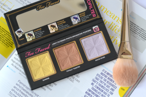
Two Faced Selfie Powder

Two Faced Selfie Powder

Marketers have been appealing to women’s insecurities, fantasies, and aspirations for a very long time. But how can some yellow powder make you look like an instagram filter? Who would believe this marketing mumbo jumbo? I recently read an article in the New York Times, “Makeup for the Selfie Generation” by Courtney Rubin and it made a little more sense. Products such as Too Faced’s Selfie Powder and the “iPhone Test” are representative of technological and social age we live in. With the immense influencing power of beauty bloggers, instagrammers, and Youtubers, the performance of a product in front of the lens is more important than ever. Cosmetic companies not only have to test makeup under normal conditions, but make sure that their products “play with light, offering photo finishes or airbrush effects that claim to make wearers camera-ready.” According to industry experts, this isn’t a passing fad. So you can prepare to see more hashtags on the shelves and photo-ready powders.

24SKIN2-master315

Sources:

http://www.nytimes.com/2015/09/24/fashion/selfie-new-test-makeup.html

No More Starving Artists

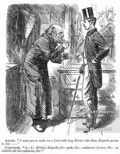
When you think of an art patron, you might imagine something like this:

Artist asking costumer for a coat like those worn in Hogarth's pictures

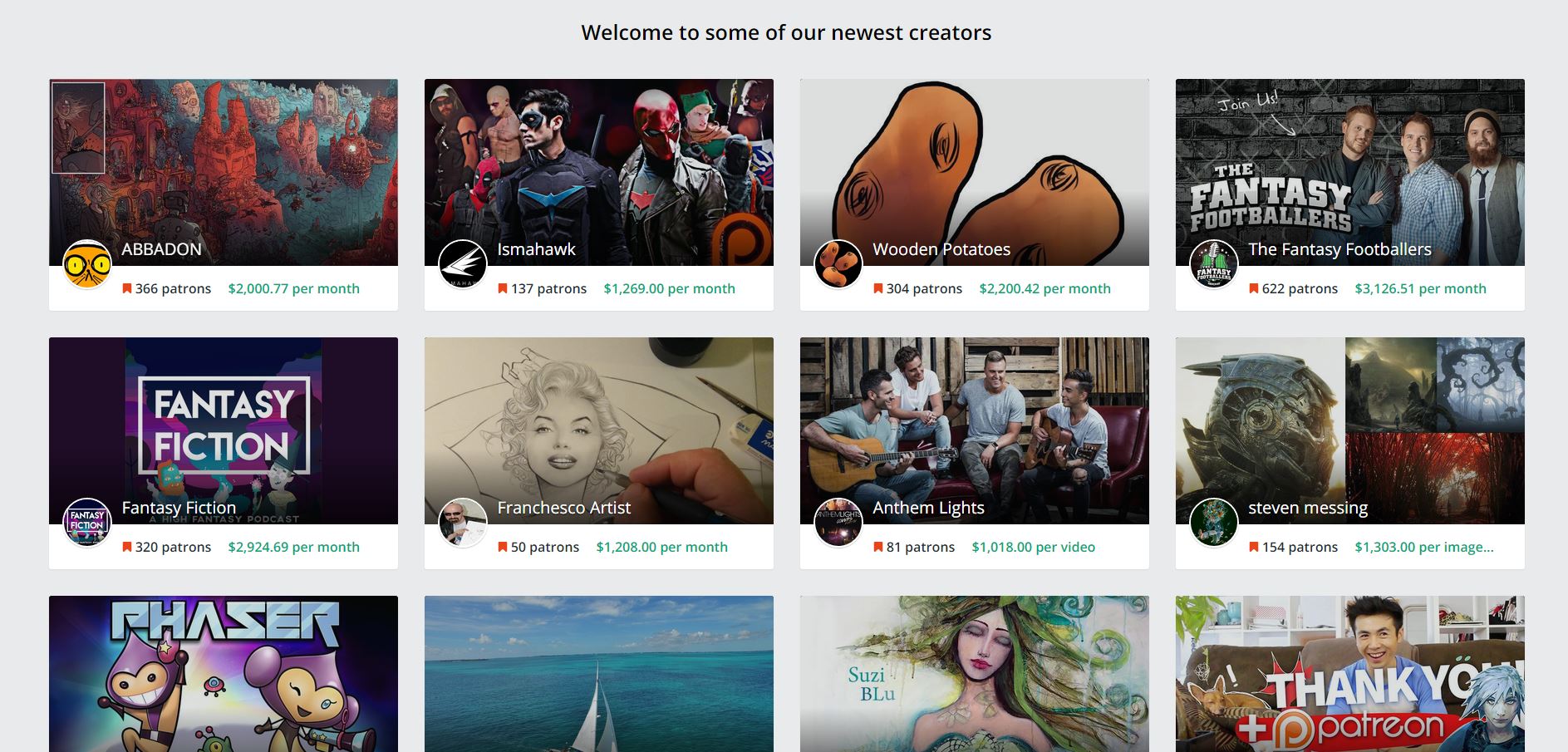
But modern patronage offers a different image. Gone are the days of starving artists. Patreon is a crowdfunding platform started in 2013 for artists to receive a steady income for work they are already creating, and for fans to support their favourite artists and content creators. Unlike Kickstarter, funding is provided on a regularly and not a project-basis. Patrons can interact with artists and access exclusive content such as limited edition art, presale concert tickets, and Google Hangouts sessions. It’s a model that challenges the conventional thinking that artists have to provide content if they are paid, and fans will only pay if forced to. Successful artists can earn approximately $2,000 per month and top earners rake in $10,000 a month. But if we look closely, Patreon is simply just an old model that has existed for hundreds of years in shiny new packaging. Growing up as a little wannabe-artist, I thought that artists had very few career options: slave all day working for a company drawing what they tell you to, or work on commission and starve. I’m constantly amazed by how technology has made it easy people around the world to have relationships such as these as well as provide means for people to do what they love and make a living out of it.

Patreon

https://www.youtube.com/watch?v=wH-IDF809fQ

Sources:

https://patreon.zendesk.com/hc/en-us/articles/204606315-What-is-Patreon-

https://en.wikipedia.org/wiki/Patreon

http://www.bbc.com/news/technology-34423932

Alien Life Detected

With over two billion pageviews a month and the self-titled “front page of the internet”, the social website, Reddit is known for its user-generated and crowd-voted content. The website boasts hundreds of thousands of subtopic pages called “subreddits,” ranging from topics like gaming to politics to animal pictures, all of  which are created and moderated by users who share similar interests. While this sounds like the jackpot of online marketing to me, this begs the question: what makes marketing on Reddit so different from Facebook and twitter and why haven’t more brands done it yet?

Turns out it’s not that simple. In his blog post, “Marketers Take Notice: Reddit is Very Much Here,” Jon Thomas of Post Advertising writes that it’s because of the power of an audience of digital influencers that makes the site so unique and significant for marketers. Thomas points to the success of Bill Gates and Barack Obama’s online engagement on the site, and discusses the powerful implications this site has for brands. Thomas believes that one of the reasons why it is challenging for brands to engage Reddit is because there simply isn’t a place for brands to hold AMA-type interactions, whereas it makes much more sense for an individual to interact and answer questions. Like individual interactions, Thomas also believes that the most successful brands are transparent and have no hidden agenda.

From personal observation, I find that redditors are incredibly skeptical of marketers and will call out any company that they see targeting the site, which with a large digitally literate audience, can pose a threat to the image of the company  In order to effectively control brand perceptions on Reddit requires first of all, understanding its unique community. To quote Thomas, “If there is a conversation going on about your brand, you have to be present to dispel rumors and at least make your best effort to turn negative opinions into positive ones.” Indeed, the hum of online conversation is only going to grow louder and louder as the world becomes more and more digitally connected, and brands must adapt and understand the trend or get lost in a sea of noise.


Sources:

http://www.postadvertising.com/2013/02/reddit-marketing-gates-obama/

http://www.blueglass.com/blog/how-to-market-on-reddit/

Archives

Archives

Spam prevention powered by Akismet