Canada is often hailed as the pinnacle of multiculturalism. The smell of superiority hangs heavy in the air, especially when comparing our country to our neighbours to the south. However, a recent study of graduate students at a Canadian university has tarnished this facade of equality, revealing the reality of racism in this country. In fact, these students took NASA’s ‘Golden Record’ project – a project that intended to shine a beacon of Earth’s inclusivity into space – and turned it into nothing more than the equivalent of high school cliques. Here’s proof:
The graduate students were asked to select 10 songs from the 27 selections that were originally included on the Golden Record: a record that was launched into space for the purpose of sharing our earthly experiences with extraterrestrial life. Despite the Golden Record’s careful curation of internationally representative tracks, our “educated” North American students excluded the music of the world, ultimately selecting good ol’ rock ‘n’ roll to represent our planet.
Allow me to explain, with a brief introduction to graph theory.
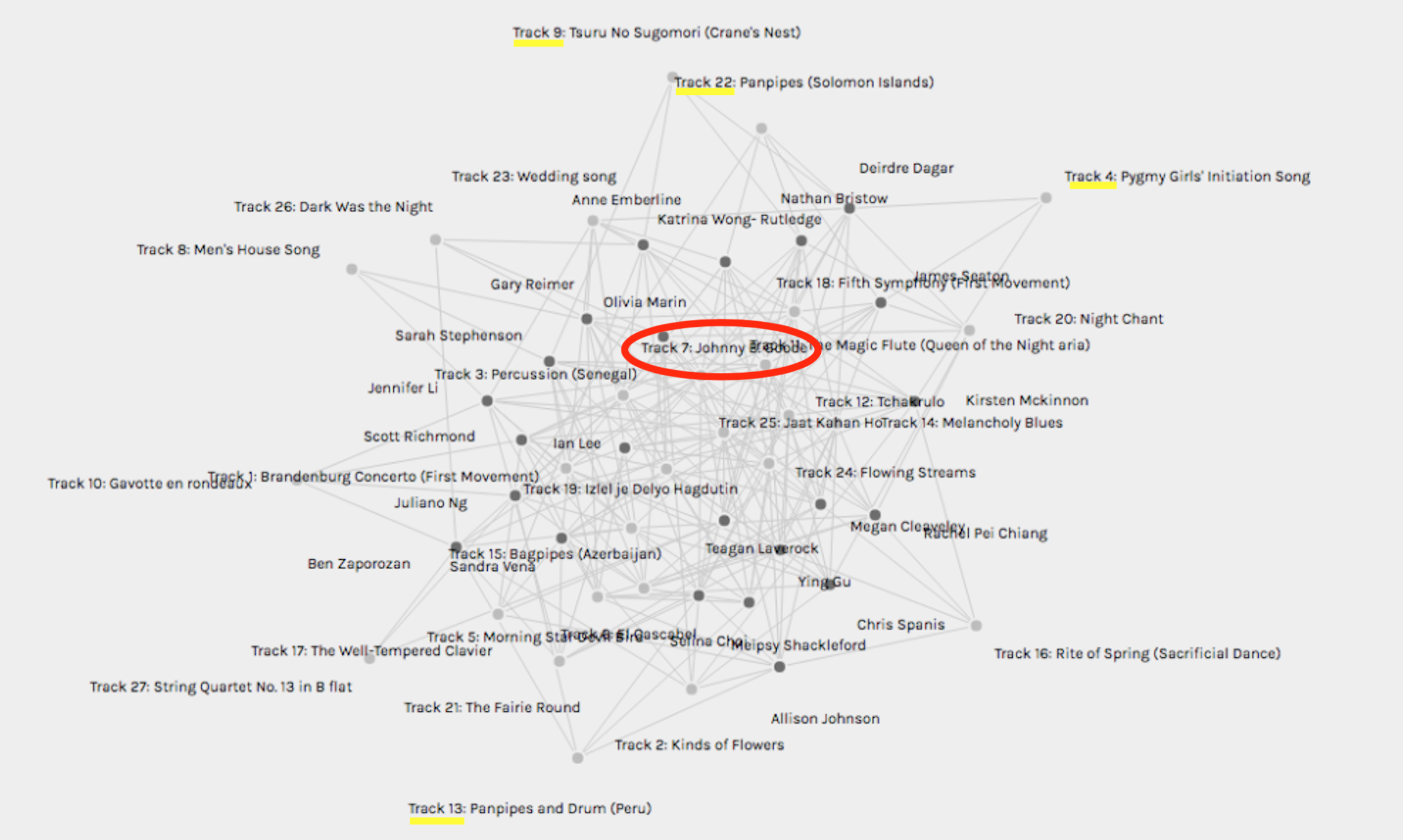
What you see above is known as a multi-graph. It includes a series of nodes (the circles) and links (the lines) between the nodes. Nodes are things or entities to which a value can be ascribed (Systems Innovation, 2015a.) In this graph, nodes represent students and songs.
This particular graph is an “undirected” graph in that it does not provide insight regarding the relationship between the nodes. If it were a “directed” graph, it would use symbols such as arrows to indicate the direction of the relationship. It is also an “unweighted” graph, as no numbers are provided to quantify the degree of interaction between the nodes (Systems Innovation, 2015a.)
According to graph theory, the “degree of connectivity” shows how connected any given node is in the network (Systems Innovation, 2015b.) In the graph above, we see that “Track 7: Johnny B Goode” has the highest degree of connectivity as a node with multiple links connecting to it. We are cautioned against assuming that more is better in this context, however, as “more connections can also leave you more open to a virus” (Systems Innovation, 2015b.) In the case of this study, the virus is closed-mindedness demonstrated through musical taste.
The cultural narcissism of the graduate students is further evidenced by the graph’s lower degrees of connectivity for songs outside of Western culture. Consider “Track 9: Tsuru No Sugomori” at the top of the graph, appearing much like an outsider looking in at a broader community of data.
The software that produced this graph (Palladio) can further analyze the data into groups of students who shared a preference for certain song selections. To protect the names of the not-so-innocent, I have excluded those images.
In fairness, the student subjects in this study come by their racism honestly. We all want to belong. We are wired to pursue “sameness.” And we are inundated with choice in a world with endless information at our fingertips. We want to weed out the unnecessary. Case in point: the success of Google’s “Page Rank” algorithm. Google developed “Page Rank” to generate “the most relevant results for a search by taking into account how many other pages linked to a given page. The idea is that if lots of websites think that a webpage is interesting, then it’s probably the one you’re looking for” (Code.org, 2017.) This study reveals that we do not always want to follow what others, or other websites, consider to be “interesting.”
What will we lose in this divisive polarity? What if we are given no options other than the “path most taken?” What if Google just gives us Johnny B Goode? I assert that that would B Bad.
_______________________________________________________________________
The opinions expressed in this blog are purely satirical and do not reflect how this graduate student feels about herself or her classmates. It was inspired by the current pervasiveness of disinformation and the growing use of storytelling within data visualization. In recent years, data visualization tools such as Palladio, the software used for this task, have been combined with storytelling to explore and present data. Kosara & Mackinlay (2013) write: “Stories have proven to be not only an incredibly popular way of conserving information and passing it on, they also provide the connective tissue between facts to make them memorable” (p. 2.) While stories have been used for various purposes since the beginning of time, “…storytelling is a relatively new subject in visualization. As such, it faces many challenges” (Tong et al., 2018, p. 2)
We need to be more critical about the information we consume. The digital age has increased the prevalence of “disinformation” or “intentional falsehoods spread as news stories or simulated documentary formats to advance political goals” (Bennett & Livingston, 2018, p. 124.) As Gladwin (2021) puts it: “Crisis has become our daily story. Truth and credibility have taken a backseat to sensationalism and fear” (p. 36.)
“Stories can be used for understanding and education, as well as for coercion and control. Stories rooted in fear dominate social media, news (mainstream media), family histories, relationships, and politics” (Gladwin, 2021, p. 21.)
Of course, many other stories could be told from the Golden Record curation data and its graphic depiction. For example, if one took the time to explore the data further or chose a different view of the data, they would have found that the student data indicated a high degree of connectivity with “Jaat Kahan Ho,” a song from India.
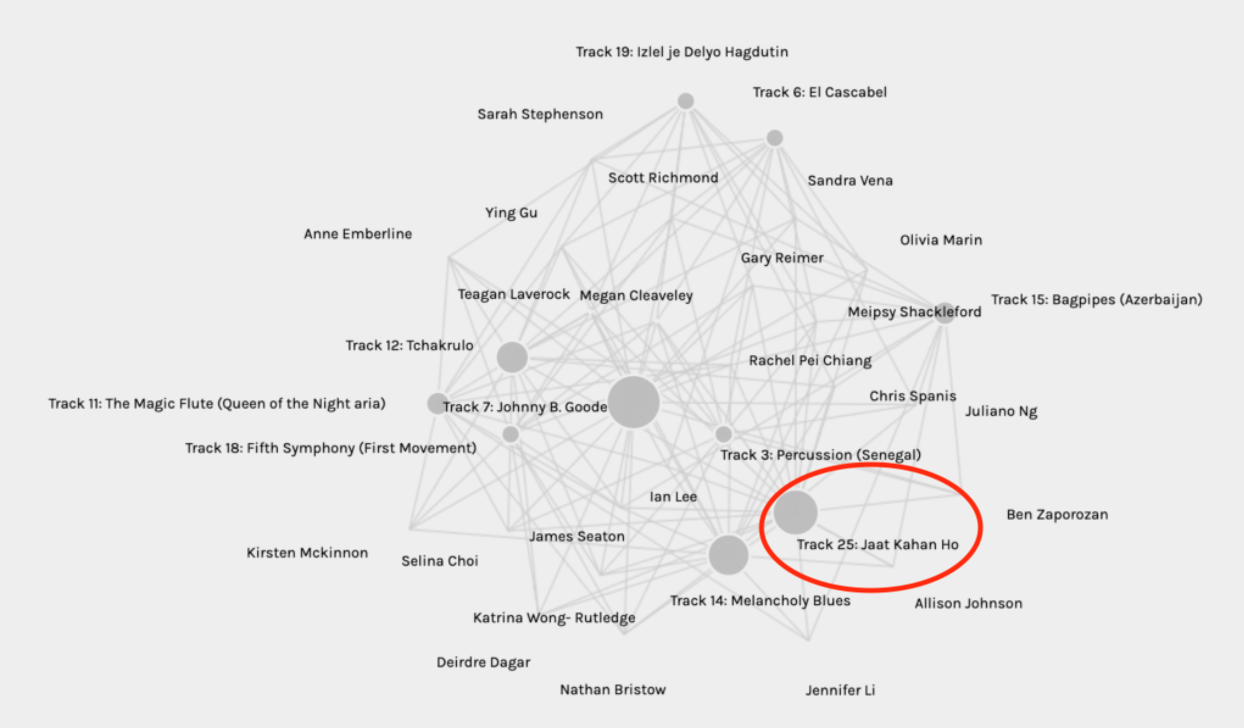
This new visualization could have dispelled the narrative of racism that opened this blog entry.
We need to understand better the origins, integrity and limitations of the data we receive. The Googles and Microsofts of the world put this responsibility in our hands. For example, when describing how spammers’ “game” algorithms to generate revenue by appearing higher in search results, Akshaya from Microsoft Bing, says: “Ultimately, it’s up to you to keep an eye out for these pages that are untrustworthy by looking at the web address and making sure it’s a reliable source” (Code.org, 2017.)
“Search engines use information not explicitly provided to help you narrow down your search” (Code.org, 2017.) It could be said that our Palladio graph’s data is excessively “narrowed down” due to its lack of explicitly provided information: the lack of information regarding the parameters used by each student when developing their personal Top 10 Lists of songs from the Golden Record. Perhaps the data would have been more meaningful if Palladio had used a “spider” program as described in “The Internet: How Search Works” (Code.org, 2017.) A spider program could have visited each of our blog entries from Task 8 to compile information about the criteria used for our individual song selections. The graph could then be built from data extracted from a more comprehensive database of information. Without the context of decision-making criteria that influenced our individual selections, there is no way to conduct substantive analyses.
References:
Bennett, W. L., & Livingston, S. (2018). The disinformation order: Disruptive communication and the decline of democratic institutions. European Journal of Communication, 33(2), 122-139. doi:10.1177/0267323118760317
Code.org. (2017, June 13). The Internet: How Search Works . Retrieved from https://youtu.be/LVV_93mBfSU
Gladwin, D. (2021). Rewriting our stories: Education, Empowerment and Well-Being. Ireland: Cork University Press.
Kosara, R., & Mackinlay, J. (2013). Storytelling: The next step for visualization. Computer (Long Beach, Calif.), 46(5), 44-50. https://doi.org/10.1109/MC.2013.36
Systems Innovation. (2015a, April 18). Graph Theory Overview . Retrieved from https://youtu.be/82zlRaRUsaY
Systems Innovation. (2015b, April 19). Network Connections . Retrieved from https://youtu.be/2iViaEAytxw
Tong, C., Roberts, R., Borgo, R., Walton, S., Laramee, R., Wegba, K., Lu, A., Wang, Y., Qu, H., Luo, Q., & Ma, X. (2018). Storytelling and visualization: An extended survey. Information (Basel), 9(3), 65. https://doi.org/10.3390/info9030065