Proposed Locations for the New Public Bike Share System in Vancouver

In the summer of 2016 the City of Vancouver is planning to implement a public bike share (PBS) system. Projects like these already exist in Toronto, Montreal, and many other cities across North America and Europe. It is a service where people can rent a bike for however long they need it and pay based on use, not dissimilar to Car2Go. The plan is to have 150 stations across the metro Vancouver area with a focus on the downtown area. Our team planned to find the best locations to site the 50 stations incipient throughout the city.

Our team consisted of 4 members all with individual and group tasks. One member was responsible for creating a flow chart of all the actions completed throughout the project, 2 members member was responsible for gathering data and information about the technical aspects  of the city’s project, and I was responsible for the majority of the GIS analysis. We all worked together to compile the proposal and final report.

This was my first big GIS project where I had to plan, find the data, conduct analysis, and disseminate the findings. It proved a valuable learning experience for me and was the most beneficial part of the course for me. Some lessons learned were:

  • When working as a team it is beneficial to denote everyone’s task. This makes for a more efficient use of resources and time. It is not necessary to make a group decision about every little thing, tasks should be delegated and entrusted with the respective member.
  • GIS analysis on a project works best if only one person is working at a time. This ensures that nothing is missed and datasets are not altered before they should be.
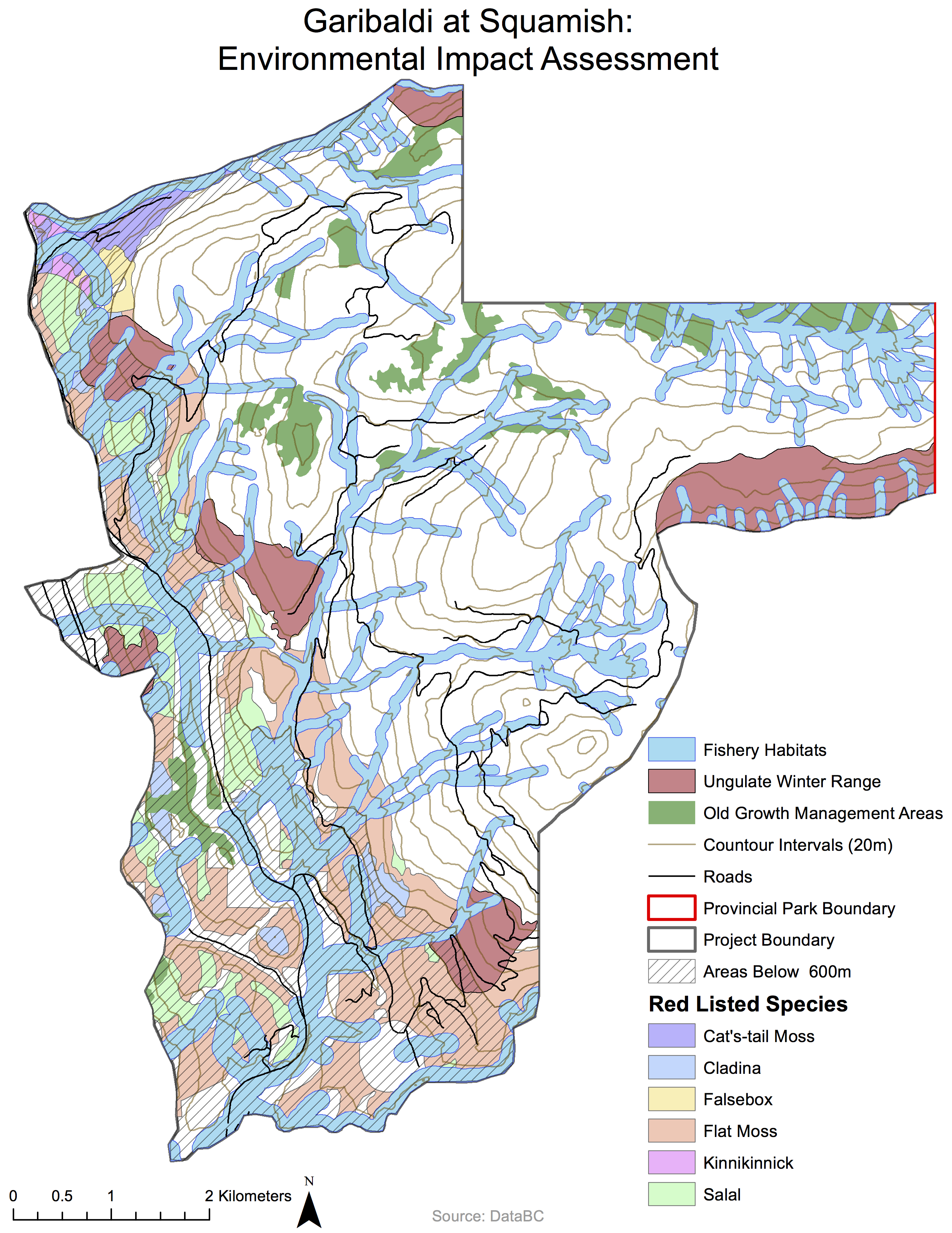
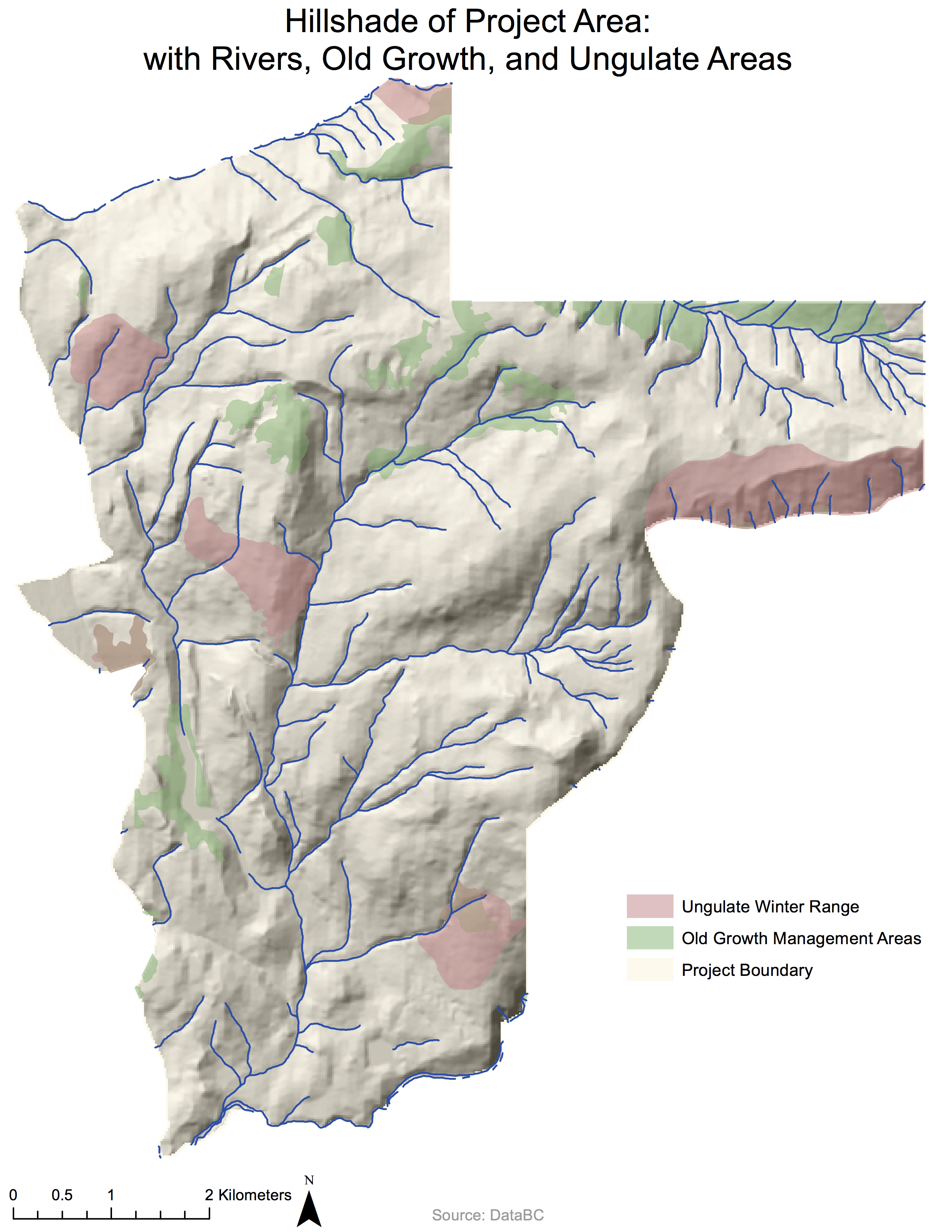
  • It was surprising that all the data that we required for this project was available in the public domain. From either DataBC, the City of Vancouver, or the University of Toronto.
  • Always keep track of your data and use intuitive naming so as not to cause unnecessary confusion during the analysis.


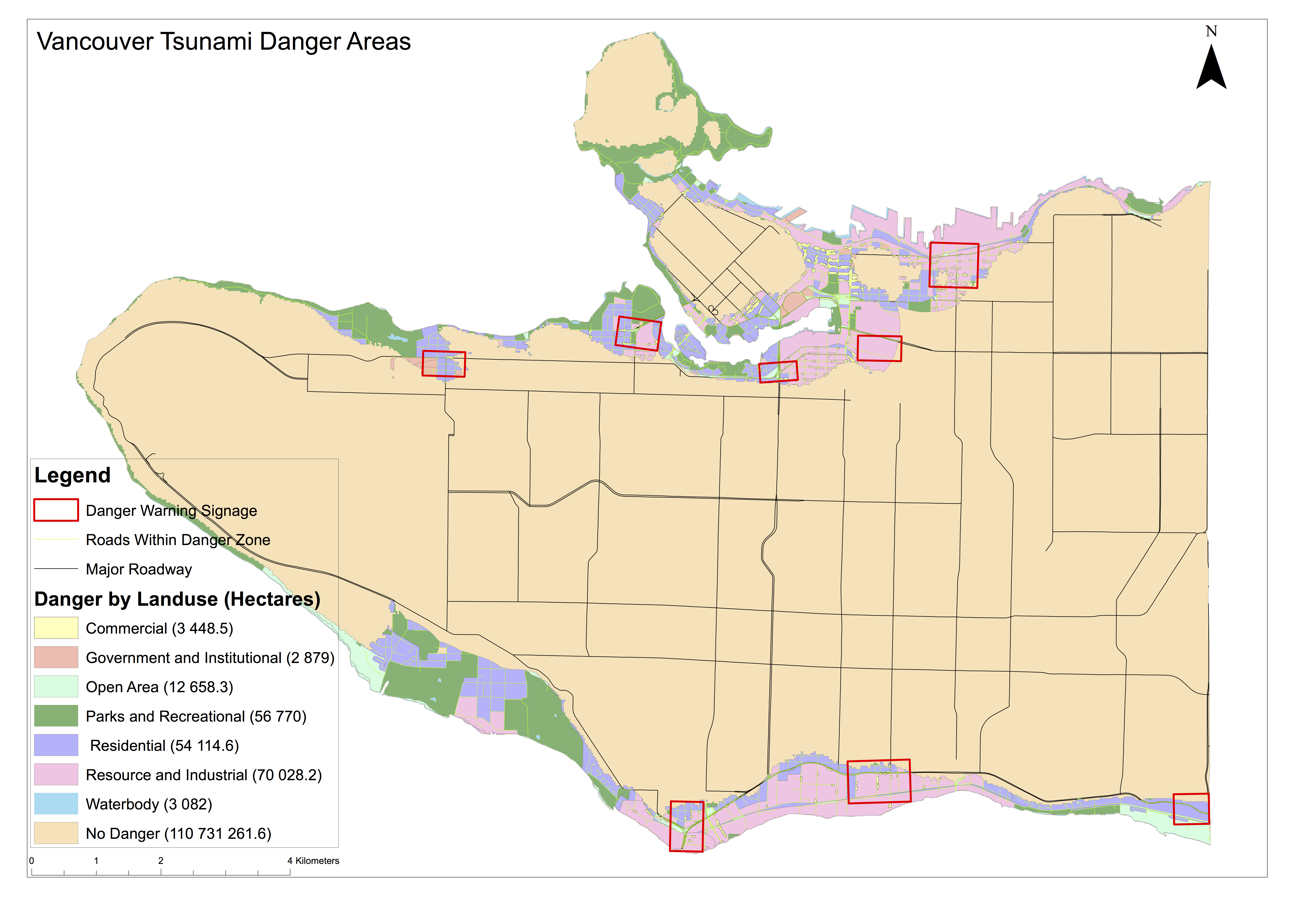
I have attached our report that contains our analysis, findings, and recommendations for those interested.

GEOB 270 Final Report+Appendix+Flow Chart

Environmental Impact Assessment: Garibaldi at Squamish Ski Resort

The maps below highlight the different categories required for an environmental impact analysis.

Envornmental Impact Assessment

Hillshade


Below is a hypothetical memo in support of the project’s continuation:

BCSF,

I have reviewed the project proposal for the Garibaldi at Squamish ski resort and Whistler Blackcomb’s objections to the project. I have also completed my own environmental assessment of the project area and have come to my own conclusions. Although I had originally opposed the project, after my own assessment I believe that the project will not have any large environmental impact. My analysis has included the following steps:

  • Sourced data about the topography, river systems, road networks, ungulate winter range, old growth forests, provincial park boundaries, and any red listed species
  • Cropped all data and retained only data pertinent to the proposed project area
  • Determined the areas that will be above and below the snow line (600m)
  • Plotted all environmentally sensitive areas and calculated their respective areas
  • Produced a simplified map displaying all environmentally sensitive areas that will hamper the project

One of Whistler Blackcomb’s major concerns was that there would not be enough snowfall to sustain another ski resort and their analysis concluded that 600m is the snowline for the project area. Although this is a valid point, only 32% of the project area is below 600m and the majority of this area is environmentally sensitive that cannot be developed anyways. In totality, 53% of the proposed project contains environmentally sensitive areas.

There are two major concerns that I have with the project. The first is the possible damage to red-listed species habitats. This can be mitigated by not building ski runs below 600m, where most of these habitats are. The other major concern is to ungulate winter ranges, which are mostly above 600m. The majority of these areas appear to be near rivers and I think they can be avoided as the ski runs cannot cross over a river.

Overall, after reviewing the proposal, reviewing objections, and conducting my own assessment, I have come to the conclusion that you should support the project’s progressions.


Regards,

Nick


Although this hypothetical memo supports the project, it is a not my own personal view. After conducting this analysis it is clear to me that the environmental damage that will be done by this project will outweigh the economic benefits that it brings. If I was working on this project I have would have the option to continue the work, but go against my morals in order to keep my job, or quit and stick to my morals.


Accomplishment Statement

Applied the 7 stages of data visualization to my project: acquiring, parsing, filtering, mining, representing, refining and interacting with the data.

Housing Affordability in Canada: Vancouver Contrasted with Ottawa

Lab4housecostVO (1)

What is Housing Affordability?

Housing affordability compares household income and housing prices. This is done by normalizing the median household income of a census tract with its respective median house price, providing a ratio. This metric is a much better way to examine affordability as it takes both income and housing prices into account instead of just housing prices.

What are the Housing Affordability Categories?

The housing affordability categories for this analysis were taken from the Demographia International Housing Affordability Survey and can be seen in the table below. The Median Multiple refers to the median house cost divided by the median household income for each census tract. Therefore, an affordable area is defined as an area where the median house price is 3 times or less than the median household income.

Affordability-Categories

Is Affordability a Good Measure of a City’s Livability?

I believe that affordability is a good indicator of a city’s ‘livability’ but it is only a single factor amongst many that ought to be taken into account. Affordability of shelter is not the only thing that draws people to an area. Many other factors will draw people to a city such as: weather, transit, nightlife, the job market, recreation possibilities, and cleanliness. While Vancouver is clearly becoming a very unaffordable place to buy property, it scores very highly on these other metrics, continuing to draw people to the city.

Accomplishment Statement

Retrieved spatial and tabular data, normalised for comparison, and created visuals for the datasets using different classification methods.

Quantitative Data Classifications

Within ArcGIS there are 4 main data classifications. 1. Natural Breaks, 2. Manual Breaks, 3. Equal Interval, and 4. Standard Deviation. These 4 methods all use the same data, but display the data differently. These 4 methods all serve a purpose and you must choose the right one for your specific task.

lab4dataclass

We should consider the following questions when choosing a method:

  1. Does the method take into consideration the distribution of data?
  2. Does it make it easier to understand data?
  3. Does make computations easier?
  4. Does it make the legend easier to read?
  5. Is it appropriate for our selected number of classes?
  6. Is this method the most ethical?

Different methods of classifications highlight the data in different ways and dependent on my audience and agenda, I would display different maps. If i wanted to highlight the inequalities then I would display the natural breaks or standard deviation map as they accentuate the price differences. If I wanted to say that there is not much of a difference I would display the equal intervals map. If I was a real estate agent I would use manual breaks because I can choose the specific price ranges. There are ethical implications to the map classification method because the data can be manipulated for the intended use, but the natural breaks appears to be a fair method.

Tsunami Risk Areas Within Vancouver

Lab 3 - Tsunami Analysis

Vancouver sits on the border of the North American and Pacific tectonic plates. These plates represent a convergent boundary, where seismic activity is not uncommon. If a large earthquake happened along this boundary it would cause a tsunami that would impact the coastal areas of North America. As Vancouver is a coastal city, it faces a tsunami risk. From my analysis, I’ve determined that 15.5% of Vancouver is at risk of damage from a tsunami. My parameters were areas within 1 km of the coast and less than 15m below sea level. I performed an intersect command to determine where these two areas intersected to determine the danger area for Vancouver.

Within this tsunami risk area lie multiple schools and healthcare facilities. To determine these locations, I performed an intersect command of the danger area with schools and healthcare facilities. The facilities that have a tsunami risk are:

Schools

  1. St Anthony of Padua
  2. Ecole Rose Des Vents
  3. Heritage 3R’s School
  4. Vancouver Montessori School
  5. False Creek Elementary
  6. Emily Carr Institute of Art & Design
  7. Henry Hudson Elementary
  8. St John’s International
  9. St Francis Xavier

Healthcare

  1. False Creek Residence
  2. Broadway Pentecostal Lodge
  3. Coast West Community Home
  4. Yaletown House Society
  5. Villa Cathay Care Home

Accomplishment Statements Thus Far

  • Gained a practical working knowledge of ArcGIS software and a variety of datasets for geographic analysis.
  • Created composite images from remote sensing data to examine the effects of the Mt. St. Helens eruption by comparing the surrounding area pre- and post-eruption.
  • Used spatial and tabular datasets to create a map to determine and communicate the areas of Vancouver and important facilities that may be at risk from a tsunami.

Misaligned and Improperly Referenced Spatial Data in GIS

Why is This a Problem?

When data is captured, it is done with a specific projection in mind. When the wrong projection is used to display the data, areas, angles, and direction can become deformed—negatively impacting GIS analysis. To prevent this issue, a GIS user needs to ensure that all obtained data sets are properly aligned and referenced. To determine what coordinate datum and projection the data is stored as, check within the ‘Spatial References’ tab in the layer’s properties.

How to Fix the Problem

To fix this problem, select ‘XY Coordinate System’ tab within the layer’s properties and select the appropriate coordinate system. However, if spatial analysis needs to be done, the necessary action is to project the layer. Projecting a layer alters the data and creates a new layer with a different coordinate system. From the ArcToolbox, select Data Management Tools > Projections and Transformations > Project. The ‘Input Dataset’ field should be filled with the name of the file  that you want to change the projection of and the ‘Output Dataset’ field should have the desired projection.

The Use of Remotely Sensed Landsat Imagery

Landsat imagery is a beneficial tool for all GIS analysts to have in their toolbox. Remotely sensed imagery not only provides basic aerial photos to use for analysis, but also captures different wavelengths of energy. These different bands can be used for more advanced analysis regarding vegetation, glaciers, or a multitude of other tasks. Landsat imagery has been collected of the Earth since 1972, providing a visual history of the changes to the Earth’s surface—allowing for analysis on differing timescales.