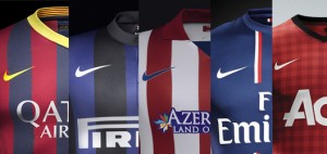
“I don’t love it, but I think it will grow on me”
These are the words that came out Philip Knight’s mouth when he first saw the design for the iconic swoosh logo, designed by Carolyn Davidson for $35 in 1971. Here we are after over 4 decades, and the swoosh has taken over the world of sports and it probably has one of the most powerful brand images in the world.
Having worked in the graphic design field for years, I have always been amazed by logos, the power they have on projecting the brand image and the association they create over time with respect to the brand. Recently I read a book called “50 Best Logos Ever” which triggered my already-existing admiration for logo designs and I wanted to post about it. In this article, I wanted to focus on analyzing the design and the impact of one logo as opposed to going through that list and I thought that Nike would be a great example that represents the power of logos and branding.
 A logo is so much more than a visual design. It’s the symbol of the entire identity and the brand. It is on every single product, letterhead, business card, marketing collateral, signage and any other marketing communications medium. When Carolyn Davidson came up with one of the most simplistic logo design ideas for the Nike brand, she probably didn’t anticipate the brand to be where it is today and what the impact of her design would be. The swoosh is now so tightly tied to the Nike brand that the company stopped using the word “Nike” on its products, because the swoosh itself creates the association in everyone’s mind that they know what brand it is.
It is also interesting to observe the evolution of logos through time. As the art of graphic design became more sophisticated and computerized, the design concepts started changing with it. Just like the process itself, design techniques have become more advanced as well, taking into account consumer psychology by using colour themes to trigger certain emotions and project the brand image. A great example of this is to observe the evolution of the logo design for Shell Corporation. As seen in the timeline below, what started as a realistic drawing of a mussel shell kept evolving through time into a bi-coloured clip art type image, gradually simplified into a basic shell drawing. By 1971, the logo that we see today was initially designed by Raymond Loewy, who also designed the logos for BP and Exxon. The idea to create this new generation logo emerged when the company felt that its emblem was hard to recognize from a distance, especially seeing that the logo was primarily placed on the side of a road with traffic passing at speed. Over the next 3 decades this logo has become so recognizable that it is now being used without the company name to identify it, which marks a truly successful logo just like in the Nike case.

