
Jenn Gardy here, Gardylab decorative figurehead. Now that Amazing Resident Geoff has got us set up with this blog for sharing our public health information visualization-related work (which I’m calling phinfovis for short), I thought I’d chime in with a little history and reflection on how we ended up here.
My first exposure to infovis came as a postdoc – I’d just been recruited to Bob Hancock’s lab at UBC, where together with my PhD supervisor Fiona Brinkman, the team was working on InnateDB – a massive database of all the biological interactions associated with the innate immune system. Part of InnateDB is an analysis platform that lets users upload gene expression data and look for over-represented GO terms and pathways, and the group was interested in what that platform might look like – how do we show complex interaction networks painted with gene expression data from multiple conditions and/or time series in a meaningful, intuitive, and interpretable way. That was what I was tasked with.
I searched the UBC faculty directory to find people who were working on visualization and human-computer interaction, and found Ron Rensink, who was working on things like change blindness (how, when confronted with two subtly different images, it takes us ages to spot the difference between the two – try it for yourself here). This is exactly the sort of thing you;d be dealing with as a biologist with two or more differently-painted networks, desperately flicking back and forth between the images, looking for some sort of interesting biology.
It turned out that Ron was on sabbatical that year, but he did point me to Tamara Munzner, a comp sci prof who had joined UBC a few years before. She had already worked with a few biologists on projects like sequence and tree comparison and was excited to try out the biological network space, having done her graduate work on massive graph visualization. And thus began a beautiful collaboration that is still active a decade later!
With Tamara and her graduate student Aaron Barsky, we created Cerebral, a Cytoscape plugin for laying out graphs according to subcellular localization (thereby making a graph into something that resembles the signalling pathway diagrams biologists know and love) and for easily visualizing multiple expression datasets painted atop said graphs. Not only was it a cool contribution to the infovis community, but that little workhorse helped me analyse a load of immunology datasets. Mind you, I still can’t tell you whether IL1B is pro- or anti-inflammatory. I really don’t like immunology.
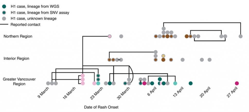
Anyway, after the Hancock Lab postdoc I joined BCCDC, where I began working on using genomics for reconstructing infectious disease outbreaks (you can read all about that on my other lab blog). Inspired by my work on Cerebral and the AMAZING data and vis work done by one of my best friends, Jer Thorp, I always tried to inject a bit of vis sensibility into the research outputs I was creating. A couple of examples I liked included this:
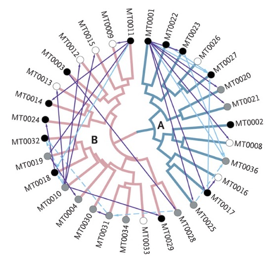
And this:
As I delved deeper and deeper into this emerging field of genomic epidemiology, two things happened that made me think it might be time to get back in the vis game more formally. First, as more and more genomic epi papers came out, I saw more and more terrible figures that violated basic principles of information display and design (function first, people, then form! Get thee to Tamara’s Vis Rules of Thumb right away!). With the exception of the absolutely stellar work of David Aanensen and Trevor Bedford (who, incidentally, are two of my FAVOURITE people in science), most genomic epi people were paying no attention to design and usability. As genomics moves closer and closer to the clinic, this is obviously Not Good At All. Second, I was fortunate enough to recruit Ana Crisan into my group, first as our bioinformatician/statistician and then as a PhD student (and Vanier Scholar! Go girl!). Ana had previous experience in using vis in the clinical space through her work at a local biotech diagnostics company, and her partner Matt Brehmer was, at the time, working on his PhD in Tamara’s lab (small world, eh?), so when it came time to establish her own PhD research trajectory, combining genomic epidemiology and infovis was the obvious choice. Tamara and I co-supervise Ana, whose work you’ll be seeing a lot of on this blog. In the meantime, follow her on Twitter for updates!
And that brings us to today. Ana is currently working on a very cool vis platform for exploring public health surveillance and lab data in an integrated, place-based fashion, and her first paper stemming from that work will be presented at BELIV 2016, a workshop held in conjunction with the IEEE Vis conference. Awesome Resident Geoff is working on the TB Report Design Project, which you can read about in the blog post he published yesterday. And I’m just kind of hanging out in the middle of it all, watching cool stuff unfold.
Genomic epidemiology has brought public health – a field that is usually pretty refractory to change – into a new era. With genomics and bioinformatics, we’re generating amazing datasets that are providing absolutely transformative insights into infectious disease epidemiology and control. BUT, all this awesome stuff is completely useless if we can’t communicate it to our end-users, the nurses, docs, and officials on the frontlines, many of whom may not know what a genome is or whose most complex computational task is sorting an Excel spreadsheet. That’s why I think one of the next logical steps for the genomic epi field is to stop making so many damned pipelines and start thinking about what comes out of those pipelines, visually. How do we report data in a meaningful and actionable way?
So, join our little group as we try to find a little bit of visual order in the data chaos that’s out there!
Thanks for sharing this lovely background info Jenn!