Golden Record Network Analysis

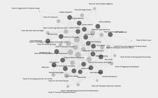
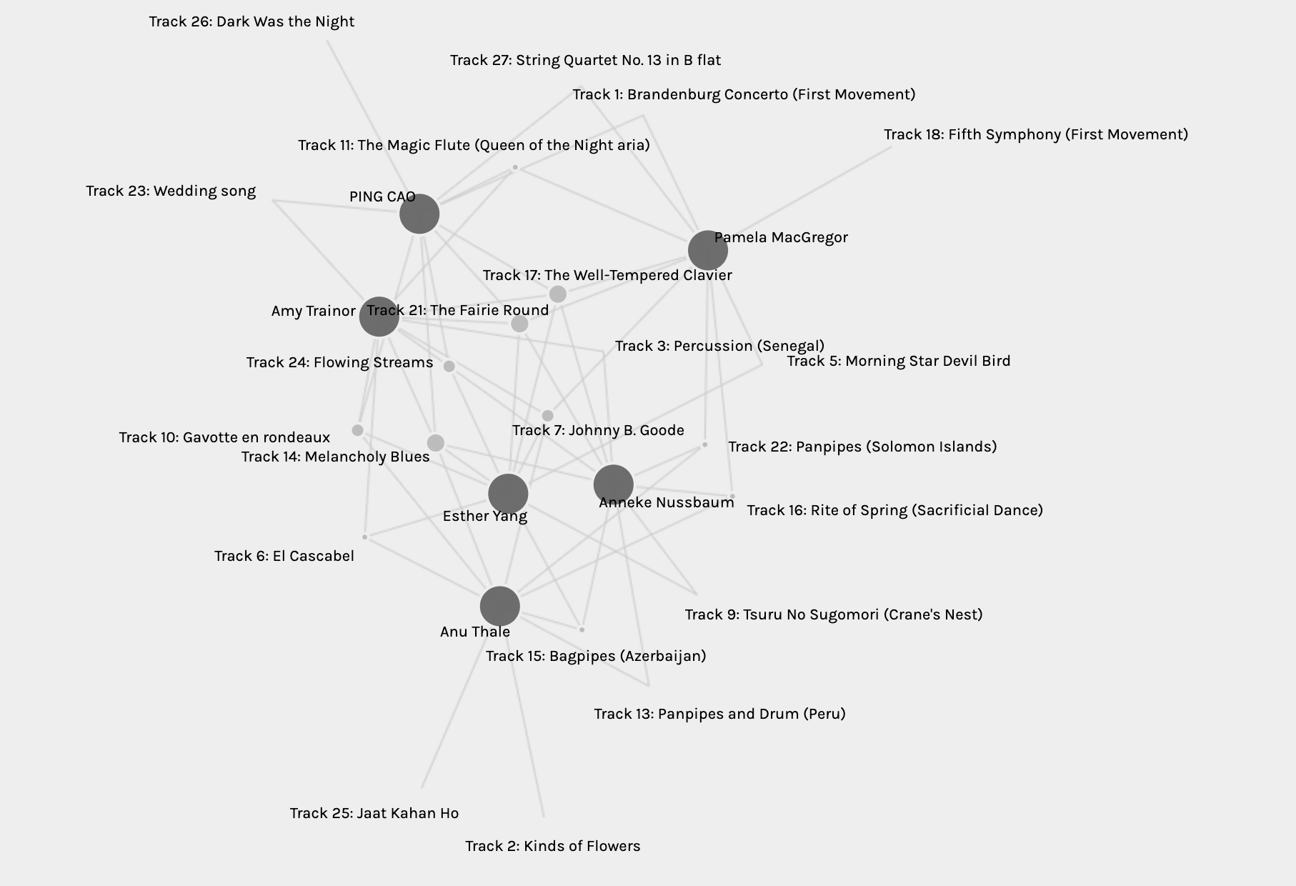
Our previous task was to pick ten out of the 27 pieces of music included on the Golden Record. We all submitted the survey, and Ernesto (our instructor) did some magic to the data (isn’t “magic” a perfect word for “things I don’t understand fully” 😉 ) and voilà, here is the visualization on Palladio. This shows the network of the 27 pieces of music and the choices students in my section made.
What are the odds?
The first question jumped to my mind was, “how many combinations are there?” My memory of mathematics knowledge from high school was able to guide me through the calculation, which is C (27, 10) = (27*26*25*24*23*22*21*20*19*18)/(10*9*8*7*6*5*4*3*2*1)=8436285.
Then I challenged myself to a more advanced question “what are the odds for the two of us selecting the exact same ten tracks?” (Looking back now, I probably would not have tried this if I knew how much time I ended up spending on this).
I was stuck, so I tried to google probability but was not able to find anything I could understand. I then tried Baidu (searched the topic in Chinese so I would at least not have a language barrier), which led me to this video – yes, a video meant for students in elementary schools who compete for the Mathematical Olympiad.
After multiple failed attempts (seriously, two whole hours), I thought I was finally able to wrap my head around this. Here is what I thought at that moment (happily without knowing what was coming my way ;)).
For the ten tracks to be selected by both students, we are going to group them together and treat them as one chain (the order does not matter), so the rest tracks that are not selected are 17. If any one of the ten tracks is from this 17, meaning we do not have an exact match, so now I need to calculate how many combinations are there that one to ten of the ten tracks is from the outside 17 tracks. and rest from within the group of ten. The calculation is = C (17, 10) + C (17, 9)*C(10, 1) + C (17, 8)*C(10, 2) + C (17, 7)*C(10, 3) + C (17, 6)*C(10, 4) + C (17, 5)*C(10, 5) + C (17, 4)*C(10, 6) + C (17, 3)*C(10, 7) + C (17, 2)*C(10, 8) + C (17, 1)*C(10, 9).
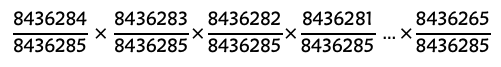
I could not possibly calculate all these, so I used an online calculator, and guess what? These added up to 8436284, which is the total number of combinations – 1, meaning the chance for the first two students to get different ten tracks is 8436284/8436285.
Well, that was a lot of work for nothing. However, it did offer me a new way of thinking. What about the rest 20 students (as per the id_1 of the graph, we have 22 students in total in my section)? For the first two students to select the exact same ten tracks, the chances are (1-8436284/8436285) so 1/8436285. How do I calculate this for the 3rd student? The 3rd student could select the exact ten tracks with either students 1 and 2, but not both, or it won’t quality “only two” students choose the same ten tracks. Will it be simpler just to calculate his/her “not-exact” match and then use 1 to minus this and get the chance of having the same with 1st and 2nd, respectively (not both)?
Here we go! For the 3rd student, the chance of him/her getting the exact same of the ten tracks with the 1st student is still 8436284/8436285, but since the 2nd student had chosen one same as the 1st student, we need to make sure the 3rd student does not choose the same one, so we do not violate the “only two” condition. So his/her “not-exact” choice become 8436285 – 2 = 8436283. So, the chance for the three students to have no match is (8436284/843628,5)*(8436283/8436285), and the odds for the two of them to get the same ten tracks would be 1 – (8436284/8436285)*(8436283/8436285). Same calculation logic for the rest of the class, the possibilities for 22 students to not have “no two matches” is
So the possibility of only two out of the 22 students who have the exact same number is
With the help of an Excel workbook, the odds are 0.00249%. That is like the chance of winning 1.5% of the Loto Max Pools Fund based on the info provided by Lotto Max Prizes and Odds of Winnipeg.
This is too much time spent reviewing high school mathematics (or elementary school students who compete for Mathematical Olympiad in China) for me in one night (it has been four hours since I started drafting this section). I am worried that I may not even get this right? If you are great with mathematics, please share in the comments if you find my calculation problematic.
It is amazing that I was chatting with a MET alumni about this task and I said I drafted a long section about the combination C (27,10), she said she did the same thing! What are the odds! She was way smarter than I was and figured this out in one try. Plus, I think she had explained it better than I did here. Here is her post if you are interested.
My Community
As per the task instruction, we are grouped based on the strengths of our choices, and the individuals with similar responses belong to one community. I am in a community with Amy, Pamela, Esther, Anneke, and Anu.
| Shared Edges | ||
| Amy Trainor | 7 | Ping Cao |
| Pamela MacGregor | 5 | Ping Cao |
| Esther Yang | 5 | Ping Cao |
| Anneke Nussbaum | 4 | Ping Cao |
| Anu Thale | 2 | Ping Cao |
As you can see, I share the most edges (the edges here represent the songs we choose) with Amy and the least with Anu. This is also represented in the graph of my community (no manipulation of the visual presentation), where the walk from my node to Amy’s is the shortest. In contrast, the walk to Anu’s is the longest. The three nodes (Pamela’s, Esther’s and mine) formed an equilateral triangle because both of them share five edges with me. The walk from my node to Anneke’s is further than Pamela’s and Esthers’s but still a lot closer than to Anu’s.
The Most, The Least
I shared seven with Amy, and I laughed when I read her post that her Grade 4/5 learners find many songs “depressing.” Her reason for picking the 10 songs is the ones that simply sounded appealing to her. This is similar to my choices, the ones I liked. I also listened to the three tracks that Amy picked that were different than mine, and honestly, I like all three, so if we were given more choices (e.g. 15 out of 27), I might end up having more shared edges with Amy in our graph.
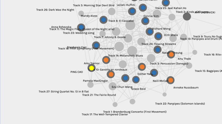
Another thing that stood out to me is that I only shared two tracks with Anu, but we are in the same community. I started to dig deeper into the visualization by putting the six of us back into the initial graph and seeing where we were.
Below is a portion of the graph, and I heightened myself with yellow and the community members with orange.
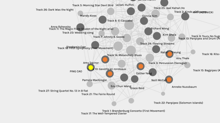
Based on my previous theory, the length of the walk between our nodes shows the strength of our connections. I find something odd. All these blue nodes are closer to me than Anu’s. Why was I not placed into the group with any of these blue nodes?
Suddenly, I realized that all my reasoning was based on how other members in my community connect with me, but I could be wrong from the start, which means I am not the center of this network (my community). Now, the question is, who is then?
The Center
My hypothesis is that the center member should be the person who shares the most tracks with all community members. To figure out who shared the most with all of us, I started listing out all our choices in a table. The column headings represent the tracks, the row headings are our names, and the cell filled with blue represents our selection.
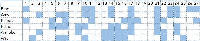
Among all these tracks, 0 track was selected by all six of us, 3 tracks were selected by the five of us, 3 tracks were selected by the four of us, and 5 tracks were selected by the three of us. I only picked the tracks the three of us shared as a starting point to evaluate who shares the most (three is the exact half of our community size – six people).
Below is the # of tracks that each individual selected out of our most shared tracks (selected by the five, or four, or three of us), and the highest numbers of each are filled with a green background colour.
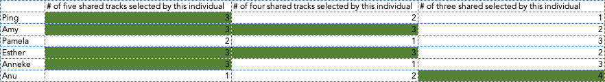
Based on the numbers listed in this table, I would say:
- Both Amy and Esther were the centers of our network
- I am a little closer to the center than Anneke
- It is hard to tell whether Pamela or Anu is closer (if by overall how many tracks are listed here, then Anu (7) should be closer than Pamela (6), but Pamela picked two tracks out of the shared give compared to Anu’s one).

Going back to the graph of our community, if my conclusion of #1 is correct, then if we draw a line between Amy and Esther, and pick the center point of that line as a new node (let’s call it node X), then walk to the rest of our’ nodes (you can print the graph of my community and use the ruler on the paper to do simple drawing and measuring, or use any fancy tech you wish) should demonstrate how close we are to the center of our community. As I guessed in #2, my node was a tiny bit close to node X. For #3, you don’t even need a ruler to tell that Anu was actually closer to the center than Pamela, so maybe the overall number of tracks that we shared is a more critical factor in creating this community.
I understand that my process can be problematic. Amy and Esther do share all the tracks the five and the four of us share, but there is a difference between the tracks they share in the “three shared tracks” category. There is a possibility that one of them shares more tracks with a member who is closer to the center (meaning also has a higher sharing rate in other categories), then it may make one of them the actual center. Moreover, my simple analysis of our community above is based on my hypothesis at the beginning of the section, which could also be wrong.
Data Visualization
There are many ways to approach this analysis task, but, in my opinion, the data visualization presented to us on Palladio is probably one of the best ways to show almost everything in one graph without listing the raw data. The size of the tracks nodes gives us a sense of how popular tracks are among us. The links between nodes show the relationship, the community we are grouped within shows the similarity of our choices. Data visualization provides us with a more visual tool to “see” data. However, I feel there are many aspects of the data that may not be reflected by the current data visualization, such as how the data was collected, what hypothesis we had, how we analyzed the raw data to support/reject the hypothesis, how Palladio generated this visualization, how visualization is interpreted (i.e., reasons, meanings).
Do you think the visualization is able to capture all the reasons behind your or your community members’ choices?
The Tracks We Liked Most
The three tracks that our community likes most are tracks 14, 17, and 21.
Now Let’s enjoy these tracks together!
Track 14 – “Melancholy Blues,” performed by Louis Armstrong and his Hot Seven. 3:05
Track 17 – Bach, The Well-Tempered Clavier, Book 2, Prelude and Fugue in C, No.1. Glenn Gould, piano. 4:48
Track 21 – Holborne, Paueans, Galliards, Almains and Other Short Aeirs, “The Fairie Round,” performed by David Munrow and the Early Music Consort of London. 1:17
There are two tracks that more than half of the section selected, they are the biggest nodes in the center:
Track 6: El Cascabel (14/27)
Track 14: Melancholy Blues (14/27)Did you pick any of these? What are the reasons for you to pick or not pick it/these ?