Attention Economy
Awesome? Really 😉
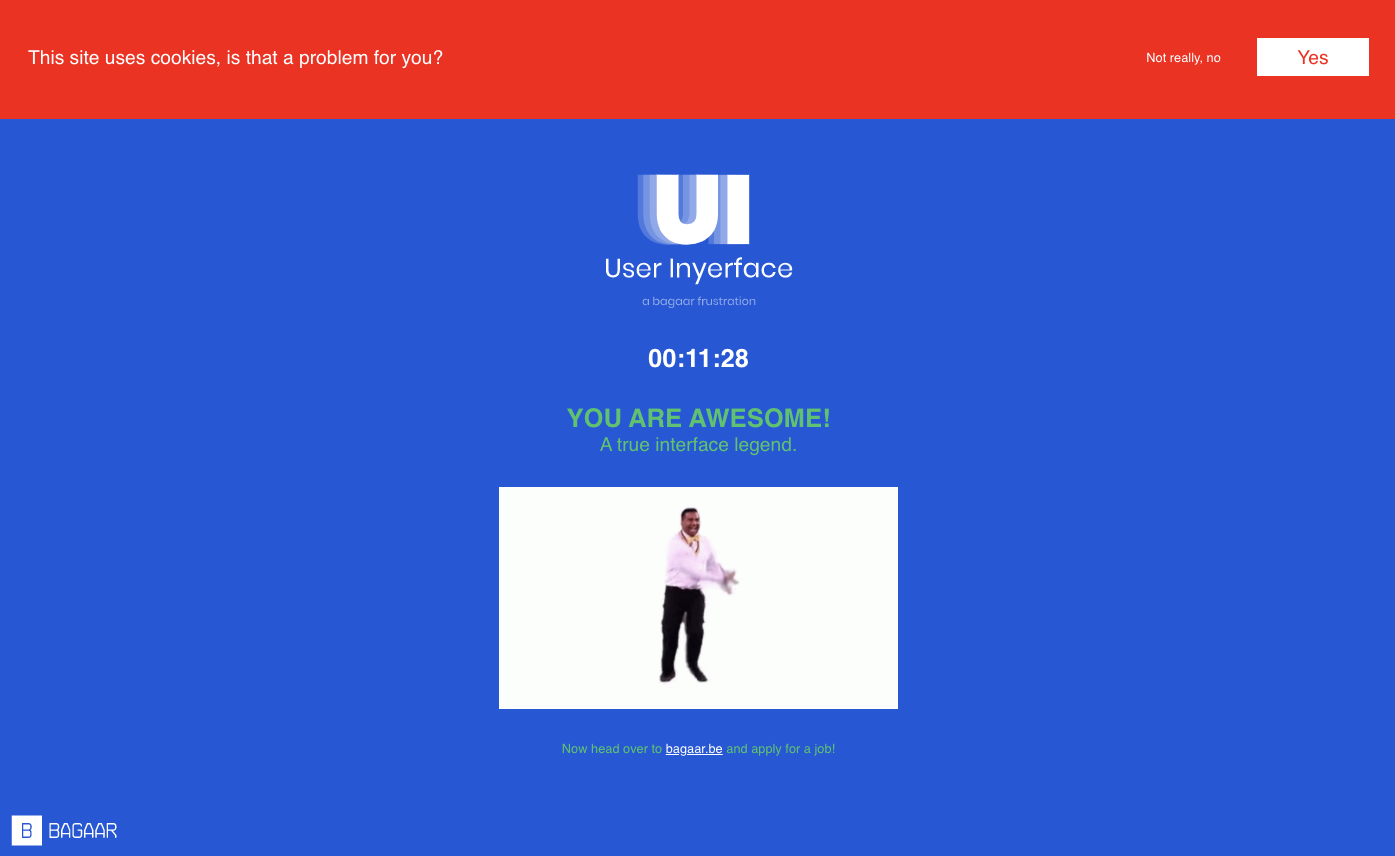
I had expected this online game User Inyerface (by the Belgium interaction design studio Bagaar) to be frustrated, but I had to admit that “frustration” is an understatement. It only has four steps but felt like a million steps. I planned to take notes along the process for my reflection, but I was completely drowned in the game and had to retake it again to take some screenshots and gather my thoughts 🙁
Now, let me walk you through these only four steps and show you how “awesome” this experience is!
The World of Frustration
The texts next to the image are not my monologue, just some make-up thoughts that I imagine people would have in their heads if this is the actual interface they need to register for something they must do, such as an online banking account.
Attribution
I shared in my linking assignment that I liked how Mandy used the curvey lines with texts to annotate the image throughout her tasks, and I recently got a new “toy” for my birthday and decided to try this same technique in this task.
Step 1
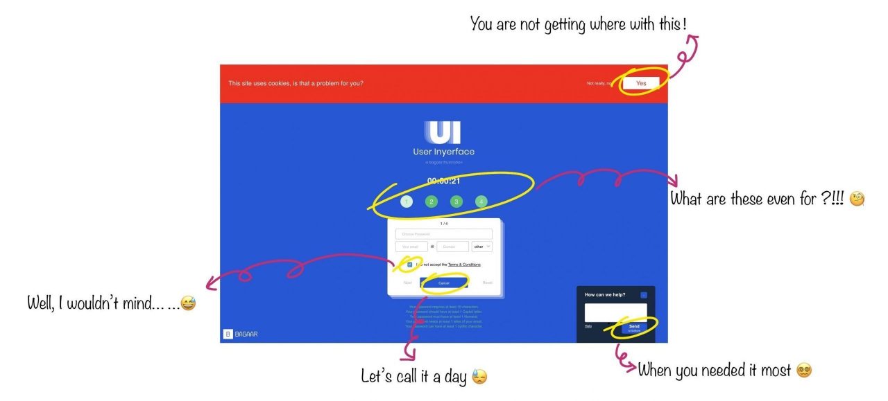
The Persistent Pop-Up Alert
Step 2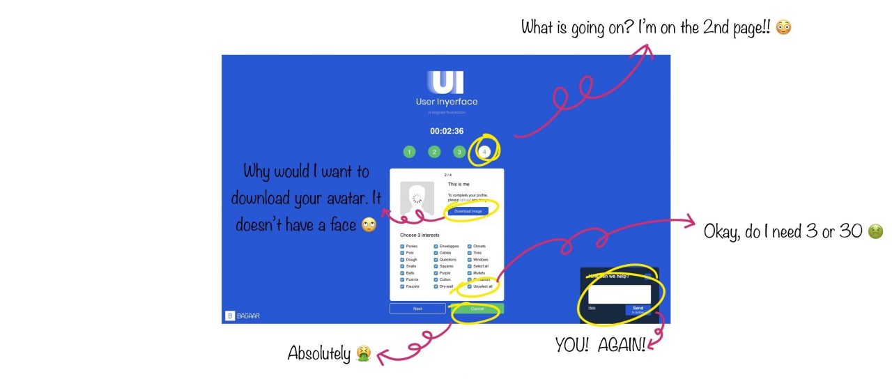
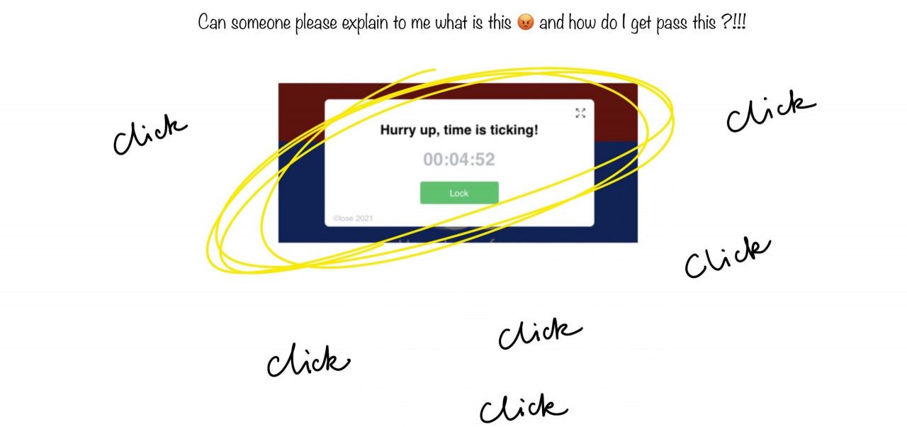
Step 3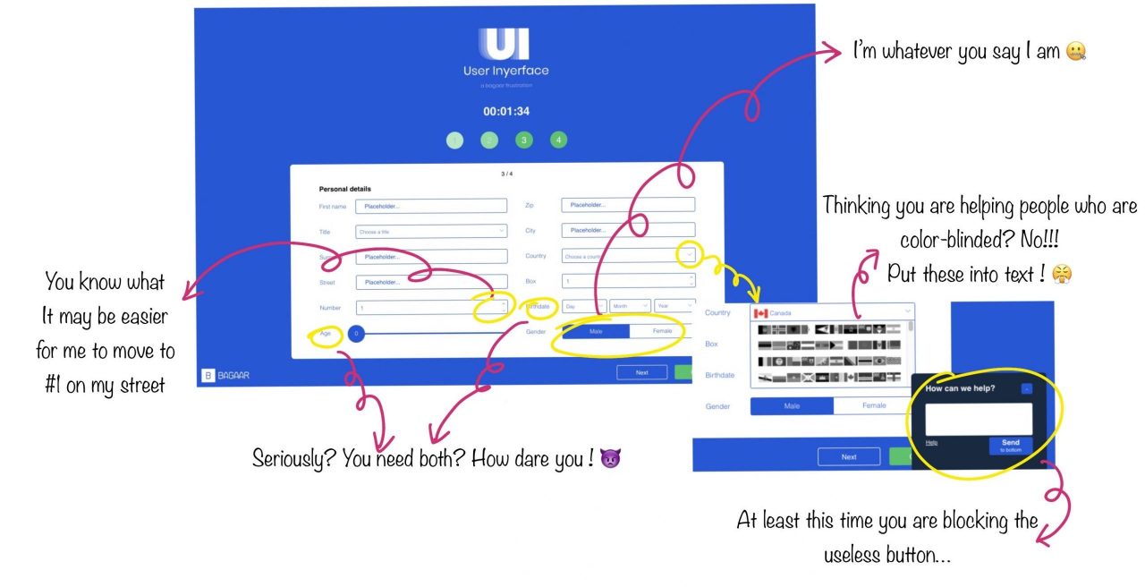
Step 4
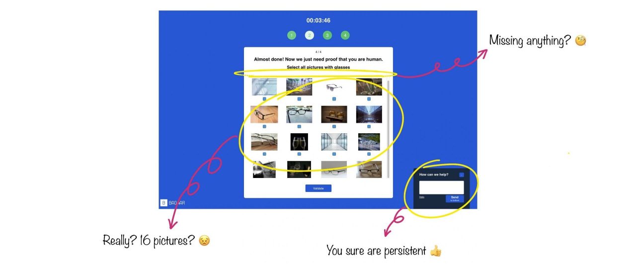
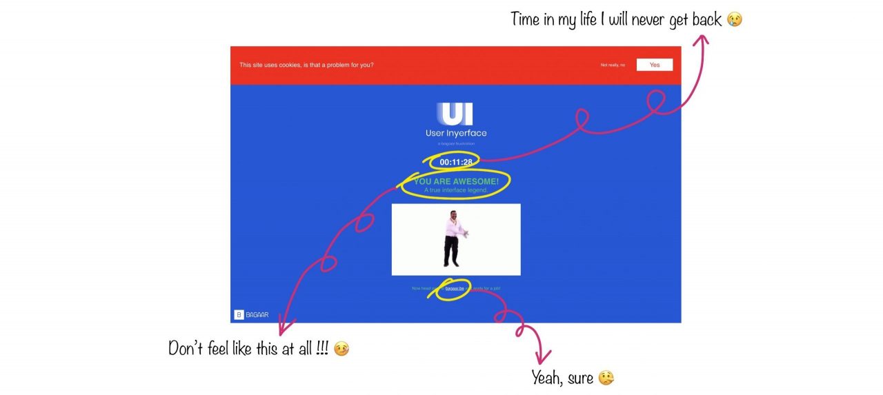
Done? Are You Sure?
The Reflection
I never thought my English was good enough to write any sort of poem, but I guess frustration does challenge you to reach beyond your limits 😉
We say we read, and the truth is we only skim.
We believe we have the freedom to choose, but we don’t really have.
They all promise our privacy is protected but only a fool would believe.
We should take action now, or there is nothing we can change.
Well, I tried to write a limerick and apparently, I failed.
Now, let’s get a little more serious.
I think everyone would probably agree this is a bad user interface, but why? Was it because we quickly decided on the action and realized it wasn’t working as we thought it would? Our frustration comes from the fact that the outcome does not match our expectations. But how do we get the expectations we have now? I think at least one of the answers is “we are trained to.” For example, we are exposed to a button with the background colour that leads us to the next step for the first time, followed by reinforcement (many websites use this technique). We are now conditioned to press these buttons before our minds even have enough time to process the texts our eyes saw. Technology can be used by anyone who has access to it, which means everyone can use this design technique (button with background colour) to achieve their own purposes. It could mean a friendlier user experience (the good) or a trap you will fall into unconsciously (the evil).
The user is probably the only “control” in this process (even if there are regulations to restrict deceptive design, it would be hard to define what ‘deceptive’ means in different contexts), so we will probably have to keep our eyes peeled. This is similar to the issues discussed in this week’s two Ted talks (Tristan Harris, Zeynep Tufekci). It will be impossible for big enterprises already making billions using these algorithms to help them generate revenue to take a sudden turn to head in the more moral direction any time soon. At least for now, it will be up to the end-user (us!) to find ways to defend our value if we still value it!