A Space for Reflections
Baviskar, Hartle & Whitney (2009) described the four essential features of constructivism. One of the most critical features, which helps learners be aware of what they have learned through expressing what they have learnt, is the reflection on learning.
ETEC 540 offers us a series of practical tasks throughout the term. While we are busy creating and writing, this linking assignment allows us to consolidate what we have learned through reviewing and reflecting on our peers’ work.
Task 1 – Natalie Cheung: What’s in your bag?
The first task in an online course is always vital. It is the touchstone for both instructor and student.
Task 1 is perfect to be the first and mandatory task for numerous reasons. The top one is that it provides students with a chance to familiarize themselves with the technology that will be used throughout the course.
As educators, we need to incorporate appropriate technology to help us achieve the pedagogical goal but not let the technology itself be an obstacle in learning. The first task, simply describing something in your bag, gives learners time to get familiar with the technology without stressing the content.
Back to Natalie’s bag 🙂
I can’t help but notice how clean the image looks. The layout shows Natalie has carefully arranged the items to fit in one image and look organized. When presenting something, how it looks to the audience matters. This reminds me of the “visceral level” Dr. Norman described in his TED talk (Norman, 2003). Text can be designed just as an image or any other element. For example, changing the text font or colour will change people’s perception of it.
I agree with Natalie that “the bag is an extension of the psyche,” and indeed, it is “an intimate meditation.” And almost everyone has devices like a smartphone, or tablet, or laptop in their bag. The information in those devices is maybe enough to rebuild a person’s life, including the relationships with others, bank accounts, work emails, etc.
The one item that resonates with me most is the packet of tissues. I remember when I was back in China, we had to carry it with us everywhere, mainly because most public washrooms did not offer toilet paper. Even though I don’t need the packet of tissues now, I still do keep a box of Kleenex in my car all the time, and I wonder why 😉
Task 2 – Natalie Cheung: Does language shape the way we think?
The poem caught my attention right away. As a teenager, we spent days and nights reciting these poems. We were frequently tested on our understanding of the poems, who the poets are and what inspired them to write these poems.
Without understanding the culture, it is almost impossible to understand an ancient Chinese poem. Our teacher always explained the background information to help us understand why such a metaphor was used and why it was so encouraging for the people.
As language changes with time, I think the younger generations will need more and more “background information” to help understand ancient written text. I believe language shapes the way we think because language is produced and influenced by everything around us, such as culture and technology, just like our minds.
Interestingly, just like how comedy turns life’s misery into funny jokes and leaves people thinking after laughing, most poems tend to do the same thing – using beautiful and powerful words to protest against the unfairness in the world. Interestingly, many famous Chinese poets wrote their most significant poems after they lost their political careers.
Task 3 – Eduardo Rebagliati: SPEECH TO TEXT
I think Eduardo’s unedited text is probably one of the best among all the Task 3 posts. Same as Eduardo, I noticed the obvious miss of punctuation. I wonder if there is one voice-to-text software that can insert necessary punctuation based on the length of the pause. If there is, will the unedited text be perfect or what kind of deviation we may find?
The most interesting thing I have read in Eduardo’s post is how words will first appear in his head before he reads it. I have actually never thought about it. Here is an example he wrote in his post.
Looking more closely, it seems to me like, before a word is formed in consciousness, there is an image of an experience. In that sense, the text I am seeing is a description of images and experiences. What feels “wrong” in the text is when this description becomes non-sensical through an error in the text. For example, one was “nobody is really perfect, and if that is true Bend I have no reason if you ashamed”. It seems to me that sentences like this are considered wrong or mistakes because they create sentences that can’t be properly referenced to images and experiences in our memory.
This reminds me of the first task that I have done in this course, in which I had included how a Chinese character (山) had developed from a simple drawing of a mountain to the actual character that people are using today, in contrast to how English evolved from its Greek origins based on meaning (Schmandt-Besserat, 2009). I don’t know if my understanding is correct, but this relationship between symbols and language mentioned in the example above seems to represent abstract v.s. concrete. Something you have experienced or have an image of is more on the concrete side and makes you feel right, and something deviating from our life too much can feel wrong. Will this apply more to the culture and value than the use of language itself? Something considered normal in a small tribe may be very strange for us if we do not know the culture and the historical reason behind it.
I have included a written version of my story after I had done the voice-to-text. Exactly as Eduardo quoted from Gnanadesikan (2011), “writing is generally done more deliberately than speaking, so finished written pieces are much more carefully crafted than a typical spoken sentence” (p.5). Even though my written piece was done quickly without thinking too much about it intentionally, it was still significantly better than the voice-to-text one. It is more concise, focused (on the main point), and more structured.
On one final note, my observations of people around me align with Eduardo’s experience that his text is more fluent and structured thanks to his experience as a musician. I have noticed my friends who sing perfectly in tune also speak other languages better (with fewer accents). Definitely no scientific proof on this, just my observations of a group of friends. I just thought it would be interesting to share!
Task 4 – Delian Gaskell: Potato Printing
From the Smithsonian Magazine (digital version!), I learned one quote from the Diamond Sutra about the passage of life that is timeless (translated by Bill Porter, or “Red Pine”):
So you should view this fleeting world –
A star at dawn, a bubble in a stream,
A flash of lightening in a summer cloud,
A flickering lamp, a phantom, and a dream.
It was part of the oldest printed book, but would this be better spoken or read?
What caught my Diamond Sutra part because I don’t recall a famous quote related to the English version I saw in your post, so I did some digging. Here is what I find, the Chinese version of Diamond Sutra was “一切有为法,如梦幻泡影,如露亦如电,应作如是观” (金刚经 第三十二品 应化非真分).
Both are translated by the meaning, and both were using a poem format. It is incredible how both English and Chinese translators decided to translate Diamond Sutra with the most beautiful expression they could find in the language. It is also challenging to understand if you have no references.
To answer Delian’s question, I think printed text and the “spoken or read agree” proposed by Delian both have their advantages. On the one hand, Diamond Sutra is the record of conversations between Tathagata Sakyamuni and the elder Subhuti and other disciples when he was alive, so reading would make sense to reenact that scene. On the other hand, Diamond Sutra is so rich and deep in meanings, so I agree with Hass’ argument that “written texts foster contemplation, analysis, and critique” (2013, p9), and it also makes sense for us to view the written text to analyze what are the multilayers of meaning.
To answer your question, I think printed text and the “spoken or read agree” proposed by your both have their advantages. On the one hand, Diamond Sutra is the record of conversations between Tathagata Sakyamuni and the elder Subhuti and other disciples when he was alive, so reading would make sense to reenact that scene. On the other hand, Diamond Sutra is so rich and deep in meanings, so I agree with Hass’ argument that “written texts foster contemplation, analysis, and critique” (2013, p9), and it also makes sense for us to view the written text to analyze what are the multilayers of meaning.
Task 5 – Mandy Alves: Twine Task
I have wanted to comment on Mandy’s posts a few times on the annotation tool she continues to use in her posts. I love how clear those curved lines are with written text next to them. She had unutilized these techniques in many of her posts, like listing out the items in her bag, proofreading her written text, etc.
We learn how to use word processing tools to type out the text we once had to write, and with the advancement of technology, we now create prettier-looking text with other visual elements (e.g. the curve line).
Bitmoji is the other tool that Mandy uses consistently in her posts. She utilizes this tool to create her own images that are more relevant to the topic/story.
Even though there were some technical hiccups (I was still not able to see the image in her twine) but, just like mine, those encouraged us to dig deeper into the technologies, to find solutions, to solve our issues. The digital world plus the internet provides unlimited resources. Solutions we used to take a lot of time to find now, maybe just a few clicks away.
I enjoyed reading her post, the “why” part particularly. “Twine makes ‘you’ exist in a place and time,” well said! And with the help of technology and the internet, this presence of ‘you’ could be forever.
Why? Well, Twine makes ‘you’ exist in a place and time– so you own your own perspective. Yet, you also live vicariously through the associations, giving you insight and authority to the decisions that lay in front of these peoples. Bolter (2001) extends this point, “In following hypertextual links, the reader becomes conscious of the form or medium itself ” (p.43). In essence, this ‘text’ contains less bias, and become more objective.
One final, totally unrelated comment as I noticed that there is a single hair in both of our featured photos. Not sure if it is ours or the little ones, but that single hair portrays our effort in juggling family, work, and school.
Task 6 – Amy Jazienicki: “An Emoji Story”
Amy and I both chose the Squid Game for this emoji task, and it seemed we used the same emoji keyboard.
She had also observed the lack of “negative words” in the emoji keyboard we chose, plus the similar and different emojis we used to represent the same meaning. Below are her comments.
Hi Ping,
Great to see someone else who has elected to tell the story of ‘Squid Game’ using only emojis! Your “retelling” of it was excellent, capturing many of the significant details of the narrative. Of course, having watched the series myself, I am able to “fill in the blanks” between emojis that might not convey the entirety of what happens in the story.
I found that I couldn’t use more negative words either (e.g., gun), so it was challenging to convey what happens in the series without such emojis. Similarly to your retelling, I also used emojis that might have somehow connected to death: you used a ghost emoji, and I repeatedly used a skull emoji after and even between each “game”. However, it seems we both had the inclination to use number emojis to denote the sequencing of the “games”, as well as the “explosive head” emoji.
I greatly appreciate you bringing up Zaltzman’s (2019) assertion regarding cultural context: pictorial content can have multiple and divergent meanings, depending on the reader’s cultural frame of reference. If someone has not watched the series, it would make for an entertaining time to see how they would interpret what you or I have created exclusively through emojis!
Excellent work, Ping.
I had also compared our emoji stories and noticed a few things interesting. We are both trying to describe the whole series, not just one episode, so the details we choose probably represent how important that piece means to the two of us in understanding the story.
In describing the title, Amy put the Korean flag, which I totally forgot about. Now think back. I probably did not think it was necessary because I watched Korean shows often when I was in University, so it did not pop up for me to be a unique detail that I needed to include. But looking at yours, I thought how inconsiderate I was, thinking everyone watches Korean shows just like I do.
I also chose the slot machine emoji to represent gambling because it is an important detail for me as gambling is illegal in China (excluding Macao). It raises a red flag for me instantly, and how everything that happens after is connected to the moment of gambling.
Like Amy has observed, we both used numbers, which reminds me of the lecture we watched in week two. We write the numbers the same way in both languages (Chineses and English). Therefore, the consistency is high when it comes to things that can be represented in numbers.
I chose to emphasize the beginning of everything, so a lot of details went into game one. For the rest of the games that happened after they restarted, I included the number of the game and two emojis for the details, whereas Amy had both the games and what happened after the games. It is definitely easier to visualize with more emojis.
One last thing is about the format. I think me trying to make every line with only fours emojis may look clean but not represent the story best because of the lack of details. The reason is I didn’t watch everything in full because I didn’t have enough time. I got the main idea by watching episode one, and then I knew what would happen, so I just watched a YouTube video where the host discussed the rest of the episodes with some details.
It is fun to have a head-to-head comparison (same story, same emoji keyboard) and visually see how different our thoughts are!
Task 7 – Graeme Baerg: Mode-Bending
I enjoyed Graeme’s video and the written reflection, and I think he is really taking this task to the next level. He attempted to incorporate many semiotic modes in his video. Some examples are:
- The intense colour contrast from the leaves the items from the bag are placed on
- The music (songs) in the middle and at the end of the videos.
- The gestures in presenting the content.
- The spoken (voice-over) and written (the annotations) language.
I resonate with Graeme’s comment about how these items in our bag become the extension of us and a reflection of our status. Think about how people get an impression of a person before they start talking. It begins with observing the items surrounding the person, such as the cloth, phone, bag, watch, etc. These items represent the choices we made when we purchased them or our status (e.g., a work tool provided to me that represents my profession).
Another comment that caught my eye was how different representations of texts can be fused together and carried everywhere thanks to the portability of multimodal literacy. Just like tasks 1 and 7, we do not need to possess any of the items from any of our peers’ backpacks or be around them physically to learn who they are. We learn through the image and video they presented to us, explaining the items in their bags and conveying a message about themselves.
I do wish Graeme’s reflection had more details of the production process, as it interests me a lot about how he decided to present all the materials he recorded this way. For example, did he write a script, or a structure, or just do a one-take of what he has on top of his mind but re-do the sentences he made a mistake, or he voiced over after the video is recorded? What does his storyboard look like (if he has one), especially in how he designed what clips he wanted to shoot and how to arrange them to better present his ideas? What are his own interpretations of the semiotic modes in his video?
Task 8 – Connie Sim & Amy Jazienicki: Golden Record
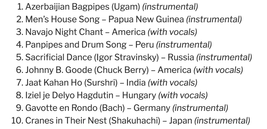
I thought it would be interesting to see if anyone in the entire section picked none of the songs I chose, but it turned out that I shared at least one track with everyone in my section. So I decided to check who shared the least with me, and I got two winners. Connie (track 24 flowing stream) and Amy (track 10 Gavotte en rondeaux) both shared only one track with me.
When I revisited both Connie and Amy’s posts, I found they were both implementing criteria as opposed to my “whatever I like listen to” approach.
Connie selected songs based on the continents. There are some duplications of the continents, so she tried to pick different countries. She believes her picks of music rich in sounds and tones better represent the different cultures than it would be if she picked based on the ones that simply appeal to her.
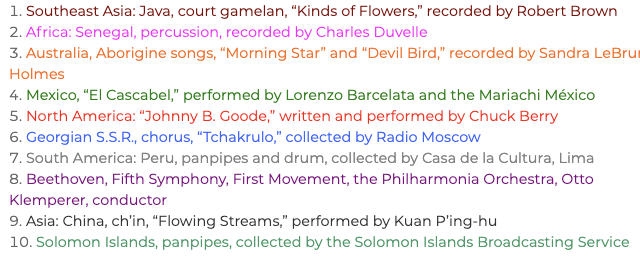
Amy’s selection has also taken continent into consideration, but hers has another layer by separating the tracks by whether they are exclusively instrumental or with vocals.
Their approaches may be more “scientific” as they rely on logic rather than feelings, which would probably be closer to the scientist who first picked these 27 songs. However, I wonder if aliens use the same logic (e.g., pitch, frequency of vibration, etc.) as we do or they are going to like/dislike based on their feelings 😉
One interesting observation that I noticed, they only share two tracks even though they both considered the continent factor. So the three of us, putting into a network as shown below, selected 26 out of the 27 total tracks.
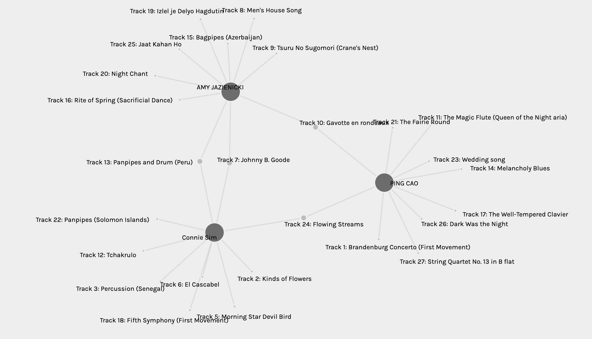
The one, none of us, selected was “Track 4: Zaire, Pygmy girls’ initiation song, recorded by Colin Turnbull.“, which was not included in the link of the music content that was put into the course, so it probably explained why few selected it in the entire section as they would have to search the track especially to listen to it.
Task 9 – Kirn Bhela: Network Assignment
Kirn’s post is taking a completely different approach. She refuses to “guess” the reason behind the data and gives an explanation on how should data be interpreted based on her UX working experience.
In her description of how data (I assume she meant quantitative data here) should be interpreted with qualitative data, I learned a new term, “affinity diagramming.” This leads me to do some research on my own, which is one of the best things that the MET program offers – professionals share the tools or structures they use daily (meaning with proven success or a high level of practicability) in their posts or discussions. It seems the affinity mapping is a method to sort and organize qualitative data, which could be used to create a priority list – what needs to be addressed first.
I enjoyed reading Kirn’s example and applauded her for her determination to approach this task from an unexpected direction. However, after reading it a few times, I think what she believed (i.e., “[t]he data points are simply numbers encoded for us to gain an understanding of the similarity in patterns between our responses. However, it does not provide depth to our responses”) could also be an assumption she set up based on her perception of this task.
To be more specific, her interpretation of this task is for us to guess what makes those communities. This could be a direction if you don’t mind guessing, and it is fun to do so. If you are like Krin, trying to avoid assumptions, there are also other ways you can analyze this data without having to assume anything. For example, who shared most tracks with you?
If I can be frank, I think it could be risky to assume that qualitative data (e.g., interviews) provides a better understanding of the data collected because humans are on both ends of the analysis (i.e., interviewer and interviewee). It is hard to avoid bias or ensure the interview questions can thoroughly cover all aspects. Also, without studying how Palladio groups us, it could be risky to assume that the algorithm behind the grouping is “simple.”
Task 10 – Mandy Alves and Katie Naish: Attention Economy
Mandy shared her weekly ‘screen time‘ report in her Task 10 post as she find it played well into the content of the course. I was instantly curious about my screen time so I went on and checked mine.
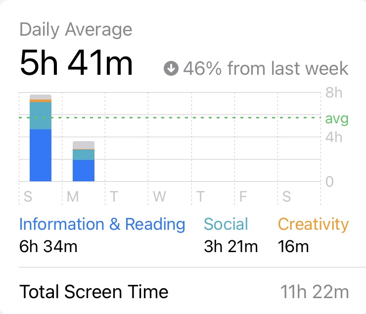
It shows my screen time for Sunday (almost 8 hours), and the daily average (only Sunday and half-day of the Monday) was 5 hours 41 minutes. This looks not alright compared with Many’s 5 hours and 27 minutes. However, if you take a closer look, it says decreased 46% from last week. Since this week only has 1.5 days so far, last week’s average is probably more accurate, and my calculation says my last week’s average is 10.5 hours. It is scary as I do use my work laptop for work, and my personal laptop for school. Even though I read and draft, and communicate with colleagues using my phone, I am quite sure that I complete most work and school on my laptops. This requires further investigation that I probably can’t afford the time to do now, but I will put on the list of things I need to complete during Christmas break.
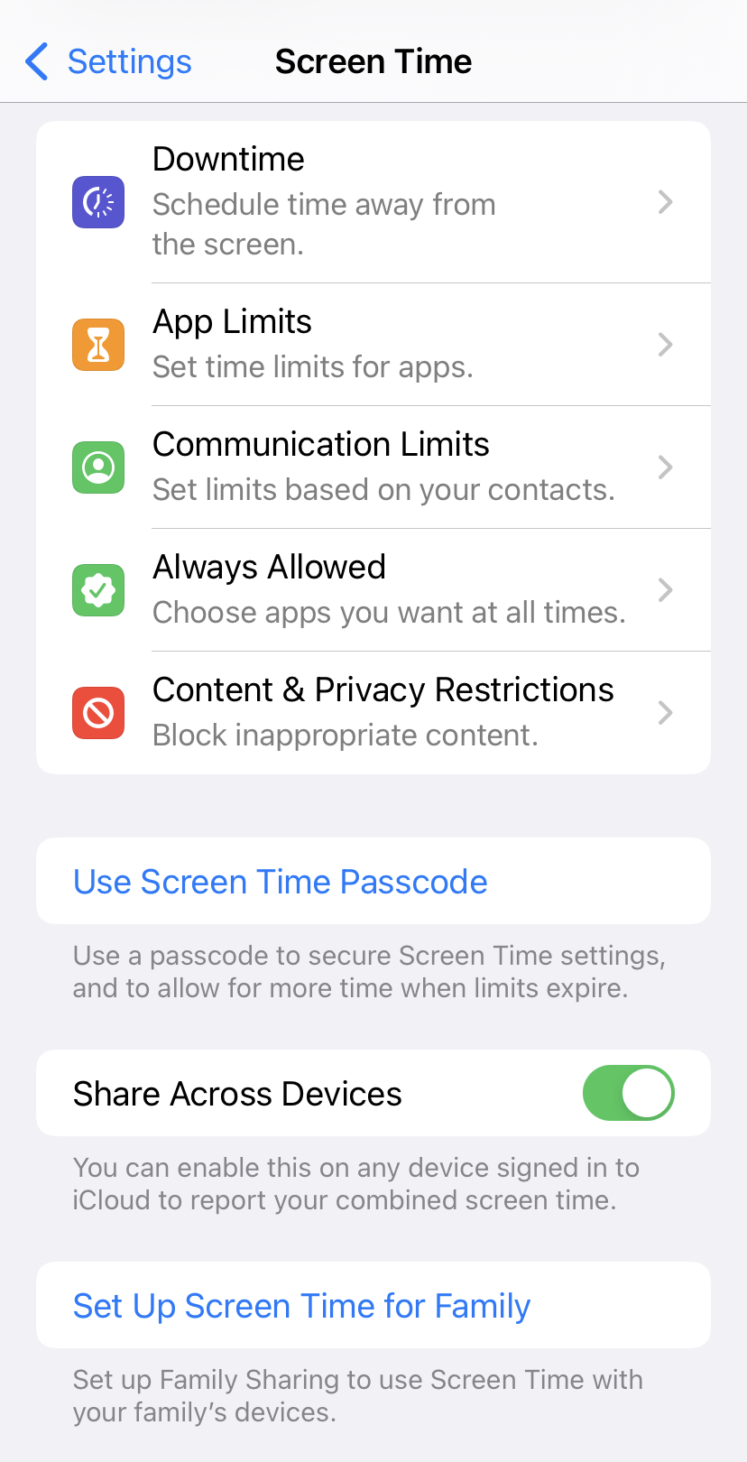
When I search for my screen time report, the options provided to be below my report caught my attention. Look at the screenshot below, my phone actually provides me with options to help regulate my screen time. It allows you to set downtime before bed (quite against my bad habit of reading or watching something on my phone), set limits to each app you are using (if you know you love TikTok and don’t know when to stop, maybe set a time limit each day for it), who can contact you during your downtime, which apps are essential you must allow all the time, and privacy settings (haven’t quite figure out this one). Once I have done my investigation, I plan to give the “App Limit” function a try.
I agree with Katie that the two pops up are the most frustrating experience. Maybe this negative feeling towards pop-up is not simply because of the User Inyerface online game. Watch this fun clip from Ralph Breaks the Internet movie, do you also feel annoyed by the popup ads?
Katie had also included a Youtube video (How fast Is Your Brain? The Stroop Test) about how fast our braid process information, and I just thought it is such a fun game and totally reflects how we read but we don’t really read as our brain process information in a mysterious way. Read this article about typoglycemia!
References
Baviskar, S. N., Hartle, R. T., & Whitney, T. (2009). Essential criteria to characterize constructivist teaching: Derived from a review of the literature and applied to five constructivist teaching method articles. International Journal of Science Education, 31(4), 541-550. https://www.tandfonline.com/doi/full/10.1080/09500690701731121
Bolter, J. D. (2001). Writing space: computers, hypertext, and the remediation of print. New York, NY: Routledge.
Gnanadesikan, A. E. (2011). “The First IT Revolution.” The writing revolution: Cuneiform to the internet (Vol. 25). John Wiley & Sons (pp. 1-10).
Haas, C. (2013). “The Technology Question.” Writing technology: Studies on the materiality of literacy. Routledge. (pp. 3-23).
Helen Zaltzman (Host). (2019, July 13). 102. New Rules. In The Allusionist. https://www.theallusionist.org/new-rules.
Norman, D. (2003, February). 3 ways good design makes you happy [Video]. TED Conferences. https://www.ted.com/talks/don_norman_3_ways_good_design_makes_you_happy?language=en
Schmandt-Besserat, D. (2009). “Origins and Forms of Writing.” Handbook of research on writing: History, society, school, individual, text. New York, NY: Routledge.