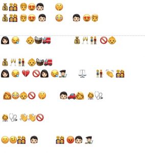
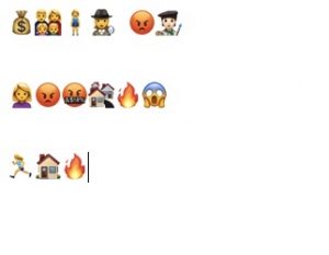
Using the conventional emoji keyboard has led me to discover there is not emoji for meerkat or wildebeest which meant I was not going to be able to retell The Lion King, the last movie I had watched, so it was on to the last novel read. This was going to be a challenge because although the title was simple, the story itself proved to be more difficult.
In order to guess this book title, you might need to be familiar with the book, if you are it should be easy to decipher. The plot might be as difficult to puzzle out as it was to write. And so I began with the title and wrote in ideas or concepts and groupings of words or ideas rather than in syllables which are only bites of sound meaning little.
The difficulties in my writing in emojis began with the plot of this story being circular rather than a linear plot line. Many books that I have read lately seem to actually tend to do this more complex plot line. A colleague (English department head) recently told me that First Nation stories often have a circular path and yes linear, circular and iterative are indeed in the English Arts Curriculum. The story begins at the end, then flashes back to an earlier time in the character’s line in order to explain the final scene. There is also a point where the plot flashes back yet again, twice actually.
Bolter claims that “[s]ince its invention, printing has placed the word effectively in control of the image” (48). In the case of emojis, they are incontrol as they become the words. Word choice is governed by the availability of emojis. I worried that I should not announce the gender of a character using a pink or blue shirt. I soon discovered that babies did not come in all colours and races which although not central to my plot would have helped. I tried to create groupings or “families” of character to make them more identifiable. Also missing were some occupations that I wanted as well as at least one medical procedure. And where was the pregnant emoji? Seriously? I was looking for that as well and was wondering how we petition for meerkats, wildebeests and pregnant people.
What was omitted also was interesting: no punctuation, spelling or grammar to worry about, although, I did section ideas into sort of sentences or lines as well as adding spaces between lines to create some semblance of paragraphs between ideas and spans of time. It was easier to create the pauses using a lack of text or by using spaces than it was with the earlier voice to text task. It would have been interesting to simply draw or move the emojis around in different arrangements but the document demanded a line after line arrangement following the conventions of English language. My emoji story retelling still has the constraints of the conservative arrangement of a book that Bolter (2001) describes.
Where do emojis fit into text? Kress describes written words and spoken to be a representation or “vague description” whereas an image is a more accurate representation. Bolter (2001) also makes an interesting point in that “ekphrasis sets out to rival visual art in words, to demonstrate that words can describe vivid scenes without recourse to pictures” . . . yet . . . “in digital media and even in print, we get a reverse ekphrasis in which images are given the task of explaining words (Ch 4. P. 56). Writing in emojis is a space that exists in this tension, in a sort of “no man’s land” which is neither image nor word. The emoji are a representation of words and become symbols of words which are what words are. Both are removed from the actual event and need to be interpreted by the reader.
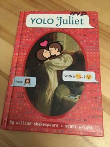
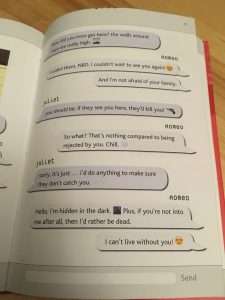
This writing experience was definitely a challenge. Emojis were designed to add emotion to text especially in shorter pieces of writing, such as in tweets, messages and chats, to avoid misunderstandings that could arise (Bolter, Ch. 4). It is so hard to tell sometimes if someone ‘s message is being terse or sarcastic or just plain nasty or maybe they are just in a hurry. We rely on more than just written words to convey meaning. This is all great but emojis are designed for these short bursts of text instead of having to rely on lengthy explanations, whereas a novel has the time it takes to set a stage or scene(s) and use multitudes of descriptive language to create meaning. I have a text in my class library, YOLO Juliet and even it is not written in full emojis but more a rebus style with the odd emoji thrown in as well as being translated into a more modern slang version. According to Bolter: “Digital media claim to achieve greater immediacy and authenticity by integrating images (and sound) with prose.” (2001, Ch.4, 47). Notice that Bolter says “with”? Emojis are images but to rely totally on them does not create a full story or even plot; they paint a simple picture of emotions and objects but only of those that are available.
Bolter, J. D. (2001). Chapter 4. Writing space: Computers, hypertext, and the remediation of print (2nd ed.). Mahwah, N.J: Lawrence Erlbaum Associates. doi:10.4324/9781410600110
Shakespeare, W. & Wright, B.( 2015). YOLO Juliet. Random House.
Please note: no animals were injured in the making of this story . . . (but maybe a few humans)
This amazing story is available through this shareable link from google drive which will allow you to first see the html language which is quite lengthy and impressive. Once you download it and open the file, you are ready to read!
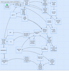
The creation of this Twine story and a few thoughts:
The mapping of the Twine fascinated me as it showed all of the links between the passages. The connections of links are more obvious in the building of the story than they are in the reading. It was even possible to link back to previous passages and have the reader re-live passages or scenes. I was fascinated with the building process and got a little over enthusiastic perhaps. It may be annoying to some; but not to my students who read choose your own adventure stories over and over again to see different outcomes. I am reminded of how text has changed from words in books written in a linear fashion or a “complete or closed verbal structure” (Bolter, 2001, p.77) to a more circular rendition through the use of hyperlinks.
This reminds me of my English departments reporting comment bank which states: Student “can construct and create by choosing particular formats (linear, circular, and iterative) in the creation of story/text.” In the past we may have thought of a story or text being anything other than linear but to me that seems “unnatural.” “The supporters of hypertext may even argue that hypertext reflects the nature of the human mind itself— that because we think associatively, not linearly, hypertext allows us to write as we think” (Ch. 3. 2001, p. 43). Ted Nelson was one who thought “hypertext was natural to the mind” (Bolter, 2001, 42). I know that my mind certainly works in circles of association -sometimes I even speak this way; words need to weave and twine around each other. Yes, the pun is intended as the Twine does just that as it circles back and steps sideways and forward.
There has been criticism that hyperlinks do not truly reflect all association. Bolter (2001) mentions supporters of books such as Birkerts (1994) and Slouka (1995), claim that “as authors prescribe links, they deny the reader the choice of making her own associations . . . [by] letting them “choose links only gives the illusion of control (Ch. 3, p. 42). Indeed my own Twine appears to give choices to the reader and yet I force the reader to make a choice or manoeuvre them to circle back to the choice I want them to take. Sometimes, I did not even give a choice; choice is an illusion in this case. Editors of encyclopedias decide what to include and what to exclude in both print and on the world wide web (Bolter, 2001, Ch. 5, p. 90). Do you wonder what I have left out of my story? There was much more but I will save that for a sequel – I really have enjoyed this experience that much.
The product itself, The Dark and stormy night twine, is rough but as I have said, I was much more mesmerized by the process. It was like a puzzle putting all the pieces together and to tie the ending up . . . well, sort of tie it up. I have included some of the twine statistics which I found quite by accident. There were a total of 30 passages and 41 links which translates to quite a lot of circling back in for the reader, maybe until they got it right. again, I emphasis the control that the reader thinks they have but actually do not.
I wondered if the process and being so focused on it was the reason for the grammatical errors which I would not have made if I had written the story in a linear fashion on paper. That would have forced my mind to focus on the mundane side of grammar rather than the creative. I had thought to edit them further but decided not to as a statement to the power of the technology. I know wonder if this might be why my own students seem to forget capitals, punctuation and spelling. maybe they are really focused on the creation. Or is punctuation changing – I had no idea that a ‘.’ or full stop was rude in a message, tweet of chat (Zaltman).
In addition to correcting grammar and spelling*, I might have also taken more time to get the formatting of each passage perfected. Again, I was more interested in the story than its appearance . . . except for the lovely dark background. I did discover how to edit the formatting but chose not to as I think it suits the dark theme of the story. I do not think Twine 2 is easy to download sound effects and graphics to (this according to the site) but the story is meant to be read in a dark, deadly quiet space.
The narrator “voice”was modelled after the Twine example of “The temple of No” with a cheeky humorous tone but with a bit cleaner language as I would like to share my Twine with my grade 8/9 classes. The narrator(s), maybe I was arguing with myself, I envisioned arguing throughout the story but this may have been hard to maintain. By using a second person perspective, and “you” in the story even more engagement is created along with the illusion of control. I think it is something students would appreciate and maybe even like to try. Last Halloween, we read a choose your own adventure in class using a google slide show with linked slides which was a big hit and later we participated in a BBC refugee simulation (a bit more serious) but the interactiveness of the activity was highly engaging for the students. To be able to create and understand linking and the opportunity to control it adds yet another layer to this educational process.
*some grammatical and spelling errors have now been corrected after sharing with a small group ( 2 students and 1 educator) for feedback. There were more errors than I had first thought. DIY and feedback are valuable.
I chose this link because I was struck by how similar our planning, thought process and conclusions were and yet despite having many similar elements, our websites are actually quite different.
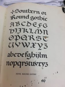
Tanya’s experience was similar to mine as the planning process of the task seemed to be of significance for both of us. She selected a word that held meaning for her, “Teach” defining who she is or what she does. My own word also reflects my teaching experience by defining my identity as a Raven House teacher. We both placed an importance on the appearance of our fonts, considering the historical significance of Gutenberg’s Bible and typeface. Fonts are where we diverged: she wished to display a more modern version to reflect change in teaching and also used the laddered T to indicate meaning. As I reflected on the monks’ writing and Gutenberg’s Bible’s Blackletter, I also thought of American Gothic writer Edgar Allan Poe and his poem “The Raven,” and decided to try a version of Gothic lettering. Our time spent on the project was also similar with results that as she so eloquently put “still missing the consistency that machinery could give but there is more life and humanity in it’s imperfections.” To this statement, I wholeheartedly agree; there seems to be more value in the handcrafted lettering.
Tanya’s webspace, however, is different from my own. It is a Weebly space which confused me initially as accessing from the course’s student webspace, looks different. There is not a complete list of tasks and blogs that usually appears under each individual’s name. Instead the access point appears as only one word, “tasks,” which redirects the viewer to a Weebly. Focussing on the weekly task I had not realized it was a Weebly site initially. The site appears very similar to my own WordPress which uses Booklite as a theme. Similar to my own site, Tanya’s blog presents items in chronological order with the most recent one at the top. Also at the top is of Tanya’s menu are the same words or links as mine own site with the exception of a “Contact” link on her site. Because I had co-created an earlier course’s Weebly for a project, I had wanted to create the same type of appearance in the menu at the top. With these similarities, my brain connected the two sites.
Because I had made this connection, it was all the more confusing when Tanya’s site did not navigate the same. What was different and confusing on her site was that to comment, I needed to go to the top of the post rather than the bottom and click on a link. I missed this at first which may be not only the location but also the lighter coloured and smaller font. The link took me to a form to fill out identifying information in addition to commenting and to ask approval to comment. Because it is different, adding another layer of complexity, it took more time and effort. As frustrating as it was to navigate, not realizing why, it is a worthwhile experience to learn to navigate multiple blog platforms.
The site itself has a clean minimalist appearance with a boldface type of the task which draws attention and a white background. The photos display well on a white background. For someone who is more visual, the blog post is excellent. However, for someone with less than good eyesight it might be difficult to read the smaller, lighter font. I have played with my own font and background colours but have yet to settle on a satisfactory one as it seems to depend on graphics and effect I am looking for. One constraint of the course design was the preference to use WordPress. With this platform, I have yet to find the variety of fonts that I would prefer. I had found a font in google docs, Almendra, which I would have liked to use or something similar, to create a Gothic font appearance. I have also found that my video file type was incompatible with uploading which necessitates uploading to YouTube first. I had wanted to experiment with my blog content. It has definitely been an exercise in exploration. What has been pleasantly surprising, is the way the course itself explores and allows a hands on, authentic experience that evolves with the text technologies despite being an online course.
I chose this task because I had, as a child, done potato print stars with angular straight cuts; it should be easy.
Here is a quick preview of the process:
A detailed look at the process of potato printing:
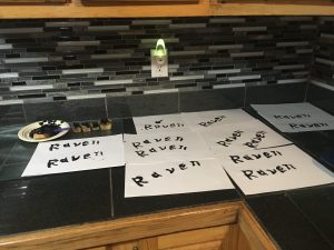
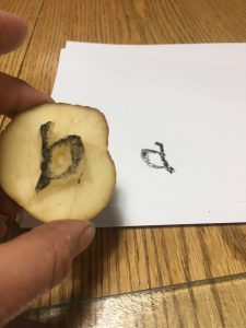
First, there was planning to do including a day ruminating over word choice. A 5 letter word. Should it be one that could be recycled over and over toPotato make the maximum number of smaller words such as “twine” . . .twin. . . win. . . in . .. net . .. wine. Or should it be a word of significance? The first book Gutenberg printed, after all, was the Bible so the word should be IMPORTANT. Thus a word go significance to me was selected, Raven, which reminded me of Edgar Allan Poe’s The Raven and my Raven house team at the Middle School where I work.
Might I soon be saying “nevermore” in frustration? Perhaps.
Benson & Carey. The Elements of Lettering.
Font selection: A suitable font for “Raven” was needed but not just any font. I consider fonts to be of particular importance as they can visually communicate an era, a style, an emotion or idea. Gutenberg’s Bible, the first printed text, was done in Blackletter, also known as Gothic or Textura which appeared similar to the handwriting of medieval monks (The Printed 00:37:50) with its “strong vertical strokes and vertical appearance”(Cloud). Appearing remarkably similar to the monk’s writing helped to promote acceptance of Gutenberg’s work (The Printed 00:37:50). Further, Edgar Allan Poe’s genre of writing is described as American Gothic and so a modified Gothic style seemed appropriate for my Raven. I have done both the Blackletter and the Southern Gothic font in the past, using a calligraphy pen; however, I soon learned this would be a far more difficult task on a potato.
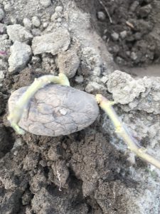
Next, there was the procurement of potatoes. Unfortunately my potatoes had sprouted and were planted in the garden the day previous so off to the store to purchase new potatoes. I selected russets which proved to be far too juicy and I wonder if the new white potatoes would be better as I thought of Gutenberg selecting the best metals to use for his moveable type press. (Harris, 00:36:54)
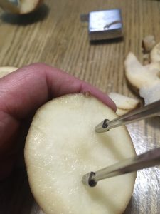
Tools: Gathered in anticipation were a Leather-man (not used), a steak knife (used extensively, a chef’s knife, a tape measure, a geometry set divider, a pen (which proved to be useless), a felt marker (nearly as useless as a pen), and some references (paper based and online) to check fonts.
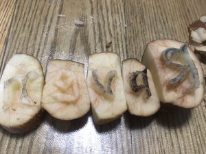
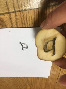
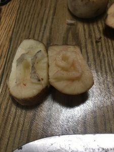
Finally, at 7:02 pm the actual carving process began. Individual letters were in mirror image so they would appear oriented correctly. This I checked several times. I chose to carve in order of the spelling of the word; I am not sure why but suspect I was following the English convention of writing from left to right. The potato was halved and the letter “R” was carved in uppercase after several attempts with each on making a smaller and smaller potato “halve.” This is when the decision to make a simple version of the font occurred. The potatoes were incredibly juicy making it messy as well as difficult to see to see the letters and whether too much had been trimmed off. Next time, I would try a dye on the surface to create more contrast. (Yes, I am excited to try this again!)
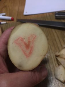
The letter “a” took only a couple attempts and was not the most challenging letter despite the interior cut that needed to be made. The letter “v’ was one of the harder letters because for some reason I could not get the right angle between each side making the letter too wide. I ended up cutting it off and starting again. The style of the letters also dictate that there be some curves even to the seemingly angular letter “v.”
Interrupted by my spouse, I envy the medieval monks in scriptoriums where “silence is mandatory” (Harris, 00:06:36).
Even more troublesome letter was the “e” which was strangely was the most angular of all letters and should have been the easiest. The letter “n” was too large at first attempt and needed to be downsized which was done without incident.
Throughout the process, the divider was used to measure the height of the letters; I preferred the speed and ease over the tape measure that was initially used. Uniformity of font size would improve the finished look of the word. Again, I am reminded of the medieval people marvelling over Gutenberg’s uniformity of text (Harris) which drove me to attempt to perfect the uniformity of my letters. I chose not to trace them, thinking that would be “cheating” and instead carved freehand which made uniformity of size more challenging.
I then trimmed the sides of each letter so they would nest closer and flat beside each other as well as the bottoms so that I could line them up on a straight edge. Next time I will attempt to use a long skewer to join the potato pieces much like a typeset tray.
Ready to Print! Maybe . . .
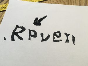
The printing process stalled when I realized that my paint had been packed in one of 30 or more boxes in the process of renovations (never again during a course). A frantic search resulted in some lovely black acrylic and one stubby paint brush, both selected because they were all that was available but they worked well! Success . . .almost. The first printing resulted in the letter “a” appearing backwards which was puzzling. I was sure I carved it in reverse. I had even tested it on another potato half.
Then came the realization that it was upside down; the style of the “a” made it possible to appear like a
backwards “a.”
Crisis averted, the black paint was applied and potato print blocks lined up ready to be placed ” carefully because they tended to slide and smear easily. I discovered the letter “n” was not quite flat or level and needed to be rocked slightly to leave a full imprint. As I did this I thought of the monk’s letters, “crisp and straight upon the page” (Harris, 00:10:18).
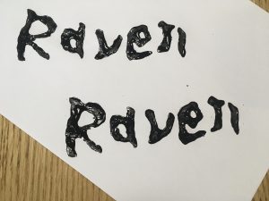
9:04 “Raven” was completed!
Reflections:
I was quite pleased with the way the letters waved almost birdlike in their shape and the rough fill of the paint, all of which seems to suit the Raven of Edgar Allan Poe’s poem. And of course the “found” black seems like fate – perfect. Was I able to get the two words to match exactly? No, but that uniqueness is reminiscent of the monk’s almost, but not quite perfect lettering. Potato printing seems to bridge the world of hand written manuscripts and the “mechanization” of the printing press, being not quite part of either world. Potato printing is labour intensive initially but one can rapidly print once the printing blocks are completed.
At several points in the process I had even wished I had chosen to write a 500 word manuscript instead, envying the monks hunched over their writing but I soon became addicted to printing with my potato blocks trying different angles on the paper and curving letter arrangements. It became soothing as I derived pleasure from this simple act of printing. The almost 2 hour process of carving resulted in the ability to quickly print many more and I had extras to give to my colleagues and fellow Ravens the next day. An evening well spent!
And then I decided to try Animoto to create a dynamic video of the process which need to be uploaded to YouTube which all took almost as long as the potato printing. It will go faster the next time . . . potatoes and new technologies!
References:
Benson & Carey. (1950). The Elements of Lettering. Toronto: McGraw-Hill.
Cloud, G. (July 12 2016). The Jenson Bible joins the Gutenbergs Bible’s page turning. The Ransom Center. University of Texas. https://www.hrc.utexas.edu/ retrieved June 3, 2020.
Harris, B. “The Printed Book: Opening the Floodgates of Knowledge” How it Began: A History of the Modern World. podcast.
As a “Double Feature,” I have chosen as my first link assignment submission to link to Sasha Passaglia and Jamie Ashton’s blogs on Lera Boroditsky’s video on How the Languages We Speak Shape the Way We Think.
From my perspective, both task contrast each other. I was able to connect to Sasha’s task in understanding and content. Our experiences with the viewing of the video were very similar, while Jamie’s task felt like I was reading a foreign language at times although there was much common ground to be discovered.
First, I will describe my Link to Sasha’s task
Connections: Our perspectives are quite similar as is our viewing experience. This viewing experience is not one to ignore as it impacts our thinking and ability to connect in similar and yet slightly different ways. Our own children interrupted the viewing process as they attempted to interact with us, hers in person and mine via text messages. (If I do not respond, there are then subsequent phone calls.)
As I read Sasha’s blog, I felt validated in my blog comments as I could see many similar interpretations and thoughts. The first viewing gave an overall view but on the second viewing, more details were gleaned. We had both recognized our surprise and what I will call our own egocentric thinking about thinking and language. Other similarities included the opinion that the other module videos complimented Boroditsky’s video by adding a passion for languages other than text as well as an historical perspective. We both recognized the value of the past and the need to preserve languages but Sasha included a purpose: for future generations, as her perspective as a mother of youth children reminds her of this important need. Shared experiences of being teachers, mothers, nature lovers, and classmates in an earlier ETEC course could be a reason for our shared or similar understandings. Perhaps it is also a shared culture of ETEC graduate students.
Authoring: Sasha’s space is an easy to navigate and access WordPress blog. Items are clearly defined and accessible with a simple menu of 3 links at the top of her page. There are no additional permissions or passwords required with the comment section that easily accessible adding an element of co-authoring. The task is primarily text which is well organized and logical in its flow. A text based task such as this may privilege a more literate viewer; someone who is more of a visual learner may not find it as “approachable.” However, a quote from another source is included with its formatting (offset or indented and in a different italicized font) adds another texture to her post making it more appealing in addition to highlighting a key understanding for her.
My own site’s authoring is similar to Sasha’s. It is a WordPress blog with a simple “menu” at the top which is really just my 3 categories, an About page and a Home page. My home page contains all of my posts and seems maybe redundant but for now it stays. There will be opportunity to change it later (I am afraid to do so now for fear of losing items). I am new to WordPress, and thus used a simple blog comment about the experience with no additional photos or attachments. I have chosen to reflect on the experience as well as the content linking it to the other “readings” with a simple blog comment. This simplicity may be due the assignment itself as there was no requirement to post; this may also be considered a design restraint. While that may be all that is needed, I later returned to attempt to insert a link to Borditsky’s video which did not have the visual appeal, I had wanted. I think I have since discovered how to include visuals such as videos now though.
Pedagogical underpinnings of the course design are evident in specifically in Task 2’s the requirement of annotations, or learning a new system of communication in an asynchronous manner. It is almost like being in a class discussion but this immersive experience felt disjointed not being in real time with the luxury of asking for clarification. This disruption of thinking echoes one of the portions of Boroditsky’s examples of how interrupting thought patterns can change the way an individual recalls events. Clever of the task for a truly immersive experience but was it intended?
My own 8/9 classes are in the early states of working with annotations and this technology making this an interesting experience. A DIY or do it yourself is highly recommended before attempting new experiences with students. The synthesizing of information from multiple sources is another pedagogical underpinning which both Sasha and myself did as we noticed how the tap dancer and Shetlandic poet complimented and even advanced the lecture by Boroditsky.
Yet, another underpinning of the course design may be in the process in which new knowledge builds upon old. Being new to WordPress, my blog design had been modelled as much as possible like a Weebly built in another ETEC with a top menu. In uncertain times, there is comfort in familiarity and from this one might develop the confidence to branch out and attempt new formats. This is much the same for my own students. I can see and appreciate a process of attaching to previous knowledge before adding new.
Unfortunately, due to the RSS feed requirements my pages needed to be changed to posts. This was done with categories and a menu created from those categories. An excellent tutor on Google meet screen shared and walked me through the difference between pages and post and how to set up categories to appear in a menu; many thanks Ernesto! I am reminded of the need to start out at an appropriate level with some or enough support so that a task can be done independently. In addition to having instructor support, there was also the peer support. By having the ability to share comments in the CLAS annotations in addition to viewing tasks in other students blogs will help to define and refine skills. Further, the need to change and discover how to use the WordPress tool took some time and “tinkering.” As more tools and skills become familiar, these will be added to the repertoire. Time to explore in the early stages of ETEC 540 and develop this familiarity works. It may organization of that time that will be a challenge.
Connections and disconnections: I have chosen to also link to Jamie’s task because it is so different from my own and also outside my own experience and paradigm of language. I cannot imagine speaking 6 different languages ever! For someone who struggled with French until grade 12, but still remained essentially unilingual, Jamie’s multilingual background amazes me. It also affords her a much deeper understanding of language reminding me that we all come from different experiences and places. The value or importance of a second or third language or the need to be bilingual varies sometimes due to cultural or geographical location. One thing that I could not connect to were, Jamie’s “very crazy looking syntax trees” which overwhelmed me initially, and still does. I am in awe of her understanding.
I did, however, the use of augmentative technology for language as I worked as an intervenor for several students who used this technology. The world of those with deaf-blind live in a tactile language world. It is really difficult to understand until you have had a chance to be with another culture. My experience is not nearly as broad but I was able to make a few tentative connections to Jamie’s ESL experience and differences in culture and language.
I also connected with the annotation quoting Boroditsky: “combining a finite set of words into an infinite set of new meanings” which I, as had Jamie, found debatable as we do add new words as language evolves. But there is definitely an ability to build infinite meanings with different combinations; and even different ways to combine media to explain this concept. Jamie’s addition of the John Green’s book title video shows this well.
At one point in the annotations Jamie notes it is “probable to consider that language developed in relationship to things that needed to be given attention in any given society” (7:54) which while I agreed with this statement, it also lead me to think about where and why our task diverged in content and thought. This may primarily be due to our own experiences and the worlds we are immersed in: Jamie in linguistics and I in a world of History. A theme of past, present and future emerging for me.What resonated with me was who language and culture was shaped from our past histories and generations and the need to preserve dialects and appreciate their value. I even felt a passionate about this, similar to Sasha and found it initially odd to not “feel’ this in Jamie’s blog as for me this was the essence of the module.
Authoring: Jamie’s website is clean, easy to navigate with a wide variety of well placed visual elements. And then I recognized the theme, Anders Norén, which allows one to easily see tasks much like file folders or sticky notes. Incidentally, I selected this same theme for another course blog after an agonizing couple of hours. I believe the theme sspeaks yet another language as it communicates through its layout whether it is a serious “news” type blog or perhaps a modern avant garde blog. Jamie’s blog header image fits well with the theme of How the Languages We Speak Shape the Way We Think. I was also impressed with the addition of her annotation log along with Boroditsky’s video, as well as the links to additional videos and other information. I am in awe of the many literacies that Jamie possesses. which also privileges a a wider range of literacies by include not simply text, and images but also audio-visual content.
My own blog was short and simply text as I had yet to discover how to add other elements but the essence of meaning is still there . – language is constructed through culture and is linked to the past despite evolving into the future. Later in comments, Jamie helped to clarify these final thoughts as even I too, am evolving in my understanding, thinking and literacies.
Julius a story for the not so faint of heart show me warned there may be some scenes that may be disturbing to sensitive listeners reviewers apologies but the rest of you I hope you can enjoy the horror of the story story begins on the road in a semi rural area at a little house with a white picket fence set back down a long dirt driveway away from the I guess secondary Highway Novus Highway has an S curve just passed the house really great place I rolled my brother’s keep there when I was 16 oz cars tend to come down the hill Fairlane at least 30 to 40 km over the speed limit and the s-curve they cut the corners and yeah it was in my name so I get the chips that’s another tale though Archdale takes place a few years later my sister lived in the little house I’m a little house was beside my house it was great being Neighbors and my sister loved her cat Julius he was an orange striped nail Tom but he wasn’t a nasty Tom he was one of those nice friendly in your face kind of cats so you can imagine her concern when Julius went missing gone she looked everywhere for that cat she called Julius Julius where are you no cat after several days maybe a week or so or to my memory is not as clear as it used to be walking down the road past my sister’s driveway and I come to the S curve and as I’m coming closer to the hill I see a ball of fur off to the side of the road a crumpled mango body oh no! not Julius! There was Julius decapitated headless Josh his bloody stump of the neck it was horrific! my sister was away work and what was I to do I took a shower and carefully scooped up the body you do realize it was like summer and quite hot so I did what I had to do I took the body and no I didn’t put it in the refrigerator or the freezer that’s gross I actually dug a small grave close to my raspberry patch not in the raspberry patch that’s where the former neighbours buried the doll nasty children my sister came home I told her I found Julius and I told her that I had buried him and show her the grave she was so sad she was nearly inconsolable. Psy so about a week later you can imagine how to spell. Oh wait let me back up here a bit I forgot to tell you my sister was a fan of Stephen King and had recently read the novel Pet Sematary. space yes The Cat Came Back! there was Julius sitting on our doorstep licking himself very much alive. my sister scream in Terror! Okay she wouldn’t go near the cat she wouldn’t touch the cat she swore that that cat smelt like the dirt of the grave and walked with a bit of a flirt lurch the cat I’ve been raised from the dad dead! know if you’re unfamiliar with Stephen King impact stem Cemetery you won’t be too terrified or horrified.. but she had got cat was never allowed back in her house I might have told you another Tale Pier One perhaps but that’s tail has been taken old mr. Johnson and his cat the end. And now for the backstory in our neighbourhood there are at any given time at least three to five feral cats call Sharon similar genetics each card has its own doppelganger. got. Or do they?
Story Analysis:
How does this story deviate from the conventions of written English? (Or what is wrong with the text?) To me the most obvious deviation is the lack of punctuation to tell the reader where I paused, dramatically, I might add. All of the expression has been lost as even if you yell into the microphone, THE CAT CAME BACK! or THAT”S GROSS! sadly, no emphasis is given. I see myself as a very expressive storyteller but none of that was conveyed in my story, although I did add a “exclamation mark” and it added an “!” (Is that allowed?) Okay, confession, I also may have said “period” or “sigh” which was translated to Psy. A pause did not produce a period or comma or new sentence. Structurally, the story is almost one long run on sentence which destroys the sense of excitement and horror as it visually appears to be “monotone” lacking in variety of sentence length or structure. Conventions such as punctuation are needed in written stories to help to convey the features that oral language has such as tone, volume, inflection, pace and gestures. This is where the voice to text really felt “wrong.”
Another deviation for the conventions of written English is use of proper spelling: however, this might actually be word replacement rather than the misspelling of words as most words are spelled correctly. One such replacement was “reviewer” for “viewer” in the second line and later “dad” for “dead.” It was hard not to repeat the word in frustration as I watched it incorrectly appear. Sometimes the meaning is lost through this misspelling and replacement of words although the results were hilarious in places. Most disappointing was the intended suspense and horror being lost.
What went right with the text? The basic story remained intact despite the lack of guiding punctuation. Surprisingly, most of the spelling is correct and names of cats and people are recognized as such and are capitalized (although I have no idea who Sharon is in the final 2 lines). Homophones such as “tale” and “tail” are recognized by the voice to text tool, being used correctly. Oddly, “crumpled mango body” created an interesting visual images that works despite the fact that it should have read “crumpled, mangled body.” Incidently, the incorrect spelling of the word “cemetery ” is ironically correct in the context of the story as it matches the title of Stephen King’s “Pet Sematary.” In case you are wondering, according to Merriam Webster “King’s spelling of cemetery as sematary is intentional—it is a use of realism, which is the practice in writing to accurately represent real life.” To me this is an important point in my story (as well as King’s).
Ultimately, the mistakes of the text are considered mistakes because they alter the meaning of the story. “card” and “cat” are very dissimilar in meaning, for example. These mistakes include not only word misspellings and replacements but also the lack of punctuation which totally changed the pacing and the expression of the story.
Had I scripted the story, it may have been marginally more organized, and I would have included more descriptive details. I am sad that I neglected to include a few more details to set the story up and to describe my removal and burial of the body, and of my sister’s horrified expression. (I was worried it might be a bit too graphic). This is a true story and so the way it unfold is much as I have described it. Sometimes my stories ramble and go off on tangents much to the annoyance of my family. As a written story, understanding of the horror (and the humour) of the situation may have been aided through the use of conventions. I prefer oral storytelling to written because of the ease at which one can create tension and excitement through pacing, tone of voice, inflections and use of sound effects (these did not transfer to written text well). Gestures also aid in creating meaning. Oral storytelling does not immediately translate to written. In written stories, so many artificial or invented means are required to produce the same effects.
A few final task reflections:
This story was recorded with google docs voice recording, a new experience for me. First, I discovered that voice recording does not appear in the tool menu of google docs when using Safari browser; it must be in google drive. I can appreciate student frustration in using voice to text technology although it is, in my opinion, much more reliable than early versions of Dragon Naturally speaking. The story was an easy one to retell but I did neglect to tell it all as it occurred over a decade ago. I was only reminded of it by my sister, last week. In the retelling, I also felt that I might be judged by the content – for me this was worst than “baring all” in the “What’s in my bag?” task. Through this task, I can appreciate both story telling and writing as valuable but distinct skills. I also see a need to create more video recordings of story telling, to be able to see and hear the rich weaving of words. With that, I leave your with Mr. Johnson’s cat.
The video of Lera Boroditsky’s How the languages we speak shape the way we think has offered me a perspective that I had not previously thought of. I feel like I tend to live in a little egocentric bubble until I heard her lecture, thinking we generally, as humans, all think alike. The first viewing was interesting but it becomes a richer experience after listening to the tap dancer, Anderson and the Shetlandic poet Christine de Luca. A second viewing allows for more connections and deeper thinking although it was a bit difficult to listen and stop and read posts and reconnect to what the speaker, Boroditsky, was saying.
The connections between thinking, language and culture did become clearer. Theshapingoflanguageandculturefromourpasthistoriesorgenerations really resonated with me as well as the need to preserve dialects and appreciate their value. There was a passion evident in the tap dancer’s language and the Shetlandic that involve so much more than just words. They were building on existing language but changing it to make it their own. There is a theme of past, present and future emerging here for me. The idea that language is a living thing evolving over time speaks to me. Languageismorethanjustthebuildingblocks of words; it is theway or patterns of words, symbols, text, gestures, sounds and tones woven together.
Here’s my “riff off” of photographer Ellie Brown’s visual art project: Brown’s BAG project
I have chosen to share a photo of my hydration pack and its contents because it is my sanity saver. I try to get out onto the trails every day that I can to destress and to think. Moving meditation. I also use my bag to train for trail marathons and on occasion, if I am ambitious, ultra marathons. So, there you have a general overarching theme for my bag and its contents: survival.
The bag itself is an Aspire hydration pack without the hydration sac (for now) chosen because it chafes less than my Salomon pack (which I am wearing pictured above). Comfort is more important than looks. This bag travels with me in the trunk of my car for the moment when I can escape from work which, ironically, I have been doing only to find myself filming trails to share with my PE 8 class. The pack’s back is expandable or can be cinched down to reduce its bulk and has generous stretchable pockets to accommodate all the essentials that I might need for a long hike or run in the forests.
Bag essentials (listed moving clockwise):
Bear spray and bell for protection (also for social distancing) -some debate over the usefulness of these
A packable jacket for protection from the elements
Cellphone – SE small enough to fit in a pocket- outdoor apps but photo app is most used – compass and communication capabilities are also important
First aid kit & a tiny container of meds including Tylenol, Claritin (and Noon) because so far my friends have twice broken legs, once broken arm and a dislocated patella
Sunscreen
Blister stick- Foot glide
Inhaler for asthma
Small rock (because the big one wouldn’t fit and is too heavy)
Kona cola NUUN (sadly discontinued) for electrolyte balance
nourishment cucumber mint GU, Justin’s Almond butter
lifestraw for when I run out of water and need to drink out of a stream or puddle
Finally a water bottle for hydration which never is enough
* missing item – car keys zipped into small pocket
These items are texts which communicate that I enjoy outdoor activities and I like to be prepared. I will be gone for a long time. My husband now knows it means: “See ya later, Sweetie.” Because of the sheer amount of stuff, one might read this as, “a hiker” when most of the time I run with it. The iPhone, my text technology, quite literally, might appear to say that I cannot do without being tethered to technology; however, it is really there because I am a storyteller who loves to share my adventures and photos with family and friends. The outdoor apps are fun (iNaturalist, Plantsnap, Trailforks . . .) but the photo app is most used to snap pics and short videos. I am now creating iMovie trailers to entice grade 8s to hike. I hate listening to music as I run as it blocks out the sound of impending doom in the form of surprised wildlife. It is encased in a torn, worn out Life-proof case because either I take it everywhere. Sometimes I will check messages if they ping incessantly, more so now that my daughters are both expecting.
The literacies displayed include outdoor skills and safety awareness in the form of bear aware tools and first aid supplies. Some of these have been learned through experience some have been taught from more skilled outdoor enthusiasts and conservation officers. There has also been life experience (see note above regarding broken appendages). Another literacy is in physical movement and nutrition necessary for endurance activities. A literacy in technology is also displayed in the iPhone with many apps apparent. My contents truly are who I think I am or aspire to be. I really try to get out into the wild as much as I can even though sometimes the bag lies in wait in the trunk of my car. Sometimes but not often. The real lie in this photo is the arrangement that I have chosen for my items. In reality, I am a disorganized mess and this arrangement is my attempt to rectify it and create some measure of control in my life. I even re-copied and pasted, rearranging my list in clockwise order because my initial attempt of counter-clockwise was just “not right.” This is the hidden, backstory of who I hope to be seen as or hope to become.
If an archeologist found my bag decades from now, I would hope, first, they would organize the contents in a similar fashion. (Perhaps I should include a photo and instructions as to proper layout?) The iPhone would long be obsolete as well as the bear bell. Would we have imagined handheld computers twenty years ago when flip phones were the rage? A search of the device, if a power cord and source were available would reveal a multitude of apps (+112) and texts in the form of messages, reminders, notes, docs and sheets. The icons are a language of their own. Replacing the bear bell, a different signalling device would be used in the future or even be unnecessary as the bear species might even be extinct, also rendering the spray a curiosity. The idea of social distancing would also be obscure as COVID-19 would finally have subsided but still it forms a text which tells a story. Because many of the items are clearly labelled with written (print) information, their use would be easier to ascertain except for maybe the purpose of the small rock as well as the NUUN tablet if the container wasn’t present. I wonder if they would puzzle over that rock . . . kept for sentimental reasons of a far off trip to a trail. I only wish I had kept the larger, tiger striped one now. This is the story my bag tells.
Reference:
Brown, E. (2018). Ellie Brown Photography and Artworks Ellie Brown Photography and Artworks. Retrieved May 15, 2020, from Ellie Brown Photography and Artworks website:http://www.elliebrown.com/
Welcome to my new website created for my ETEC 540 course: Text Technologies: The changing spaces of reading and writing. This space is where I will be embarking on a new adventure exploring the concept of “text.” Blogs are a new text experience for me; it seems that not only are text spaces changing but so too am I as it shapes me. There is a reciprocal nature in texts as we interact in old and in new exciting ways.
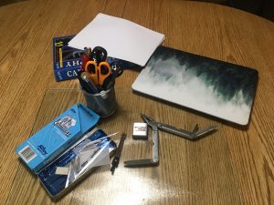 Tools: Gathered in anticipation were a Leather-man (not used), a steak knife (used extensively, a chef’s knife, a tape measure, a geometry set divider, a pen (which proved to be useless), a felt marker (nearly as useless as a pen), and some references (paper based and online) to check fonts.
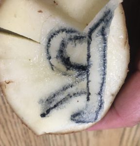 Finally, at 7:02 pm the actual carving process began. Individual letters were in mirror image so they would appear oriented correctly. This I checked several times. I chose to carve in order of the spelling of the word; I am not sure why but suspect I was following the English convention of writing from left to right. The potato was halved and the letter “R” was carved in uppercase after several attempts with each on making a smaller and smaller potato “halve.” This is when the decision to make a simple version of the font occurred. The potatoes were incredibly juicy making it messy as well as difficult to see to see the letters and whether too much had been trimmed off. Next time, I would try a dye on the surface to create more contrast.
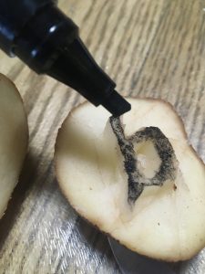
 Throughout the process, the divider was used to measure the height of the letters; I preferred the speed and ease over the tape measure that was initially used. Uniformity of font size would improve the finished look of the word. Again, I am reminded of the medieval people marvelling over Gutenberg’s uniformity of text (Harris) which drove me to attempt to perfect the uniformity of my letters. I chose not to trace them, thinking that would be “cheating” and instead carved freehand which made uniformity of size more challenging.