Mar
9
The latest buzz about Starbucks’ new logo is spreading fast. To celebrate its 40th Anniversary on March 30, Starbucks adopted a minimalist new face : the cropped green siren (without the circle around it and the word “Starbucks Coffee”)
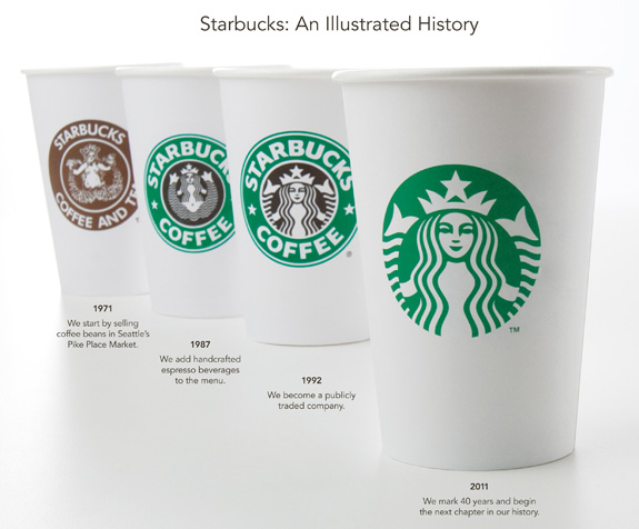
Starbucks dropped the word “coffee” on their logo because they don’t want to be limited to only specializing in coffee. Even though many years of branding efforts had made Starbucks synonymous to “coffee”, the goal of the new logo is to change this perception in consumers’ minds.
Along with the launch of their new logo, Starbucks introduced new product categories. One that I particularly like is their new line of small dessert treats called Starbucks Petites. Based on Canadian Press’ article, Starbucks debuts new logo, products in stores; new products also debut for 40th anniversary, this new line include ‘mini cupcakes and “cake pops,” small sweets on a stick.’ The idea of these desserts being ‘mini’-sized is such a cute temptation that’s hard to resist!
As with any other logo change attempt (i.e. Gap), there will always be a mix of responses.
The Harvards think that the change is a risky move for the company. In the Harvard Business Review article, Starbucks’ New Logo: A Risky Move, they compared Starbucks attempts to diversify to Apple. The main difference between the two is that Apple have stated at the very beginning that they are not just about computers. Their decision to drop the word “computer” is therefore logical. Starbucks, however, gained its popularity solely through coffee. Dropping the word “coffee” therefore, might put consumers’ trust at risk.
My opinions on the new logo? Well, I don’t detest it. But I definitely preferred the old familiar face.
Maybe after so many cups of Starbucks coffee, I have developed an emotional attachment to it.
Comments
1 Comment so far
[…] with only the female image left. I read blog from Ruth Widjaja regarding the new changing of logo.https://blogs.ubc.ca/ruthirmawidjaja/2011/03/09/starbucks-specializing-in-coffee-no-more/. According to the blog, the purpose of this changing is to “introduce new product […]