# ------------------------------------------------------------------ #
# ---------------------- Install Libraries ------------------------- #
# ------------------------------------------------------------------ #
install.packages("GISTools")
install.packages("RJSONIO")
install.packages("rgdal")
install.packages("RCurl")
install.packages("curl")

# Unused Libraries:
# install.packages("ggmap")
# library(ggmap)
# ------------------------------------------------------------------ #
# ----------------------- Load Libararies -------------------------- #
# ------------------------------------------------------------------ #
library(GISTools)
library(RJSONIO)
library(rgdal)
library(RCurl)
library(curl)
Step1: This step is the beginning, and to make sure the R studio has installed and loaded the tools for my project.
# ------------------------------------------------------------------ #
# ---------------------------- Acquire ----------------------------- #
# ------------------------------------------------------------------ #
# access csv data from desktop
fname = ('/User/Borui/Desktop/crime_2004.csv')
# Read data as csv
data = crime_2004.csv(fname, header=T)
# inspect your data
print(head(crime_2004))
Step2: When the R studio is ready, then I import the data about Vancouver crime statistics in 2004 into R, and let it read from the local.
# ------------------------------------------------- #
# -------------- Parse: Geocoder ------------------- #
# ------------------------------------------------- #
# change intersection to 00's
crime_2004$HUNDRED_BLOCK = gsub("X","0",crime_2004$HUNDRED_BLOCK)
print(head(crime_2004$HUNDRED_BLOCK))

# Join the strings from each column together & add "Vancouver, BC":
crime_2004$full_address = paste(crime_2004$HUNDRED_BLOCK,
 paste(crime_2004$NEIGHBOURHOOD,
 "Vancouver, BC",
 sep=", "),
 sep=" ")

# removing "Intersection " from the full_address entries
crime_2004$full_address = gsub("Intersection ", "", crime_2004$full_address)
print(head(crime_2004$full_address))
Step3: Then I notice some number ‘0’ show the symbol ‘X’ in the data. I change intersection to 00’s, and let ‘X’ to become ‘0’ under the HUNDRED_BLOCK column. Next, I created a new column called ‘full address’ to combine the HUNDRED_BLOCK with NEIGHBOURHOOD. Also I remove the intersection in order to make my data clearer and easier.
# BC geocoading
bc_geocode = function(search){
 if(!is.character(search)){stop("'search' must be a character string")}
 search = RCurl::curlEscape(search)
 base_url = "http://apps.gov.bc.ca/pub/geocoder/addresses.json?addressString="
 url_tail = "&locationDescriptor=any&maxResults=1&interpolation=adaptive&echo=true&setBack=0&outputSRS=4326&minScore=1&provinceCode=BC"
 final_url = paste0(base_url, search, url_tail)
 response = RCurl::getURL(final_url)
 response_parsed = RJSONIO::fromJSON(response)
 if(length(response_parsed$features[[1]]$geometry[[3]]) > 0){
 geocoords = list(lon = response_parsed$features[[1]]$geometry[[3]][1],
 lat = response_parsed$features[[1]]$geometry[[3]][2])
 }else{
 geocoords = NA
 }
 return(geocoords)
}

# Create an empty vector for latitude and longtitude coordinates
lat = c()
lon = c()
# loop through the addresses
for(i in 1:length(crime_2004$full_address)){
 # store the address at index "i" as a character
 address = crime_2004$full_address[i]
 # append the latitude of the geocoded address to the lat vector
 lat = c(lat, bc_geocode(address)$lat)
 # append the longitude of the geocoded address to the lon vector
 lon = c(lon, bc_geocode(address)$lon)
 # at each iteration through the loop, print the coordinates
 print(paste("#", i, ", ", lat[i], lon[i], sep = ","))
}

# add the lat lon coordinates to the dataframe
crime_2004$lat = lat
crime_2004$lon = lon
# export csv file
ofile = "/Users/Borui/Desktop/crime.csv"
write.csv(crime_2004, ofile)
Step4: This step is a huge and time-consuming task. I firstly define the bc geocoding function in order to run the bc geocoding API to get the latitude and longitude coordinates for each full address. This task costs me 4 hours. After a major computational task, my data now has specific latitude and longitude coordinates related to the crime scene. Then I output this data and named crime_csv to keep a copy.
# ------------------------------------------------- #
# --------------------- Mine ---------------------- #
# ------------------------------------------------- #
# --- Examine the unique cases --- #
unique(crime_2004$TYPE)
for (i in 1:length(unique(crime_2004$TYPE))){
 print(unique(crime_2004$TYPE)[i], max.levels=0)
}

#Divide classes to group type
#-----------------Mischief--------------#
Mischief = c('Mischief')
#-----------------Theft---------------#
Theft = c('Theft from Vehicle',
 'Theft of Vehicle',
 'Other Theft')
#----------------Break and Enter----------#
Break_and_Enter = c('Break and Enter Commercial',
 'Break and Enter Residential/Other')
#----------------Offence Against a Person------------#
Offence_Against_a_Person = c('Offence Against a Person')
#---------------Homicide--------------#
Homicide = c('Homicide')

# give class id numbers:
crime_2004$cid = 9999
for(i in 1:length(crime_2004$TYPE)){
 if(crime_2004$TYPE[i] %in% Mischief){
 crime_2004$cid[i] = 1
 }else if(crime_2004$TYPE[i] %in% Theft){
 crime_2004$cid[i] = 2
 }else if(crime_2004$TYPE[i] %in% Break_and_Enter){
 crime_2004$cid[i] = 3
 }else if(crime_2004$TYPE[i] %in% Offence_Against_a_Person){
 crime_2004$cid[i] = 4
 }else if(crime_2004$TYPE[i] %in% Homicide){
 crime_2004$cid[i] = 5
 }else{
 crime_2004$cid[i] = 0
 }
}
Step5: To find every crime types, I type a unique code. Then I integrate my data and divide to 5 different types crime. They are the mischief, the theft, the break and enter crime, offence against a person and the homicide. After the integration, I give the class ID number for each type crime.
# --- handle overlapping points --- #
# Set offset for points in same location:
crime_2004$lat_offset = crime_2004$lat
crime_2004$lon_offset = crime_2004$lon

# Run loop - if value overlaps, offset it by a random number
for(i in 1:length(crime_2004$lat)){
 if ( (crime_2004$lat_offset[i] %in% crime_2004$lat_offset) && (crime_2004$lon_offset[i] %in% crime_2004$lon_offset)){
 crime_2004$lat_offset[i] = crime_2004$lat_offset[i] + runif(1, 0.0001, 0.0005)
 crime_2004$lon_offset[i] = crime_2004$lon_offset[i] + runif(1, 0.0001, 0.0005)
 }
}
# get a frequency distribution of the calls:
top_calls = data.frame(table(crime_2004$TYPE))
top_calls = top_calls[order(top_calls$Freq), ]
print(top_calls)
Step6: To avoid the same coordinates for the crime, I set the offset on the latitude and longitude by adding 0.0001 to 0.0005. Then I get two new columns for the lat_offset and lon_offset.
# ------------------------------------------------------------------ #
# ---------------------------- Filter ------------------------------ #
# ------------------------------------------------------------------ #
data_filter = subset(crime_2004, (lat <= 49.313162) & (lat >= 49.199554) &
 (lon <= -123.019028) & (lon >= -123.271371) & is.na(lon) == FALSE )
# plot the data
plot(data_filter$lon, data_filter$lat)
ofile_filtered = '/Users/Borui/Desktop/crime_filtered.csv'
write.csv(data_filter, ofile_filtered)
Step7: After the offset the latitude and longitude, I need to filter some data outside Vancouver’s boundary. Then I give a limit to the boundary coordinate to only focus on Vancouver. I plot each data to this limited area and export as crime_filtered.csv file.
#-------------Saving Dataset------------#
# --- Convert Data to Shapefile --- #
# store coordinates in dataframe
coords_crime_2004 = data.frame(data_filter$lon_offset, data_filter$lat_offset)
# create spatialPointsDataFrame
data_shp = SpatialPointsDataFrame(coords = coords_crime_2004, data = data_filter)
# set the projection to wgs84
projection_wgs84 = CRS("+proj=longlat +datum=WGS84")
proj4string(data_shp) = projection_wgs84
# set an output folder for our geojson files:
geofolder = "/Users/Borui/Desktop/GEOB_472/"
# Join the folderpath to each file name:
opoints_shp = paste(geofolder, "calls_", "1401", ".shp", sep = "")
print(opoints_shp)# print this out to see where your file will go & what it will be called
opoints_geojson = paste(geofolder, "calls_", "1401", ".geojson", sep = "")
print(opoints_geojson) # print this out to see where your file will go & what it will be called
# write the file to a shp
writeOGR(data_shp, opoints_shp, layer = "data_shp", driver = "ESRI Shapefile",
 check_exists = FALSE)
# write file to geojson
writeOGR(data_shp, opoints_geojson, layer = "data_shp", driver = "GeoJSON",
 check_exists = FALSE)
Step8: On this step, with a filtered dataset, I can write my file out to a shapefile and a geojson. I create latitude and longitute coordinates of the crime in WGS84 projection shape file by using filtered data.
#---------------------Creating Hexagon Grid-------------------#
# --- aggregate to a grid --- #
# ref: http://www.inside-r.org/packages/cran/GISTools/docs/poly.counts
# set the file name - combine the shpfolder with the name of the grid
grid_fn = 'https://raw.githubusercontent.com/joeyklee/aloha-r/master/data/calls_2014/geo/hgrid_250m.geojson'

# read in the hex grid setting the projection to utm10n
hexgrid = readOGR(grid_fn, 'OGRGeoJSON')

# transform the projection to wgs84 to match the point file and store
# it to a new variable (see variable: projection_wgs84)
hexgrid_wgs84 = spTransform(hexgrid, projection_wgs84)

#-----------------Assigning Values to Hexagons-----------------#
# Use the poly.counts() function to count the number of occurrences of calls per grid cell
grid_cnt = poly.counts(data_shp, hexgrid_wgs84)

# define the output names:
ohex_shp = paste(geofolder, "hexgrid_250m_", "1401", "_cnts",
 ".shp", sep = "")
print(ohex_shp)

ohex_geojson = paste(geofolder, "hexgrid_250m_","1401","_cnts",".geojson")
print(ohex_geojson)

# write the file to a shp
writeOGR(check_exists = FALSE, hexgrid_wgs84, ohex_shp,
 layer = "hexgrid_wgs84", driver = "ESRI Shapefile")

# write file to geojson
writeOGR(check_exists = FALSE, hexgrid_wgs84, ohex_geojson,
 layer = "hexgrid_wgs84", driver = "GeoJSON")
Step9: I download a hexgonal grid at a resolution of 250m and reproject it from UTM zone 10 to WGS84. Then using the polu.counts function to count the number of points in each grid cell. Also output them to shapefile and geojson.
#---------------------Version1---------------------------#
#--------------------------------------------------------#
# add the leaflet library to your script
library(leaflet)
filename = "C:/Users/Administrator/Desktop/crime_filtered.csv"
data_filter = read.csv(curl('https://raw.githubusercontent.com/joeyklee/aloha-r/master/data/calls_2014/201401CaseLocationsDetails-geo-filtered.csv'), header=TRUE)
# subset out your data_filter:
df_Mischief = subset(data_filter, cid == 1)
df_Theft = subset(data_filter, cid == 2)
df_Break_and_Enter = subset(data_filter, cid == 3)
df_Offence_Against_a_Person = subset(data_filter, cid == 4)
df_Homicide = subset(data_filter, cid == 5)

# initiate leaflet
m = leaflet()
# add openstreetmap tiles (default)
m = addTiles(m)
# you can now see that our maptiles are rendered
m

colorFactors = colorFactor(c('red', 'orange', 'purple', 'blue', 'pink', 'brown'),
 domain = data_filter$cid)
m = addCircleMarkers(m,
 lng = df_Mischief$lon_offset, # we feed the longitude coordinates
 lat = df_Mischief$lat_offset,
 popup = df_Mischief$Case_Type,
 radius = 2,
 stroke = FALSE,
 fillOpacity = 0.75,
 color = colorFactors(df_Mischief$cid),
 group = "1 - Mischief")
m = addCircleMarkers(m,
 lng = df_Theft$lon_offset, lat=df_Theft$lat_offset,
 popup = df_Theft$Case_Type,
 radius = 2,
 stroke = FALSE, fillOpacity = 0.75,
 color = colorFactors(df_Theft$cid),
 group = "2 - Theft")
m = addCircleMarkers(m,
 lng = df_Break_and_Enter$lon_offset, lat=df_Break_and_Enter$lat_offset,
 popup = df_Break_and_Enter$Case_Type,
 radius = 2,
 stroke = FALSE, fillOpacity = 0.75,
 color = colorFactors(df_Break_and_Enter$cid),
 group = "3 - Break_and_Enter")
m = addCircleMarkers(m,
 lng = df_Offence_Against_a_Person$lon_offset, lat=df_Offence_Against_a_Person$lat_offset,
 popup = df_Offence_Against_a_Person$Case_Type,
 radius = 2,
 stroke = FALSE, fillOpacity = 0.75,
 color = colorFactors(df_Offence_Against_a_Person$cid),
 group = "4 - Offence_Against_a_Person")
m = addCircleMarkers(m,
 lng = df_Homicide$lon_offset, lat=df_Homicide$lat_offset,
 popup = df_Homicide$Case_Type,
 radius = 2,
 stroke = FALSE, fillOpacity = 0.75,
 color = colorFactors(df_Homicide$cid),
 group = "5 - Homicide")

m = addTiles(m, group = "OSM (default)")
m = addProviderTiles(m,"Stamen.Toner", group = "Toner")
m = addProviderTiles(m, "Stamen.TonerLite", group = "Toner Lite")

m = addLayersControl(m,
 baseGroups = c("Toner Lite","Toner"),
 overlayGroups = c("1 - Mischief", "2 - Theft",
 "3 - Break_and_Enter","4 - Offence_Against_a_Person", "5 - Homicide")
)
# make the map
m
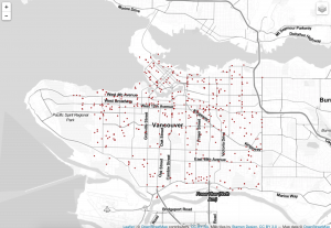
Step10: This is the version1 code. It is working with point data. Firstly, I use the subset function to get store my data into 5 different classes. Then I initiate the leaflet map and insure different colors for the different classes. Next I type addCircleMarker function to add points on the map.Finally, I use addProviderTiles function to change the map’s background and use addLayerControl function to create a control bar to choose the different layers.

#-------------------------Version2----------------------------#
#-------------------------------------------------------------#
# add the leaflet library to your script
library(leaflet)
filename = "C:/Users/Administrator/Desktop/crime_filtered.csv"
data_filter = read.csv(curl('https://raw.githubusercontent.com/joeyklee/aloha-r/master/data/calls_2014/201401CaseLocationsDetails-geo-filtered.csv'), header=TRUE)
# subset out my crime_filtered:
df_Mischief = subset(data_filter, cid == 1)
df_Theft = subset(data_filter, cid == 2)
df_Break_and_Enter = subset(data_filter, cid == 3)
df_Offence_Against_a_Person = subset(data_filter, cid == 4)
df_Homicide = subset(data_filter, cid == 5)

data_filterlist = list(df_Mischief = subset(data_filter, cid == 1),
 df_Theft = subset(data_filter, cid == 2),
 df_Break_and_Enter = subset(data_filter, cid == 3),
 df_Offence_Against_a_Person = subset(data_filter, cid == 4),
 df_Homicide = subset(data_filter, cid == 5))

# Remember we also had these groups associated with each variable? Let's put them in a list too:
layerlist = c("1 - Mischief", "2 - Theft",
 "3 - Break_and_Enter","4 - Offence_Against_a_Person", "5 - Homicide",
 "0 - other")

# We can keep that same color variable:
colorFactors = colorFactor(c('red', 'orange', 'purple', 'blue', 'pink', 'brown'), domain=data_filter$cid)

# Now we have our loop - each time through the loop, it is adding our markers to the map object:
for (i in 1:length(data_filterlist)){
 m = addCircleMarkers(m,
 lng=data_filterlist[[i]]$lon_offset,
 lat=data_filterlist[[i]]$lat_offset,
 popup=data_filterlist[[i]]$Case_Type,
 radius=2,
 stroke = FALSE,
 fillOpacity = 0.75,
 color = colorFactors(data_filterlist[[i]]$cid),
 group = layerlist[i]
 )
}
m = addTiles(m, "Stamen.TonerLite", group = "Toner Lite")
m = addLayersControl(m,
 overlayGroups = c("Toner Lite"),
 baseGroups = layerlist
)
m
Step11: This is the version2 code. It is optimizing version. The same process like the version1, I also use subset function to divide my data. Then I create a list to include these variables. Other fundamental color and map code keep the same like the version1.
#----------------------Version3-1--------------------------#
#----------------------------------------------------------#
library(rgdal)
library(GISTools)
# define the filepath
hex_1401_fn = 'https://raw.githubusercontent.com/joeyklee/aloha-r/master/data/calls_2014/geo/hgrid_250m_1401_counts.geojson'
# read in the geojson
hex_1401 = readOGR(hex_1401_fn, "OGRGeoJSON")

m = leaflet()
m = addProviderTiles(m, "Stamen.TonerLite", group = "Toner Lite")
# Create a continuous palette function
pal = colorNumeric(
 palette = "Greens",
 domain = hex_1401$data
)

# add the polygons to the map
m = addPolygons(m,
 data = hex_1401,
 stroke = FALSE,
 smoothFactor = 0.2,
 fillOpacity = 1,
 color = ~pal(hex_1401$data),
 popup = paste("Number of calls: ", hex_1401$data, sep="")
)
m = addLegend(m, "bottomright", pal = pal, values = hex_1401$data,
 title = "Vancouver Crime Distribution in 2004",
 labFormat = labelFormat(prefix = " "),
 opacity = 0.75
)
m
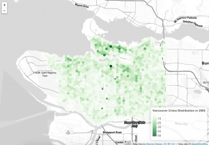
Step12: This is the version3-1 code. It is working with polygons. To do this map, I need to read my hegrid with my data. Then I use colorNumeric function to choose green to show on the map. Finally, I add my polygon on the map.
#---------------------------Version3-2----------------------------#
#-----------------------------------------------------------------#
library(rgdal)
library(GISTools)
library(leaflet)
filename = "C:/Users/Administrator/Desktop/crime_filtered.csv"
data_filter = read.csv(curl('https://raw.githubusercontent.com/joeyklee/aloha-r/master/data/calls_2014/201401CaseLocationsDetails-geo-filtered.csv'), header=TRUE)
# initiate leaflet map layer
m = leaflet()
m = addProviderTiles(m, "Stamen.TonerLite", group = "Toner Lite")

# --- hex grid --- #
# store the file name of the geojson hex grid
hex_1401_fn = 'https://raw.githubusercontent.com/joeyklee/aloha-r/master/data/calls_2014/geo/hgrid_250m_1401_counts.geojson'

# read in the data
hex_1401 = readOGR(hex_1401_fn, "OGRGeoJSON")

# Create a continuous palette function
pal = colorNumeric(
 palette = "Greens",
 domain = hex_1401$data
)

# add hex grid
m = addPolygons(m,
 data = hex_1401,
 stroke = FALSE,
 smoothFactor = 0.2,
 fillOpacity = 1,
 color = ~pal(hex_1401$data),
 popup= paste("Number of calls: ",hex_1401$data, sep=""),
 group = "hex"
)

# add legend
m = addLegend(m, "bottomright", pal = pal, values = hex_1401$data,
 title = "Vancouver Crime Distribution in 2004",
 labFormat = labelFormat(prefix = " "),
 opacity = 0.75
)

# --- points data --- #
# subset out my crime_filtered:
df_Mischief = subset(data_filter, cid == 1)
df_Theft = subset(data_filter, cid == 2)
df_Break_and_Enter = subset(data_filter, cid == 3)
df_Offence_Against_a_Person = subset(data_filter, cid == 4)
df_Homicide = subset(data_filter, cid == 5)

data_filterlist = list(df_Mischief = subset(data_filter, cid == 1),
 df_Theft = subset(data_filter, cid == 2),
 df_Break_and_Enter = subset(data_filter, cid == 3),
 df_Offence_Against_a_Person = subset(data_filter, cid == 4),
 df_Homicide = subset(data_filter, cid == 5))


layerlist = c("1 - Mischief", "2 - Theft",
 "3 - Break_and_Enter","4 - Offence_Against_a_Person", "5 - Homicide",
 "0 - other")


colorFactors = colorFactor(c('red', 'orange', 'purple', 'blue', 'pink', 'brown'), domain=data_filter$cid)
for (i in 1:length(data_filterlist)){
 m = addCircleMarkers(m,
 lng=data_filterlist[[i]]$lon_offset, lat=data_filterlist[[i]]$lat_offset,
 popup=data_filterlist[[i]]$Case_Type,
 radius=2,
 stroke = FALSE, fillOpacity = 0.75,
 color = colorFactors(data_filterlist[[i]]$cid),
 group = layerlist[i]
 )

}

m = addLayersControl(m,
 overlayGroups = c("Toner Lite", "hex"),
 baseGroups = layerlist
)
# show map
m
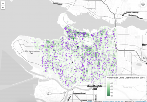
Step13: This is another vesion3-2 code, but it is synthesis. It includes both points and polygons on the map. For the point part, I copy the code from version2, then I also keep the code from version3 in order to combine point and polygon maps.
Comments: At the beginning, I have around 56228 records. After running the data through passing and geocoding and filtering, I have 44918 records left. I think these data are reliable without lost of error. When seeing the final map, it is clear that the map only focus on Vancouver with different types of crime. A shpfile is a vector data storage format for storing the location, shape and attributes of geographic features. Csv means common separated values, and it is a plain text format. It holds plain text as a series of values. Excel or xls file holds information about all the worksheets in a workbook, comprising both content and formatting. Geojson is a standard for representing the core geographic features that we are interested in. It does not contain everything that a shapfile can contain and it does not contain any styling information. In this project, I use csv file (crime_2004.csv) for the data source, and use shpfile (calls_1401.shp) and geojson (hexgrid_250m.geojson) to store the location in order to show the the distribution on the final map.
---------------Full Script---------------
#####################################################################
# Vancouver Crime Distribution in 2004: Data Processing Script
# Date:2016.10.31
# By: Rui Zhang (Jerry)
#####################################################################
# ------------------------------------------------------------------ #
# ---------------------- Install Libraries ------------------------- #
# ------------------------------------------------------------------ #
install.packages("GISTools")
install.packages("RJSONIO")
install.packages("rgdal")
install.packages("RCurl")
install.packages("curl")

# Unused Libraries:
# install.packages("ggmap")
# library(ggmap)
# ------------------------------------------------------------------ #
# ----------------------- Load Libararies -------------------------- #
# ------------------------------------------------------------------ #
library(GISTools)
library(RJSONIO)
library(rgdal)
library(RCurl)
library(curl)

# ------------------------------------------------------------------ #
# ---------------------------- Acquire ----------------------------- #
# ------------------------------------------------------------------ #
# access csv data from desktop
fname = ('/User/Borui/Desktop/crime_2004.csv')
# Read data as csv
data = crime_2004.csv(fname, header=T)
# inspect your data
print(head(crime_2004))

# ------------------------------------------------- #
# -------------- Parse: Geocoder ------------------- #
# ------------------------------------------------- #
# change intersection to 00's
crime_2004$HUNDRED_BLOCK = gsub("X","0",crime_2004$HUNDRED_BLOCK)
print(head(crime_2004$HUNDRED_BLOCK))

# Join the strings from each column together & add "Vancouver, BC":
crime_2004$full_address = paste(crime_2004$HUNDRED_BLOCK,
 paste(crime_2004$NEIGHBOURHOOD,
 "Vancouver, BC",
 sep=", "),
 sep=" ")

# removing "Intersection " from the full_address entries
crime_2004$full_address = gsub("Intersection ", "", crime_2004$full_address)
print(head(crime_2004$full_address))

# BC geocoading
bc_geocode = function(search){
 if(!is.character(search)){stop("'search' must be a character string")}
 search = RCurl::curlEscape(search)
 base_url = "http://apps.gov.bc.ca/pub/geocoder/addresses.json?addressString="
 url_tail = "&locationDescriptor=any&maxResults=1&interpolation=adaptive&echo=true&setBack=0&outputSRS=4326&minScore=1&provinceCode=BC"
 final_url = paste0(base_url, search, url_tail)
 response = RCurl::getURL(final_url)
 response_parsed = RJSONIO::fromJSON(response)
 if(length(response_parsed$features[[1]]$geometry[[3]]) > 0){
 geocoords = list(lon = response_parsed$features[[1]]$geometry[[3]][1],
 lat = response_parsed$features[[1]]$geometry[[3]][2])
 }else{
 geocoords = NA
 }
 return(geocoords)
}

# Create an empty vector for latitude and longtitude coordinates
lat = c()
lon = c()
# loop through the addresses
for(i in 1:length(crime_2004$full_address)){
 # store the address at index "i" as a character
 address = crime_2004$full_address[i]
 # append the latitude of the geocoded address to the lat vector
 lat = c(lat, bc_geocode(address)$lat)
 # append the longitude of the geocoded address to the lon vector
 lon = c(lon, bc_geocode(address)$lon)
 # at each iteration through the loop, print the coordinates
 print(paste("#", i, ", ", lat[i], lon[i], sep = ","))
}


# add the lat lon coordinates to the dataframe
crime_2004$lat = lat
crime_2004$lon = lon
# export csv file
ofile = "/Users/Borui/Desktop/crime.csv"
write.csv(crime_2004, ofile)

# ------------------------------------------------- #
# --------------------- Mine ---------------------- #
# ------------------------------------------------- #
# --- Examine the unique cases --- #
unique(crime_2004$TYPE)
for (i in 1:length(unique(crime_2004$TYPE))){
 print(unique(crime_2004$TYPE)[i], max.levels=0)
}

#Divide classes to group type
#-----------------Mischief--------------#
Mischief = c('Mischief')
#-----------------Theft---------------#
Theft = c('Theft from Vehicle',
 'Theft of Vehicle',
 'Other Theft')
#----------------Break and Enter----------#
Break_and_Enter = c('Break and Enter Commercial',
 'Break and Enter Residential/Other')
#----------------Offence Against a Person------------#
Offence_Against_a_Person = c('Offence Against a Person')
#---------------Homicide--------------#
Homicide = c('Homicide')

# give class id numbers:
crime_2004$cid = 9999
for(i in 1:length(crime_2004$TYPE)){
 if(crime_2004$TYPE[i] %in% Mischief){
 crime_2004$cid[i] = 1
 }else if(crime_2004$TYPE[i] %in% Theft){
 crime_2004$cid[i] = 2
 }else if(crime_2004$TYPE[i] %in% Break_and_Enter){
 crime_2004$cid[i] = 3
 }else if(crime_2004$TYPE[i] %in% Offence_Against_a_Person){
 crime_2004$cid[i] = 4
 }else if(crime_2004$TYPE[i] %in% Homicide){
 crime_2004$cid[i] = 5
 }else{
 crime_2004$cid[i] = 0
 }
}

# --- handle overlapping points --- #
# Set offset for points in same location:
crime_2004$lat_offset = crime_2004$lat
crime_2004$lon_offset = crime_2004$lon

# Run loop - if value overlaps, offset it by a random number
for(i in 1:length(crime_2004$lat)){
 if ( (crime_2004$lat_offset[i] %in% crime_2004$lat_offset) && (crime_2004$lon_offset[i] %in% crime_2004$lon_offset)){
 crime_2004$lat_offset[i] = crime_2004$lat_offset[i] + runif(1, 0.0001, 0.0005)
 crime_2004$lon_offset[i] = crime_2004$lon_offset[i] + runif(1, 0.0001, 0.0005)
 }
}
# get a frequency distribution of the calls:
top_calls = data.frame(table(crime_2004$TYPE))
top_calls = top_calls[order(top_calls$Freq), ]
print(top_calls)

# ------------------------------------------------------------------ #
# ---------------------------- Filter ------------------------------ #
# ------------------------------------------------------------------ #
data_filter = subset(crime_2004, (lat <= 49.313162) & (lat >= 49.199554) &
 (lon <= -123.019028) & (lon >= -123.271371) & is.na(lon) == FALSE )
# plot the data
plot(data_filter$lon, data_filter$lat)
ofile_filtered = '/Users/Borui/Desktop/crime_filtered.csv'
write.csv(data_filter, ofile_filtered)

#-------------Saving Dataset------------#
# --- Convert Data to Shapefile --- #
# store coordinates in dataframe
coords_crime_2004 = data.frame(data_filter$lon_offset, data_filter$lat_offset)

# create spatialPointsDataFrame
data_shp = SpatialPointsDataFrame(coords = coords_crime_2004, data = data_filter)

# set the projection to wgs84
projection_wgs84 = CRS("+proj=longlat +datum=WGS84")
proj4string(data_shp) = projection_wgs84

# set an output folder for our geojson files:
geofolder = "/Users/Borui/Desktop/GEOB_472/"

# Join the folderpath to each file name:
opoints_shp = paste(geofolder, "calls_", "1401", ".shp", sep = "")
print(opoints_shp)# print this out to see where your file will go & what it will be called

opoints_geojson = paste(geofolder, "calls_", "1401", ".geojson", sep = "")
print(opoints_geojson) # print this out to see where your file will go & what it will be called

# write the file to a shp
writeOGR(data_shp, opoints_shp, layer = "data_shp", driver = "ESRI Shapefile",
 check_exists = FALSE)

# write file to geojson
writeOGR(data_shp, opoints_geojson, layer = "data_shp", driver = "GeoJSON",
 check_exists = FALSE)

#---------------------Creating Hexagon Grid-------------------#
# --- aggregate to a grid --- #
# ref: http://www.inside-r.org/packages/cran/GISTools/docs/poly.counts
# set the file name - combine the shpfolder with the name of the grid
grid_fn = 'https://raw.githubusercontent.com/joeyklee/aloha-r/master/data/calls_2014/geo/hgrid_250m.geojson'

# read in the hex grid setting the projection to utm10n
hexgrid = readOGR(grid_fn, 'OGRGeoJSON')

# transform the projection to wgs84 to match the point file and store
# it to a new variable (see variable: projection_wgs84)
hexgrid_wgs84 = spTransform(hexgrid, projection_wgs84)

#-----------------Assigning Values to Hexagons-----------------#
# Use the poly.counts() function to count the number of occurrences of calls per grid cell
grid_cnt = poly.counts(data_shp, hexgrid_wgs84)

# define the output names:
ohex_shp = paste(geofolder, "hexgrid_250m_", "1401", "_cnts",
 ".shp", sep = "")
print(ohex_shp)

ohex_geojson = paste(geofolder, "hexgrid_250m_","1401","_cnts",".geojson")
print(ohex_geojson)

# write the file to a shp
writeOGR(check_exists = FALSE, hexgrid_wgs84, ohex_shp,
 layer = "hexgrid_wgs84", driver = "ESRI Shapefile")

# write file to geojson
writeOGR(check_exists = FALSE, hexgrid_wgs84, ohex_geojson,
 layer = "hexgrid_wgs84", driver = "GeoJSON")

#---------------------Version1---------------------------#
#--------------------------------------------------------#
# add the leaflet library to your script
library(leaflet)
filename = "C:/Users/Administrator/Desktop/crime_filtered.csv"
data_filter = read.csv(curl('https://raw.githubusercontent.com/joeyklee/aloha-r/master/data/calls_2014/201401CaseLocationsDetails-geo-filtered.csv'), header=TRUE)
# subset out your data_filter:
df_Mischief = subset(data_filter, cid == 1)
df_Theft = subset(data_filter, cid == 2)
df_Break_and_Enter = subset(data_filter, cid == 3)
df_Offence_Against_a_Person = subset(data_filter, cid == 4)
df_Homicide = subset(data_filter, cid == 5)

# initiate leaflet
m = leaflet()
# add openstreetmap tiles (default)
m = addTiles(m)
# you can now see that our maptiles are rendered
m

colorFactors = colorFactor(c('red', 'orange', 'purple', 'blue', 'pink', 'brown'),
 domain = data_filter$cid)
m = addCircleMarkers(m,
 lng = df_Mischief$lon_offset, # we feed the longitude coordinates
 lat = df_Mischief$lat_offset,
 popup = df_Mischief$Case_Type,
 radius = 2,
 stroke = FALSE,
 fillOpacity = 0.75,
 color = colorFactors(df_Mischief$cid),
 group = "1 - Mischief")
m = addCircleMarkers(m,
 lng = df_Theft$lon_offset, lat=df_Theft$lat_offset,
 popup = df_Theft$Case_Type,
 radius = 2,
 stroke = FALSE, fillOpacity = 0.75,
 color = colorFactors(df_Theft$cid),
 group = "2 - Theft")
m = addCircleMarkers(m,
 lng = df_Break_and_Enter$lon_offset, lat=df_Break_and_Enter$lat_offset,
 popup = df_Break_and_Enter$Case_Type,
 radius = 2,
 stroke = FALSE, fillOpacity = 0.75,
 color = colorFactors(df_Break_and_Enter$cid),
 group = "3 - Break_and_Enter")
m = addCircleMarkers(m,
 lng = df_Offence_Against_a_Person$lon_offset, lat=df_Offence_Against_a_Person$lat_offset,
 popup = df_Offence_Against_a_Person$Case_Type,
 radius = 2,
 stroke = FALSE, fillOpacity = 0.75,
 color = colorFactors(df_Offence_Against_a_Person$cid),
 group = "4 - Offence_Against_a_Person")
m = addCircleMarkers(m,
 lng = df_Homicide$lon_offset, lat=df_Homicide$lat_offset,
 popup = df_Homicide$Case_Type,
 radius = 2,
 stroke = FALSE, fillOpacity = 0.75,
 color = colorFactors(df_Homicide$cid),
 group = "5 - Homicide")

m = addTiles(m, group = "OSM (default)")
m = addProviderTiles(m,"Stamen.Toner", group = "Toner")
m = addProviderTiles(m, "Stamen.TonerLite", group = "Toner Lite")

m = addLayersControl(m,
 baseGroups = c("Toner Lite","Toner"),
 overlayGroups = c("1 - Mischief", "2 - Theft",
 "3 - Break_and_Enter","4 - Offence_Against_a_Person", "5 - Homicide")
)

# make the map
m

#-------------------------Version2----------------------------#
#-------------------------------------------------------------#
# add the leaflet library to your script
library(leaflet)
filename = "C:/Users/Administrator/Desktop/crime_filtered.csv"
data_filter = read.csv(curl('https://raw.githubusercontent.com/joeyklee/aloha-r/master/data/calls_2014/201401CaseLocationsDetails-geo-filtered.csv'), header=TRUE)
# subset out my crime_filtered:
df_Mischief = subset(data_filter, cid == 1)
df_Theft = subset(data_filter, cid == 2)
df_Break_and_Enter = subset(data_filter, cid == 3)
df_Offence_Against_a_Person = subset(data_filter, cid == 4)
df_Homicide = subset(data_filter, cid == 5)

data_filterlist = list(df_Mischief = subset(data_filter, cid == 1),
 df_Theft = subset(data_filter, cid == 2),
 df_Break_and_Enter = subset(data_filter, cid == 3),
 df_Offence_Against_a_Person = subset(data_filter, cid == 4),
 df_Homicide = subset(data_filter, cid == 5))

# Remember we also had these groups associated with each variable? Let's put them in a list too:
layerlist = c("1 - Mischief", "2 - Theft",
 "3 - Break_and_Enter","4 - Offence_Against_a_Person", "5 - Homicide",
 "0 - other")

# We can keep that same color variable:
colorFactors = colorFactor(c('red', 'orange', 'purple', 'blue', 'pink', 'brown'), domain=data_filter$cid)

# Now we have our loop - each time through the loop, it is adding our markers to the map object:
for (i in 1:length(data_filterlist)){
 m = addCircleMarkers(m,
 lng=data_filterlist[[i]]$lon_offset,
 lat=data_filterlist[[i]]$lat_offset,
 popup=data_filterlist[[i]]$Case_Type,
 radius=2,
 stroke = FALSE,
 fillOpacity = 0.75,
 color = colorFactors(data_filterlist[[i]]$cid),
 group = layerlist[i]
 )
}
m = addTiles(m, "Stamen.TonerLite", group = "Toner Lite")
m = addLayersControl(m,
 overlayGroups = c("Toner Lite"),
 baseGroups = layerlist
)
m

#----------------------Version3-1--------------------------#
#----------------------------------------------------------#
library(rgdal)
library(GISTools)
# define the filepath
hex_1401_fn = 'https://raw.githubusercontent.com/joeyklee/aloha-r/master/data/calls_2014/geo/hgrid_250m_1401_counts.geojson'
# read in the geojson
hex_1401 = readOGR(hex_1401_fn, "OGRGeoJSON")

m = leaflet()
m = addProviderTiles(m, "Stamen.TonerLite", group = "Toner Lite")
# Create a continuous palette function
pal = colorNumeric(
 palette = "Greens",
 domain = hex_1401$data
)

# add the polygons to the map
m = addPolygons(m,
 data = hex_1401,
 stroke = FALSE,
 smoothFactor = 0.2,
 fillOpacity = 1,
 color = ~pal(hex_1401$data),
 popup = paste("Number of calls: ", hex_1401$data, sep="")
)
m = addLegend(m, "bottomright", pal = pal, values = hex_1401$data,
 title = "Vancouver Crime Distribution in 2004",
 labFormat = labelFormat(prefix = " "),
 opacity = 0.75
)
m

#---------------------------Version3-2----------------------------#
#-----------------------------------------------------------------#
library(rgdal)
library(GISTools)
library(leaflet)
filename = "C:/Users/Administrator/Desktop/crime_filtered.csv"
data_filter = read.csv(curl('https://raw.githubusercontent.com/joeyklee/aloha-r/master/data/calls_2014/201401CaseLocationsDetails-geo-filtered.csv'), header=TRUE)
# initiate leaflet map layer
m = leaflet()
m = addProviderTiles(m, "Stamen.TonerLite", group = "Toner Lite")

# --- hex grid --- #
# store the file name of the geojson hex grid
hex_1401_fn = 'https://raw.githubusercontent.com/joeyklee/aloha-r/master/data/calls_2014/geo/hgrid_250m_1401_counts.geojson'

# read in the data
hex_1401 = readOGR(hex_1401_fn, "OGRGeoJSON")

# Create a continuous palette function
pal = colorNumeric(
 palette = "Greens",
 domain = hex_1401$data
)

# add hex grid
m = addPolygons(m,
 data = hex_1401,
 stroke = FALSE,
 smoothFactor = 0.2,
 fillOpacity = 1,
 color = ~pal(hex_1401$data),
 popup= paste("Number of calls: ",hex_1401$data, sep=""),
 group = "hex"
)

# add legend
m = addLegend(m, "bottomright", pal = pal, values = hex_1401$data,
 title = "Vancouver Crime Distribution in 2004",
 labFormat = labelFormat(prefix = " "),
 opacity = 0.75
)

# --- points data --- #
# subset out my crime_filtered:
df_Mischief = subset(data_filter, cid == 1)
df_Theft = subset(data_filter, cid == 2)
df_Break_and_Enter = subset(data_filter, cid == 3)
df_Offence_Against_a_Person = subset(data_filter, cid == 4)
df_Homicide = subset(data_filter, cid == 5)

data_filterlist = list(df_Mischief = subset(data_filter, cid == 1),
 df_Theft = subset(data_filter, cid == 2),
 df_Break_and_Enter = subset(data_filter, cid == 3),
 df_Offence_Against_a_Person = subset(data_filter, cid == 4),
 df_Homicide = subset(data_filter, cid == 5))

layerlist = c("1 - Mischief", "2 - Theft",
 "3 - Break_and_Enter","4 - Offence_Against_a_Person", "5 - Homicide",
 "0 - other")

colorFactors = colorFactor(c('red', 'orange', 'purple', 'blue', 'pink', 'brown'), domain=data_filter$cid)
for (i in 1:length(data_filterlist)){
 m = addCircleMarkers(m,
 lng=data_filterlist[[i]]$lon_offset, lat=data_filterlist[[i]]$lat_offset,
 popup=data_filterlist[[i]]$Case_Type,
 radius=2,
 stroke = FALSE, fillOpacity = 0.75,
 color = colorFactors(data_filterlist[[i]]$cid),
 group = layerlist[i]
 )
 }
m = addLayersControl(m,
 overlayGroups = c("Toner Lite", "hex"),
 baseGroups = layerlist
)
# show map
m
Visualization:
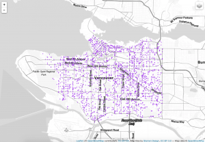
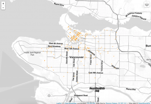
When making this map, I think the cartographic constraint is the final map, which combines the point with the polygon. When seeing this final map, there are so many points with deep colour, and the green polygons are covered by these points. As a result, it is unclear for people to see the frequency distribution on the map through the green polygons.
Insight:
According to the map, I can see downtown has the highest crime frequency no matter which types of crime. In addition, the theft and break and enter crime both are the most common rascality in Vancouver. Downtown has the largest population density and lots of homeless people. It is make sense that these floating population bring more criminal activities. Furthermore, when focusing on downtown, I also notice that the east side has more criminal activities than the west side. Related to the real world, the east side is actually bad than other places, especially in the main street of downtown. Here is filled with lots of drug activities, erotic trades and drunken riots. There is no doubt that these bad activities will bring more criminal activities.
In addition to downtown, the distribution of theft and breaking crime in Vancouver area . When I see these criminal activities, they are more common on the busy street like the boardway and kingsway. Generally, the east side of Vancouver has more criminal activities than the west side of Vancouver. This is maybe caused by the population class. Due to the low rent and house price, there are more low educated and jobless people in the east side. These people maybe steal valuable things to sell. As a result, more theft and breaking crime happen here.
Reflection:
Now, I have experienced ArcGIS, Adobe Illustrator and R studio for the map making. My favourite software is the AI. It is good to design the infographic with a nice picture, but it is hard to deal with the enormous data. To process the huge data, R studio is better to operate. However, when comparing it to other softwares, it requires more base knowledge for programming. Thus, it has a high level difficulty for most people to design. The ArcGIS is good at data processing and map display. However, when comparing its map to the AI, it is not good-looking; when comparing its data processing to the R studio, it is not fast and accurate.