
Ever since more people have started to use social media, companies get a lot and a lot of Data about customers’ behaviors across social media. We called this as a revolution of Big Data. Marketers are required to translate this data to information that are relevant to serve their purposes. One way to do this is by constructing a simple Dashboard, allowing marketers to keep them in track of what information needed to achieve their objectives so that they can have relevant information for their decision making process.
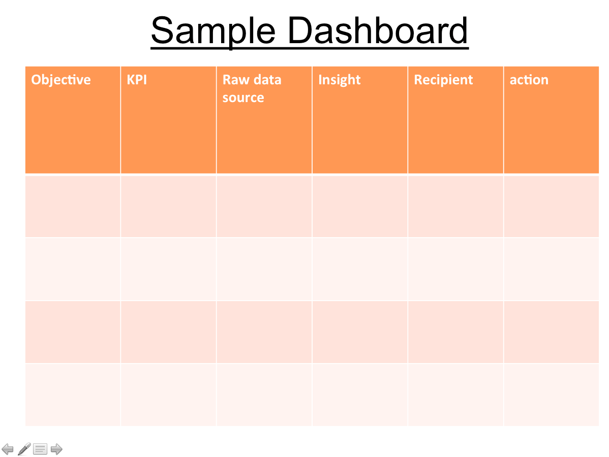
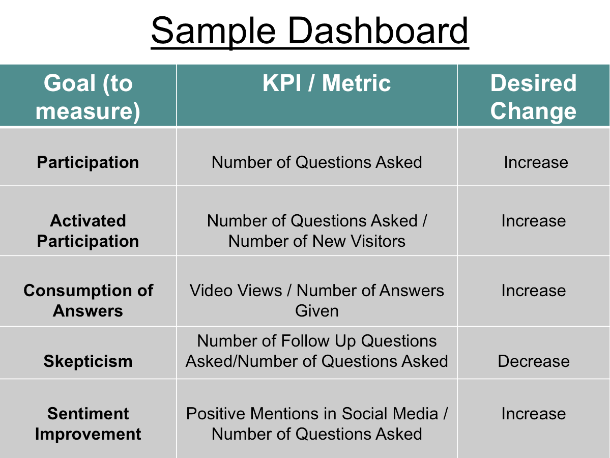
First, marketers need to analyze the current market situation, and define their goals or objectives. Then, they need to define the measurement or key performance indicators (KPIs) by translating those objectives into identifiable metrics, such as, the number of new visitors or the number of page, or video views. After getting all the raw data, marketers need to analyze and organize data into a dashboard. Here are the dashboard template and the sample dashboard we discussed in class.
Finally, marketers are required to present the data and provide recommendations to their client or their CEO who will have the final word in making the decision. However, giving the dashboard itself is not enough for making decisions.
According to Avinash Kaushik, there are four required elements in presenting “the action dashboard”.
- Present the graphic, showing the trend for the metric.
- Pinpoint what are the key trends and insights
- Present your recommendations. Do not let your client or CEO to interpret the data by their selves.
- Mentioned on the impact on the company and customers if the given recommendations will not be implemented, emphasizing the importance of taking the recommendations.
Implementing all these steps allow marketers to focus on their goals and gain relevant information, which will help them to make the right decisions.