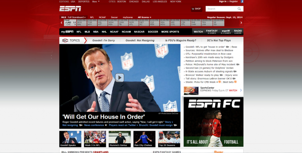
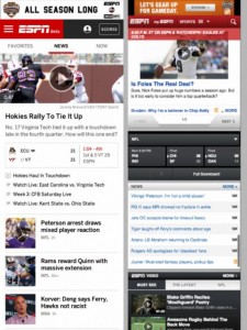
I recently read that ESPN is re-launching their website with the mentality of mobile- use in their design. ESPN provide the perfect example of the importance of web design and modification of web design overtime. The full article from Mashable can be read here:
http://mashable.com/2014/09/15/espn-com-is-launching-a-major-redesign-and-heres-an-early-look/
Below are images of what the website looks like now and what it will look like when it officially launches in 2015. It is clear that ESPN have taken into consideration the amount of visitors are on their website using a mobile or tablet platform.
If we briefly examine the 7cs of design in this sneak peek, we can see what ESPN has considered and executed well in their new design.
- Context: Referring to the layout and design of the website, the new design has a much sleeker look with easy to read texts, easy navigation and less clutter on the homepage. The background is an off white which makes the content and navigation clearer than ever before. Overall the website has become more aesthetically pleasing and intuitive.
- Content: The content appears to be very similar and has a great amount of diverse content on both the desktop and mobile versions including, scores, news and videos as well as the ability to watch and listen live.
- Community: ESPN has always been great at building a relationship with their digital audience with polls, customization and integrated apps. Although these sneak peeks don’t say too much about their community interaction, there is assurance these will remain on the website. I would love to see social media feeds on the desktop version and icon links to their social channels on the mobile version.
- Customization: Users are able to customize their favourite teams and content around those teams will be delivered on the left column of the desktop version and as well as a stream on the mobile version. The article also mentions that
- Communication: With the removal of clutter on the desktop and mobile version, the communication from ESPN to audience will improve significantly. Despite having the
- Connection: Without testing the site, it is difficult to determine if there will be any new links to external websites or applications. The current webpage does have links to applications, advertisements and a shop which will likely remain.
- Commerce: This sneak peek appears to have the shop button removed from the top of the screen so we can only wait to test out if the site will still have the e-commerce store linked to Dick’s Sporting Goods webpage.


Recent Comments