
On first glance at the visualization, I see that two
tracks (boxed in green) appear at the outer edge of the visualization: Track 22 Panpipes (Solomon Islands) and Track 27 String Quartet No. 13 in B flat. Track 22 was only selected by one individual as indicated by one link and Track 27 was selected by two individuals, as indicated by two links. At this time, it is not apparent to me why these tracks were selected so few times.
Switching to the metrics section (using the icon that looks like a calculator at the top right of the screen) the data was presented in a table format, which I found easier to interpret compared to the graph.
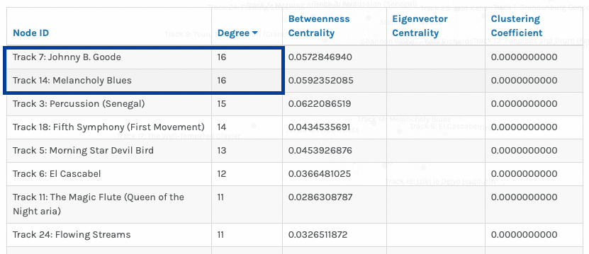
This view allowed me to count the number of nodes representing students (23) and the number of nodes representing pieces of music (27) and by sheer inclusion of each piece of music as a node, this indicates that each piece of music was chosen at least once. Next, by filtering by ‘Degree’, I discovered the two tracks (boxed in blue) that are chosen most frequently and that have the highest degree of connectivity: Track 7 Johnny B. Goode and Track 14 Melancholy Blues. Based on Task 8, I recall that these two pieces are by American artists, indicating to me their popularity in the task perhaps based on recognition – maybe our class recognized these two pieces or based on geographical relevance – given that our school is based in North America, perhaps we are more likely (consciously or not) to ensure that North American musical pieces are represented in the Golden Record.
Next, I analyzed each group’s graph and found myself in Group #4, the smallest group consisting of only two students, myself and Brie.

I see that we have 5 tracks in common, which seems high considering we are a group of 2. From the visualization itself, I do not understand the rationale behind our choices. I based my choices based on geographical diversity and perhaps Brie may have taken a similar approach given the overlap of 5 tracks, but this inference is made using pre-existing knowledge of my curation process and is just a guess. There is no other demographic data for the nodes (e.g. location of students or location where pieces originated, ethnicity, age, etc.) that may help to provide insight on the reasons behind the choices.
After looking at Group #4 (the group where I was placed), I wondered how many links other groups had for each track.
Group 1 consists of 5 students, but there was not a single track chosen by all 5 students; the highest degree of connection was 4 links.
Group 2 consists of 5 students and had a single (1) track chosen by all 5 students: Track 6: El Cascabel. Do each of these 5 students have a preference towards or relationship with Mexican music? Their rationales for all choosing this track is not apparent based on the visualization.
Group 4 consists of 4 students and had 4 tracks chosen by all 4 students! The group seems very connected. I wonder if there are any other demographic, geographic, or psychographic similarities between Sebastian, Julia, April, and Lucy that may help explain the high degree of connectivity.
Group 0 consists of 4 students and had 2 tracks chosen by all 4 students and Group 5 consists of 3 students and had 4 tracks chosen by all 3 students.
This means that my group (Group #4) had the highest number of tracks in common, but we are also the smallest group, being the only group of 2 students.
Our class collectively curated the following 10 pieces of music, selected based on the highest degrees of connectivity:
- Track 7: Johnny B. Goode
- Track 14: Melancholy Blues
- Track 3: Percussion (Senegal)
- Track 18: Fifth Symphony (First Movement)
- Track 5: Morning Star Devil Bird
- Track 6: El Cascabel 12
- Track 11: The Magic Flute (Queen of the Night aria)
- Track 24: Flowing Streams
- Track 25: Jaat Kahan Ho
- Track 9: Tsuru No Sugomori (Crane’s Nest)
The most connected tracks, as indicated by the number of links, could indicate tracks that are most popular, but may also indicate the tracks most original regardless of whether one actually enjoys the track. I don’t think we can know the reasons or rationale behind a track’s ‘popularity’, only that the class, for some and likely varying reasons, thought it would well-represent music of the world.
Hi Shannon,
Thanks for your analysis! It’s good to know that I wasn’t the only one feeling a bit lost with all the data and trying to make sense of something if not everything.
I also noticed that how the most selected tracks really brought people together into tight clusters, especially with the top six tracks, and the less popular tracks had such sparse connections. It really shows how some tracks, probably because of their familiarity or cultural significance, seem to resonate more broadly, while others reflect more personal, niche tastes, in my opinion.
I agree that it’s difficult to make any assumptions due to the lack of demographic data in the nodes. I wondered too if our backgrounds—like being from English-speaking countries or just being more familiar with Western culture—played a big role in why tracks like “Johnny B. Goode” and “Melancholy Blues” were so popular. But as you mentioned, without that specific data, it’s tough to nail down exactly why certain tracks stood out more than others. It definitely adds another layer of complexity to understanding the choices we made.
Hi Shannon,
I also had similar observations from this task. I looked at my group (#2) in more details than the others groups. Specifically at my own connections within my group. I had 4 – 5 songs in common with everyone in my group, this caused me to look a bit deeper, and although she wasn’t in my group, I had more songs in common with Joti (with 6). Why wasn’t she in my group?
I reflected on the political ramifications of creating groupings without having inadequate data. Specifically, that the data may inaccurately represent the diversity of thought and experience within a community; leading to an oversimplified view of the community, ignoring the varied perspectives that exist. Also, if policymakers or decision-makers rely on such data, they may implement policies or make decisions that do not address the actual needs or preferences of the individuals within the community.
Hi Carol,
Yes good question – perhaps Joti had 6 songs in common with YOU, but a very low number of songs in common with the rest of the Group #2 members? Which is why Joti was placed in a different group? That is my guess.
Great points about the political ramifications; I like the connection you make to having an oversimplified view and how preferences or needs may be lost because of this.
We had similar takeaways, Shannon! When posed with the question: Why are responses similar? asked in the assignment, I would agree that it requires a significant amount of speculation. Additional demographic data, as you mentioned, would have allowed us to potentially visualize more correlations between students and the tracks they chose; however, this would not necessarily indicate causation.
This assignment left me pondering algorithms and what data or nodes are linked to me via edges. Are demographics, keywords or other attributes assigned to me to determine the information presented to me? If I were to look analyze it, how accurately would it represent me?
Great choice of word – causation and how even with more data, we would not be able to make such strong conclusions. This brings me back to ETEC 500 in which we learned about experiments vs. quasi-experiments and what must be done to be able to conclude a correlation or causation. There are too many confounding factors here and too many ways students could have gone about their choices!