Info-graphic on the Syrian Refugee Crisis
Question 1:
The UNHCR interactive map on world wide refugee statistics is an effective visualisation of the topic in many perspectives.
Firstly, the layout and choice of colour is neat and calming, which encourages the audience to focus on the map for longer time periods. As a proportional symbol map, although there are overlapping between country data, there is the option to zoom in and out of certain regions. This made it easy to navigate and perceive without compromising the effectiveness of a proportional symbol map. The filter option under the main map also helps the audience to filter data they want to see, which can make the map even clearer based on the different population groups. Audiences can also choose which country to highlight by clicking onto it, and it also displays more details of that nation.
However, despite that the map is able to contain so much information on one webpage neatly, it can still be a little overwhelming. The legend and description of the map are at the very bottom, which people may not recognise unless they scroll down, hence takes them longer to decipher the map. The excessive amount of clicking for the interactive component may also discourage general audience to further explore the different data embedded. This map is probably easier to digest for people aiming to look at specific concepts of the topic, or people with basic academic knowledge on the refugee crisis. It definitely requires lots of patience and time to explore all the data and details presented by the map.
Question 2 & 3:
I have put both my raw data and modified data into one excel document, so it is easy for me to navigate and utilize while making the info-graphic. There are many tabs at the bottom that you may switch between different spreadsheet. I also added the raw data into a organized table on excel so they can be easily filtered by country, year or application status etc.
You may download the excel document here, or view it on google drive here.
I would recommend downloading the actual document since google drive may adjust the format and content when uploaded.
Question 4:
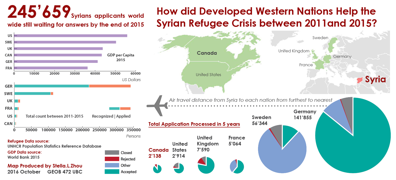
This is the info-graphic I made according to the assignment. Please click on it for the original size, which is made in the dimension of 11” x 5 ” for publication purposes.