Environmental Impact Assessment

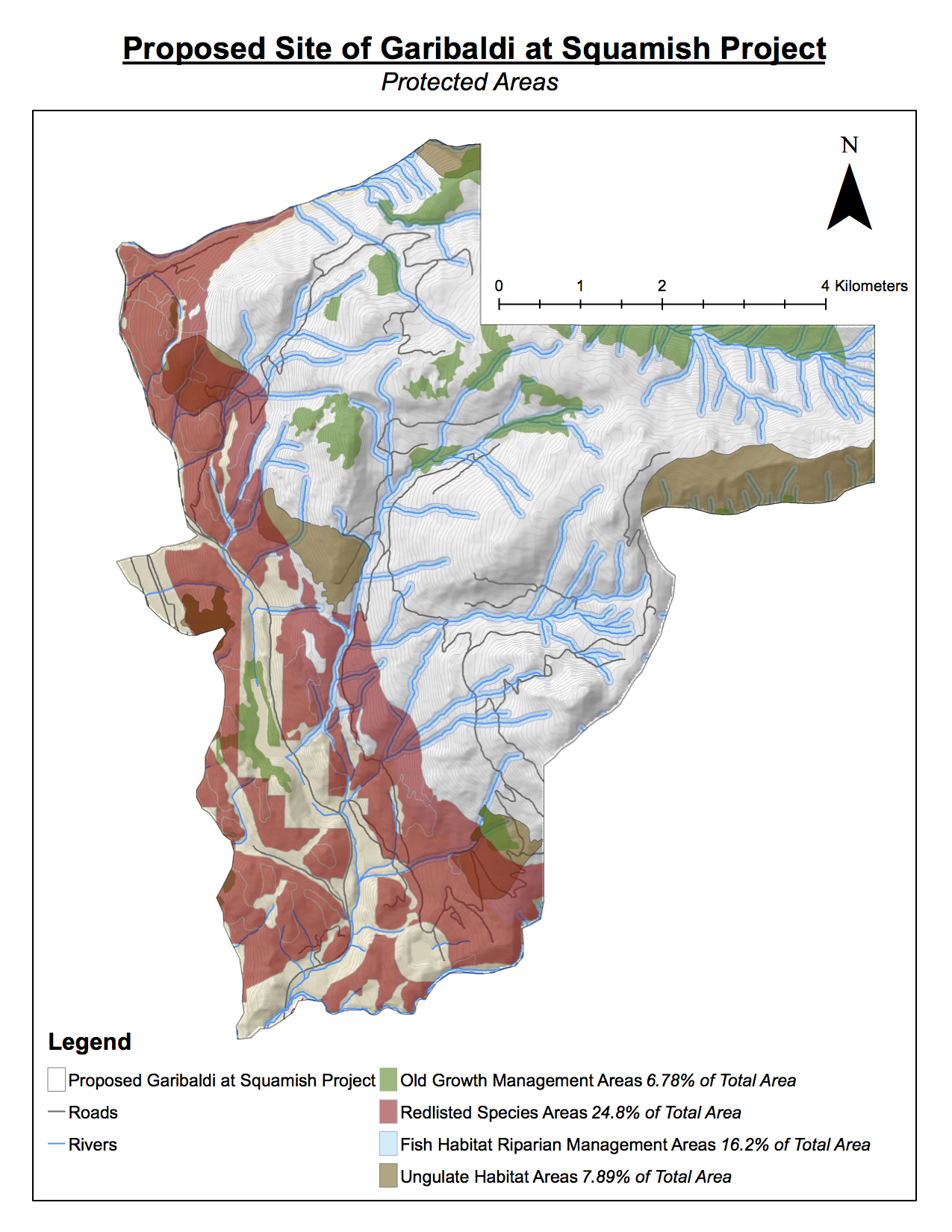
Map created by Tessa Owens, using ArcGIS software. Data from DataBC.

Over the last few weeks, I reviewed the Garibaldi at Squamish project proposal and have identified priorities that should be addressed in order for the proposal to proceed. These issues may be successfully addressed with carefully-planned architecture and ski run locations. In order to evaluate claims that the proposal lacked information on the project’s potential effects on vegetation, fish and wildlife habitat, I accessed current legal data on old growth forest management areas, the winter range habitats of Mule Deer and Mountain Goats, and areas including the following red-listed species:

  • Flat Moss
  • Falsebox
  • Salal
  • Kinnikinnick
  • Cat’s-tail Moss
  • Cladina

I created buffer zones to evaluate the total areas encompassing sensitive fish habitats that may be affected by the project site.

RESULTS

I discovered that 47.9% of the project area may directly impact regions of old growth forest, ungulate habitat, red-listed ecosystems and fish.

  • Red-listed species: 24.8%
  • Sensitive fish habitats: 16.2%
  • Ungulate winter habitats: 7.89%
  • Old growth forest: 6.79%
  • Total: 47.9%

The Resort Municipality of Whistler referenced a supposed lack of reliable skiing on the lower 555m of vertical; 29.9% of the proposed Garibaldi project falls within the lower 555m of vertical.

RECOMMENDATIONS

The two greatest environmental concerns to project development are intersections with protected areas and the potential lack of viable skiing conditions in the lower elevations.

  1. Addressing protected areas: create boundary or off-limit zones where no skiing is permitted, especially in areas where there is overlap between ungulate habitat, old growth forest, and red-listed species. Completely avoid any removal of old-growth forest in creating ski runs, lifts, or associated architecture. To evade sensitive fish habitat, build runs within 50-100 meters of streams, especially in upper-elevation zones. Avoid building runs that cross major tributaries.
  2. Addressing lack of viable skiing conditions: consider creating two ski zones – upper and lower. Close the lower section when weather conditions are not favourable enough for viable skiing. This will require an adequate number of access/exit points at a greater variety of locations.

With appropriate planning and reference to the protected areas included in the map that I have submitted in addition to this report, I believe these impediments to the success of the project may be effectively addressed.


On Ethics

Personally, I don’t think that this project should be allowed to continue – this opinion differs from what I wrote in the memo above. Half of the proposed project area would impact sensitive species or ecosystems. It is difficult to be contracted as an advisor to projects that may not align with my personal beliefs, but it is my responsibility to offer sound suggestions for improvement that could mitigate this environmental impact as much as possible.

Accomplishment Statement

Through the completion of this lab, I have learned about many of the components included in Environmental Impact Assessments (EIA). I have completed a minor EIA on my own. This lab enabled me to include DEM data (Digital Elevation Model) to display a 3D surface in a map – a very useful function. I also learned more complex functions and equations for querying data and completed basic mathematical processes in identifying values for the map. This lab was an exciting insight into the EIA process; this is something I have been curious about for many years, but finally feel I have a substantially more concrete understanding of their value, potential for subjectivity and error, and their use.

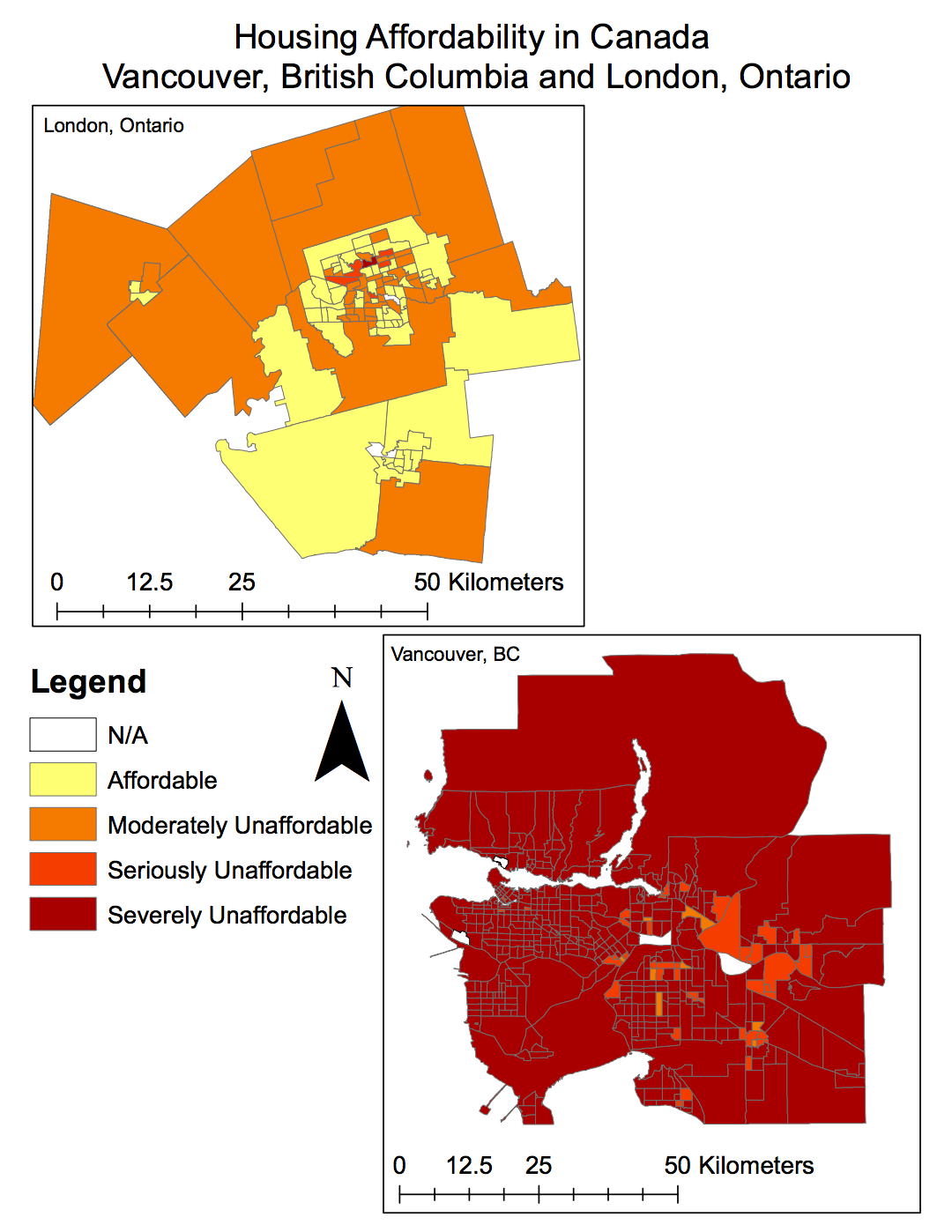
Housing Affordability

All maps created by Tessa Owens, using ArcGIS software.

What is affordability measuring, and why is it a better indicator of housing affordability than housing cost alone?

  1. Affordability measuring is the evaluation of the cost of housing relative to other factors that affect the ability of consumers in the market to access adequate housing. These additional factors may include variables such as (disposable) income, interest rates, mortgage and rent payments, and supply limits.
  2. Housing cost, measured alone, does not encapsulate any evaluation of the purchasing power of local consumers — or their ability to buy a home. It is simply a metric that describes the cost of a house, without any comparison to the income of local residents; however, this metric is not as meaningful as housing affordability metrics. In other words, if the cost of an average house in a particular market is $350,000, this may seem relatively affordable. However, if the average income in the same market is evaluated to be $30,000, then this variable, in conjunction with the housing market costs, can give a better indication of the market’s housing affordability.

What are the housing affordability rating categories? Who determined them and are they to be ‘trusted’?

The housing affordability rating categories, defined by the Annual Demographia International Housing Affordability Survey, are as follows:

  • Affordable (3.0 & Under)
  • Moderately Unaffordable (3.1 – 4.0)
  • Seriously Unaffordable (4.1 – 5.0)
  • Severely Unaffordable (5.1 & Over)

These categories are created by calculating the Median Multiple:

Median Multiple = Median House Price ÷ Gross Annual Mean Household Income

This method of measurement has been approved by the World Bank, the UN, and the Joint Centre for Housing Studies at Harvard University. It is a trustworthy method of evaluation, especially since it can vary regionally by using regional income and housing price metrics.

Is affordability a good indicator of a city’s ‘livability’?

Although (housing) affordability is one indicator of a city’s livability, it cannot encompass all the factors that should be evaluated in determining whether or not a city is livable. Other factors are myriad and include transport services, health services, local systems and infrastructure – including roads, waste management, sewer systems and city planning.

Vancouver can be described as a ‘livable’ city for factors such as its mild climate, adequate public transport systems, health services infrastructure, governance strategies and job market that contribute to a generally positive quality of life. However, if affordability was the only factor analyzed in determining Vancouver’s livability, it may be determined to be seriously lacking at present.

Accomplishment Statement

Through the completion of this lab, I have learned about including officiated indexes (such as the Housing Affordability Index) in my GIS analysis. I have also learned about subtle variations in the ways of displaying data that have significant impact on the appearance of a final map, and may lead users to different conclusions. Through this lab, I continued to develop my knowledge of GIS software, becoming more comfortable with a wider variety of functions.

Tsunami Hazard Zone in Metro Vancouver

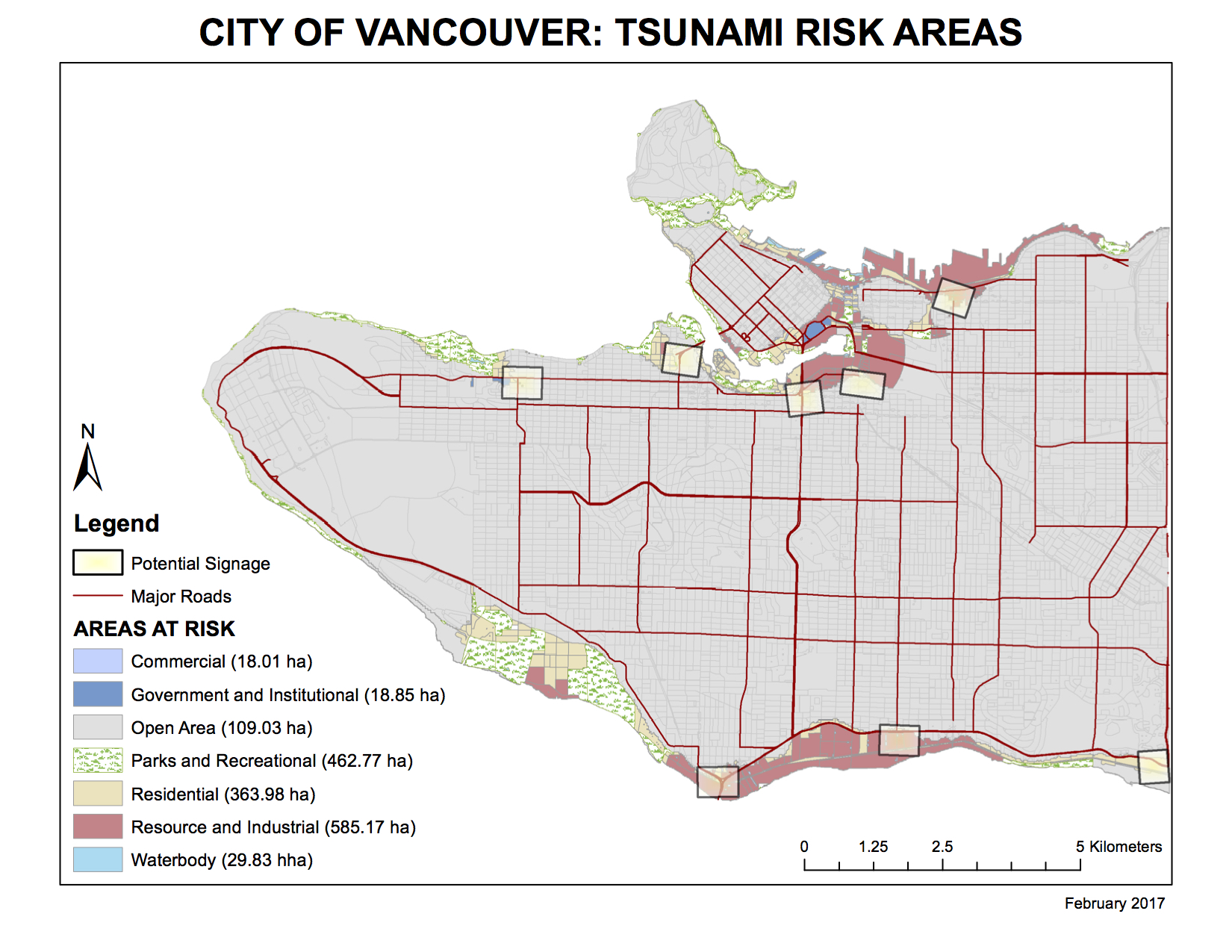
Map created by Tessa Owens using ArcGIS software

The tsunami risk area was created by isolating areas of Greater Vancouver that fulfilled both of the following requirements:

  • Within 1 kilometer of the ocean
  • Below 10 meters in elevation

Educational and health facilities that fall within this risk area include:

  • Emily Carr Institute of Art and Design
  • Henry Hudson Elementary
  • False Creek Elementary
  • St. Anthony of Padua
  • École Rose-Des-Vents
  • False Creek Residences
  • Villa Cathay Care Home
  • Broadway Pentecostal Lodge
  • Yaletown House Society

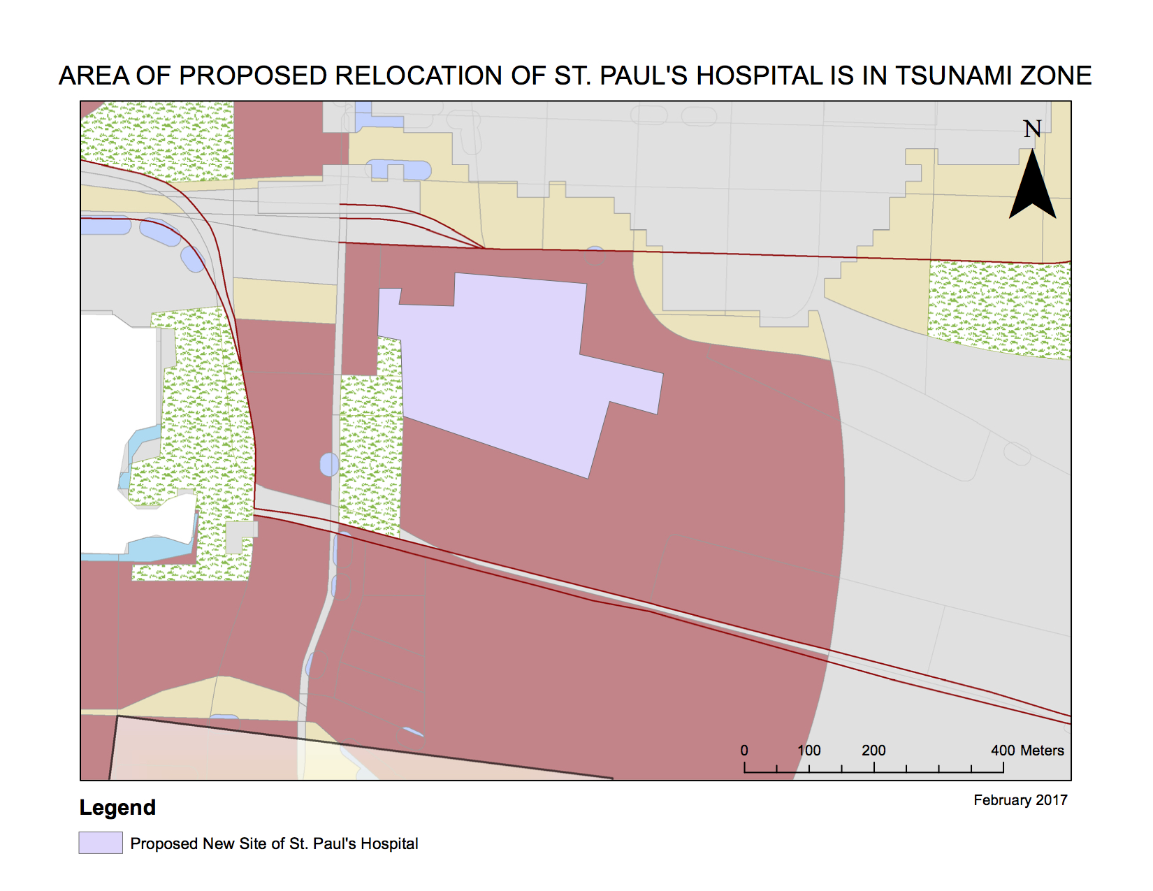
Additionally, St. Paul’s Hospital has been designated to relocate. (Further information regarding this project can be found here: http://vancouver.ca/home-property-development/new-st-pauls.aspx)

However, the area of the proposed site falls within the tsunami hazard risk area identified on the map (marked in colour; St. Paul’s would fall within the zone of “Resource and Industrial Areas at Risk”.) Due to this unmitigated risk, it may be prudent to revisit and reconsider the proposal for this relocation.

Accomplishment Statement

Through the completion of this lab, I have learned critical GIS functions such as the creation of a buffer zone, and how to clip data to a certain working area. I have learned to query data, and select data by their attributes, in order to reach a more complex level in data manipulation and use. I have also learned about the basics of creating maps – these were my first maps ever produced. This lab was very applicable to a real-life situation in identifying existing buildings that would be affected by the reach of a tsunami.

Misaligned and Improperly Referenced Spatial Data

Read on to learn about projected coordinate systems, distortions, how to take steps to avoid mismatching data layers with coordinate systems, and why using Landsat data can be advantageous for your geographic analysis!


Projected coordinate systems are used in GIS to display information in a 2D, workable form. Data projected in this form creates the display layers in maps. However, there are many different types of projected coordinate systems that use different algorithms to translate 3D data into 2D map images. It’s impossible to project 3D data in a 100% accurate way onto a 2D map.

To compromise, different algorithms prioritize different elements of display: some algorithms may display distance more accurately, whereas other algorithms may result in a more accurate display of landform size.

Thus, the difference in these algorithms can cause map projections to display disparate distances between two points; for instance, if the distance between Halifax and Vancouver was measured while using GIS software, the measurement may differ (in the range of a few kilometers) depending on which projected coordinate system is utilized.

In order to minimize this distortion, both the projected coordinate system and the geographic coordinate system should match. The following steps should be followed in order to ensure smooth operations:

1.  Preview the data with ArcCatalog, check which layers include information regarding their coordinate systems, or not.

2. Find out what the official projections are for the area of study; these differ from region to region.

3. Convert all layers into the common projection that has been identified.


Landsat images contain the longest visual record of Earth’s surface. The data provided through Landsat technology is coarse enough to offer global coverage, but is detailed enough to illustrate important developments on Earth’s surface. These may include images that range from illustrating the change and growth of human infrastructure on Earth to the retreat of glaciers in water storage areas of the world. Because of its prolific history, Landsat data can be used to supplement study on global topics such as climate change, desertification, and urbanization.

Melting ice in Antarctica. Photo: Tessa Owens, 2014

Images provided courtesy of Tessa Owens (SOI Antarctic Expedition, 2014) and pixabay.com, a website hosting images and videos free of copyrights. 

Accomplishment Statement

Through the completion of this lab, I have learned about the differences between geographic coordinate systems and projected coordinate systems in GIS software. I have learned how to overcome barriers in data sourced from different coordinate systems and include these data in my GIS analysis. I have also continued to gain more experience in navigating GIS software.

Spam prevention powered by Akismet