04/23/18

Limited Editions Club Letter

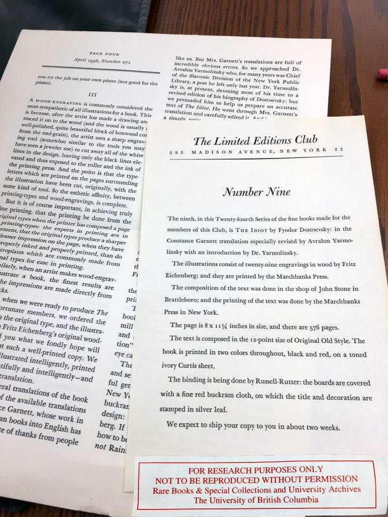
The Rare Books and Special Collection’s edition of the 1956 Limited Editions Club edition of The Idiot includes two loose-leaf pamphlets that were issued as part of the Limited Editions Club’s subscription service. A one-sided sheet gives the subscriber technical information about the book’s production: about its illustrations, text composition, page dimensions and count, and about the book’s material features.

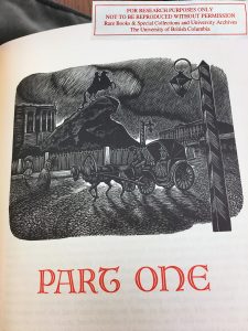
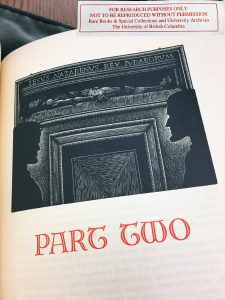
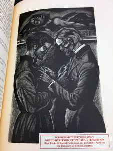
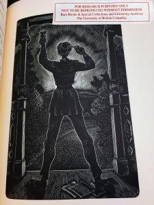
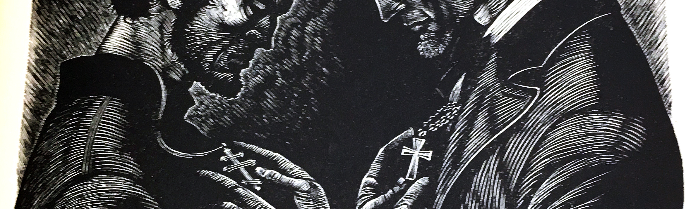
The second pamphlet is a four-page “Monthly letter” from the Limited Editions Club. This one, that came with this edition of The Idiot is entitled, “How to Be a Prince”. The letter gives a brief outline of the history of Russian writers, including the most influential modern Russian novelists–among which is Dostoevsky. The letter goes on to compare Fritz Eichenberg (this edition’s illustrator) to Dostoevsky, claiming that Eichenberg as one of the greatest illustrators of the 20th century. The latter part of the letter describes the value of this edition, justifying the quality of the book’s construction to the subscriber and reader.

04/23/18

H.R. Macmillan

This edition was donated to UBC’s Rare Books and Special Collections by H.R. MacMillan. H.R. MacMillan was a Canadian forester, forestry industrialist, wartime administrator and philanthropist. He was appointed Chief Forester of British Columbia in 1912, and received honorary degrees from multiple institutions, including the University of British Columbia. There is a building on UBC’s Point Grey campus dedicated to and named after him. According to UBC’s Wayfinding website, H.R. MacMillan and his family were major donors to the university. This would explain how this particular edition of The Idiot found its way into UBC’s Rare Books and Special Collections.

04/23/18

Typeface

The typeface used in this book is 12 point Original Old Style, in red and black ink. Old Style fonts, commonly referred to as Humanist typefaces, are based on handwriting and lettering done by scribes in the 15th century. According to Site Point, Old Style’s “relation to calligraphy can be seen in the curved strokes and letters with thick to thin transitions, looking somewhat like letters drawn with a pen and ink. Unlike Modern typefaces, the thick/thin transition is moderate and not so obvious. The serifs on Old Styles are always angled and if you draw a line though the thinnest parts of the letters, you’ll see that the stress is diagonal.”

Old Style typefaces are considered the best type for large bodies of texts, which is fitting for Dostoevsky’s The Idiot which is quite lengthy. Modern paperback editions of the novel, like the one edited by Constance Garnett and published by Vintage Classics measures about 656 pages and 243,020 words in total.

04/23/18

Marchbanks Press

1500 copies of this edition of The Idiot were made by Marchbanks Press. The copy of the edition I researched was numbered #1462.

The Marchbanks Press was founded by Joseph Blumenthal–a well-known figure in the 20th century fine press movement, who later founded Spiral Press–and George Hoffman, who established Marchbanks as a private press which was run in their spare time. In the 1920’s, Marchbanks Press was located at 114 East 13th Street in New York.

04/23/18

Renaissance Margins

An interesting aspect of this book’s page formatting are the thick margins that frame the text. In my research of fine press printing and artist-illustrated books, I discovered a term that characterizes these thick borders surrounding a given text. Printmaker and artist Barry Moser in his afterword to his self-illustrated 1982 edition of Alice’s Adventures in Wonderland. He uses the term “Renaissance margins” to describe the thick margins present in this particular text. However, I believe that this term could also be applied to describe the trend in medieval and early Renaissance printmaking, which leaves considerable white space around the text. The function of this is to allow the text/information to be edited, and additional notes could be incorporated into a text to be included in its subsequent editions. Often, medieval and early Renaissance marginalia contained annotations, footnotes–and even illustrations–in the margins.

Check out this Khan Academy article for more information about the Medieval origins of the modern footnote.

04/17/18

The Art of Marbled Paper

Marbled Pasteboard Book Cover Box of the 1956 Limited Editions Club edition of Dostoevsky’s The Idiot.

Marbled paper is incredibly mesmerizing to look at. Marbled paper may come in the form of end pages, book covers, and boxes that come with and hold books (including this edition of The Idiot). The marbled paper of this edition of The Idiot contains traces of gold, as visible in the above image. Just from an aesthetic standpoint and visual observation, it appears to enhance the overall quality and value of the book object.

Indeed, in my research I learned that the art of paper marbling belongs to a plethora of fine binding and fine printing techniques. As Andre Chevalier writes,

“Most of the collectors and trade professionals simply do not have enough knowledge about marbled paper to justify paying a premium for it. In fact, the differentiation between marbled paper qualities and options is a task that is mostly reserved for the experts in the field which specializes in fine bindings and fine printing.”


Although paper marbling is said to have originated in Turkey, Persia and their adjacent regions, sources date paper marbling back to 12th-century China and Japan. These techniques were discovered by European travellers to Turkey and Persia in the 16th-century. The popularity of paper marbling rose in Europe during the 17th-century. The French were the first to produce marbled endpapers in books, serving the function of book decorations not unlike the function of wallpaper in an interior.

The first comprehensive study of 17th-century of European paper marbling was published in 1947 by Charles M. Adams, entitled “Some Notes on the Art of Marbling Paper in the Seventeenth Century”.

Check out this interesting video that reveals the process of paper marbling:

Further Reading:

04/17/18

Blank Verso Pages

One thing I noticed when studying this edition of The Idiot was that the illustrations were almost always printed on the recto side of the page. The only exception of an image printed on the verso is the title page illustration. I also noticed that the verso of the illustrations’ pages were blank.

Some questions arise:

  • Is there a reason why the image is mostly printed on the recto side of pages? Is it for economical or aesthetic reasons?
    • That is, would it be more aesthetically pleasing and easier for the reader to view an illustration, while having the text available to them on the image’s left?
  • Why are the verso pages blank?
    • Is it to prevent ink from bleeding through the page onto the text page behind it?
04/17/18

Analyzing the Illustrations

The illustrations in this edition of Dostoevsky’s The Idiot by Fritz Eichenberg are easily identifiable due to the artist’s unique stylistic attributes. The printed woodcut engravings make extraordinary use of light and shadow through the manipulation of line. Some areas of the engraving are solid blocks of shadow, while simultaneously, delicate and subtle transitions between light and shadow allow Eichenberg to produce dramatic chiaroscuro effects.

Title page of part one (of four). Engraving by Fritz Eichenberg.

Title page of part two (of four). Depicts the meeting of Prince Myshkin and Parfyon Rogozhin standing under a Hans Holbein painting reproduction of The Body of the Dead Christ in the Tomb (1520-22). Engraving by Fritz Eichenberg.

Engraving depicting Prince Myshkin and Parfyon Rogozhin’s exchange of crosses. Engraving by Fritz Eichenberg.

Engraving depicting Ippolit Terentyev’s suicide attempt. Engraving by Fritz Eichenberg.


What defines Eichenberg’s style of engraving is heavily influenced by a combination of elements from the traditional techniques of German Northern Renaissance woodcut engravings, as well as German Expressionist engravings. The angular characteristics of the figure’s faces, especially recalls the influence of German Expressionism on Eichenberg’s style.

04/16/18

Fritz Eichenberg

There are many things I’m interested in covering about the Limited Editions Club’s 1956 edition of Fyodor Dostoevsky’s The Idiot. Have a look at further information about The Idiot, Fyodor Dostoevsky, the Limited Editions Club, or the UBC collection this edition belongs to through the links provided!

The first and most prominent aspect of this particular edition of the novel are the woodcut engraving illustrations by Fritz Eichenberg. Fritz Eichenberg (October 24, 1901 – November 30, 1990) was a German-American illustrator and arts educator who worked primarily in wood engraving.

He was born to a Jewish family in Cologne, Germany. Throughout his life he was politically outspoken, was anti-war, and a public critic of the Nazis. He worked as a printer’s apprentice, and studied at the Municipal School of Applied Arts in Cologne and the Academy of Graphic Arts in Leipzig, where he studied under Hugo Steiner-Prag.

Fritz Eichenberg, photo by Beverly Hall.

In his prolific career as a book illustrator, Eichenberg worked with many forms of literature but specialized in material with elements of extreme spiritual and emotional conflict, fantasy, or social satire, illustrating such authors as include Dostoyevsky, Tolstoy, Charlotte and Emily Brontë, Poe, Swift, and Grimmelshausen. He also wrote and illustrated books of folklore and children’s stories.

04/16/18

Introduction to the Blog

Hello! Welcome to UBC’s ENGL 419A book blog dedicated to researching the 1956 Limited Editions Club edition of Fyodor Dostoevksy’s The Idiot.

My name is Alexandra Trim, and I’m a fifth-year Art History and English Literature student at the University of British Columbia. My research interests primarily involve postwar American culture, identity politics, questions of geopolitics and ethnicity, and all things Russian.